
When it comes to news apps, the situation is a fairly interesting one…
Whilst there’s significantly more traffic on mobile, up to 70% according to research, these users tend to have a lower propensity to subscribe than desktop users.
We discussed this different context in detail in another article but, in short, these readers are often less focused, may have a limited internet connection and the smaller screen adds a bit more friction to any purchase process.
However, after a reader does subscribe, whether that be on desktop, mobile or app, they are highly more engaged than the average user. Based on the latest data aggregated across Pugpig apps, app users read an average of 28 articles in a week and have an average session duration of 13 minutes.
It’s for this reason that many publishers prioritize marketing campaigns around the app, particularly in the subscriber onboarding journey, to encourage readers to download their app and thus have a higher level of engagement.
> Discover how to increase engagement on-app in our article on The Audiencers.
 Madeleine White
But what about the actual conversion step? How can publishers work to increase conversion rates on readers already on your app, those who have the potential to be a highly engaged subscriber?
This article explores the best practices to effectively convert readers into subscribers with an adapted paywall on your app, supported by examples from industry leaders.
- Offer app users a free or reduced trial to your subscription product
- Register users, promoting subscription during the onboarding journey
- Increase visibility of your premium offer on-app
- Don’t forget about the value proposition
- Adapt your paywall to the smaller screen
1. Offer app users a free or reduced trial to your subscription product
A free or reduced trial offer can be a useful conversion tactic on apps to make use of the high levels of engagement. During this trial you can encourage the reader to sign up to your newsletter, activate push notifications, personalize their experience… anything that can help to increase retention rates and LTV.
Best-in-class example: The Telegraph
The Telegraph paywall displays a call-to-action (CTA) that doesn’t ask readers to subscribe but to claim their 3-months free trial offer. This phrasing frames subscription as a gift offered by the publisher, encouraging the reader to accept rather than having to give anything themselves.
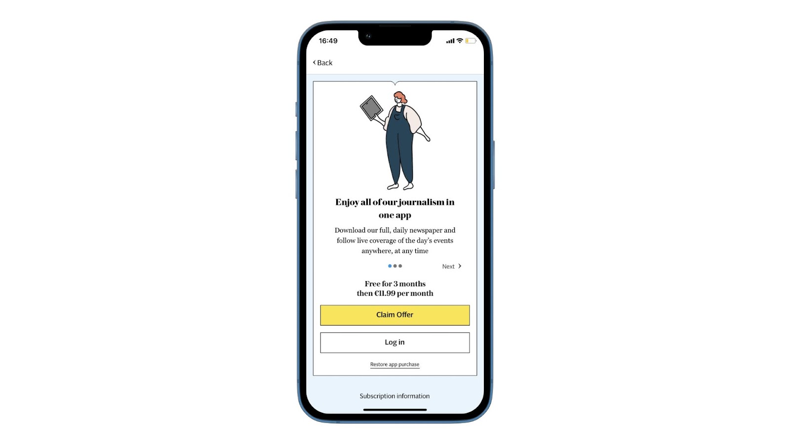
🎯 We recommend testing pricing and offers in each audience segment to really target your product to readers - you can test discounts, rewards, free trials, trial duration, or bundled subscriptions.
2. Register users, promoting subscription during the registration onboarding
App users are fairly habituated to creating an account upon downloading an app, so you can make the most of this to increase engagement and propensity to subscribe through registration. To take this strategy a step further you can lead users through an onboarding journey to encourage them to activate features, push notifications and other engagement features valuable to high LTV.
Within this onboarding journey, add in a step promoting subscription, with a clear value proposition and tempting offer adapted to this type of reader
Best-in-class example: The Independent
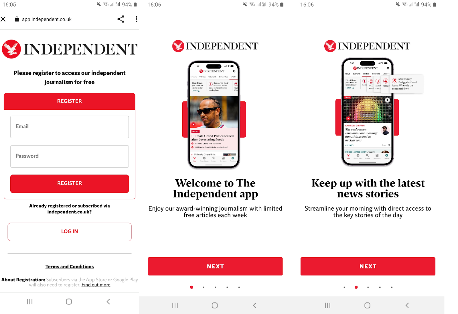
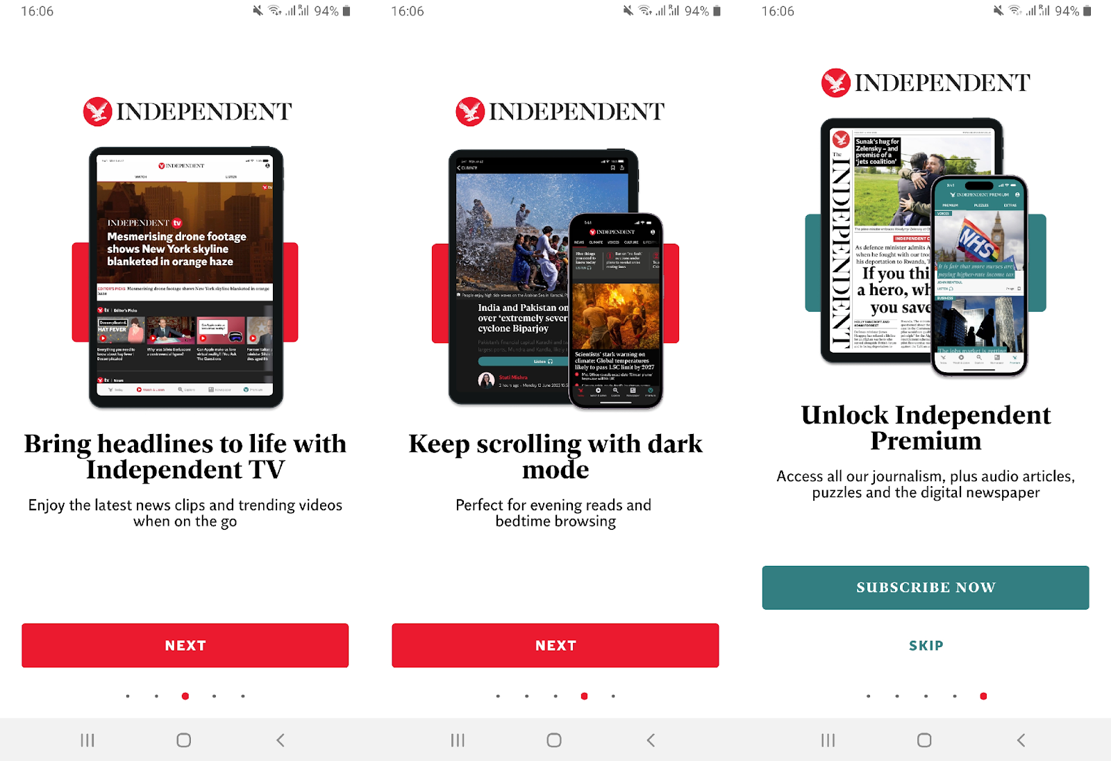
- The main goal here seems to be introducing readers to the app and it’s features
- Each step conforms to the same layout and design with an image illustrating the feature, a bold, consice, declarative sentence to present this step and keep the page scannable, followed by smaller copy going into more detail
- Dots at the bottom of the screen keep readers informed of the number of steps left in the onboarding journey
- The final step promotes their premium offer, presented in a different color that represents subscriptions across The Independent’s platforms. Note that this isn’t a paywall as it’s not blocking - we have the option to skip this step to continue to use the app for free
3. Increase visibility of your premium offer
Research has revealed a correlation between the visibility of your premium offer and user-to-subscriber conversion rates. And whilst it’s fairly easy to increase this visibility rate - through a “Subscribe” button in the header, promotional banner and paywall - there’s a balance to be found between frustration and engagement, particularly on app where the screen is smaller.
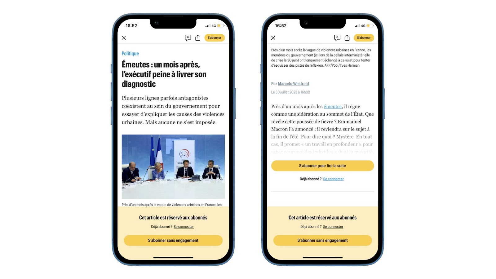
Best in class example: Le Parisien
Le Parisien achieves 100% visibility rate for readers arriving on a premium article as they’re presented with a pop-up banner even before scrolling. After a paragraph, the actualy paywall appears, providing 2 seperate CTA buttons, both in the same color representing subscription across the brand.
Add to this the button in the header, and you've got 3 touchpoints for conversion.
4. Don’t forget about the value proposition
Just because you have a smaller screen, doesn’t mean you should forget about the all-important value proposition!
Too many publishers don’t give a unique reason to subscribe, other than to gain access to content. This is perhaps why we see so many full-page walls on mobile – to allow for more space for the value proposition, CTA button and subscription offers simultaneously.
I’d argue that the value proposition is more important than having 2 offers on the wall, and that clearly communicating what you stand for, what value you’ll provide and what jobs you’ll help your reader achieve is the most important aspect of the paywall.
> We'd recommend our article on how to define your value proposition:
 Madeleine White
Best in class example: Financial Times
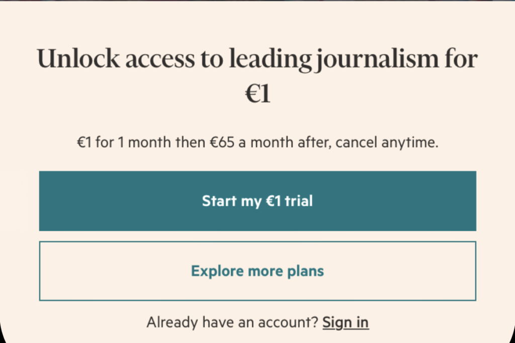
In just 7 words, FT successfully tells us what we’ll have access to, what makes them different to other publishers, and the value we have to give in exchange for this
5. Adapt your paywall to the smaller screen
Consider the context of the reader – the smaller screen, the fact that they can use Apple Pay, iTunes or Paypal to subscribe in a click, the information that their phone could fill in automatically (such as name and email).
Best in class example: The Washington Post
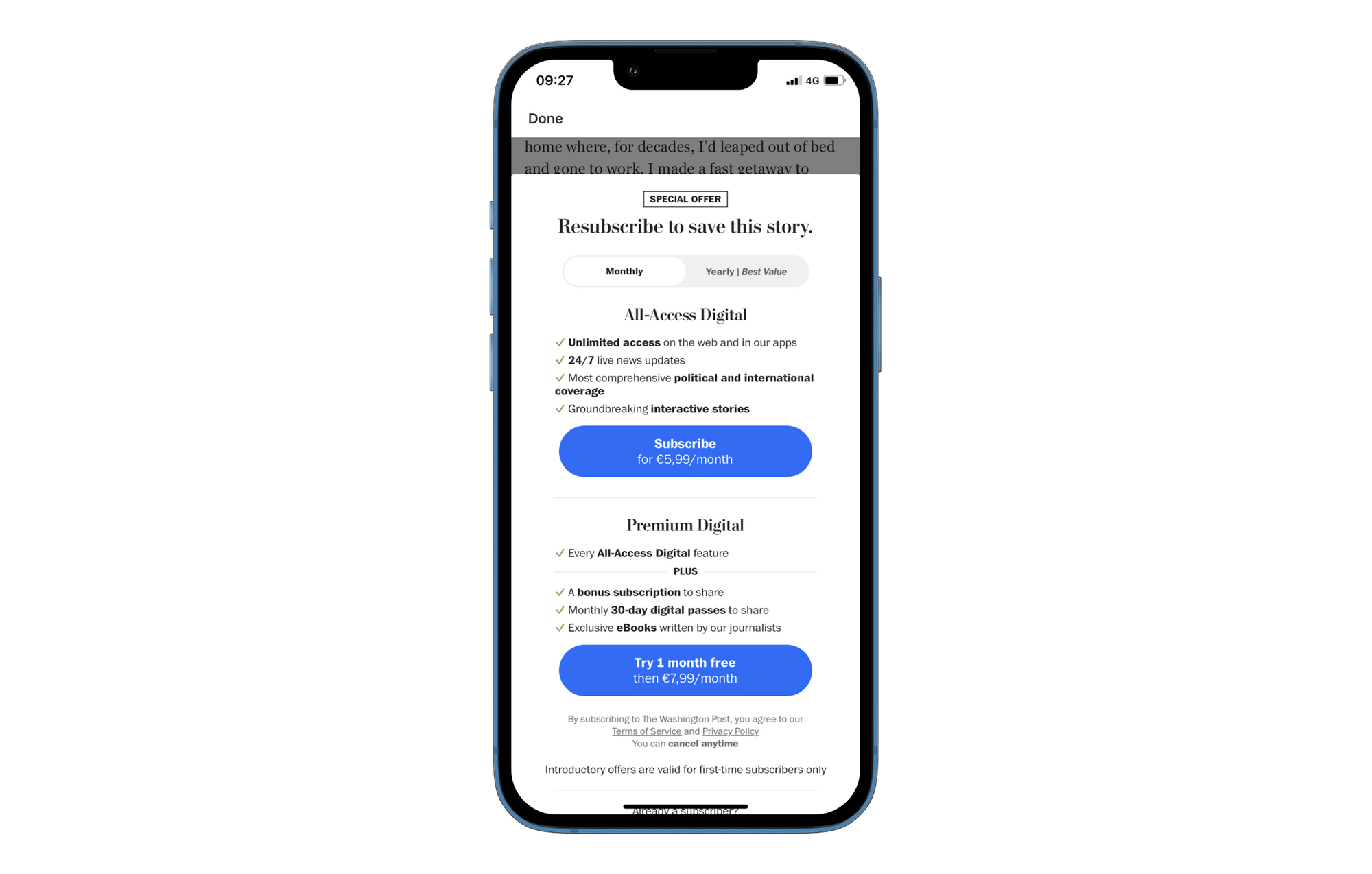
- Adapt subscription benefits to the app - for instance forefronting all-access to the app and other mobile features
- One or two offers maximum - many publishers reduce the number of offers in the paywall on-app due to the smaller screen, but it’s useful to include at least one to eliminate a step in the conversion funnel (the offers page)
- Consider foldable sections to keep the paywall from looking too busy, keeping the wall scannable - The Washington Post includes a slidable tab to choose between monthly or yearly payment options
> Discover more paywall benchmarks and best practices on The Audiencers:
Madeleine White
Conclusion
There’s a lot to think about when it comes to converting readers into subscribers on your app, and it should certainly be treated differently to the context on desktop or mobile AMP. However, when done well, subscribers on your app can prove to be the most engaged, loyal and therefore have the highest LTV.