

This is a write up of a recent Poool webinar. Prefer to watch rather than read? Find it here. Prefer to read in the language of Molière? 🇫🇷 C'est par ici
The statistics section of the Poool Dashboard provides you with a variety of data points to make more informed decisions, and analyze performance on a daily basis.
Our goal is to make it easy for you to see the outcome of your work and make decisions for the next steps.
To support you in this, we recently ran a webinar with Poool's audience conversion experts - Olivier, Product Marketing Manager, and Ludivine, Head of Customer Success - to dive deeper into exactly how to optimize your user-to-subscriber conversion strategy with Poool’s Statistics section.
As this gif says, to be taken with a little irony, data doesn't lie!

Why have Poool stats been revamped?
The statistics section has always allowed you to gather information on the different conversion actions used in your scenarios. Based on your context, this could be newsletter signup, registration, paywall click-through rate or conversion rate.
These statistics are certainly useful, but publishers can also access this data in analytical tools such as Google Analytics or AT Internet. Our goal was therefore to develop higher value statistics to give deeper insights into your conversion strategies, making better, more informed decisions on a daily basis
The goal: statistics based around our 5-step conversion framework
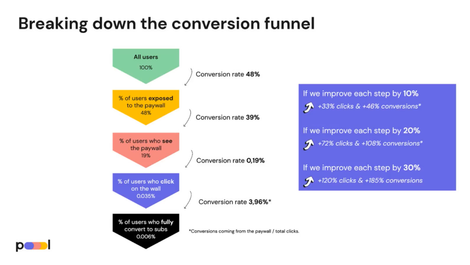
Poool’s alternative conversion framework
When looking to increase conversion rates, we tend to look at the conversion funnel alone, starting at the paywall and going through the steps to payment.
However, converting users into subscribers for publishers consists of gradually developing engagement throughout the user journey, prior to the paywall. Focusing on a single metric that only takes into account the paywall is therefore not optimal for publishers.
We have therefore created a unique, optimized approach to the conversion funnel that allows you to break conversion rates down into more manageable steps.

Our framework shows 5 key steps towards conversion, with publishers being encouraged to measure the conversion rate of users from one step to the next:
- Total number of users
- % of users exposed to the paywall
- % of users who see the paywall
- % of users who click on the paywall
- % of users who convert
If you improve each step by 10%, you will increase the click-through rate by 33% and the overall conversion rate by 46%.
And if you get to 20% in each step, then the overall click-through rate will increase by 72% and the conversion rates by 108%.
In short, this framework allows you to understand exactly where your users are converting at a higher rate and where needs work. Optimizing each of the smaller steps is a lot more manageable and has a bigger impact on the final user-to-subscriber conversion rate.
Read more about our new framework and tips for optimizing it in this white paper:
 Madeleine White
The new Dashboard Statistics section
The Poool Dashboard Statistics page follows our new conversion funnel framework, offering unique data that cannot be found in standard analytics tools.
The goal?
Measure performance at each steps towards conversion giving you insights into where needs improvement
How do you do it?
- Measure traffic rate
In the visibility section, the new "Traffic Rate" KPI allows you to monitor the traffic rate of paid vs free content:
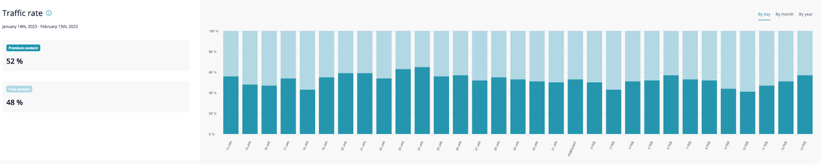
This metric represents the second step in the funnel - the share of traffic on paid content. The Dashboard allows you to measure its evolution over time: you can see the performance per day, per month or per year, as well as compare performance against a specific date range.
For instance, if you've promoted more premium content in your newsletter recently, or produced more of this type of content, you'll be able to see the impact of these efforts on the graph.
Whilst a publisher employing a hard paywall model will have 100% subscriber-only content, those with a freemium model work to find a better balance between engagement and frustration, leaving some content open to increase engagement and content discovery. 40-60% is the typical traffic rate amongst these publishers.
💡Ludivine’s tip:
"In this case, it can be interesting to link Poool stats with your analytics tool to combine it with behavioral data and a wider data panel for deeper understanding of how your audience react to a low or high traffic rate."
2. Measure visibility rate
Visibility rate is the third step in our funnel: once users have arrived on a premium article, have they actually seen the wall?
The metric is shown as a percentage (% of users who see the wall out of total traffic on premium content) alongside the number of wall impressions.
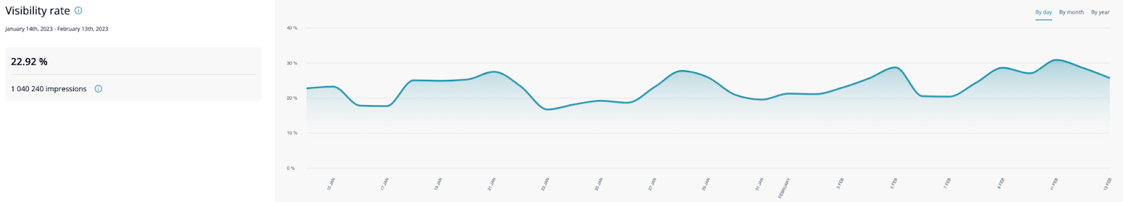
In the example above, visibility rate is around 23%, down from the previous day.
💡Ludivine's tip:
"Regarding your visibility rate, there are plenty of optimization actions to take and tests to be run to discover the optimal % for increasing conversions on your site.
You can, for example, choose to:
- Increase the amount of content blocked by the wall, from 80% of the article to 90%
- Test a full page wall (with 100% visibility) on content with the highest traffic"
3. Measuring success
The "Success Rate" is the part that interests publishers with a dynamic model the most since they can see the success of the different widget actions integrated into user journeys.
This section of the Statics page is segmented based on the widget-type, showing 2 key metrics for each and a comparison to the previous period.
E.g. the Newsletter Subscription statistics will tell you the number of emails collected and the success rate of this widget.
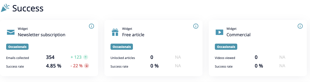
In the example above, we decided to compare the last 30 days against the previous 30 days.
What we call 'success rate' depends on the widget, but it refers to a user completing the desired action:
- For the newsletter subscription widget, it is the completion of the form
- For the free article widget, it is the click-though rate
- For the commercial widget, it is the number of times an ad is viewed
4. Measure the success of your A/B tests
A/B tests are an effective, user-friendly way to optimize your conversion strategy and improve performance at every step of the funnel. We've therefore made it easy for you to measure the success of your A/B tests in the Dashboard!
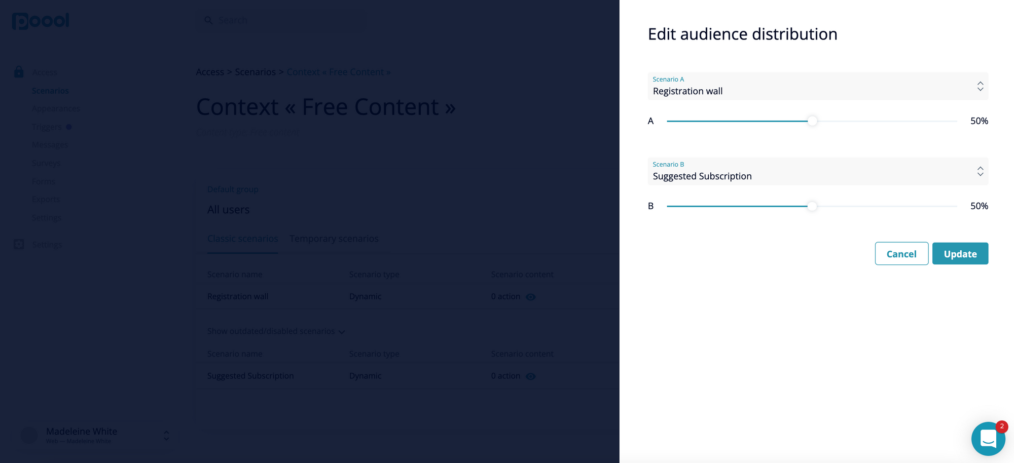
How do you launch an A/B test?
Launching an A/B test from the Poool Dashboard only takes a few minutes: you just need to activate two scenarios within the same audience group and slide the bar to specify the audience distribution (the percentage of your audience that will fall on version A or version B).
How long should you run an A/B test for?
💡Ludivine's tip:
"The length of time over which to run your A/B test depends on the volume of traffic, which can vary greatly. I always advise having a sufficient sample size, which is ideally at least 500-1000 clicks on each version. Below that volume, you won't likely have conclusive results, or you're going to have false information ultimately based on the original hypothesis."
How do you analyze an A/B test in the Dashboard?
Start by choosing your context, group, scenario and date range.
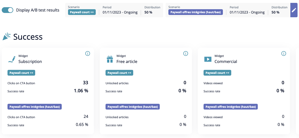
In the example above, a paywall with less text (A) is tested against a paywall that includes the subscription offers (B). Both scenarios are still running and have a 50/50 split.
You can quickly compare the success rates here - CTR on the CTA button and success rate is higher in scenario B, so we can come to the conclusion that version B is the better option for increasing conversion rates.
The Dashboard allows you to follow the evolution of the success rate over time (per day, per month or per year).
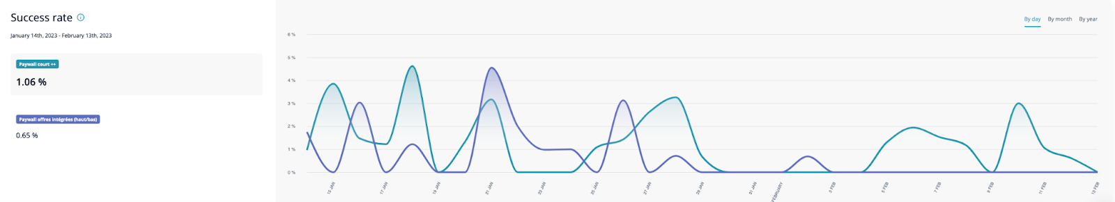
In the "Success rate" section, you also get an average success rate for all widget actions used in your scenarios. This allows you to see the real performance of the scenario as a whole rather than of only one action.
Find other examples of A/B tests in our benchmark article:
Madeleine White
Interested in finding our more about our solution? Book a free demo with our team!
Our Youtube channel also gives you a great overview of what you can do with the Dashboard and guides you through our series of 5-minute tutorials