
With newspapers such as The New York Times winning prizes left right and centre (The NYT won 125 Pulitzer prizes in a century, 3 in 2018), the widespread fame and success of certain American publishers is incontestable.
These popular newspapers are models for online publishers all over the world, particularly in regards to their pricing and communication strategies. The New York Times’ 2020 report for example, which makes reference to changes to their strategies and to the company's new goals, is every publisher’s inspiration.
For this white paper, we decided to focus on three successful, American publishers: The New York Times, The Washington Post and The Wall Street Journal. This analysis deals with the UX of these newspaper's websites as well as looking at their reader's conversion into subscribers.
We’ll see how these newspapers successfully make readers understand the importance of paying to access quality content, how they convince their audiences using the paywall and how they have developed their paywall strategies to ensure a user is given the optimal experience in every context.
Our analysis is composed of 4 parts:
- How to explain a content access model to users
- How to design a well-suited and attractive paywall
- How to customize the subscription experience in order to make it as relevant as possible
- How to take advantage of paywalls’ adjustability
In each part, you'll find key components identified by Poool to help you to understand the methods used by each publisher.
Want to find out more about Paywalls in general? Take a look at our dedicated article:
 Madeleine White
3 initial statements before we begin...
- Since advertisement is a controversial monetization model, it could be interesting to opt for data collection as an alternative to subscription (this strategy would likely involve a registration wall over paywall)
- It could be relevant to deploy different strategies for the website and the mobile app because these medias are used by readers in different ways
- A good way to attract a larger audience is by having some offers adapted to a user's profile (student, foreigner,…)
Part 1 - How to explain a content access model to users
All paywall models have an impact on the reader experience.
In the world of online newspapers, there are several business models to choose from: freemium, hard paywall, metered paywall or free access (this article on paywalls explains these models further).
In America, publishers tend to use a metered paywall, which involves a pop-up meter limiting the reader to only a certain number of articles in a set time period before they're cut off by the paywall. The number of articles given and time frame are both configured by the publisher.
The New York Times and The Washington Post are currently using this model.
According to a 2016 study from the American Press Institute, 62 of the 98 American newspapers analyzed used a metered paywall to gather subscriptions. The average number of free articles given is 5 per month before the reader is blocked by a paywall. This strategy allows users to access some content before being asked to subscribe, allowing them to discover the publisher's value proposition, UX and get a measure of the content quality.
However, The Wall Street Journal uses a dynamic paywall which involves several user experiences that will be presented to a user based on their likelihood to subscribe, even if a large number of users are still just blocked by a hard paywall. After multiple attempts, we were only able to analyze the hard state of this paywall.
Whatever model is chosen, a paywall significantly impacts a reader's experience. So, how do these 3 publishers manage this? How do they effectively and efficiently communicate their model to readers?
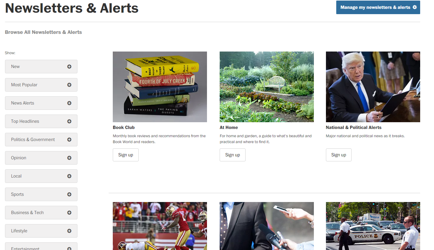
Encouraging the reader to subscribe using self-promotion areas.
Many self-promotion areas are visible on the homepage - for example a banner at the bottom of the screen. This aims at informing readers of any special offers or simply encouraging them to subscribe.

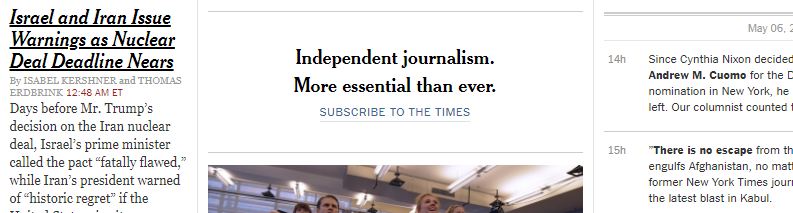
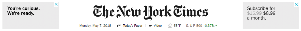
On The New York Times homepage, we can see a self-promotion area between the thumbnails and that day’s articles. The sentences are very short and remind readers of the importance of independent journalism. These sentences are often followed by a call-to-action (for example “Subscribe to the Times”) including a link for ease of access to the sign-up page.
Occasionally, a message also appears in the middle of the screen, encouraging subscription. Its impact on the reader is strengthened by the fact that the color’s used are the same as that of the paywall.


This is the case for The Washington Post and The New York Times.
Both of these publishers also display messages to let a user know that they have a metered paywall.
The Washington Post has a top-banner, giving readers a choice between subscribing or receiving the offer by email. If a user selects the latter, they'll instantly get an email with subscription details as well as a reminder two days later (note this clever technique to collect a potential subscriber's email address).


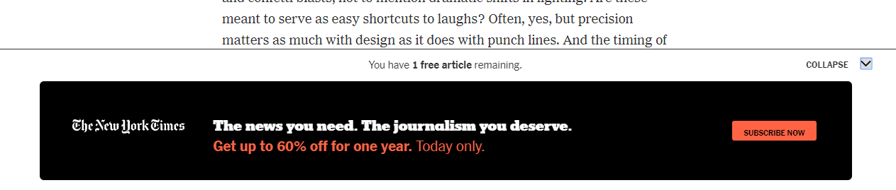
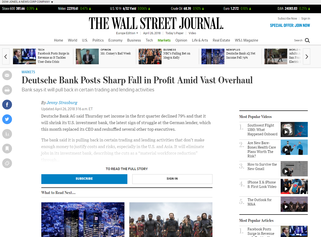
Usefully, The New York Times had added a meter on the page to let a reader know how many articles they have left.

From an UX point of view, using a meter is very interesting because it allows publishers to help readers understand the metered paywall system. They do this in an instructive and transparent way whilst still creating pressure, both useful and frustrating for readers simultaneously.
It's also important to note that these paywalls appear immediately after the reader reaches the limited number of free articles. This speed is certainly advantageous for the UX as a user won't be cut off mid article. The display performance is a great aspect of a good UX.
Convey a striking message to convince the user.
The tone has a strong impact on a reader - for example, on The New York Times’ website, text is made up of two or three short sentences emphasizing the quality of the newspaper and the fact that it meets the expectations of its subscribers.
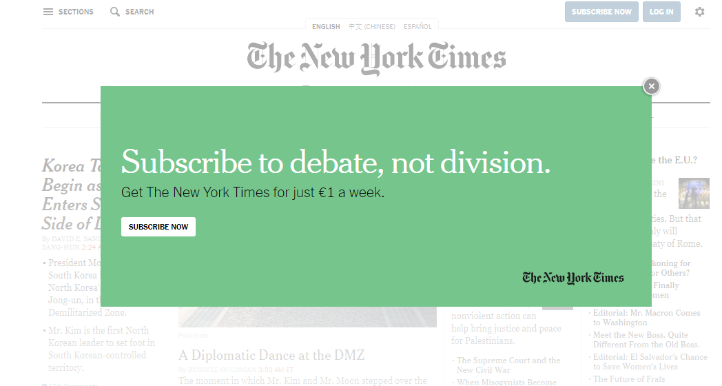
As surprising as it seems, the three publishers don’t seem to use iconography to draw their audiences’ attention on their paywalls. Instead, they use vivid colors and strong punchlines. The design isn’t disregarded; it is refined and clear.
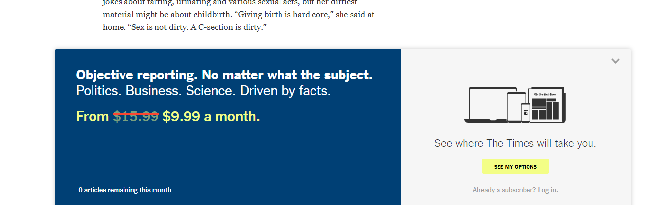
On the most renowned newspaper websites in the United States, it's very common to see publishers trying to explain their prices by highlighting the quality of their content. Most often, this is to show users that they have to pay to consume quality journalism.
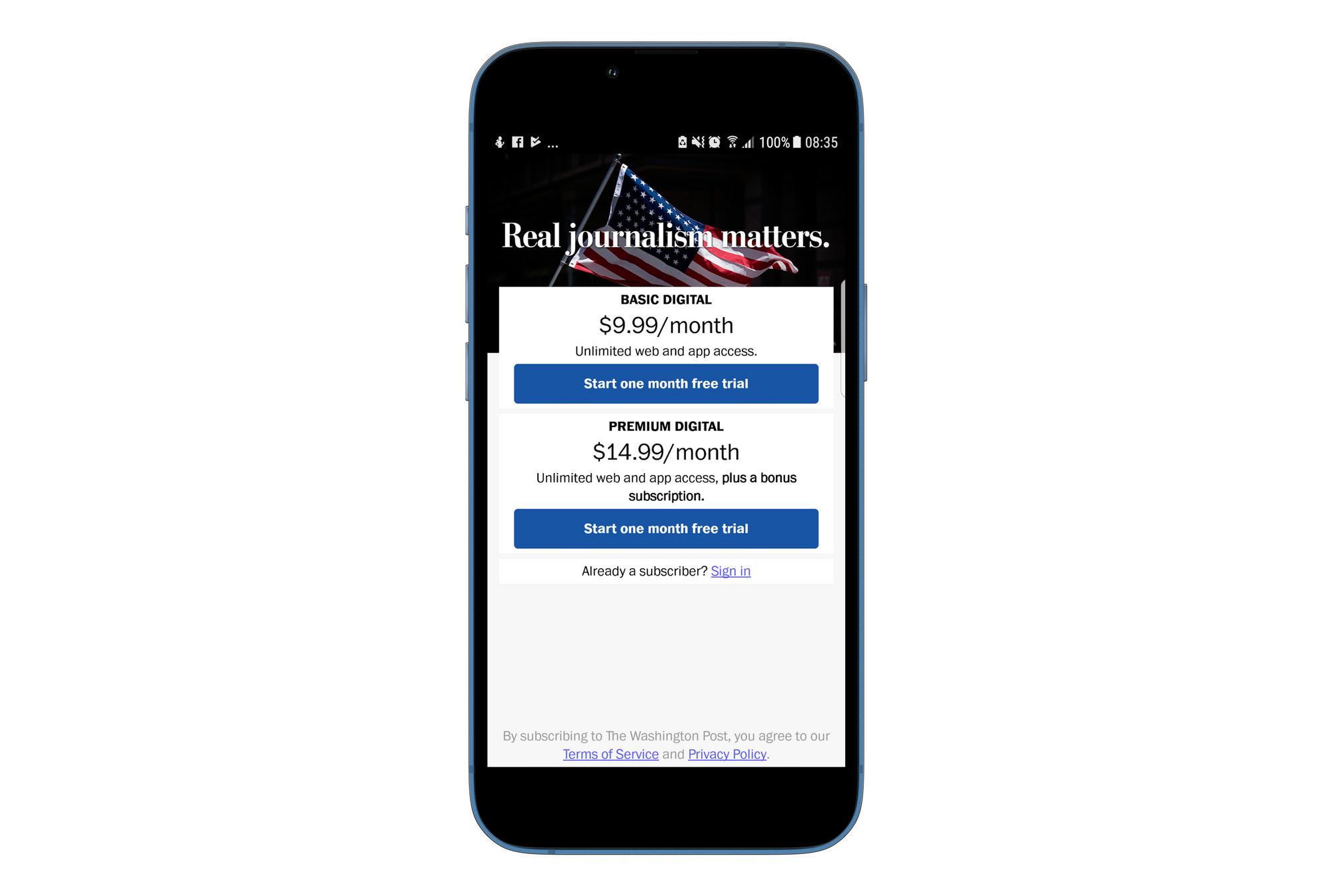
For The Washington Post, the reader is crucial for the future of journalism: by paying to read, the reader finances “real journalism” and allows the company to survive.

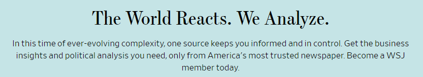
However, for the Wall Street Journal, the reader is encouraged to pay to get not only facts and quantified information, but also an advanced analysis of this information.
Here, we can see that the publisher wants to convince users of its added value. They consider themselves as ”America’s most trusted newspaper” and hope that a reader considers them as experts of political analysis.
Part 2 - How to design an attractive paywall
A unique paywall to every publisher.
A paywall's design is definitely an elaborate element but this isn't to say that is should be practical and instructional. Publishers certainly don't want to confuse readers, the paywall journey has to flow well.
However, is it better to design a small or large paywall? Yet again, there are many different design approaches.
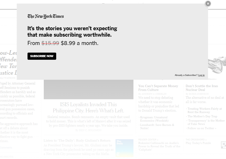
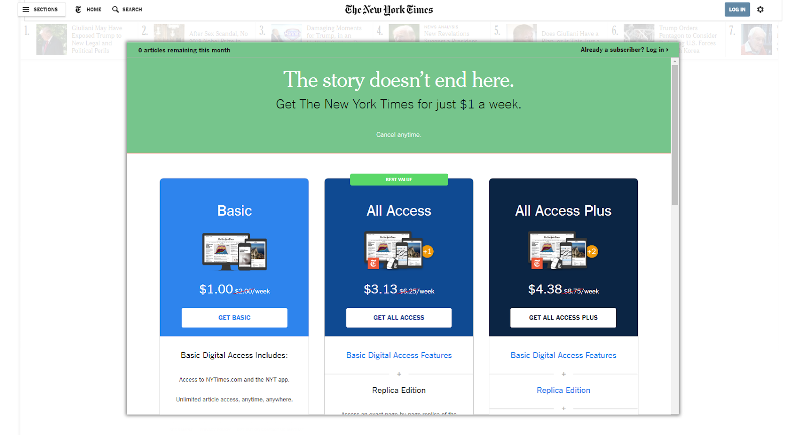
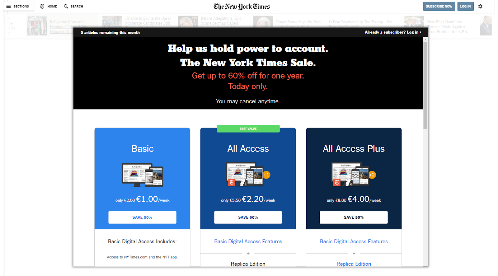
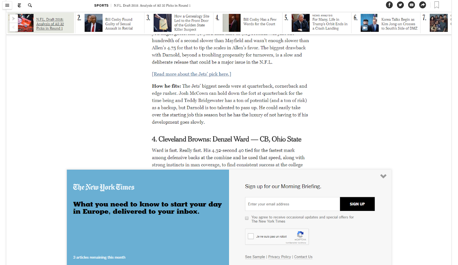
On The New York Times website, the paywall is very large and scrollable, containing a lot of information about subscription. It's easy to see why though as the publisher wants to allow readers to make a choice alone, without the NYT chooses an offer for them.
There are two versions of this paywall. One is fixed, appearing, and staying, in the middle of the screen whilst the other appears as the reader scrolls down in the page.
The first version includes a colored header, the same color as the self-promotion area encountered by the reader before.

The Washington Post’s subscription offers, however, are displayed on a page that only opens if the user clicks the “more” button. The paywall doesn't include a great deal of information and is fairly small, but it presents a clear, blue button which redirects a reader to the payment page.

On the one hand, we considered whether this lack of information on the paywall hinders the reader's decision-making concerning which offer they'd like to choose.
On the other hand, a paywall with too much information can irritate certain readers. There's definitely an ideal middle ground here.
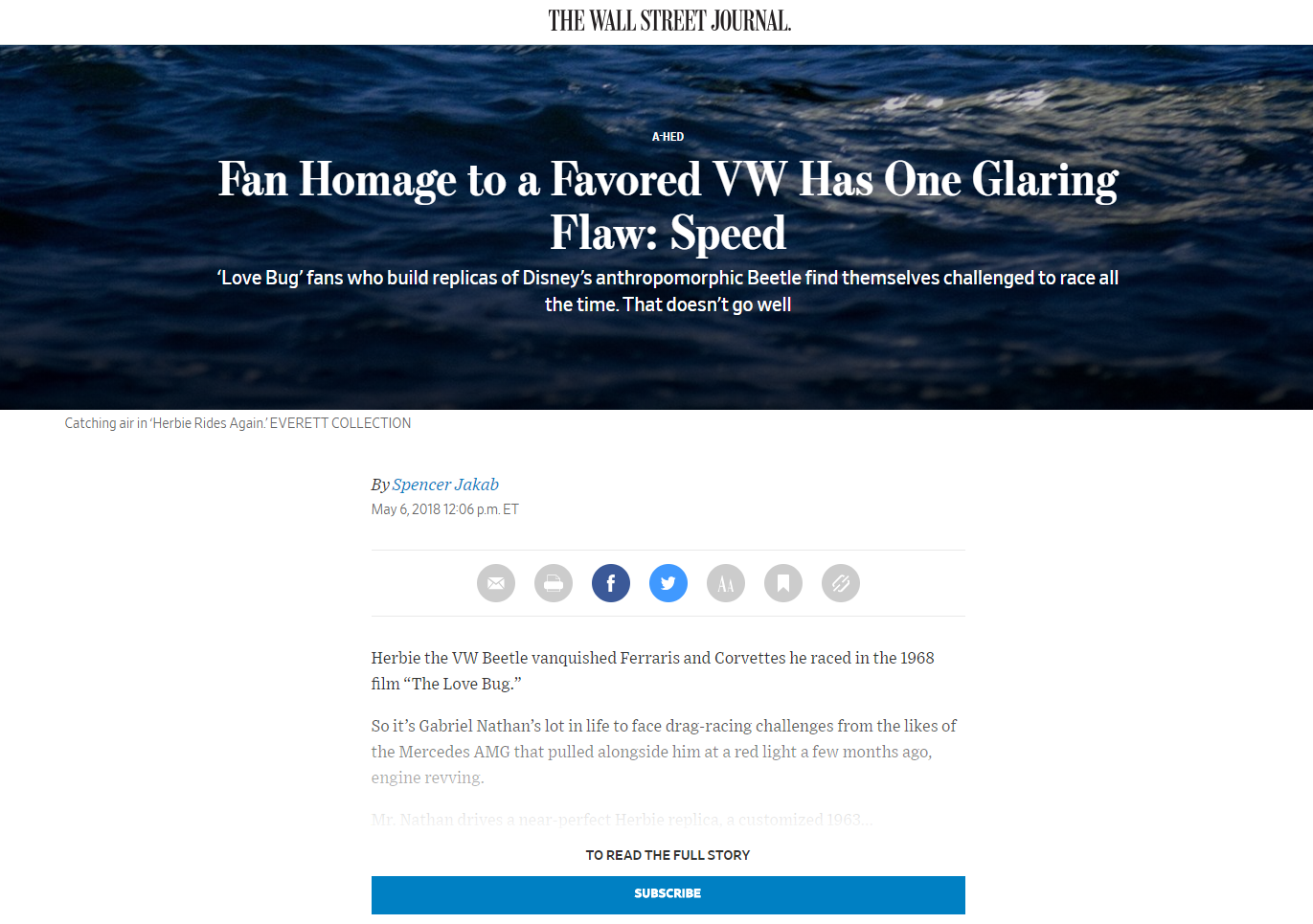
Some online newspapers use paywalls that are only composed of a few buttons, placed right under the article. That is the case for those who offer premium content and use a hard paywall (3% of American newspapers, according to the American Press Institute). None of their articles are free and a reader has no choice but to pay to gain access to content.
This is one of the possible user journeys on The Wall Street Journal site (as part of a dynamic paywall). The hard state of the paywall is composed of just two buttons: one for subscription and the other to log in.
Mastering the paywall experience over paywall unlocking
When publishers use a metered paywall, the first articles are free.
In a previous analysis of The New York Times, we realized that the reader had to go through several steps before unlocking the paywall.
However, since this first analysis, the number of free articles has substantially decreased, from 10 to 5. What's more, the messages that a reader could receive along the paywall unlocking experience have been scrapped and all that's left is the meter. This means a reader won't be aware of how many articles they have left and so may be frustrated when they do get blocked.
This is also the case with The Washington Post who doesn’t send any messages reminding the reader that their next article will be blocked.
It would be interesting to try to develop the design or wording used in the the readers’ first free article. This could allow publishers to gain more support from reader as well as building a relationship with them by pre-alerting them to the appearance of the paywall through appropriate wording.
Part 3 - How to customize the subscription experience in order to make it as relevant as possible
Convincing a large number of readers with a very simple process.
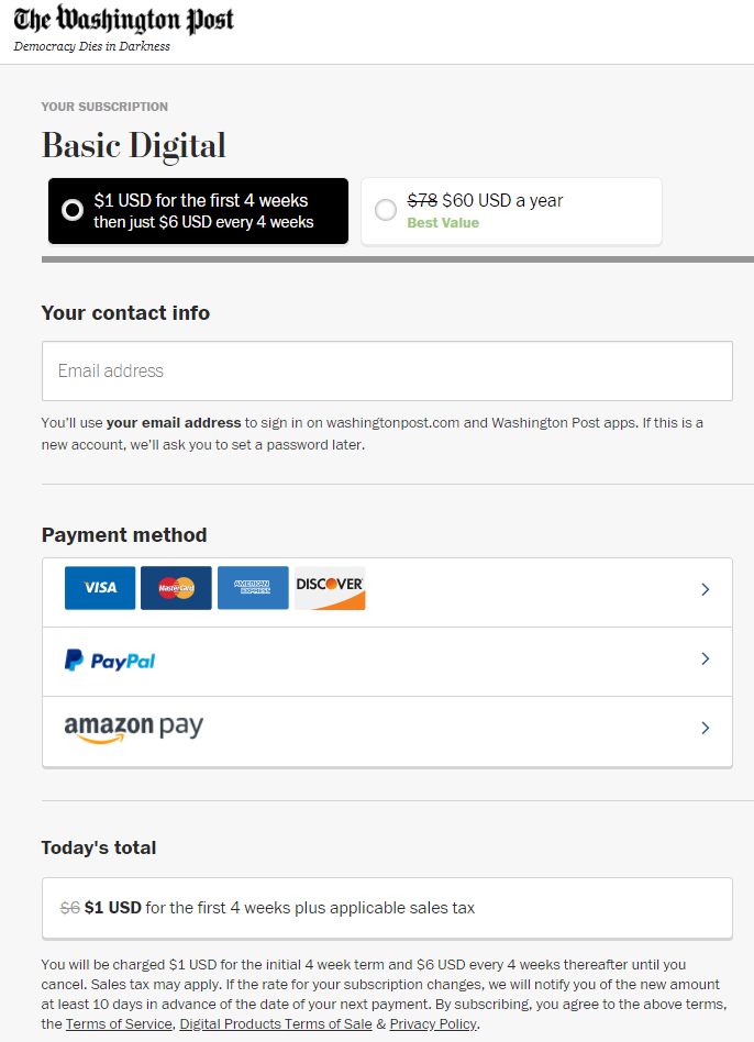
On The Washington Post’s website, a user can reach the payment page simply by clicking on the colored button. They can only see the subscription details if they click “more” on the paywall itself. The pre-selection of a subscription offer tends to simplify the process, even if the publisher may have to upsell better offers in the future.
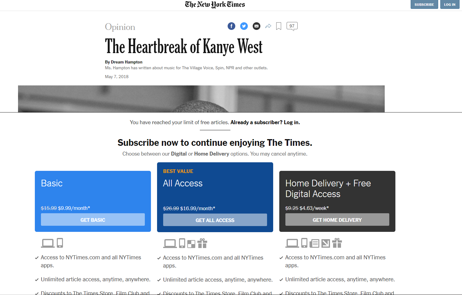
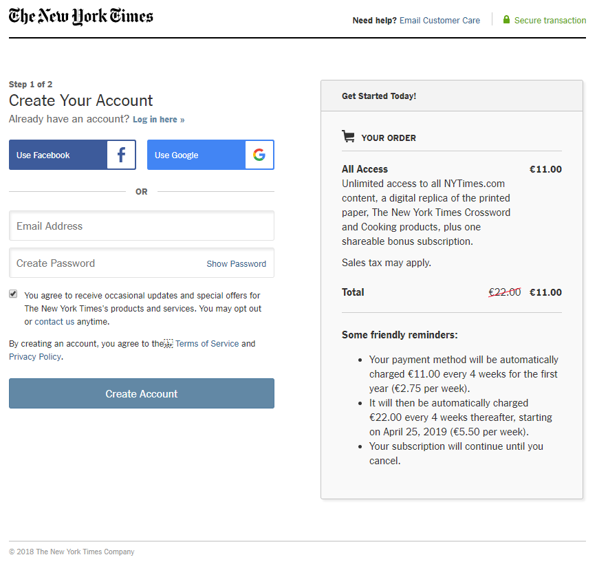
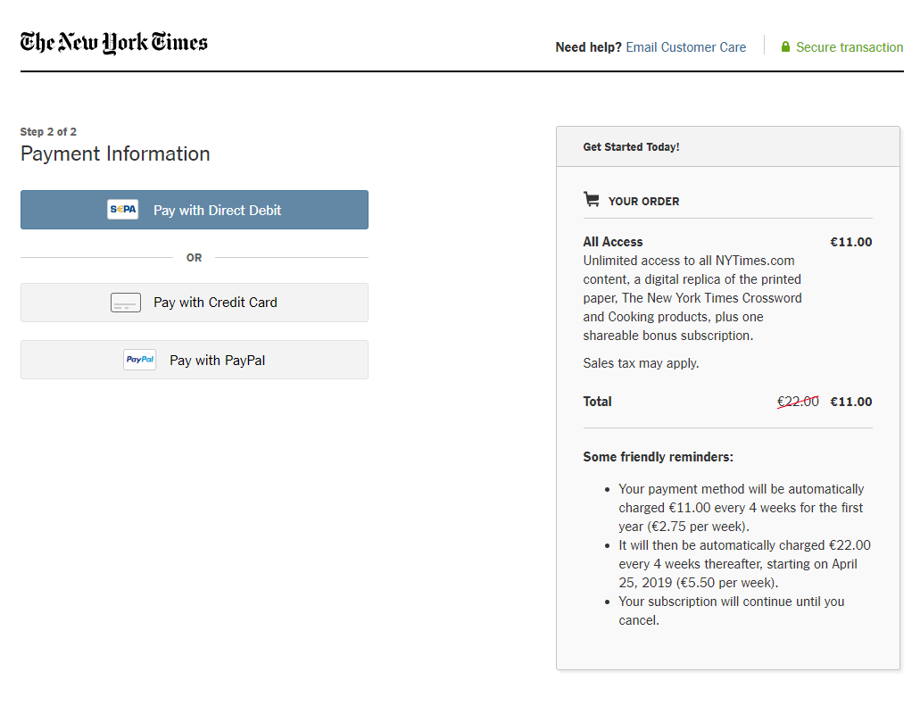
On The New York Times website, readers simply need to click on the offer that suits their needs which redirected to the payment page. They can do this in just a single step as all subscription offers are already on the paywall.
For these two newspapers, a reader can subscribe in just one click! This is quite an important aspect of their walls since we know that the conversion rate is critical between the moment a user arrives on the subscription page and their confirmation of payment.
On The Wall Street Journal’s website, any reader who clicks on the subscription button is redirected to a offer page. When they click on the subscription of their choice, they are taken straight to the payment page.
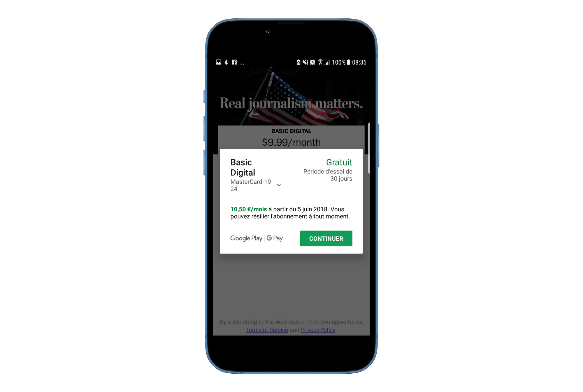
To subscribe to The New York Times, the user can choose to sign up with either their email address or through a third party such as Facebook or Google, which is also the case for the Washington Post’s payment page. Once the user is connected, they can pay with credit card, PayPal or by bank transfer.
The process used on the Washington Post’s website is also very simple. The user simply has to decide if they want to pay monthly or annually, enter their email address to create an account (or log in) and, on the same page, pay with credit card, PayPal or Amazon Pay.
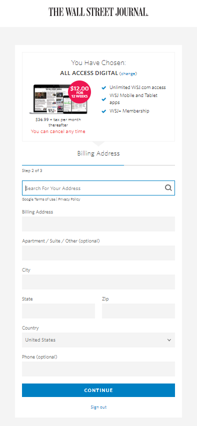
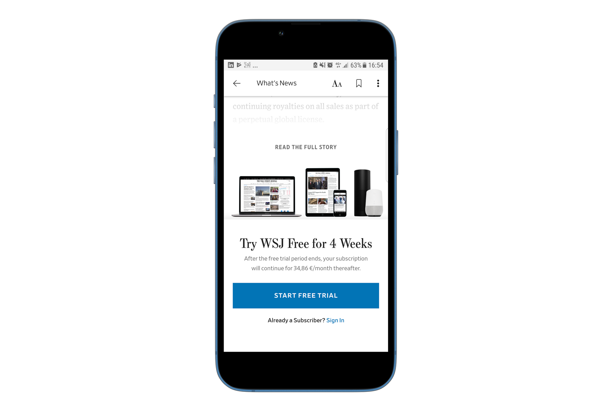
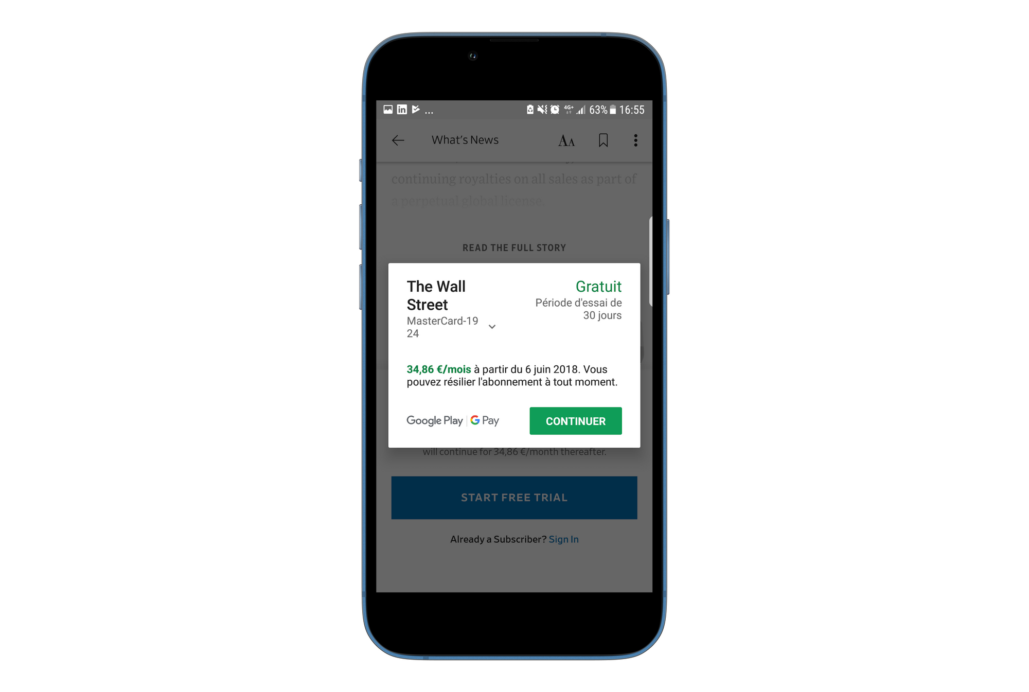
The subscription process is slightly longer on The Wall Street Journal’s website because the user has to type their entire address and phone number, even if they chose a digital offer. After this, regarding the payment, it is only possible to pay with credit card, which could be an obstacle for some readers.
Moreover, on The NYT, if a user needs help in choosing an offer, they would have to re-enter their contact details in yet another form.


Give the user a choice with multiple offers
It's very important to talk about the price of your offers as this could be the obstacle preventing readers from subscribing.
Generally, online newspapers have a basic offer which allows for unlimited access to content from any device. This offer fluctuates between $4 and $10 per month (here are more details about the prices of American newspapers). In some cases, the price can be up to $37 per month (for The Wall Street Journal for example).
The New York Times offers:
- Basic offer for $4/month
- ‘All access’ subscription for $12,52/month which, in addition to the basic offer, contains puzzles, recipes and a digital replica of the print version
- ‘All access Plus’ subscription for $17,52/month which, in addition to the ‘all access’ offer, contains the possibility to contact the reporters and watch exclusive live content
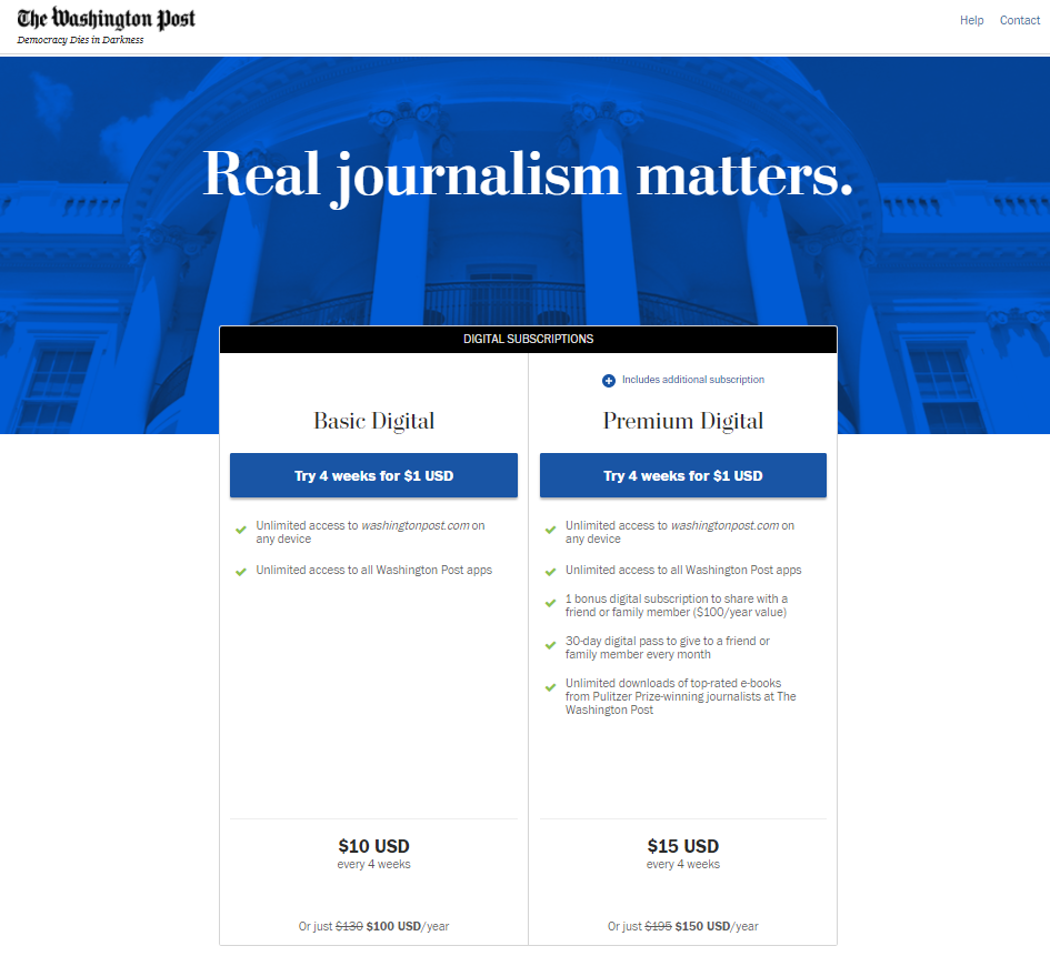
The Washington Post offers:
- Basic offer for $10/month
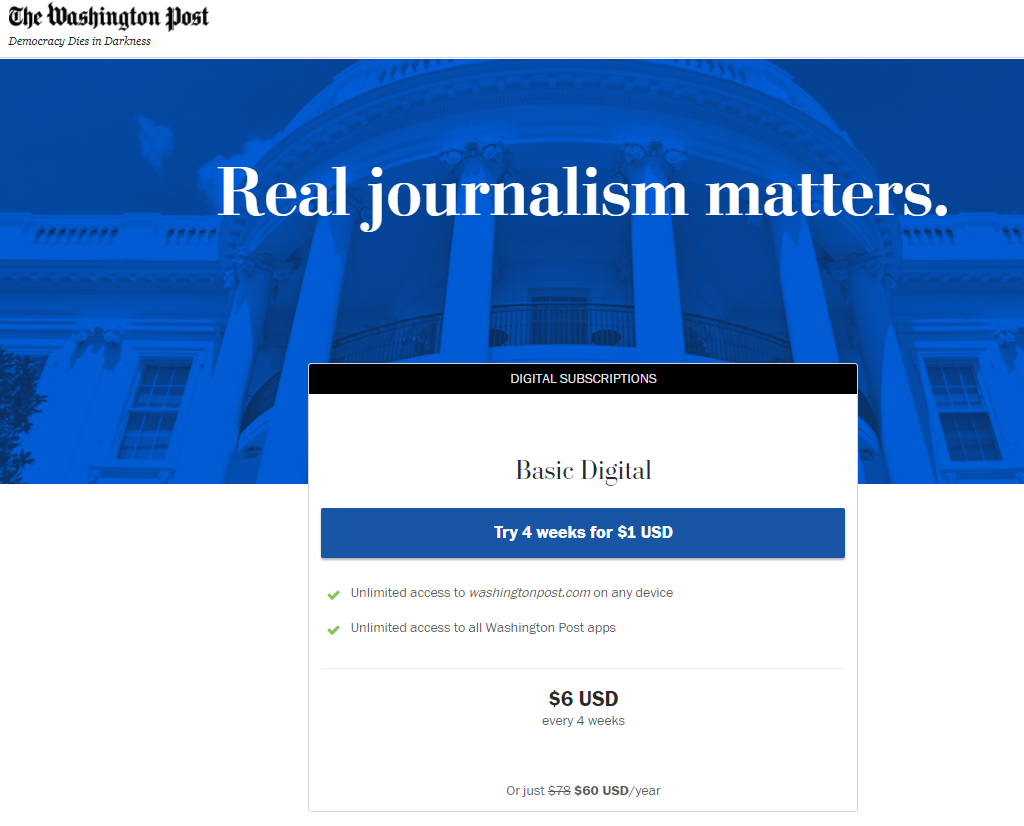
- Basic offer but for $6/month ( a lower price for readers who convert from the paywall)
- ‘Premium Digital’ offer for $15/month which allows the user to make a subscription for another person for free and to give a one-month pass to another person every month. The user also has unlimited access to the downloadable ebooks of award-winning reporters
The Wall Street Journal offers:
- ‘Digital’ offer for $36,99/month + fees which grants an unlimited access to the website and the mobile/tablet app
- ‘Print’ offer for $37,99/month + fees which means the reader receives the daily print newspaper and grants them unlimited access to the website and the mobile/tablet app
- ‘Digital + Print’ offer for $386,99/month + fees which is a mix of the two previous offers
It's important to mention here that the subscription prices are halved if a user pays for the entire year in one go.
For these three newspapers, students and associate professors are offered a reduced cost for the basic offer:
- $1/month for The New York Times
- $5/month for The Washington Post
- more or less $4 or $5/month for The Wall Street Journal
Adapting the offer to the reader’s context for more relevance
On The Wall Street Journal, the subscription offer is customized and adapted to each user. To do this successfully, the publisher uses location detection to segment their audience geographically and offer a price relevant to their location, as well as in their local currency.
Here, we can see that the reader doesn’t have the choice between various offers. They will only be offered the digital subscription, which is the most fitting offer as WSJ print newspaper isn't delivered outside of the United States.

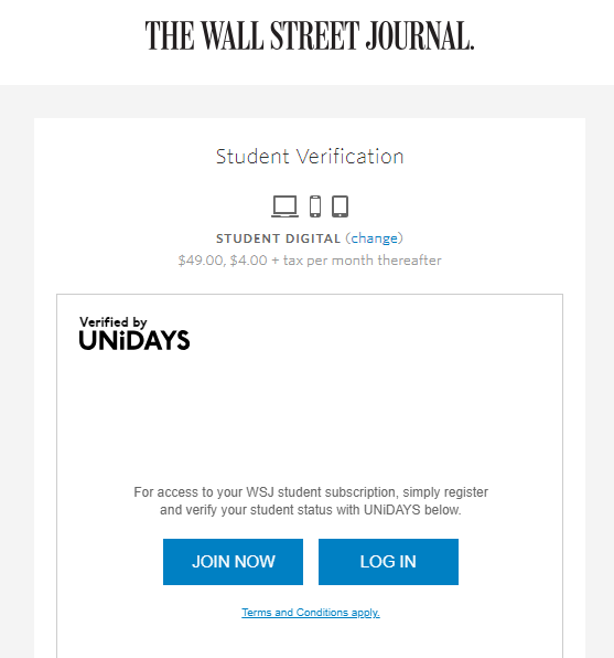
Each of these newspapers offer student subscriptions. To get this, a user has to go through a student verification process before payment, apart from on The Washington Post website where verification is after the payment process.
Attract people who aren't very inclined to subscribe using special offers
According to a second study of the American Press Institute, special offers persuade a large number of users subscribe. In fact, 45% of American readers have subscribed because of a special offer or a free trial.
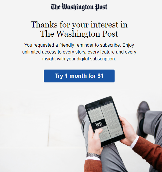
Generally, the first week or month are discounted. The first month often costs $1.
There are also limited special offers, for example:
- The Wall Street Journal’s prices were reduced by half in the United States and were very low for the rest of the world (€1, £1 or 1 CHF) during their “Spring sale”
- The New York Times sometimes has 24 hour offers, which allow the users to save up to 60% off the normal cost


The Washington Post knows that the readers who make it to the paywall are significantly interested in the newspaper, so presenting them with a discount at this stage is likely to persuade them.
The basic offer costs $60 rather than $100 a year, saving 40%. This is the default subscription offer, and the reader doesn’t have any choice, but it's by far the most fitting offer.
Whatsmore, if the user has spent some time on the subscription page without choosing an offer, they may receive a discount. Here, the publisher aims to convince hesitant readers by giving them this tempting offer.

Part 4 - How to take advantage of paywalls’ adjustability
Consider paywalls as living elements to develop them depending on what’s happening
Digital brings an amazing added value to each publisher.
For example, it's possible to analyze how a campaign has an effect on your audience and adapt strategies accordingly in order to boost subscriptions and subscriber retention.
The prices, design and messages could evolve depending on the period, the habits of the users or any changes in the newspaper.
This is very noticeable on The New York Times website. The newspaper is always evolving, notably regarding colors or phrases used. The paywall set-up has to change in order to adapt to each event.


Define a range of strategies which are adapted to the device
Even if mobile websites are almost the same as on desktop, we realized that the mobile apps of these three publishers have some differences worth noting.
For example, some of The Wall Street Journal’s articles are available for free on the mobile app. This portable version of the newspaper is freemium.

The same article is free on the mobile version but blocked on desktop.
Nevertheless, the special offers on the desktop website are not available on the app. The user has to pay the full price if they decide to subscribe on the app.

Subscribing to the content produced by a particular journalist can be done simply by clicking on their logo.
We can see that there are some advertisement areas on free articles. This is most probably because these articles are targeted at a more fickle audience, who are accustomed to seeing ads and so won’t be bothered by them.
For The Washington Post and The New York Times, the app and the mobile website also have a metered paywall.
The New York Times allows users to check a daily news brief.
When the paywall is unlocked, they can activate a free trial for 30 days if they enter their bank credentials with Google Pay or Apple Pay.
Picking the best monetization model
There are ways to create value with other monetization strategies, aside from the regular paywall (which monetizes from subscription), such as advertisement and data collection.
Monetization through advertising does work and can prove useful for online publishers but it can also damage the user experience and encourage frustrated users to use an adblocker. What's more, these ads could lessen the impact and perceptibility of self-promotion areas.

The New York Times decided to reduce its reliance on ads in order to improve the user experience with its ad-based revenues reducing from 50% in 2011 to 30% in 2018 (source: strategies.fr). The sales of advertisement areas on the newspaper’s digital version decreased by 6% in just one year (source: nypost.com).
Despite the NYT's efforts to get rid of advertisement models, the publisher asks users to deactivate ad-blockers in order to allow ads on the website to “support journalism [they] can trust”. A thin bar appears on the bottom of the article, while the user is reading which redirects to a tutorial explaining how to deactivate the ad-blocker.

Other than adverts, publishers are also able to create value by collecting users’ data. This not only allows them to better understand their audiences, but it also creates engagement and therefore customer loyalty. For example, a publisher could ask reader's to register for free on their site and so collect their email address, even if they're yet to subscribe. This data can then prove useful to the publisher, allowing them to target readers with personalized content straight to their inbox. This is what a registration wall can help with. Find out more here.
On The Washington Post’s website, the reader has a personal profile where they can sign up to newsletters arranged by topic. This is an effective way of guiding them towards content that may interest them, which they're more likely to be prepared to pay for.
For some newspapers such as The New York Times, newsletters which focus on a specific topic are considered as premium content. However, the reader can receive a daily news brief every morning in their mailbox they wish.
It's very important to note that this data collection implies meticulous adjustment work in order to respect the new european data protection regulation (GDPR).
Conclusion
What to remember about the UX applied by these 3 publishers
After this analysis, it seems that certain characteristics of the UX stand out:
- Even if there are numerous self-promotion areas, they all emphasize the impact of the subscription offer
- There is no need to use long sentences to attract readers. A striking message about how subscribing benefits the reader (and publisher) is a simple and effective way to pique their interest
- A meter is a simple way of making a user understand how the subscription works. However, it may create frustration
- If access to the payment page is easy, there is more chance that the reader will finish the payment process
- Having some offers adapted to user characteristics (student, foreigner,...) is a good way to attract larger audiences
- Special offers attract readers who are less inclined to pay for subscription
- Since advertisement is a controversial monetization model, it could be interesting to opt for data collection to create value as an alternative to subscription
- A paywall could be considered as a changing element (price, design, message) involving various features (period, geographic area, tests...)
- It could be relevant to deploy different strategies for the website and the mobile app due to the fact that readers use these two devices in differing ways
To conclude, numerous characteristics of the UX can be modified and adapted while setting up a paywall.
It's crucial to consider content as the major element in the monetization strategy. The perceived value of your articles is the most convincing way to make readers subscribe. With a huge amount of articles each month (up to 5000 for The New York Times or The Washington Post), these popular publishers consider themselves as experts and make a guarantee to their readers that articles fit their needs.
In the end, it's important to not consider the paywall as a tool which is frozen in time and identical for every user. Instead, it's an evolving element that can always be improved upon so that it can adapt to any reader’s situation (device, country, status, propensity to subscribe,...).
Even if these three paywalls already work and satisfy regular readers, it would be interesting to see if the addition of new monetization models, such as payment per article, would make more occasional readers pay for subscription. This would allow publishers to generate new income as well as grow their audiences.