
Among the most famous paywalls, the New York Times is often an example.
As we discussed in a previous post (“Landscape of paywall adoption in USA“), more than 75% of the US media (with a daily circulation > 50 000) have set up a paywall in 2015. It is between 2010 and 2015 that the paywalls appearance exploded with more than 91% of the paywalls set up at this time.
Among the most famous, the New York Times is often an example. They were one of the first publishers to set up a metered paywall in 2011 which allowed them to generate more than one million subscribers in 2015, more than 15% of the title overall revenues. The journal offers readers free access to 10 articles per month (previously 20, before 2012).
But how does the New York Times paywall work? What are the key steps? What is the user experience? Are there differences according user profiles? So many topics that we will try to address in this article.

The New York Times Paywall
The journey proposed to the readers is composed of 4 main stages:
(These tests were carried out in August and September 2016)
Step 1: 5th article
When you want to access your 5th article (no distinction on content type), the NYT displays a rather friendly message informing you that, as a loyal reader, you might be interested in subscribing, and so, you can discover the different options which are proposed to you. You also have the option to decline (“no thanks”).
Step 2: 9th article
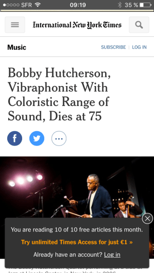
If you are not ready to subscribe and you’ve clicked on“no thanks” in the previous step, you can access the articles again for free. At the end of the 9th article, a window will appear at the bottom right of your screen indicating that you have consumed 9 of your 10 items of the month, and that you can subscribe.
This does not block access to the content but alerts you that the utopian world in which you live will soon end.

Step 3: 10th article
Like the previous step, you are warned that this is your last article offered.

Step 4: 10 items consumed
Once your 10 items are consumed, and you want to access the 11th article, a layout appears on the screen and blocks access to the article. You are advised, as expected, that you can now subscribe.
The same experience in all media?
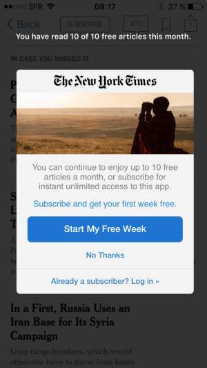
The reader experience is even more fluid and clear on the NYT mobile application. On each read of the 10 articles, a temporary layout appears (1 to 2 seconds) informing you that you have consumed X articles on the 10 of the month. Then the message repeats itself when reading a new article. This does not interfere with the user experience at any time.

At the end of the 10th item consumed, the reading is blocked and you are offered to subscribe.
Less user-friendly mobile browser experience
The experience on mobile browser is less user friendly, and appears to be a little more intrusive. At each step, a layout (that you can close) covers 1/4 of the screen. It is present for each article consumed and slightly disturbs navigation.
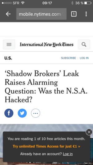
At the end of the 10th article you are automatically redirected to a web page optimized for the subscription.
The same journey for all readers?
The New York Times performs A / B tests on the user journey. In the tests we performed, we found changes to the user’s path only on the desktop at “Step 1–5th article”.
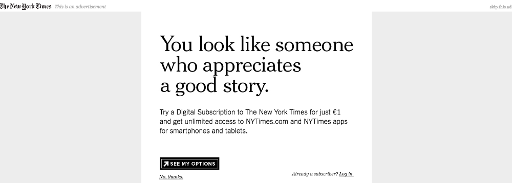
Either to test a new marketing message:

Either to force users to create an account to access the remaining 5 articles:
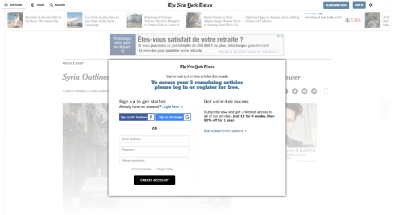
The goal of this step, which can be called “datawall” (above), is to get more data on the NYT drives, in order to exploit them:
Editor Side: To improve the user experience of the players that have created an account,
Advertising agency side: most likely to offer more targeted advertising (thus more remunerative) to its readers.
This also allows to engage the user by creating an account and most likely one or more newsletter receptions. In the end the objective is to increase the ARPU (Average Revenue Per User). This is the model used by Les Echos in France.
In our tests, we did not observe any other differences from one user to another, although it is very likely that other A / B tests are in progress.
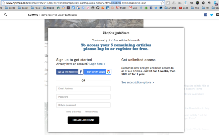
Differences can also be observed depending on the referrer. The NYT has, for a while, offered content to readers from social networks (Facebook, Twitter in particular). The aim is to create a link, and to engage a younger and often less faithful population. The NYT has recently begun to backtrack and monetize its drives (as evidenced by the image below and the parameter in the URL SMID = FB)
Are Subscription Offers still the same ones?
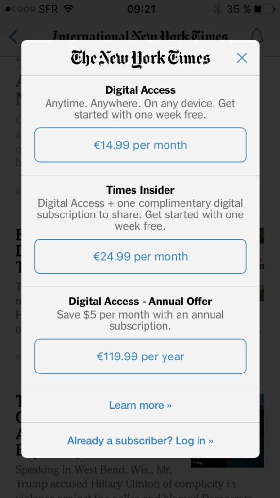
Quite surprisingly, the offers offered are not the same whether you are on a browser or on the application. In the first case, the NYT will immediately offer you a subscription offer of € 1 for the first 4 weeks, then 50% for the first year. The cheapest rate is $ 1.38 / week.
Desktop

Mobile Browser

Digital Access offers € 3.25 / week (€ 14.99 / month), but “web + smartphone apps” and “web + tablet apps” are not present . We do not know the reason, but it would be interesting to know if this is because the NYT has observed a higher average shopping cart on in-app purchases or simply because the web + app is forced to disappear .
Prices are generally fixed. Whether you are a loyal reader or this is your first time on the publisher’s website, we have not observed any changes to the proposed rates.
What lessons can be learned from the NYT paywall?
– A clear and fluid user journey for the reader in 4 main steps
– The NYT performs several A / B tests on the user journey
This remains on a single step of the journey (step 1–5th article) during which the log tests new messages to induce subscription, or forces the creation of account to access the remaining 5 articles.
– The same user experience in different countries (tested)
The various tests performed for this article were done via a US VPN. After having tested the client path according to a dozen IP addresses (France, UK, …), we noticed no difference in the course.

– A smoother mobile app experience
We observed some differences on the navigation and the display of the paywall according to the supports. The experience on the mobile application is globally more fluid and less intrusive, probably because the mobile represents a part of the future of the NYT; The experience must be treated, and must maximize the commitment of the reader.
– Offers of different subscriptions depending on the media
The subscription offers on the application are different from the offers (most expensive) offered on the browser or on desktop. If the NYT starts to customize the subscription offerings according to the medium, would it be possible to see them customize the offers according to the profile of the readers? One could easily imagine tomorrow to see on NYT customized offers according to the themes that interest the reader, and at different prices depending on the level of commitment for example, with the overall objective of increasing the ARPU of its users.
– Important promotions are offered to readers
Once blocked because you have consumed all your free items, the NYT logically offers you to subscribe. When you discover the offers of subscription, you can see that quite aggressive offers are offered (1 € the first month, less 50%, …). These offers aim to maximize the conversion rate to the subscription. It would still be interesting to know if the NYT could further improve its conversion rate and ARPU by customizing the price and promotional offers proposed according to the level of commitment of the reader. Would promotions be more effective if they were offered when necessary, and in an exclusive and limited way over time? Permanent promotion may in some cases lead to a feeling of degraded quality for the purchaser.
– Not all readers are willing to pay for the NYT today
With more than 1M subscribers on the digital market, the NYT managed to convert 1.6% of its audience into subscribers. And it’s an incredible victory. However, one can imagine that part of the remaining audience remains frustrated because not ready to pay today for blocked content. Could the NYT increase its ARPU on this audience by customizing and streamlining the reader’s experience with the paywall according to its profile, to engage, retain and monetize it in a personalized and progressive way?