

Paywalls and registration journeys aren't only reserved for the online press, they're also increasingly vital for e-learning sites who are making use of these strategies to monetize their audience.
In this article, we'll compare four paywall and registration path approaches on popular online course sites, discovering the strengths and weaknesses of each method to better understand monetization strategies and user experience in the e-learning industry.
Udemy: an e-commerce angle
The approach proposed by Udemy takes an e-commerce angle, offering a fluid and user-friendly experience.
E-commerce format
Udemy takes a similar approach to e-commerce platforms, allowing users to browse and select courses of interest without immediately requesting payment. This allows users to discover the content before making a financial commitment, which can encourage more registrations.
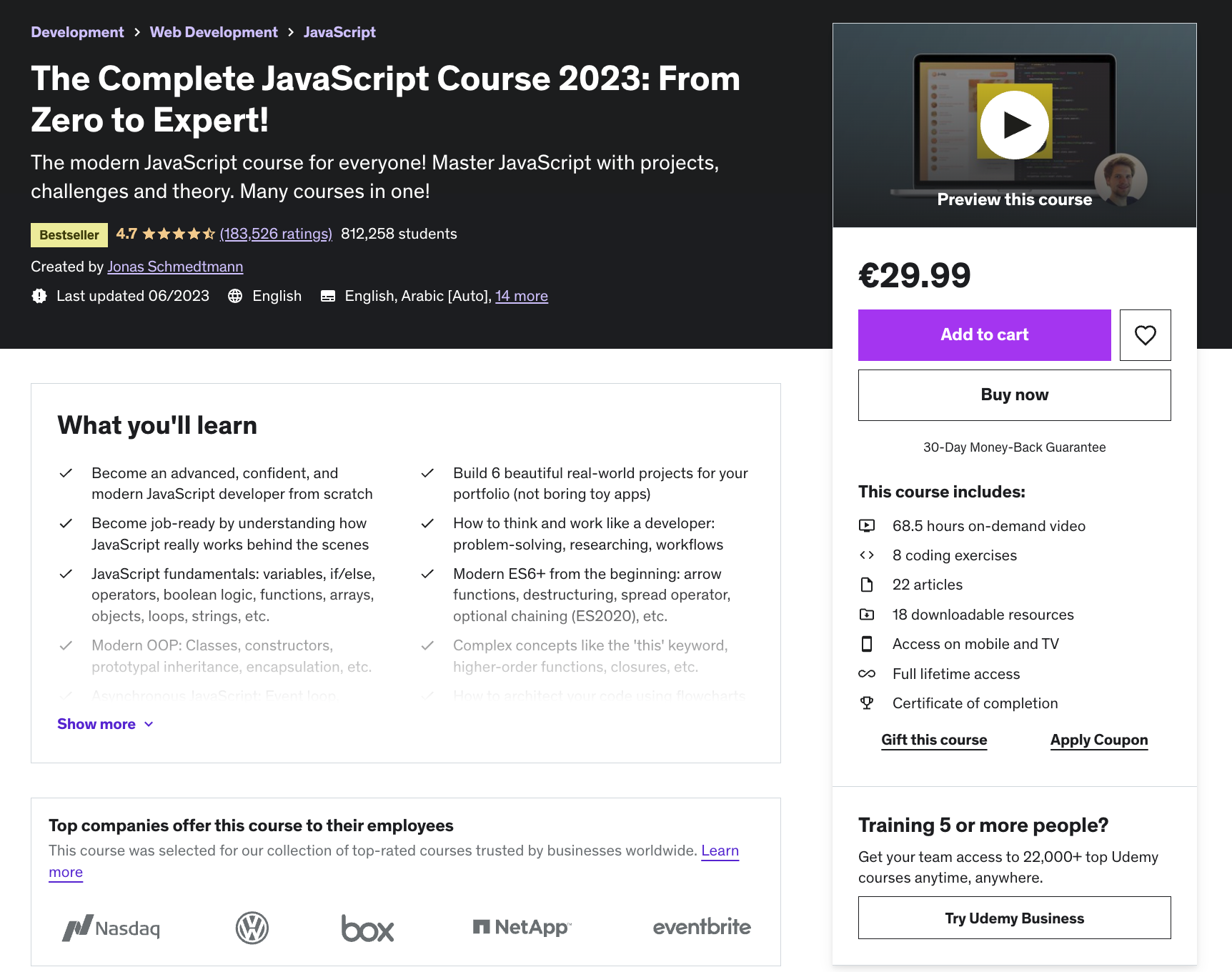
Save courses for later
Udemy integrates a "Heart" button for saving courses for easy retrieval at a later date. This feature is similar to the wish list on e-commerce sites, making it easier to plan to purchase courses at a later date.
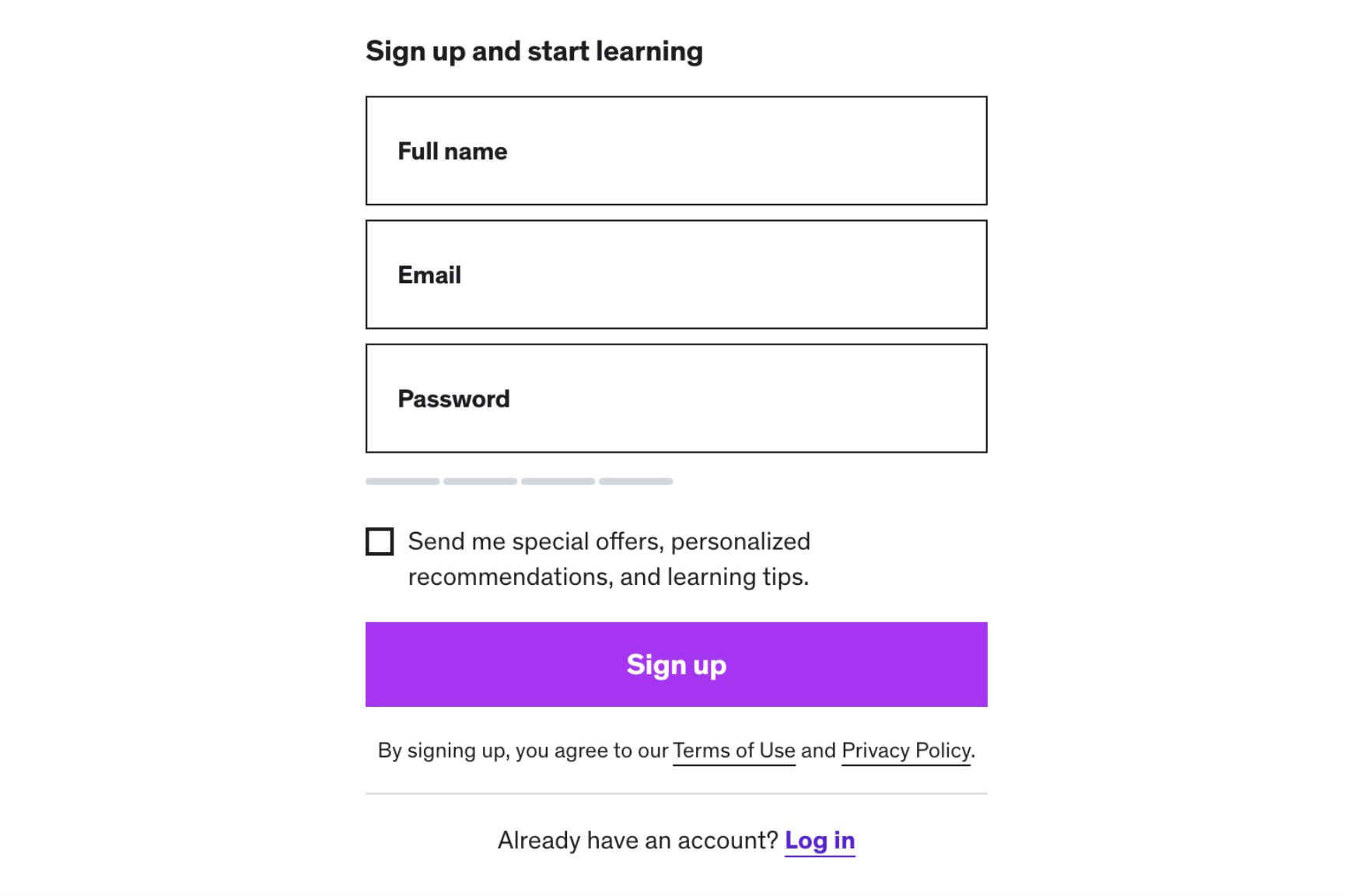
Simple registration process
The registration process on Udemy is very simple, with just three fields (full name, e-mail, password). This reduces friction, making it easier for interested users to take action.
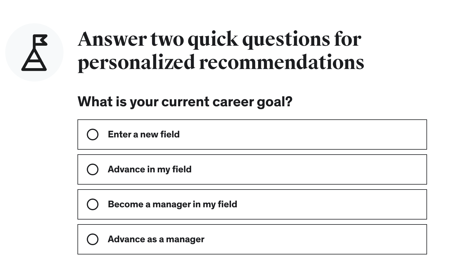
Personalized experience
Udemy uses two questions to personalize the user experience, asking for the user's goal or expected learning level, as well as their profession. This intelligent approach enables relevant courses to be offered to users quickly, sparing them the tedious process of selecting topics of interest.
No credit card required at registration
Udemy registration doesn't immediately require users to provide credit card details, allowing them to browse and select courses of interest before proceeding to payment, eliminating a barrier to initial registration.
In summary, the three key points to remember about Udemy's e-commerce approach:
- Simplified registration process with just three data collection fields
- Personalized experience, asking for the user's goal and profession
- No credit card required at registration, allowing users to discover the courses before proceeding to payment
Coursera: career-focused
Coursera offers a career-focused approach, highlighting professional development opportunities and potential outlets for learners. However, despite some positive aspects, there are a few areas where the user experience could be improved. Here's a detailed analysis of this approach:
Career-focused approach
Coursera emphasizes the career aspect right from the first visit, highlighting the possibility of finding a new career through their courses. They also feature partner companies and data on salaries and vacancies for each profession, which can reassure and motivate visitors.

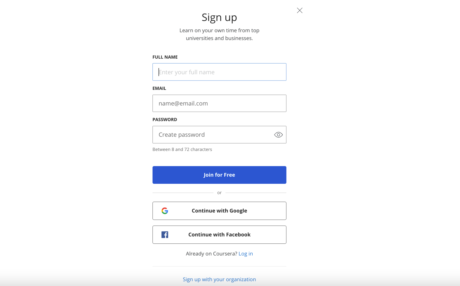
Simple registration process
Like Udemy, Coursera's first registration page requires just three data points. However, the design of the page is a little less clear and focused on key elements.
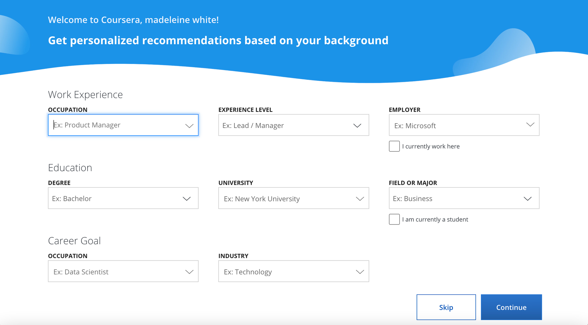
Complex personalization
Once registered, the personalization page on Coursera can seem complex, asking users to fill in no less than 8 drop-down menus. Fortunately, there's the option of skipping this step.
Confusing navigation
After registration, users are returned to the same home page, which can be confusing. It's not immediately clear how to choose a trade and apprenticeship partner. Navigation can seem confusing and require thorough research to make an informed decision.
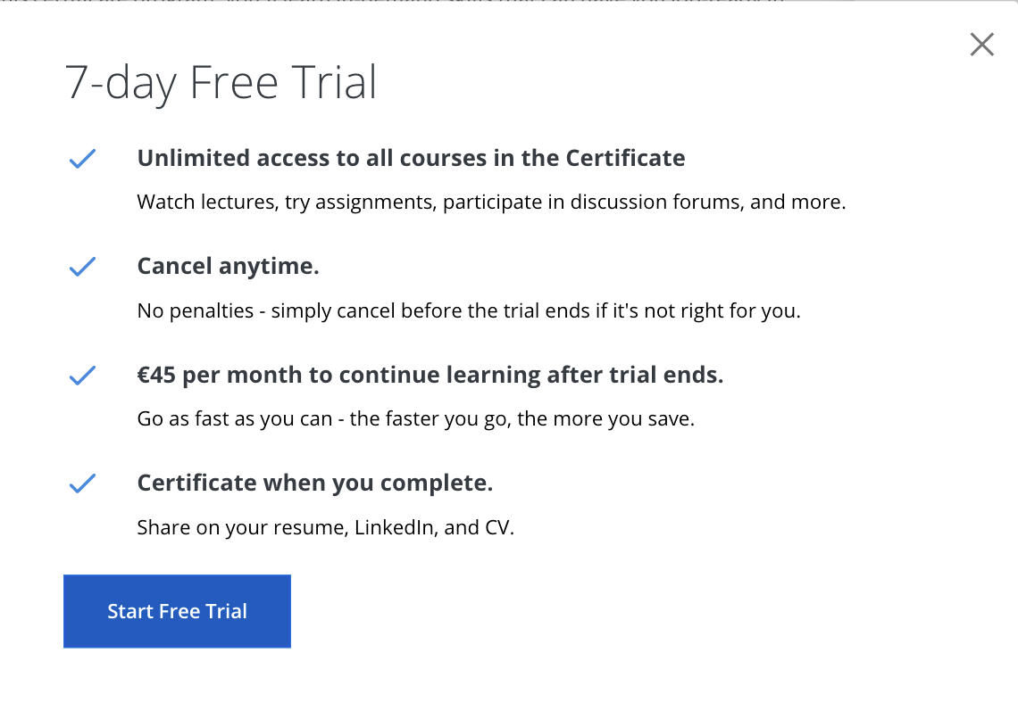
Free trial with credit card
Coursera offers a 7-day free trial for selected courses. However, this offer is conditional on submitting a credit card at this stage. Visitors may wish to be informed of this requirement on the previous page to avoid any surprises.
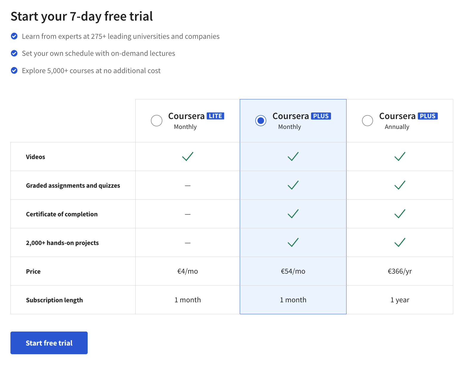
Unclear price plan
Unless the visitor specifically clicks on the button to see all the plans on offer, they may not realize that they have chosen one of the 3 plans offered by Coursera, and this could be the intermediate, mid-priced plan.
To sum up, here are the three key points to remember about Coursera's approach:
- Career orientation and focus on professional opportunities
- Simple registration process but complex personalization page
- Confusing navigation and unclear presentation of price plans
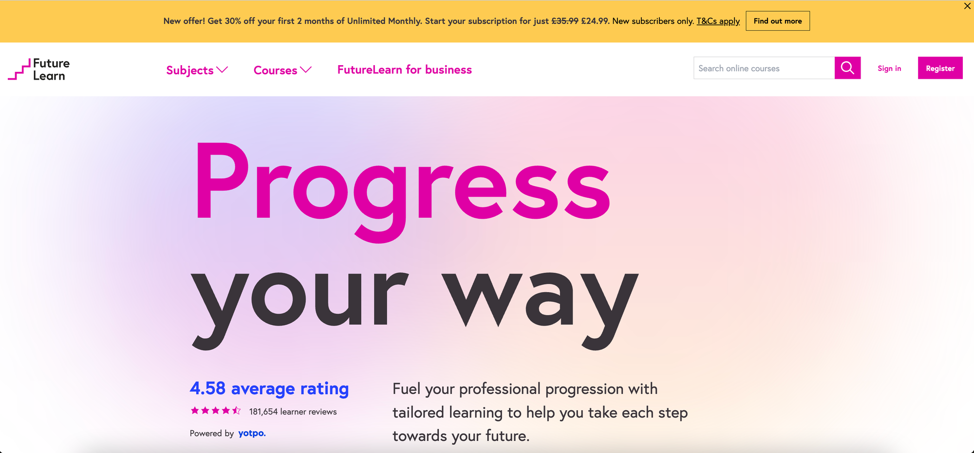
FutureLearn: short course subscription
FutureLearn adopts a price-efficient approach from the outset, with a special offer in the main title and a slash price. Unlike Coursera and Udemy, FutureLearn is positioned more as a global platform with an unlimited subscription rather than an e-commerce approach focused on individual course purchases. However, there are a few areas where the user experience could be improved. Here's a detailed analysis of this approach:
Global approach and unlimited subscription
FutureLearn offers unlimited subscription rather than an individual course sales approach. This places it more in the category of streaming content platforms (like Netflix or Spotify) and may be attractive to users wishing to explore a variety of subjects without restrictions.

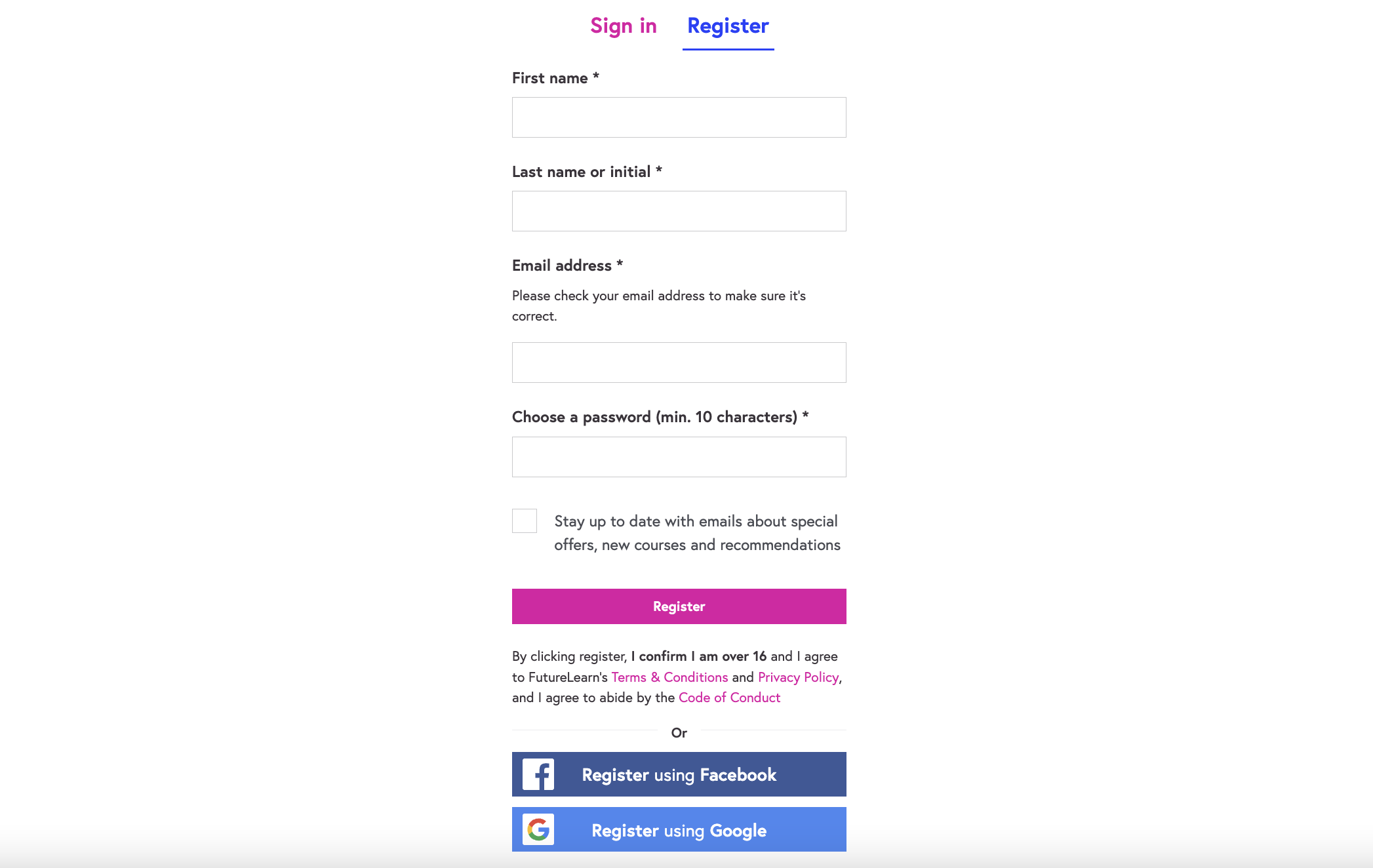
Data-centric sign-up path
FutureLearn's sign-up path seems primarily focused on quickly collecting user data and then mining it. This may give the impression that registration is quicker for the visitor, but marketing teams will likely use this data to follow up later.
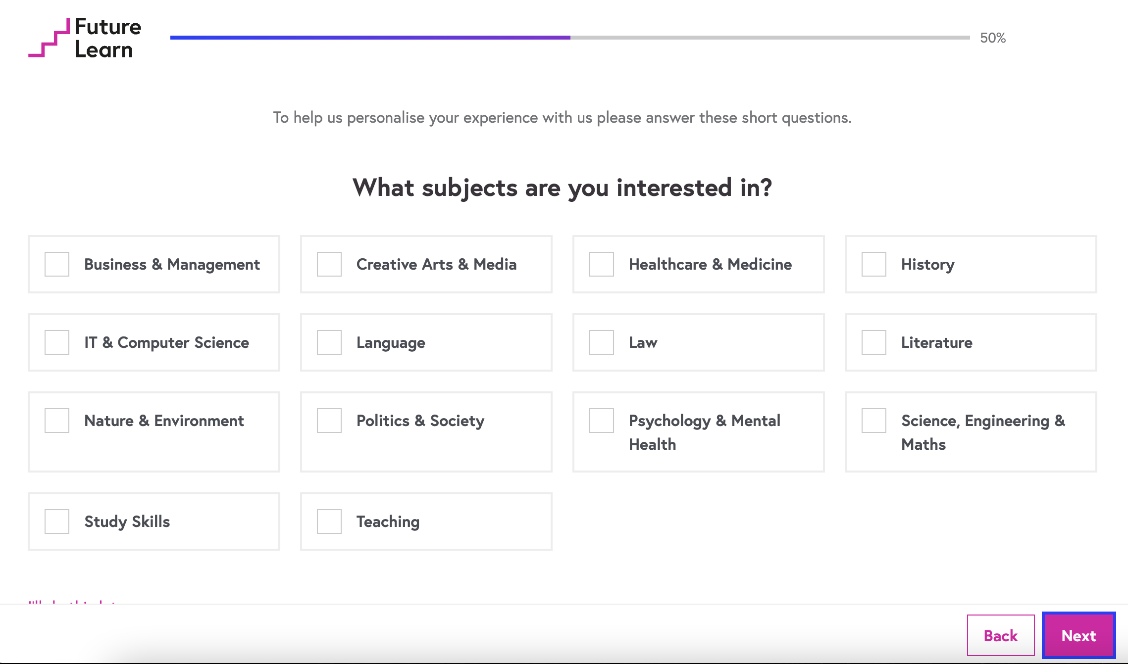
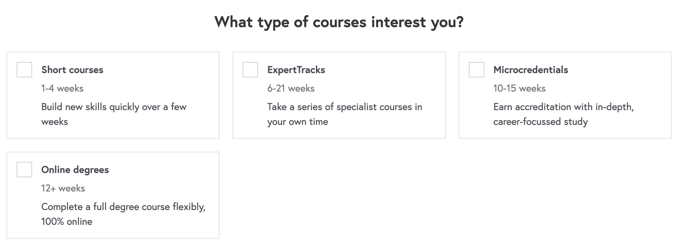
Personalization by theme
FutureLearn offers personalization by theme rather than by profession, which positions it more as a personal development tool than a career planning tool. This can reduce the perceived value for visitors who are looking for a solution more focused on their career goals.
In summary, here are the three key points to remember about FutureLearn's approach:
- Global approach with an unlimited subscription rather than the sale of individual courses
- A registration process focused on data collection, which can be perceived as long and tedious
- Personalization by theme rather than by profession, which may reduce the perceived value
Alison: an advertising based model
For the fourth site examined, Alison was selected because of its business model centered around affiliation and ad revenues, allowing them to offer content for free. However, despite this apparent free service, Alison offers paid plans to remove advertising and obtain certificates, which nuances this approach.
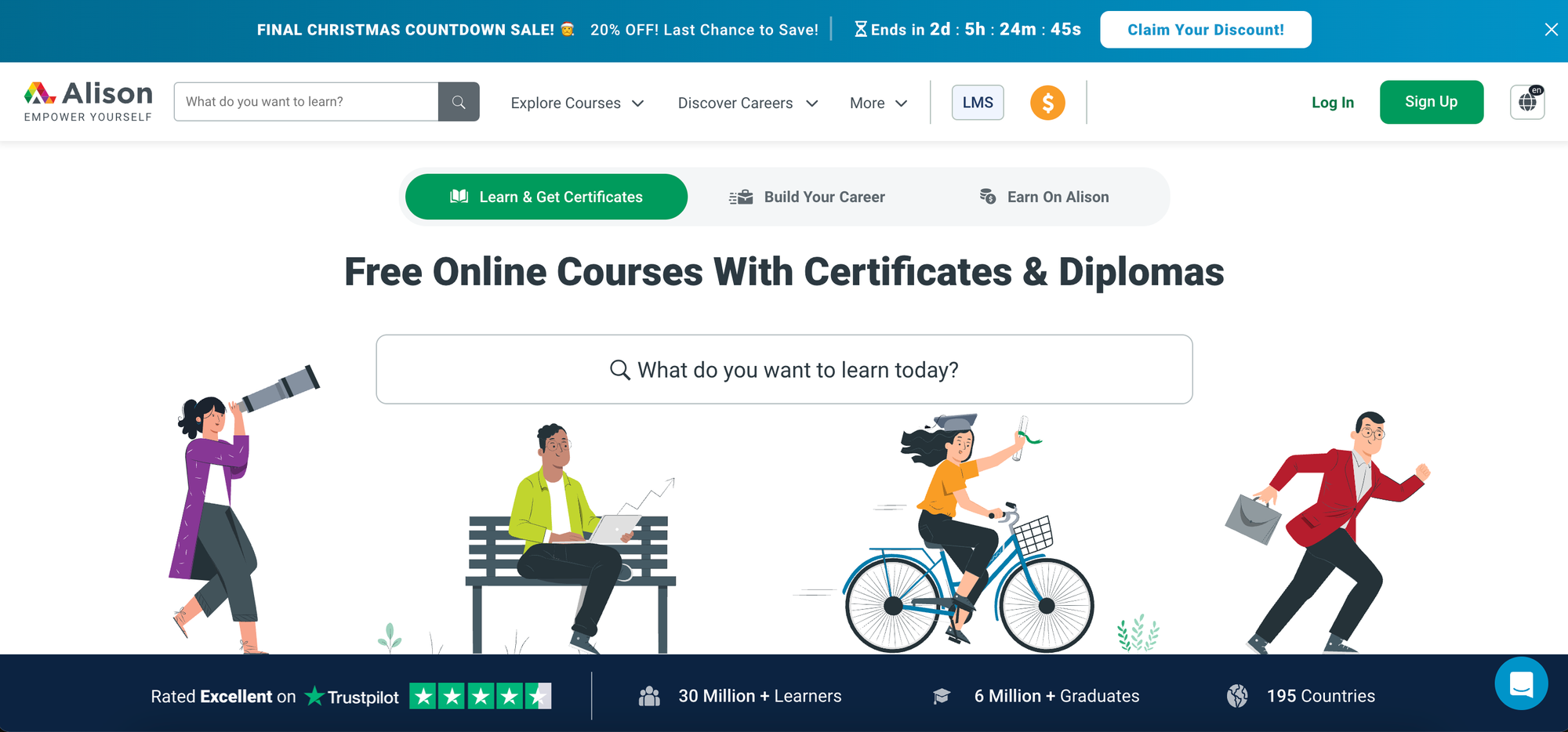
A useful search bar
Upon registration, Alison immediately offers a search bar, enabling users to quickly find the course that interests them. The search engine provides relevant results in line with user's expectations. However, the course also features additional advertisements that can disrupt the experience.
Register with social sign-in options
The sign-in process is relatively classic, but we're offered 5 options for account creation, including Microsoft and Linkedin.
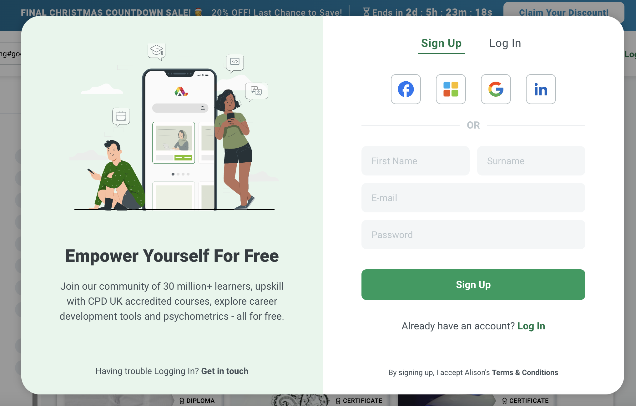
No personalization
Once registered, users are taken back to the home page, which can be confusing and makes them wonder whether they've filled in the form correctly. Moreover, the lack of personalization is notable as there's no guided tunnel to help users discover courses based on their interests.
A very poor design
The user experience is considerably affected by design issues that make navigation unpleasant, and the persistent presence of ads adds to the platform's discomfort.

To sum up, here are the three key points to remember from Alison's course:
- Sales model based on affiliation and advertising revenues, with emphasis on the free nature of the offer
- Paid plans to remove ads and obtain certificates
- Search bar to find courses quickly, but lack of personalization and design issues detract from user experience
You'll also be interested in:
 Madeleine White
 Marion Wyss
 Laure Kesler