
Prefer to read in the language of Molière? 🇫🇷 C'est par ici !
Few people can walk by a French bakery without stopping to have a look at the variety of cakes on display. And whilst the icing on the cake might not give you a clear idea of how tasty the cake will be, it’s a good starting point and definitely helps convince us to buy one.
At Poool, our sweet tooth involves digital publisher’s subscription offers pages, and they certainly offer their fair share of iced cakes!
Which offer looks tastiest? But, more than looking tasty, which offer will make you buy the cake? There may be a wide range of beautiful looking cakes but what if there are so many cakes that, because you can’t decide, you actually end up not buying any? Which offer will be the decider that persuades a user to actually buy a cake?
On today’s menu, benchmark examples of 10 subscription offers from top-tier British and American publishers to help you build the tastiest-looking shop front possible!
Enjoy!
- The Wall Street Journal
- The Washington Post
- The Athletic
- WIRED
- The New York Times
- The Financial Times
- The Independent
- The Telegraph
- The Times
- The Guardian
Our subscription offers page takeaways, in short:
- A clear, well defined value proposition is essential for this page
- Reassurance is almost always provided, whether that be in the form of “Cancel anytime”, an FAQ section, help line or other
- Give users a choice but not too much - most publishers provide 2 or 3 subscription options, and whenever there’s only a single option then 2 payment plans are offered
- Call to action (CTA) buttons should be visible and directly accessible without scrolling, making it simple to click on
The Wall Street Journal
The Wall Street Journal’s subscription offers page couldn't be clearer.
First, the value proposition is defined in two short sentences.
It positions them as solving a user's pain point of making uninformed decisions. The two mentions of "trust" position the publisher as a reliable source which is a key element at a time when publishers have to deal with a lack of trust in news (source: Reuters Report, 2023).
The value proposition is followed by a choice between two offers each with a very visible CTA. The offers are then explained with ticks to help convey their benefits.
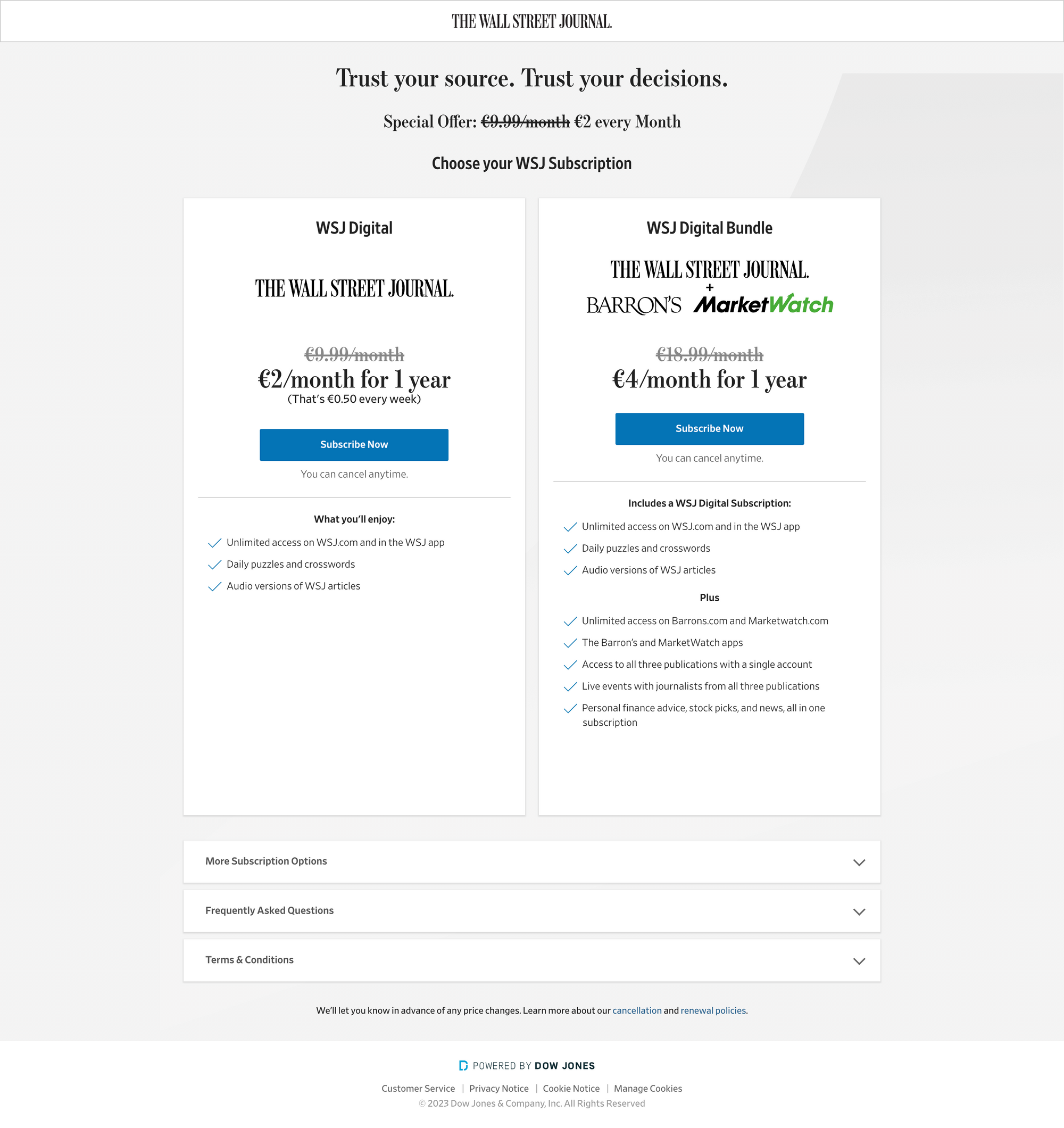
✅ A clear value proposition: professionalism and information thanks to a trust-based partnership with the reader
✅ One choice to make on the same offer: a two-month reduced rate trial or a year-long trial
✅ Reassurance: “cancel anytime” and FAQ
We've recently recreated the Wall Street Journal paywall during a webinar thanks to Poool's no-code design editor - you can watch it for free on Youtube!
Want to learn more about our solution? Are you interested in gaining more personalized insights into how you can build the best subscription offers page and increase conversion rates?
Book a demoSide note: Offers pages evolve!
Before we updated our benchmark, we had originally done the research a year ago in May 2022.
Here's what The Wall Street Journal subscription page looked like:
The offers page held a considerable amount of text and the user had to scroll to reach the CTA button.

Are you interested in A/B testing your subscription offers page? In this article, we dive into one of our clients' A/B testing strategy which doubled their number of subscribers.
The Washington Post
The Washington Post’s subscription page is somehow surprising: the font so characteristic of the Washington Post is nowhere to be seen. Nor is their famous motto “democracy dies in darkness” which often acts as their value proposition. Instead, the focus is put on the choice rather than their well-known value proposition.
Subscribing to their content is fairly easy thanks to a short and plain subscription page with only two choices and bullet-pointed benefits of what each offer includes as well as a visible CTA button: blue against white background.
✅ An easy choice to make: short, clear, plain subscription page with two choices and details of what each offer entails
✅ A deal: “four weeks for free” trial and then a reduced one year rate
✅ Very visible CTA button
✅ Reassurance: “cancel anytime” is highlighted in bold
❌ No value proposition visible on the subscription offer
The Athletic
On The Athletic’s website, our iced cake comes in the form of a customized value proposition based on a user’s interests, in this case football, as well as focussing on the one-of-a-kind value that the publisher provides.
They’ve also added a sense of urgency with ‘limited time offer’ as well as providing only a single choice on this page, making for a simple decision.
Their main offers page is just as simple and has an equally clear, hard-hitting value proposition that focusses on the unbeatable content that they provide.
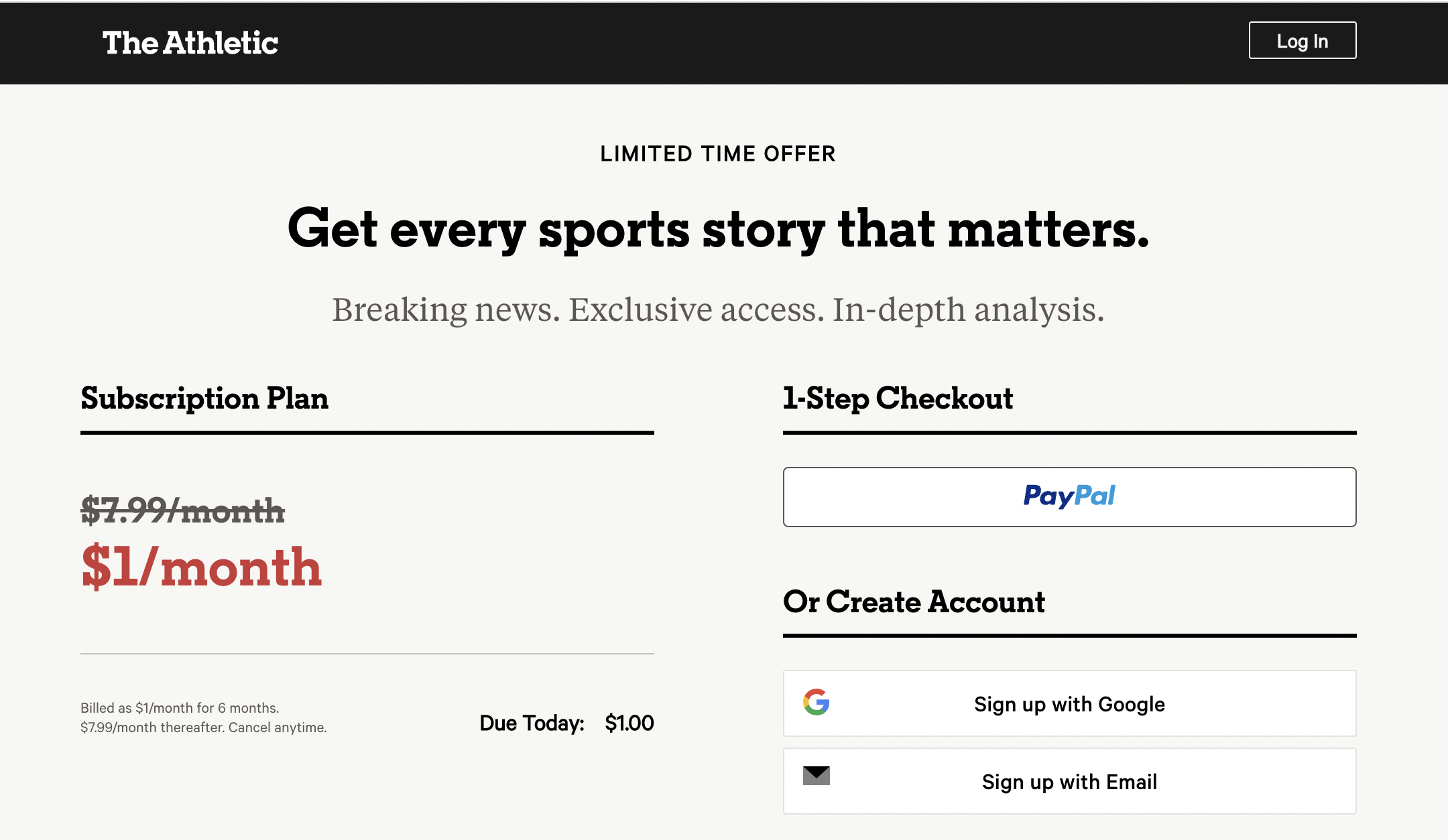
✅ A clear value proposition
✅ No choice to make: one offer (with a round number)
✅ Very easy and visible CTA button
✅ Time sensitive reduction to push conversion
✅ Reassurance: “cancel anytime”
WIRED
Subscribing to WIRED is simple. It almost saves us the trouble of making a decision.
The customer is faced with only two choices: print+digital or digital-only access. They’re guided towards one of the choices - the print+digital plan - as this offer is pre selected and highlighted as the “most popular”. This is a surprising assertion, given the decline of print, but may convince the customer that this offer is the best one, on the implicit thought that this is chosen by most users for a reason.
The subscription page in itself is a subscription journey. It’s a treat for the compulsive scroller: no need to click, the whole conversion in a single, very long page, which gives the impression of buying goods rather than information.
On this subscription page, the value proposition is not defined.
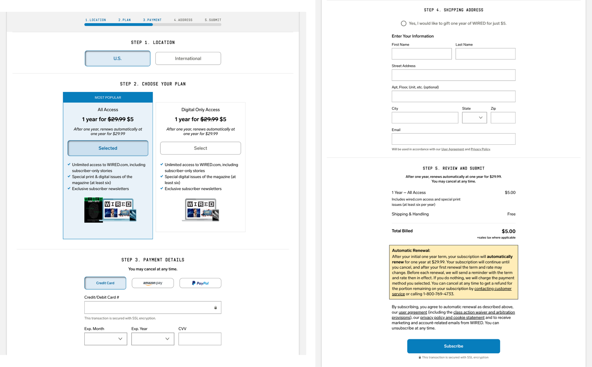
✅ Clear point explaining what the subscriber will get after converting
✅ Easy decision: only two choices and one of the offers is highlighted and pre selected
✅ CTA button is pre selected
✅ Reassurance: “cancel anytime”
❌No value proposition visible on the subscription offer
The New York Times
Because of the beige, cream colored background, The New York Times’ subscription page looks similar to the subscription page of Financial Times and differs from the usual white background used in the NYT’s articles.
The value proposition isn’t shaped for a particular audience. There are two reasons for this. First, the NYT has a well known reputation and a pre-existing audience so they don't need to redefine their value proposition. Second, the NYT implements a metered paywall that comes after a registration wall that offers access to premium content in exchange for account creation. With this strategy, the reader has been able to understand the publisher’s value proposition before subscribing.
However, they’re clear to communicate that subscribing gives users unlimited access to the NYT content, something that is likely on the user’s mind after having been blocked by both the registration wall and paywall.
On their subscription page, the subscriber can choose between two options of the same digital only offer but can also scroll down to uncover another option (print + digital).
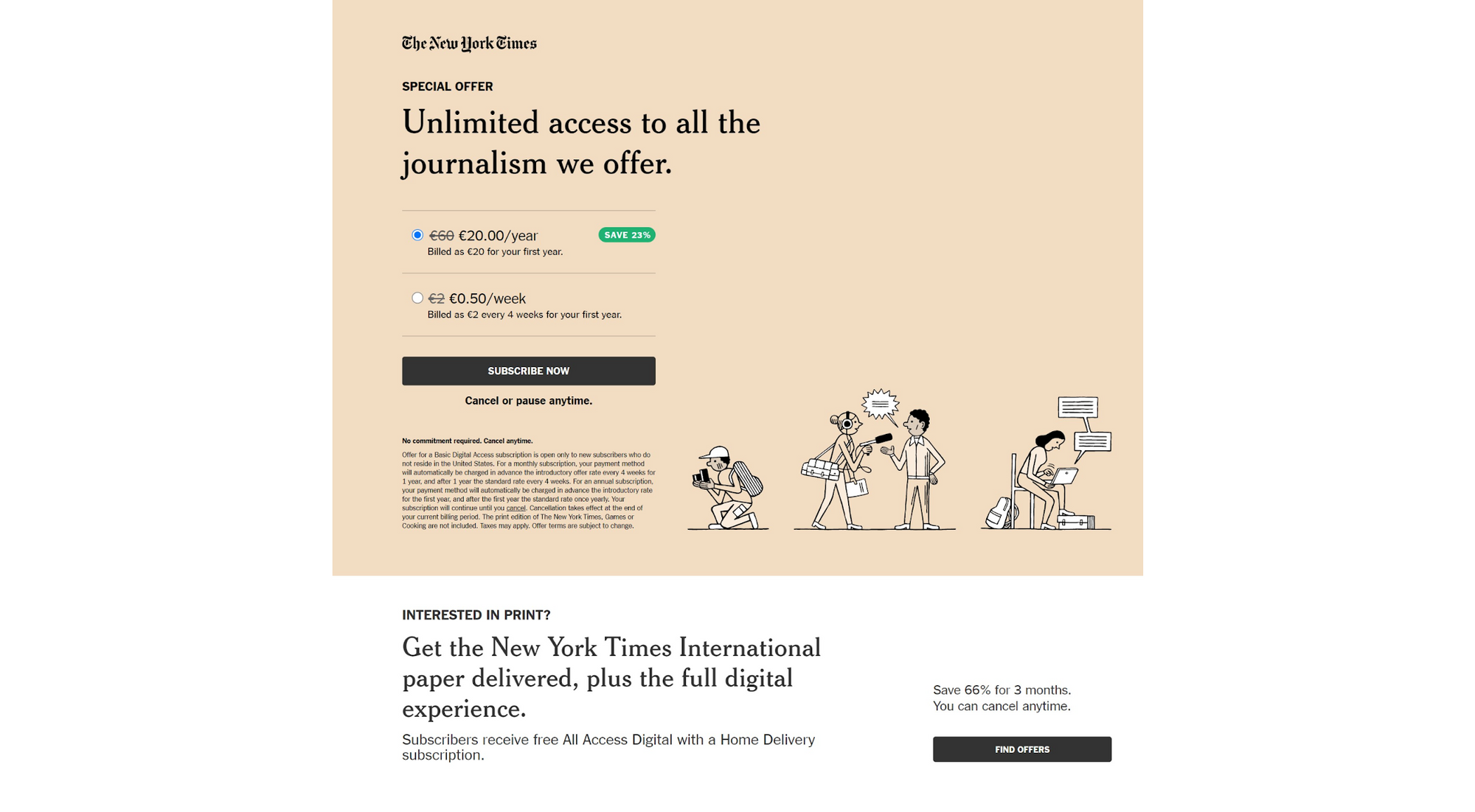
✅ A simple value proposition that relies on access to news
✅ One choice to make on the same offer: a weekly rate or a yearly rate (23% cheaper than the weekly offer)
✅ A visible CTA button “subscribe now”
✅ Reassurance: “cancel anytime”
The Financial Times
Becoming a Financial Times subscriber means choosing between four different offers: Trial, Digital, E-paper or Team/Enterprise.
The value proposition is clear and fore-fronted without distractions at the top of the page - “make informed decisions with the Financial Times”. Interestingly, this positions the subscriber as an active ‘maker’ rather than passive ‘reader’, providing an added value to access news on FT: it’s an enabler for the reader.
Next to the value proposition, a visual complements the text, showing different reading formats which underlines the different times, devices, etc that subscribers can access FT.
On this subscription page, there’s no sense of urgency that a limited time offer or a red font would create. The offer relies on the ‘rationality’ of the reader to make a well informed decision between all offers rather than on the impulse of a click. This supports FT’s positioning as providing highly researched content.
Between the four different options to choose from, the digital version offer is highlighted thanks to a best value blue tag.
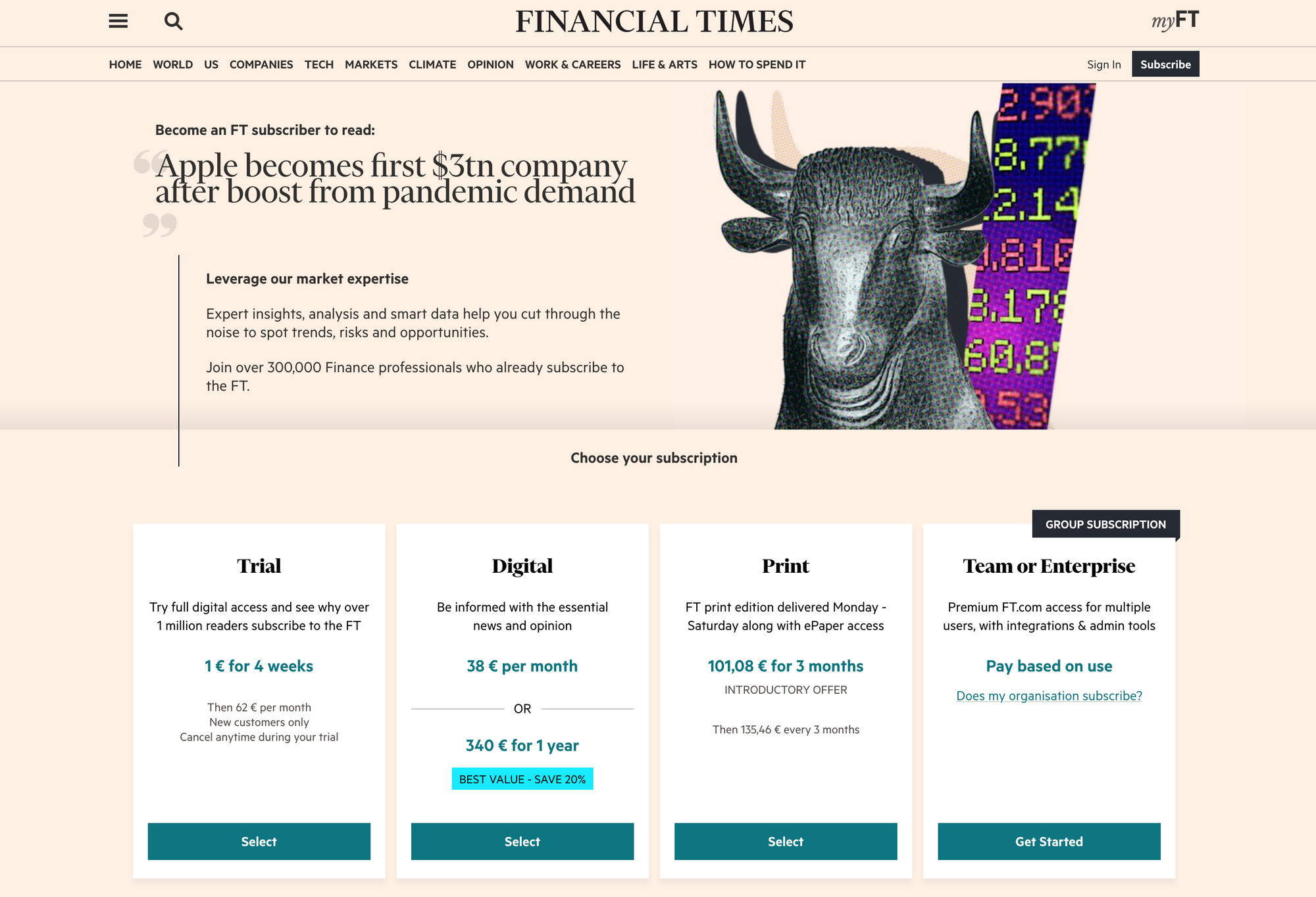
✅ Clear value proposition: Professionalism and information portraying the reader as a maker
✅ Multiple options to choose from with the digital version being fore-fronted
✅ Reassurance: “cancel anytime”
❌ 4 different options might mean too many choices, although one of these is a trial of another offer
Want to build your subscription offers page?
The Independent
The Independent’s subscription page displays a time limited offer that provides insights to help a user navigate ‘uncertain times’, thus solving a pain-point in the reader’s life (as required by a successful value proposition).
If the reader subscribes ‘today’ then the rate is reduced by 85%. The red background, which is characteristic of The Independent’s branding, reinforces this urgency.
The user is reassured of the publisher's trustworthiness with the inclusion of their News Guard award. The mention of this is all the more relevant as the picture illustrating the subscription page is a cover of war in Ukraine. In ‘uncertain times’ with a context of war of information, fake news and propaganda, trust is an essential element for conversion.
This reassurance is enhanced with the inclusion of an FAQ section and ‘Key benefits explained’ section.
The reader is given a choice between two offers, encouraged to choose the most expensive of the two, which is presented as the most popular.
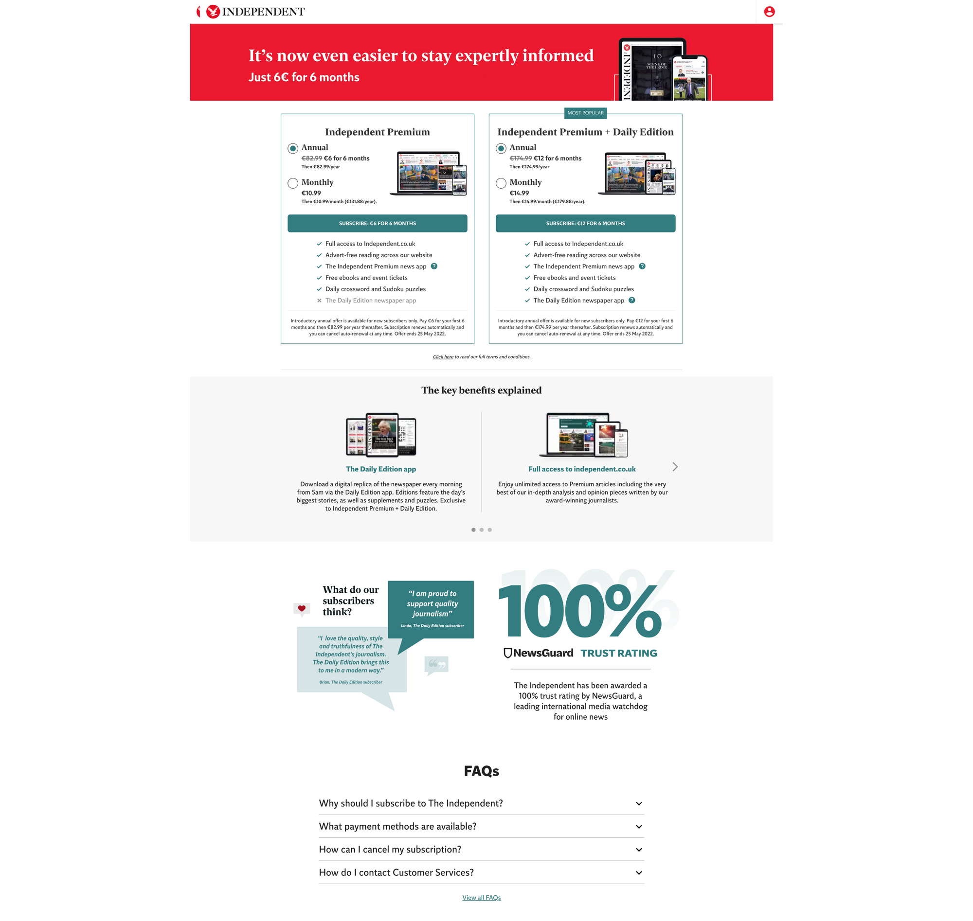
✅ A clear value proposition and a definite branding: relevant, trustworthy information
✅ Sense of a deal: limited time offer with a 85% discount
✅ An easy choice: only two offers available
✅ A visible CTA button
✅ Reassurance: ‘cancel anytime’ option, FAQs, a trust rating award and reviews from subscribers
❌ Not clear what the ‘daily edition’ is from a first look: it could be a print version when it is in fact access granted to the daily edition app
The Telegraph
Subscribing to The Telegraph feels like… a piece of cake. The CTA button takes most of the screen and encourages us to ‘start a free trial’.
Above the CTA button, the value proposition is clearly defined. The subscriber is a maker, like on the Financial Times subscription page. They can “Make sense of what matters with unlimited access to our journalism”. This focus on providing uncomplicated, clearly explained information is continued throughout the page.
When scrolling down the page, you have additional information about the subscription and can choose other subscription plans as well as compare plans. Reassurance is provided thanks to the inclusion of “cancel anytime” and subscriber reviews.
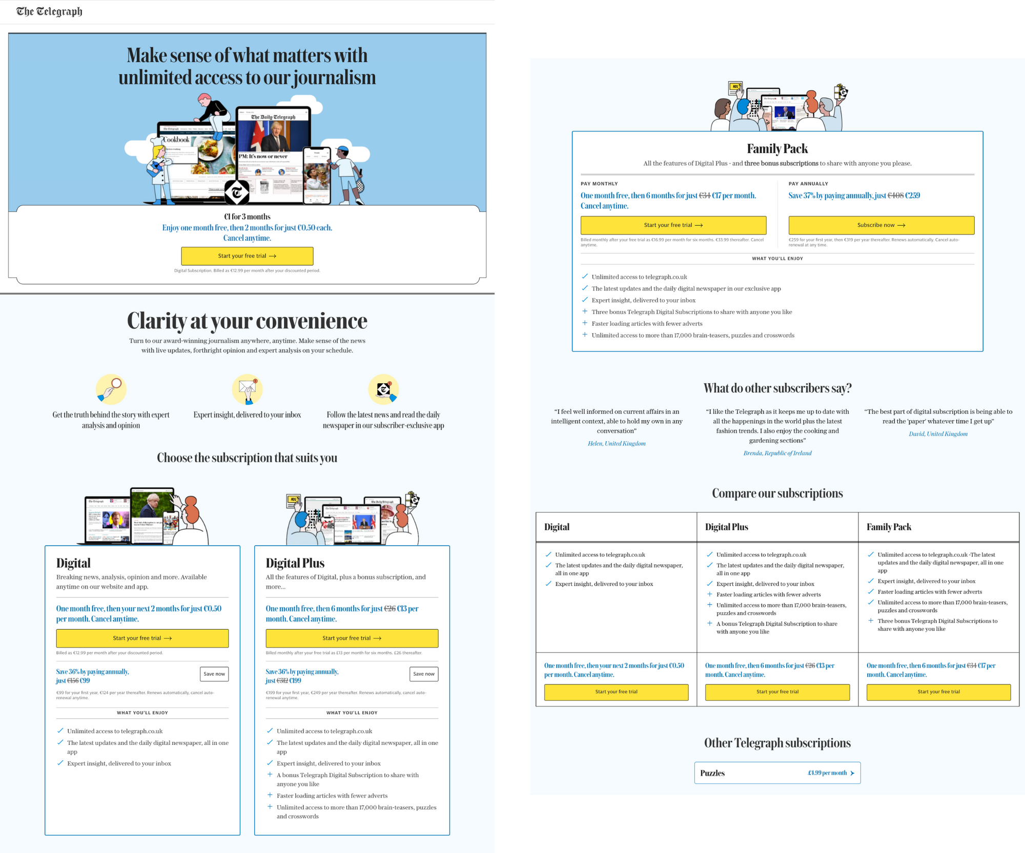
✅ A clear value proposition and a definite branding
✅ An easy choice: a single offer highlighted
✅ A deal: free trial
✅ Visible CTA button
✅ Reassurance: “cancel anytime” option, FAQs, a trust rating award and reviews from subscribers
The Times
On The Times’ subscription page, a potential subscriber is faced with three options. Among these options, the middle one is forefronted, depicting it as the most popular.
Above the offer, their value proposition is defined by one active and simple sentence: “subscribe to trusted, insightful journalism”.
A scroll is needed to access the CTA button which reads “view offers”. Scrolling on, the potential subscriber can discover other subscription options (student or group) and be reassured by a FAQ or a customer service helpline.
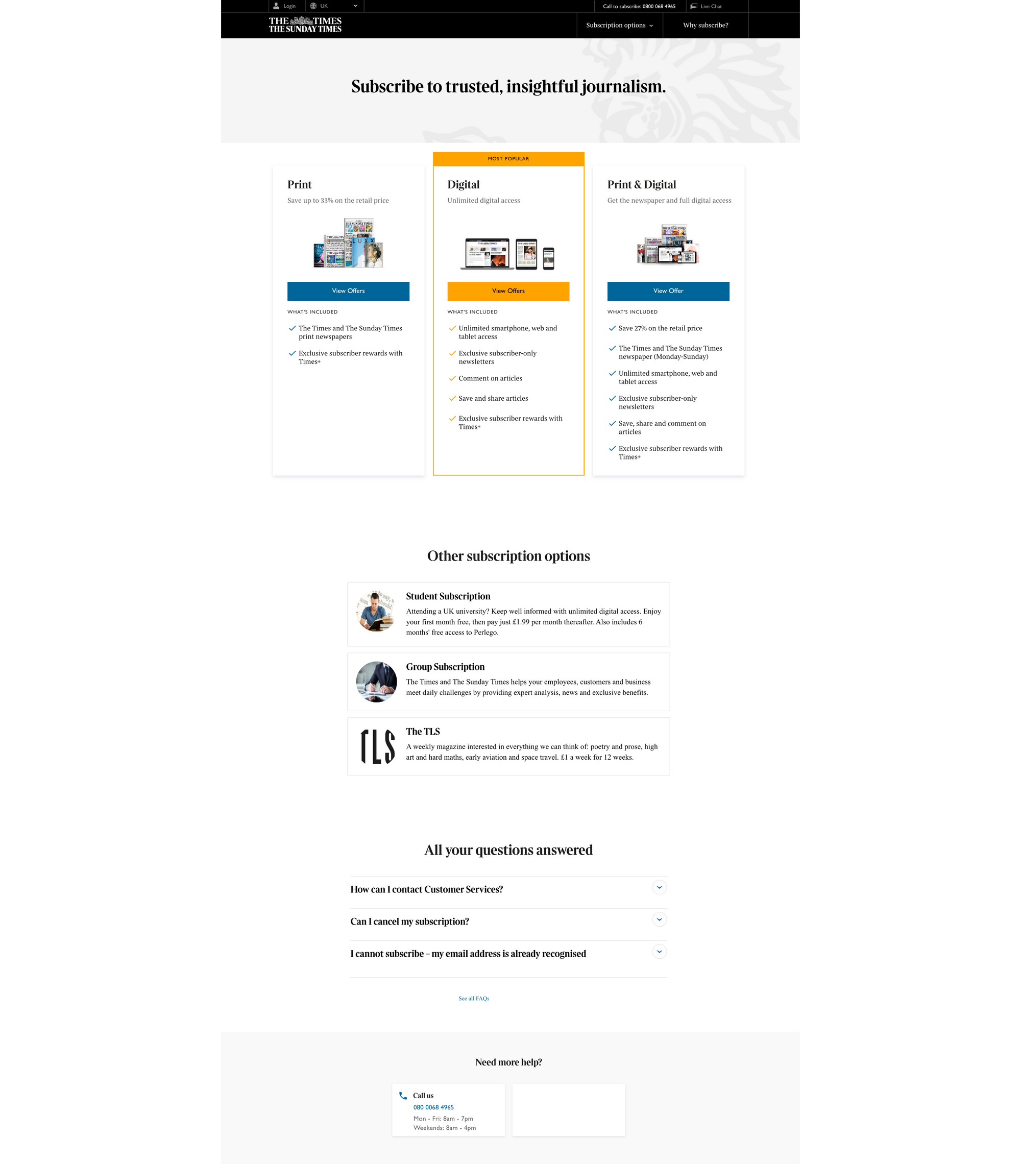
✅ A clear value proposition and a definite branding
✅ An easy choice among choices: one offer fore-fronted among three offers
✅ Reassurance: FAQs and a helpline
❌ Scroll needed to click on CTA button
❌ No sense of a specific deal
Interested in reading more examples? Check out our article with examples and strategic tips: What makes a successful subscription payment page?
The Guardian
Subscribing to The Guardian portrays engagement in a philanthropic sense - a subscriber becomes committed and dedicated to supporting the publication, making them an active participant in the transaction rather than a passive reader.
Differently to other publishers, The Guardian’s offers are displayed vertically, meaning the first offer is very much forefronted compared to the second that requires a scroll to be able to view. Given that the publisher doesn’t have a paywall on their website, the promotion of their print offer over digital isn’t surprising.
The CTA button is labeled “find out more” which doesn’t require an immediate decision as a “subscribe now” CTA button would. This fits in with The Guardian’s tone-of-voice, asking their readers for support
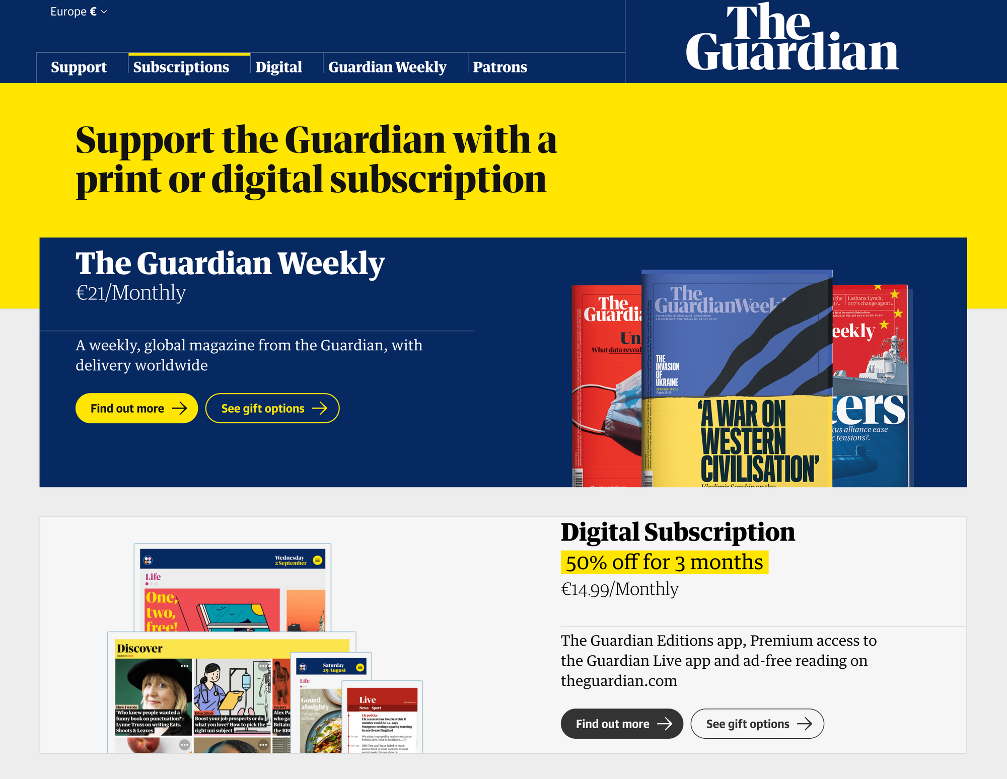
✅ A value proposition and a definite branding
✅ An easy first choice to make: either print or digital
✅ The possibility to give subscription as a gift
❌ No reassurance provided, although this doesn’t appear to be the final options page, rather clicking on “Find out more” will provide this
❌ No sense of a specific deal
Time to build or improve your own subscription offers page?
We'd love to show you around our "Membership & Subscription Suite" - the simple, all-in-one audience conversion, management & retention platform to turn content into business.
Book a demo