Membership models, also referred to as registration, are forever growing in popularity amongst producers of all types of digital content. And it’s easy to see why… First-party data collection, increased engagement, better user experience, more personalization, targeted advertising (which means more ad revenue) as well as supporting subscription revenue models.
The question then turns to how you can succeed in a membership strategy? Specifically:
- How can you generate members?
- What value can you offer in exchange for registration?
- What should the account creation process look like?
- And what best practices should you employ?
In this article we’ll consider each of these points through benchmark examples from 5 different types of content publishers:
- The South China Morning Post (news publisher)
- RHS Gardening (brand publisher)
- BBC Good Food (magazine/recipe content publisher)
- Duolingo (e-learning)
- Tablespoon by General Mills (brand publisher)
The South China Morning Post
The Hong Kong based publisher employs a membership strategy alongside their metered paywall model. The benefit of registration for SCMP is therefore to increase engagement to the point that a reader is persuaded to subscribe when faced with the paywall (shown after reaching the end of the 4-article quota per month).
How the publisher generates members
Although there’s no registration wall within content, The South China Morning Post offers a wide variety of personalization and engagement UX features that are only accessible for logged-in users. Because of this, any reader who tries to make use of these features is blocked by a pop-up wall requiring registration.
The value offered in exchange for registration
- Ability to save content for later
- Follow topics and authors
- Join conversations (comment sections at the end of content)
- Setup notifications and alerts
- Access ‘recently viewed’ content
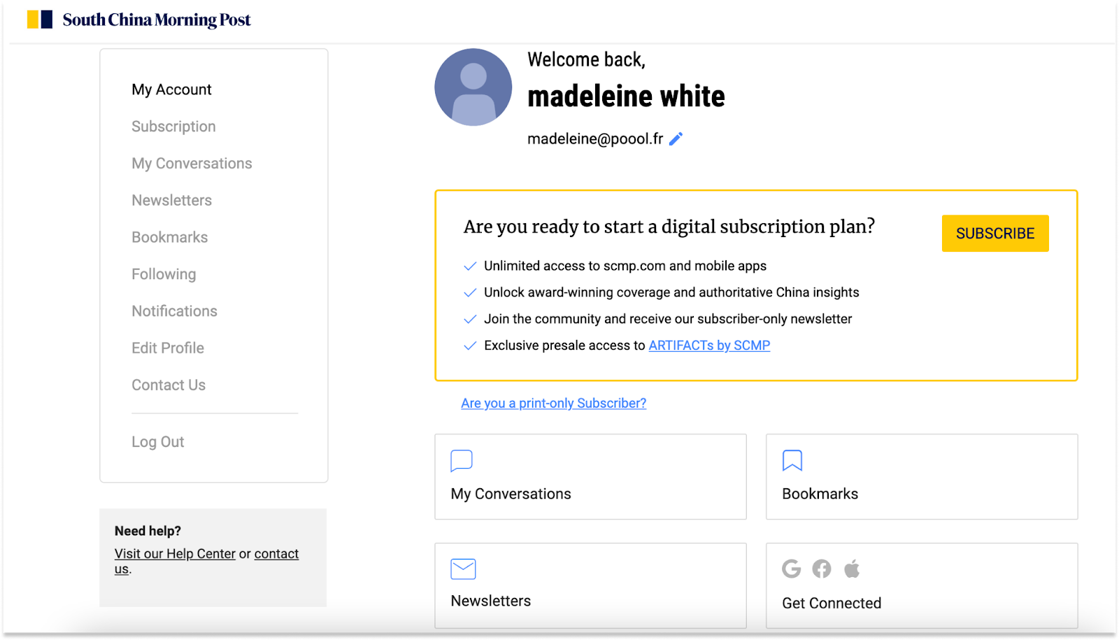
However, these benefits aren’t clearly promoted prior to account creation (not even on the registration wall itself). This is likely because SCMP prefers to keep space for their subscription offers rather than registration, but even so, registration can play a powerful role in increasing propensity to subscribe and shouldn’t be ignored as a product in and of itself, with its own value proposition.
The account creation process
The pop-up registration wall offers the option of creating an account with Google, Facebook or Apple, or alternatively with email. This then leads us through a process of email confirmation, password creation and entering our first and last name.

We’re then led through a 3-step onboarding process, encouraging us to sign up to their newsletters, follow authors or topics (as well as download the app) and consider paid subscription for unlimited access.
💡Best practice: Onboarding is often reserved for new subscribers, but leading your newly registered users through a similar process can prove hugely valuable for increasing engagement and ensuring they make the most of features you’re now providing them as a member.
SCMP also sends out an email post-registration informing the user of 5 ways to make the most of their new account, supporting their onboarding efforts through an additional medium (email).
Best practices and areas for improvement
✅ A variety of UX features on offer for registered members to increase engagement and personalize/improve their user experience
✅ Onboarding steps that don’t require too much effort from users but still support the publisher’s strategies and personalize the user’s experience
✅ Multi-medium engagement (via email onboarding, newsletters, promoting the app)
❌ A registration wall blocking content, or one that’s integrated into the metered paywall, would prove beneficial for increasing their registered user base (something that would support both subscription and advertising revenue streams)
❌ Membership value proposition needs to be more clearly defined and communicated with readers to increase conversion rates
RHS Gardening
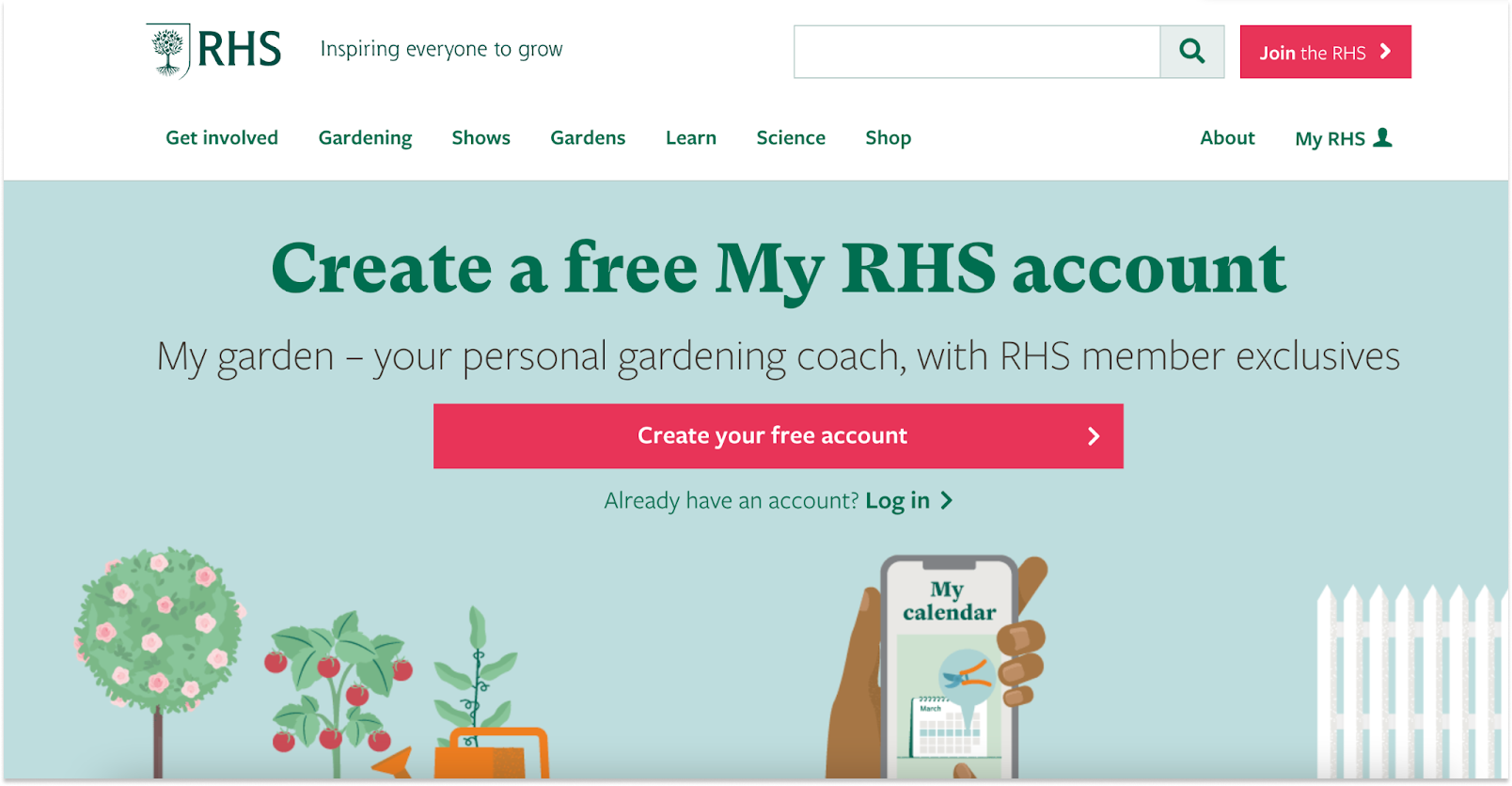
Content is entirely open to visitors, but registering as a member is promoted across the site under the name “My garden” with a variety of benefits attached.
Note that RHS also offer paid premium packages that include access to their gardens across the UK, monthly subscription to their print magazine and additional advice from their experts.
How does the publisher generate members?
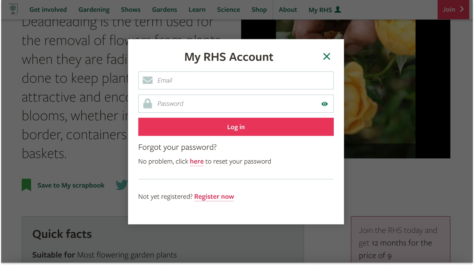
- Pop-up registration wall when users try to save content in their scrapbook
- Through promoting the free personal coach included with membership
The value offered in exchange for registration
The benefits of membership are very clearly defined and well communicated across their site, particularly on the account creation page.
- Save content in a scrapbook to “keep track of the plants you own and the plants you want all in one place”
- Create a calendar for monthly reminders of jobs to be done
- Access to a “grow your own” guide
- Recommended content and ideas
- Free gardening coach
The account creation process
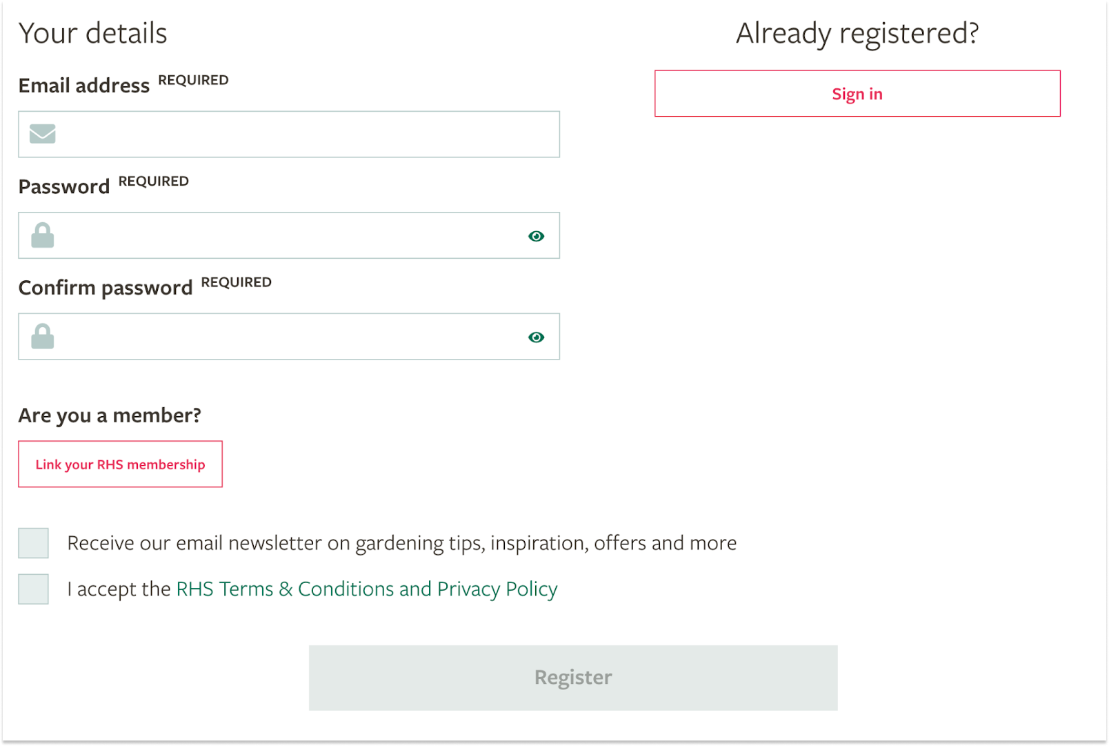
A single page, minimal information required and one click on the register button is all it takes to create an account. The publisher also makes use of this step to offer newsletter opt-in, a habit-forming content that’s hugely valuable for increasing engagement (frequency, volume and quality of visits).
After finalizing the account creation process, we’re taken to our account page where we can easily access all of the benefits of membership.

Best practices and areas for improvement
✅ Very quick and simple registration process
✅ Well defined and clearly communicated membership value proposition, with established benefits, giving visitors a reason to convert
❌ No email confirmation, welcome email or onboarding steps to help make the reader feel valued and increase engagement
❌ A registration wall on content (even a very soft one) would prove beneficial for growing their membership base
BBC Good Food
The BBC’s hub of recipes, how-to videos and a wide variety of other food-related content.
Although the large majority of content is entirely open-access, visitors are encouraged to create an account or pay for their recently-released subscription offer.
How the publisher generates members
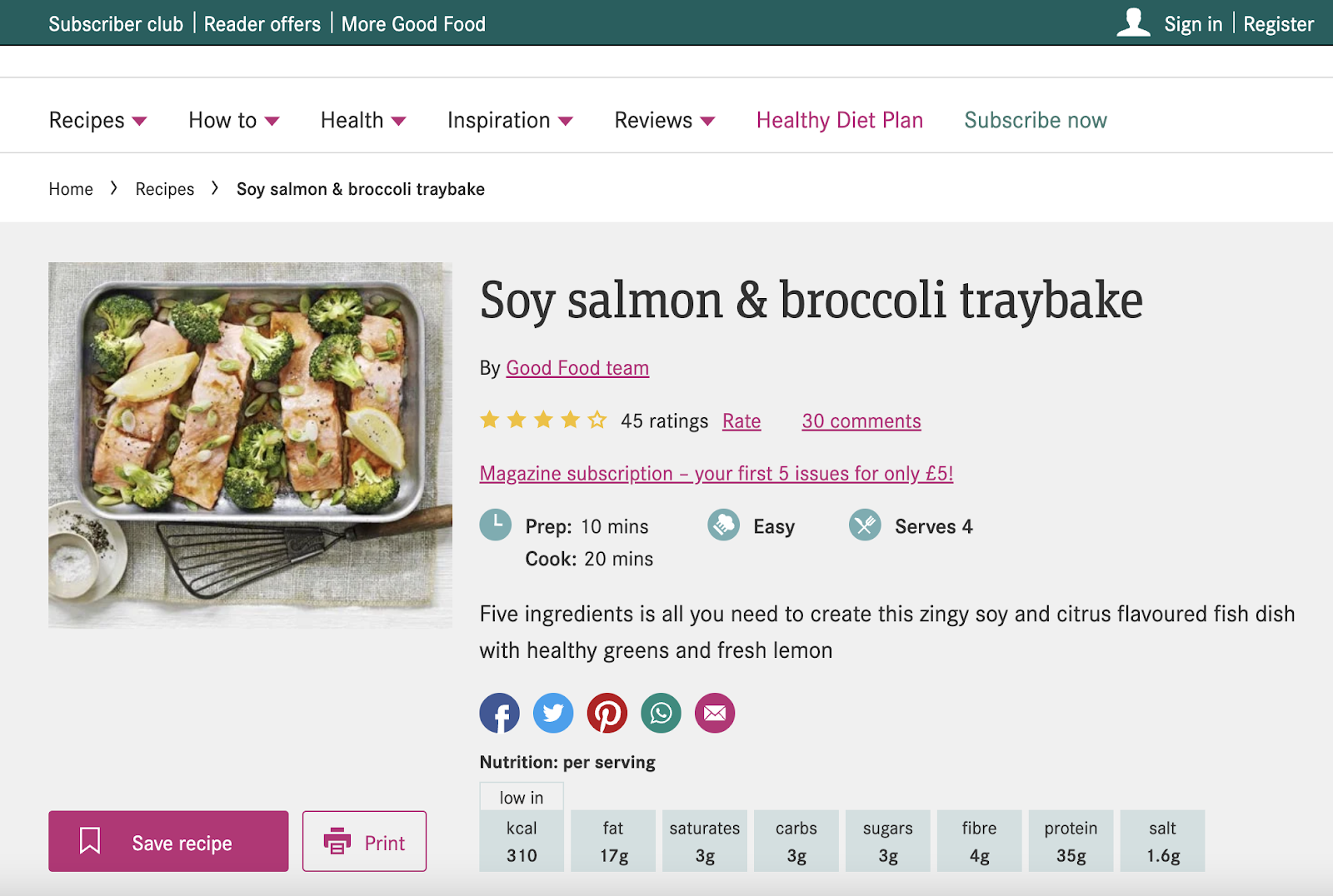
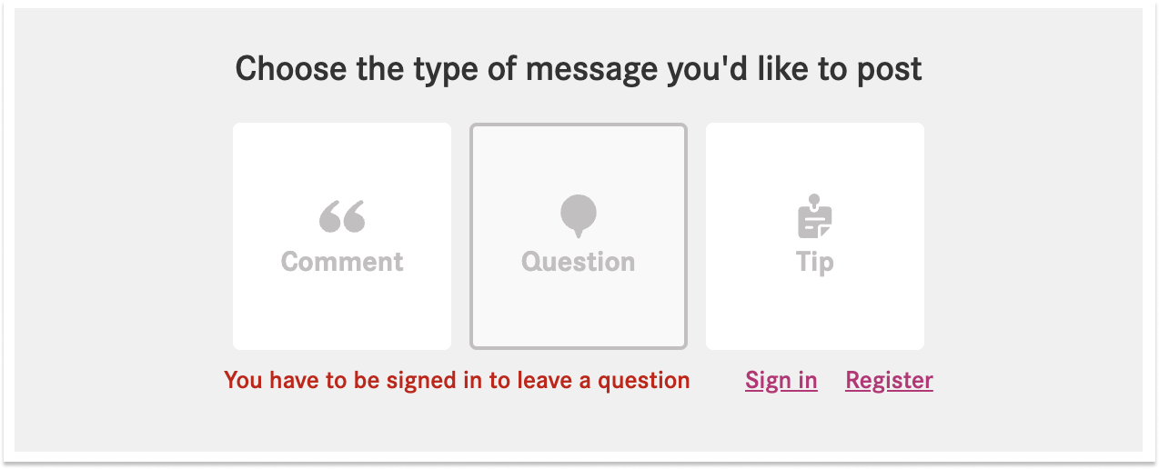
Upon trying to save a recipe, leave a comment, question or tip. This is arguably one of BBC Good Food’s areas to improve as we’re given very little encouragement to create an account - lack of value proposition, well-communicated benefits or registration wall.
The value offered in exchange for registration
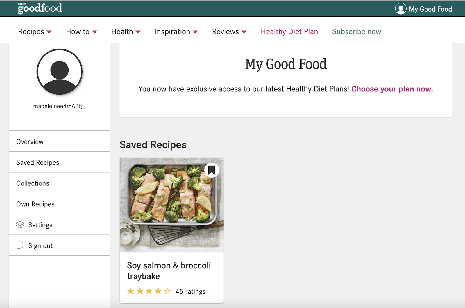
- Ability to save recipes for later
- Build content collections
- Create your own recipes
- Access diet plans
The account creation process
One step registration process with the option of using an existing social account.
Although the form only requires email and password, we’re also asked whether we want to receive 3 different types of newsletters.
💡Best practice: offer personalization options as much as possible. The more suited the content (including newsletters) is to your new member’s interests, the more engaged they’ll be - and engagement of course correlates with revenue. However, be wary to not ask for too much information in the registration funnel as this could discourage your user from completing the form. As always, it’s about balancing frustration and engagement.
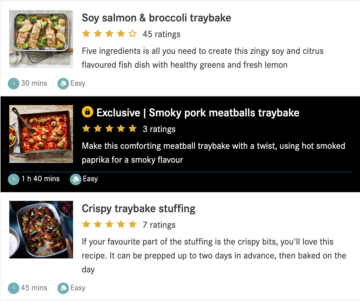
Even after registering, some content is still locked and reserved for subscription, clearly marked with a lock icon and black background, helping to increase premium content visibility and reduce frustration as users know to expect a paywall on this content.
Best practices and areas for improvement
✅ Simple registration form requiring minimal information or effort from users, reducing friction in the registration process
✅ Personalization of which newsletter to sign up to, a brilliant way to collect data about the user, provide them with content that matches their interests and increase engagement
✅ Clearly marked premium content to reduce frustration when presented with the paywall
✅ Confirmation and welcome via email (although no onboarding via email, which could have proved valuable for reminding the member of what they now have access to and increasing engagement)
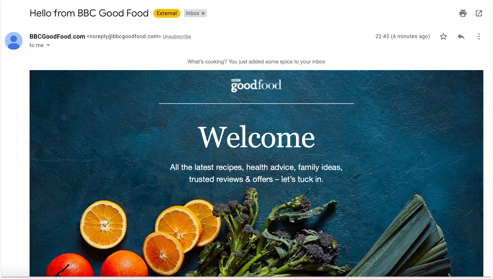
❌ The value proposition and benefits of registering aren’t clearly communicated until after registration which, combined with the lack of registration wall encouraging account creation, means readers have very little motivation to become a member
❌ Lack of onboarding or other emails to follow the one sent immediately after account creation
Duolingo
The language learning website and app is a great example of a fairly hard registration model being done well, with the additional end goal of encouraging members to subscribe in the future.
How the publisher generates members
Before even being able to see the content on offer, users are encouraged to create an account to help keep to their daily goals and save their progress. It’s not obligatory (a “not now” button is provided) but pretty essential for any user serious enough about making progress in learning a language.
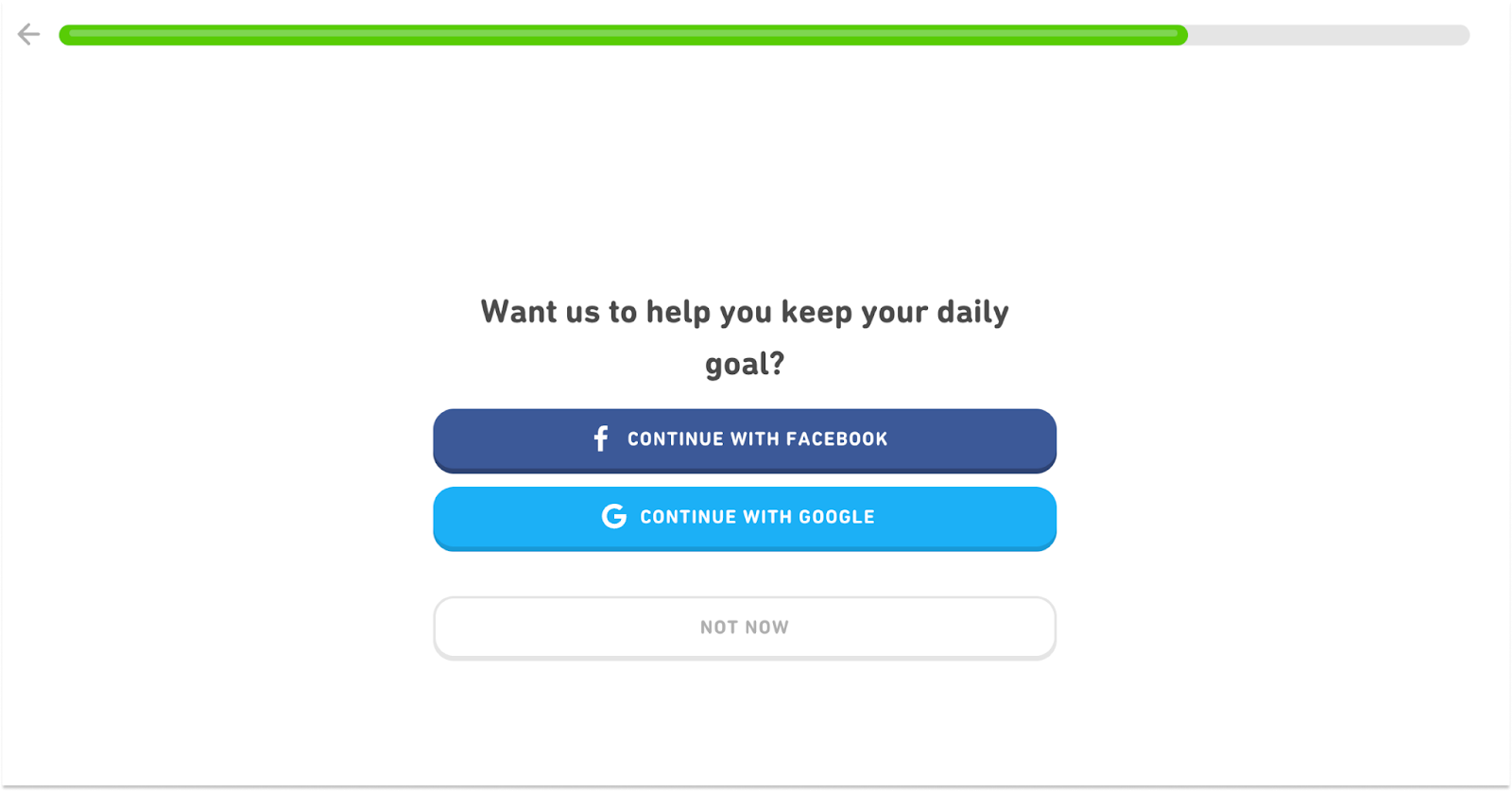
💡Best practice: Despite leading a user through the registration process prior to showing them the actual content, Duolingo asks a few simple questions to personalize the user experience before offering them a quick lesson to provide some content discovery. The mix of registration forms and content help to balance frustration and engagement, continuously showing visitors the value in creating an account.

The value offered in exchange for registration
- Save progress to resume where the user left off
- Notifications and daily reminds
- Personalized learning
- Gain achievements
- Follow friends/compete against them
- Access additional skills, classes, etc
The account creation process
We’re encouraged to create an account at 3 points in the user journey - right at the beginning, after having completed the discovery lesson or on the home page.
In each instance, we’re offered the option of registering using an existing social account or through filling out our email, name, age and password creation.
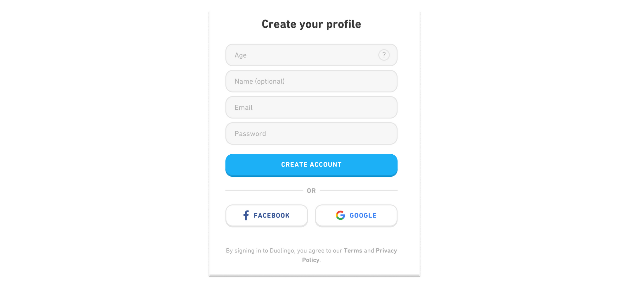
We’re then taken directly to our account page, send an email confirmation and a welcome email, detailing how to make the most of Duolingo, as well as daily reminders to practice our language.
Best practices and areas for improvement
✅ Registration process that mixes data collection (form fields) with content discovery to balance frustration and engagement
✅ Fairly hard registration wall to increase the number of members
✅ Duo makes use of email to welcome a user and inform them of what they have access to on the site
❌ The value provided to registered over anonymous users isn’t made entirely clear at first. If better communicated with visitors to the site, the e-learning site may increase the number of users who convert
Tablespoon (by General Mills)
Brand publishing is ever growing in popularity and, just as regular publishers, they need to find ways of monetizing their content. Subscriptions are rare in brand publishing (the end goal is often to sell a product or service rather than a content offer) but membership models are hugely valuable for increasing engagement, collecting first-party data and targeting ads.
Tablespoon, a recipe and cooking content site owned by General Mills, is one of the many brand publishers employing this strategy.
How the publisher generates members
Whenever an anonymous user tries to access any of the member-only benefits, they’re taken to a registration page and required to create an account. This is also promoted in the corner via a CTA button highlighting that it’s free to join.
The value offered in exchange for registration
- Content can be added to a ‘favorites’ section
- Recipes can be customized
- Content can be shared via social platforms
- Members can save money with online grocery coupons
- Access to a weekly email newsletter
- Become part of a community of members
The account creation process
Very little information is required to create an account but these small questions alone give the brand some key data points that can be used to inform their strategy.
However, it’s perhaps not necessary to ask for the user’s zip code, a data point that seems weird considering that this is a digital-only publication. This also doesn’t allow for registered users outside of the US.
Best practices and areas for improvement
✅ Easy registration process, although some information isn’t necessary to ask for and limits visitors becoming members outside of the US
✅ Clear benefits of becoming a member
❌ No registration wall to encourage conversion
❌ Lack of email confirmation of account creation or informing us of what we now have access to
You may also be interested in:


