Have you ever assembled a piece of furniture and, right when you thought you were done, found yourself with a single screw left?
Rhetorical question. We all have.
Today, we’re providing you with a checklist so that the same doesn’t happen with your paywall! Prefer to read in the language of Molière? 🇫🇷 C'est par ici
1. Ensure users have the chance to discover the value of your premium content before the paywall
2. Include brand colors, selecting a single color to represent subscription
3. In a freemium model, label premium content to reduce frustration
4. Integrate other funnel steps into the paywall
5. Work on optimizing paywall visibility rate, aiming to balance frustration and engagement
6. If you’ve already collected key data points, make use of it to personalize the paywall and user experience
7. Communicate a strong value proposition on your paywall
8. Make sure your paywall is mobile-friendly
1. Ensure users have the chance to discover the value of your premium content before the paywall
Think of subscribing like dating - you wouldn’t ask someone to marry you without first inviting them on a date. You need to give readers the chance to discover your content and value before blocking them with a paywall.
In other words, target the right users with your paywall, those that have already had the chance to discover your content. For less engaged users, we’d recommend soft conversion strategies and leaving content open to allow for content discovery.
Segmenting your users according to their level of engagement will allow you to do just that.
🏆Best in class example: Apple TV
Why is this a best in show? The user is able to watch a free episode before being blocked.

2. Include brand colors, selecting a single color to represent subscription
The idea here is simply about increasing premium offer visibility by making any promotional banners, buttons and the paywall easily recognizable.
Interestingly, yellow has become a classic color for subscription in France, likely because of its fluorescent nature.
🏆Best in class example: The Irish Times
3. In a freemium model, label premium content to reduce frustration
Increasing premium content visibility is an essential step prior to the paywall to reduce frustration and prove the value of subscription. This can be done by simply labelling premium content with a tag in the same color as all other materials promoting subscription.
Find out more in our article on The Audiencers:

🏆Best in class example: El Païs, Digiday and ELLE Magazine
Notice the yellow tag 'Abonnées' (subscribers) on ELLE Magazine's site, the red 'Member exclusive' label on Digiday, accompanied by a locked padlock, and the small yellow icons 'E' on El Païs' premium content.
4. Integrate other funnel steps into the paywall
Reduce potential friction points (clicks, scrolls and data collection) that might prevent a user from subscribing by integrating subscription offers, payment or form fields into the wall.
🏆Best in class example: Alternatives Economiques
With this wall, users are able to pay for subscription without leaving the page, maximizing on impulsive conversions. This led to a 40% increase in conversion rates for the French publisher.

5. Work on optimizing paywall visibility rate, aiming to balance frustration and engagement
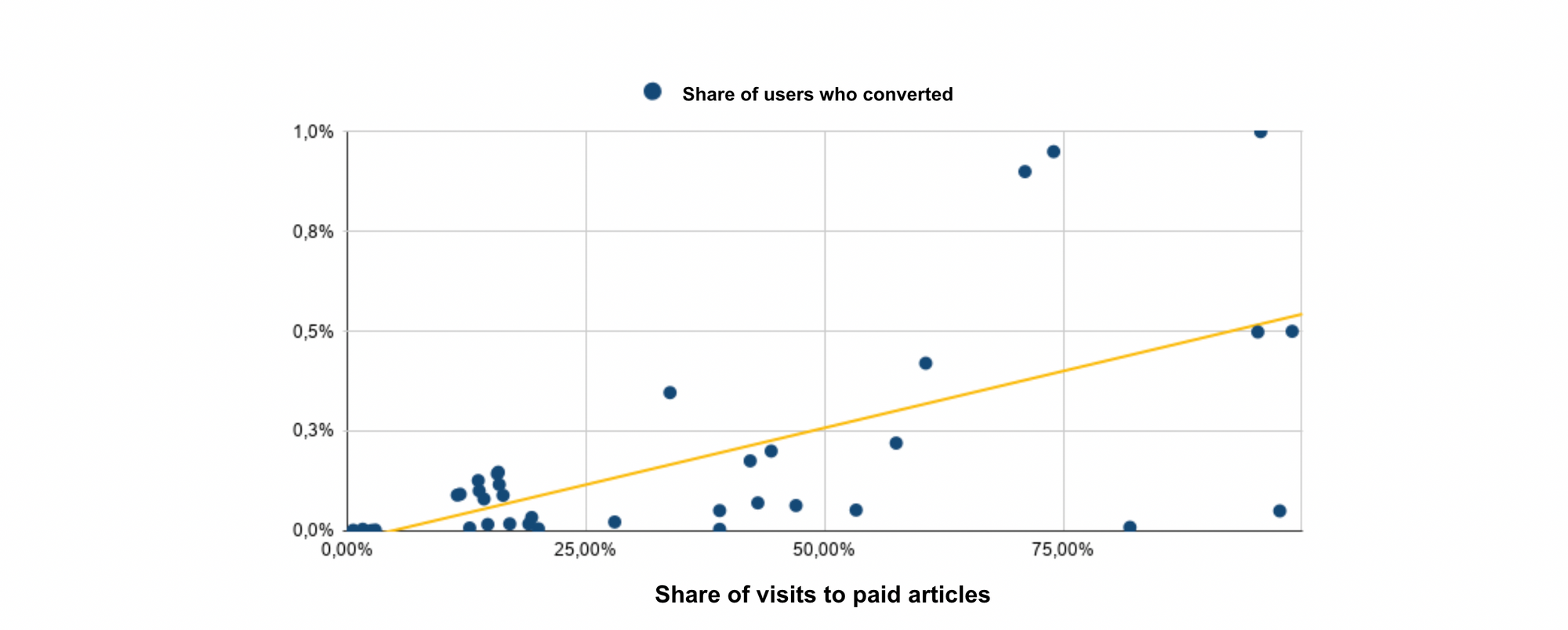
This refers to the percentage of traffic on premium content who actually see the paywall. Of course, whilst it's important that visitors are exposed to the paywall to encourage conversion, it's equally essential to allow readers to discover the value of your premium content. It's a balance between frustration and engagement.
Although we see publishers at both ends of the scale, we've found 80% to be the optimal paywall visibility rate, but A/B testing is recommended to find the optimal percentage for your publication.
🏆Best in class example: The Economist
Why? Entice readers so that they want to “get to the end of the story” by subscribing, or offer registration as a soft conversion step that reduces frustration by allowing readers to access content for free
6. If you’ve already collected key data points, make use of it to personalize the paywall and user experience
Use data points such as name or content interests to make the paywall and user experience more suited to the individual.
🏆Best in class example: Harvard Business Review
7. Communicate a strong value proposition on your paywall
The "Why" - your readers should understand why you are publishing content and why they should pay for it.
🏆Best in class example: The Wall Street Journal
Why do they publish content? To provide trust-worthy journalism that solves a pain-point for readers
What makes you different from others in the industry? The reader makes decisions daily, and WSJ will help them to make more informed decisions, more easily with trustworthy journalism, implying well-researched content written by experts.
8. Make sure your paywall is mobile-friendly
It’s harder to grab mobile user's attention, and the small screen as well as the context of content consumption will have an impact on your paywall’s success rate. You should therefore adapt your strategy:
- Reduce steps in the conversion funnel by integrating them into the paywall
- Ask for less information in forms and ensure fields are auto-filled
- Provide e-wallet payment options such as Apple Pay to instill trust and facilitate payment
- Make use of a user’s existing accounts on Apple, Facebook or Google to make account creation simple
🏆Best in class example: Le Petit Journal
Le Petit Journal kept their mobile paywall simple, adapting to the smaller screen and ensuring that the CTA button and value proposition are the center of attention.
Discover more of our content on paywalls:


