To wrap it up:
- Optimize consent banner design
- Keep users informed - transparency is key
- Employ a cookie wall with alternative to give users a choice whilst increase revenue
- Prioritize a first-party data strategy
Consent rates are falling around the world, particularly in countries such as France where restrictions on data privacy online are tightening and users now have more freedom to decline the use of cookies.
To add to this, Google is putting an end to third-party cookies and tracking on Chrome within the next two years and Apple is set to make it even easier for users to decline cookies automatically on apps.
Of course, this is great for data protection and user choice, but it’s having a negative impact on digital publisher’s ARPU.
Without cookies, marketing teams can’t track campaigns, first-party data can no longer be collected for understanding audience behavior and revenue diversification becomes more difficult than ever. In fact, Google (at the heart of the cookieless future discussion) have warned that publishers could lose up to 52% of their revenue through lack of cookies.
The question then comes down to how to solve this problem. In this article we’ll share some best practices to employ in order to optimize your cookie consent rates as well as the number one strategy to put in place NOW to overcome the challenge of the cookieless future.
Optimize consent banner design
The colors, text and layout of your consent banner can have a big impact on consent rates. After all, it’s a user’s first impression of your website and often a pop-up that they automatically try to close as quickly as possible. The design should therefore seek to catch the user’s attention, encouraging them to click ‘Accept’ whilst reassuring that you care about their data privacy.
Note that you can personalize your consent banner design either via a CMP (Consent Management Platform) or inhouse.
- Clear consent banner heading
Catch their attention quickly and stop them from immediately moving to the ‘Decline’ button. We’d recommend AB testing the wording of this but ensuring that you stay within your company’s tone of voice.
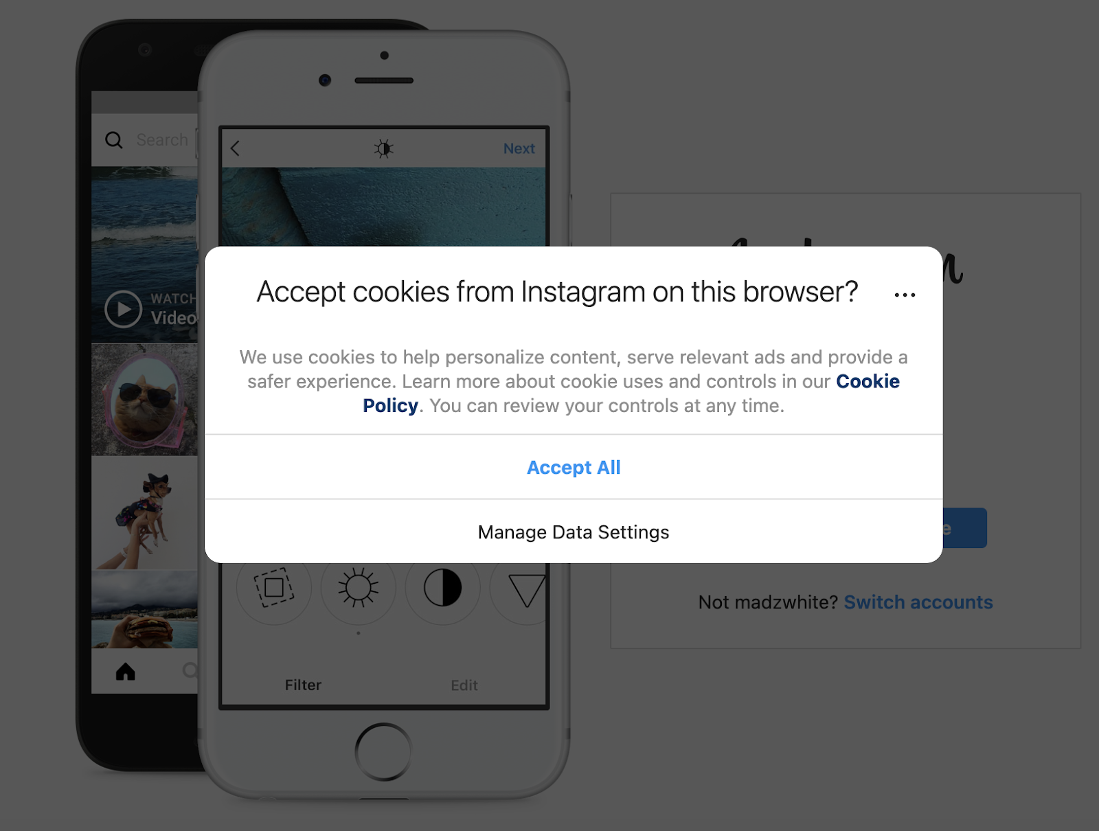
Although Instagram’s pop-up is clear on what it’s asking, it’s not very attention-grabbing or different from any other consent banner.
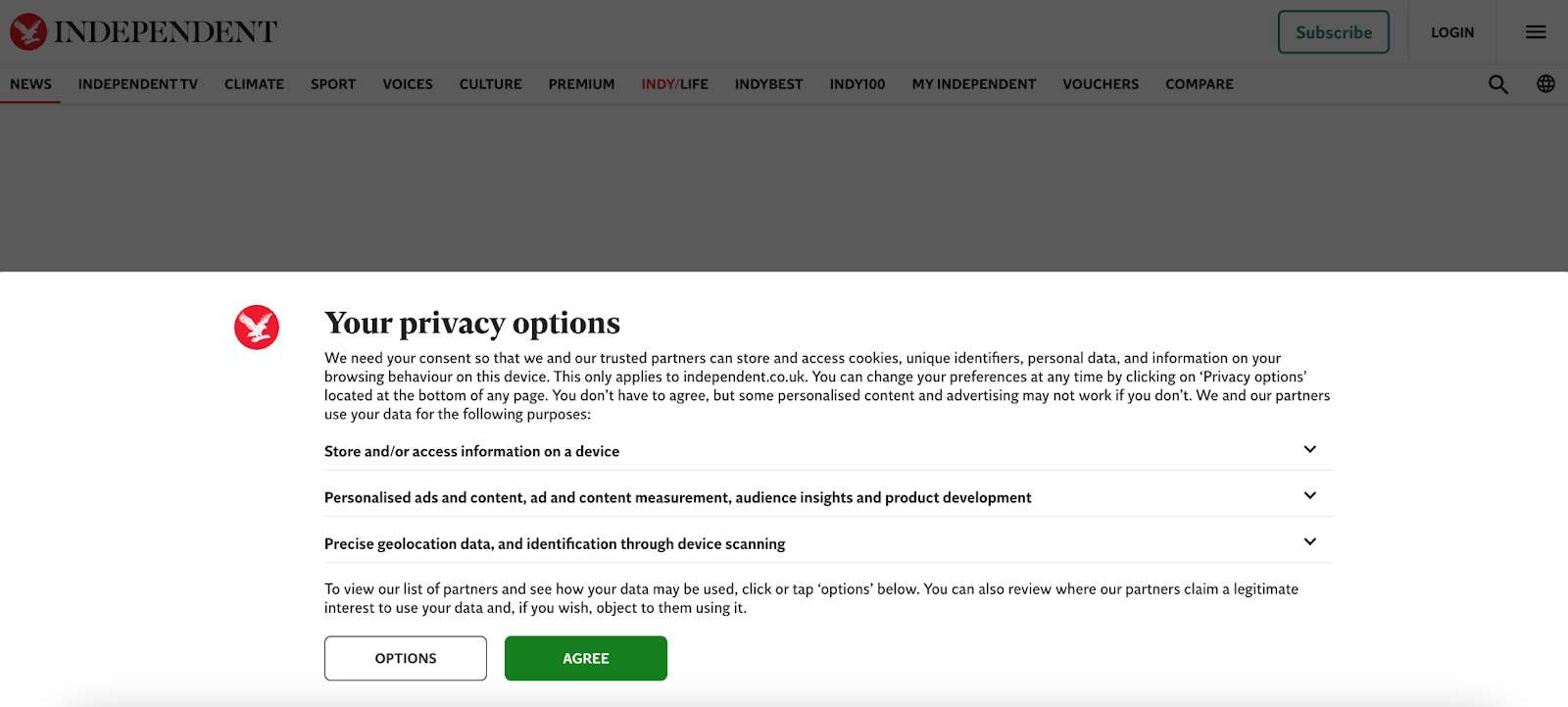
The Independent highlights the user’s ownership of their data (‘Your’) and the fact that they have a choice (‘Options’).
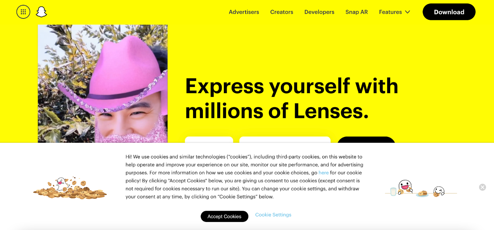
Snapchat, on the other hand, adds images to make the wall more ‘fun’ and eye-catching, even going so far as to personalize the cookie to match their branding.
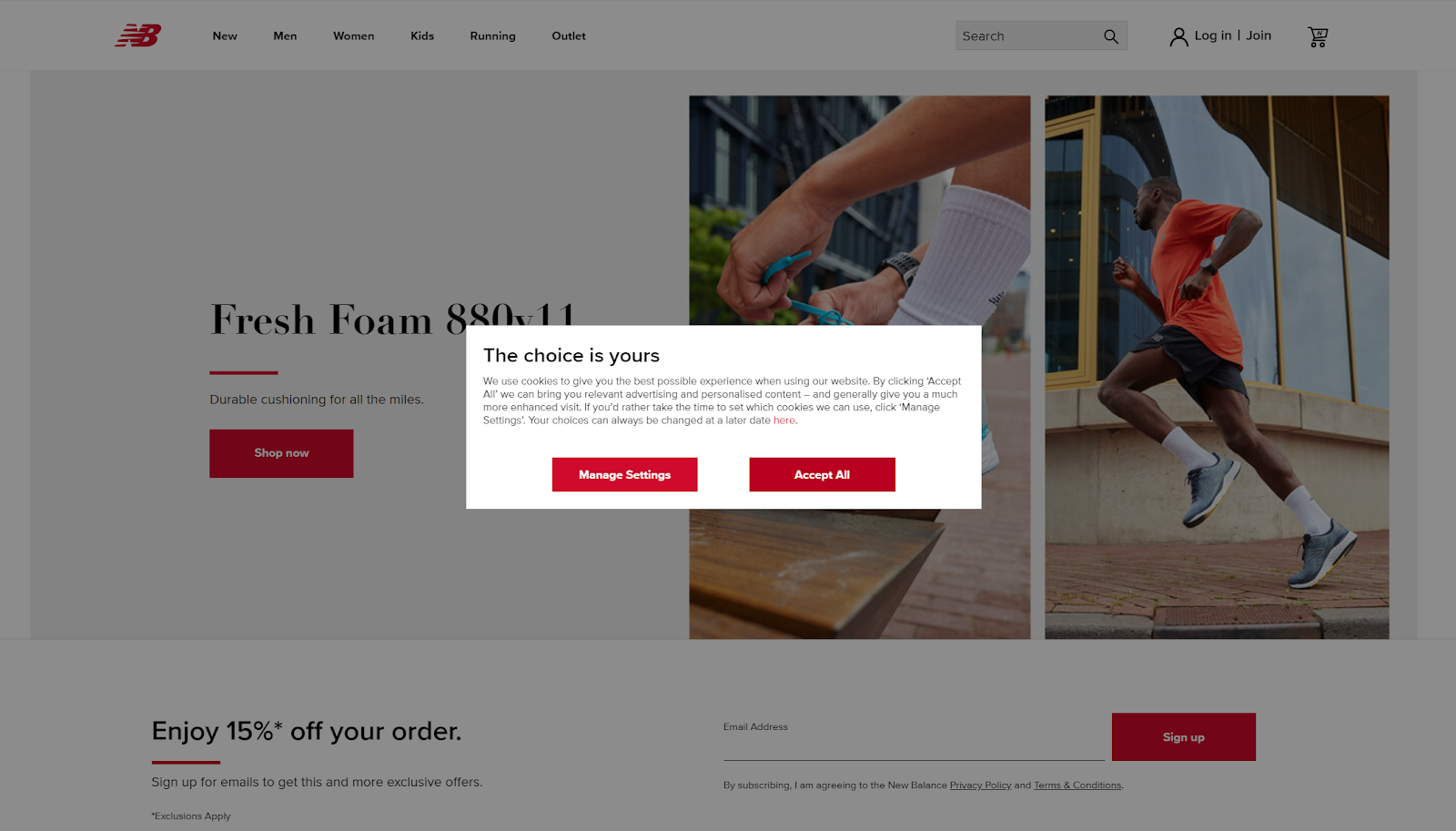
Whilst New Balance are direct in stating that the choice is ours.
- Consider the type of consent box format you’d like to employ
The automatic reaction of closing a consent box needs to be stopped - but how? You could consider a bottom- or top-of-the-screen banner, a notification in the corner or a pop-up box in the center of your screen. Each works well for different websites, so the key is testing which one best suits your audience.
- Bold CTA
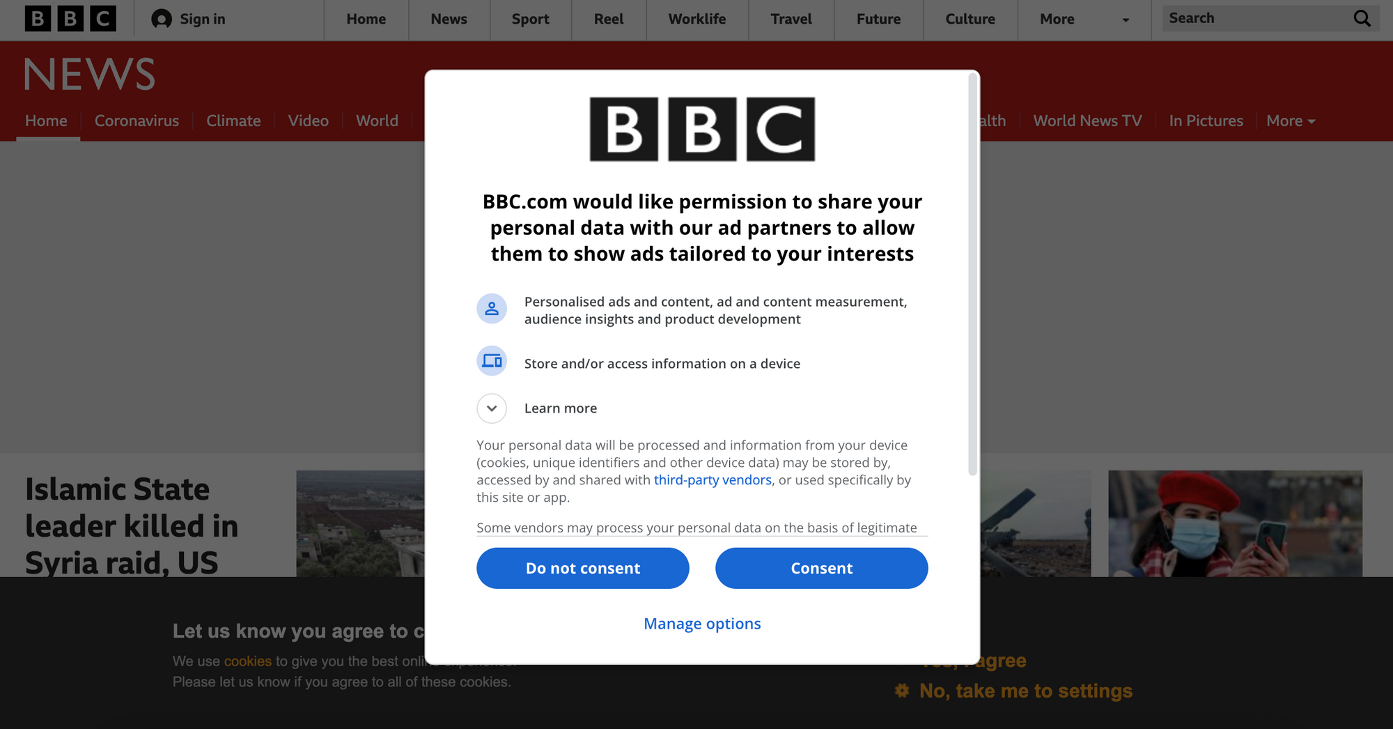
Call-to-actions should stand out compared to other text on the consent banner with the ‘Accept’ button being the most forefronted. However, it’s important to also put the ‘Refuse’ button on the same level as accept (this is actually the law in France!). You may assume that this will decrease consent rates, but it can often make the user more likely to trust your company and the way you employ cookies.
The BBC places the two options side by side, clearly offering users a choice instead of including only one button (Consent) and a link to 'manage options' alone.
Keep users informed
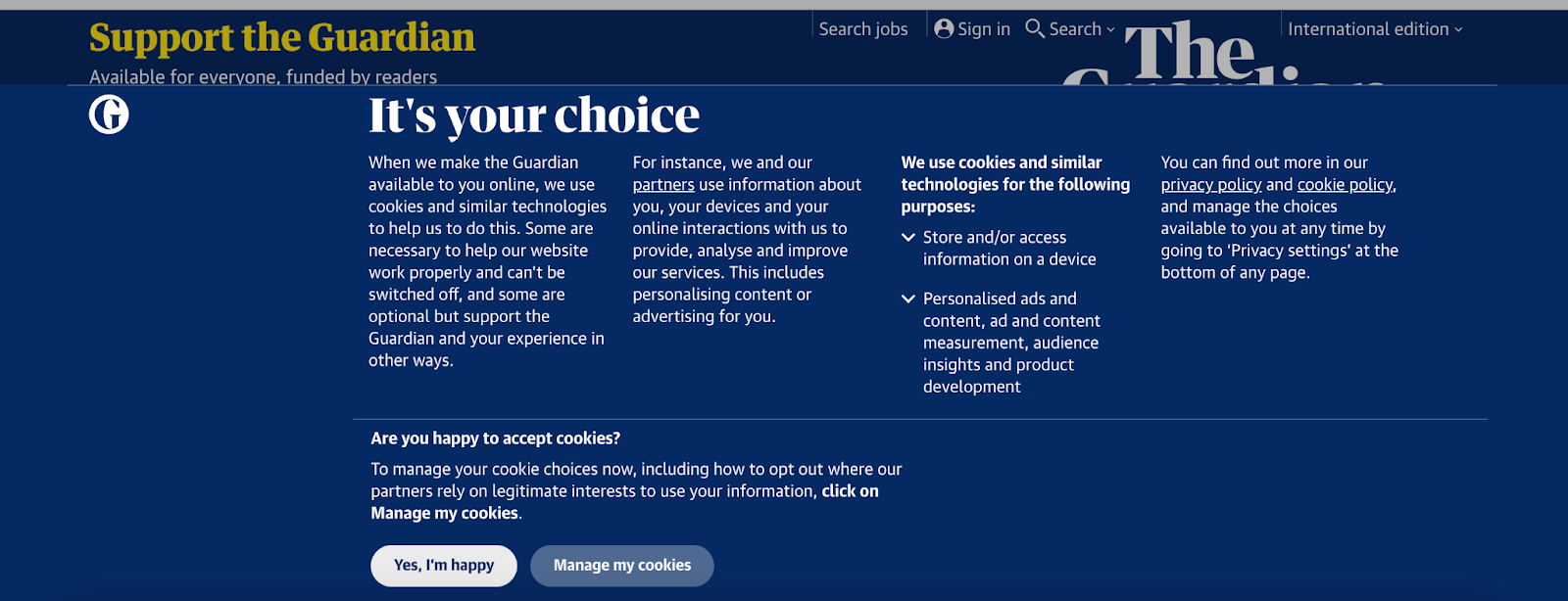
A lot of users are unaware of what cookies are, what they’re used for and how they benefit you, which doesn’t help them to make a well informed decision on whether to accept them or not.
The Guardian, for instance, starts with a stand-out heading followed by text explaining exactly how they use cookies and providing an honest explanation that accepting cookies is a way for users to support the Guardian without paying a penny.
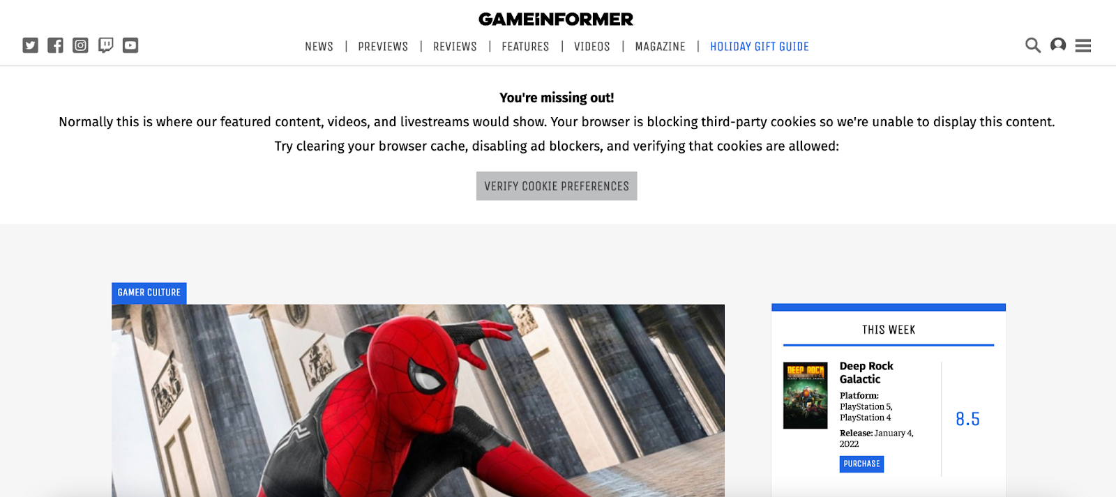
At the end of the day, accepting cookies can be established as part of a value exchange between you and your audience. By allowing you to use cookies and reap in the benefits that this provides, your users can access content freely (whilst still ‘paying’ for content). Game Informer does exactly this - a banner at the bottom of the screen asks for consent to collect cookies, whilst this other notice informs the user that declining cookies means they miss out on some of the publisher’s content.
Employ a cookie wall
A user arrives on your site and, despite your best efforts, declines cookies. This has big consequences for your strategy and business, so what can you do now to help them change their mind?
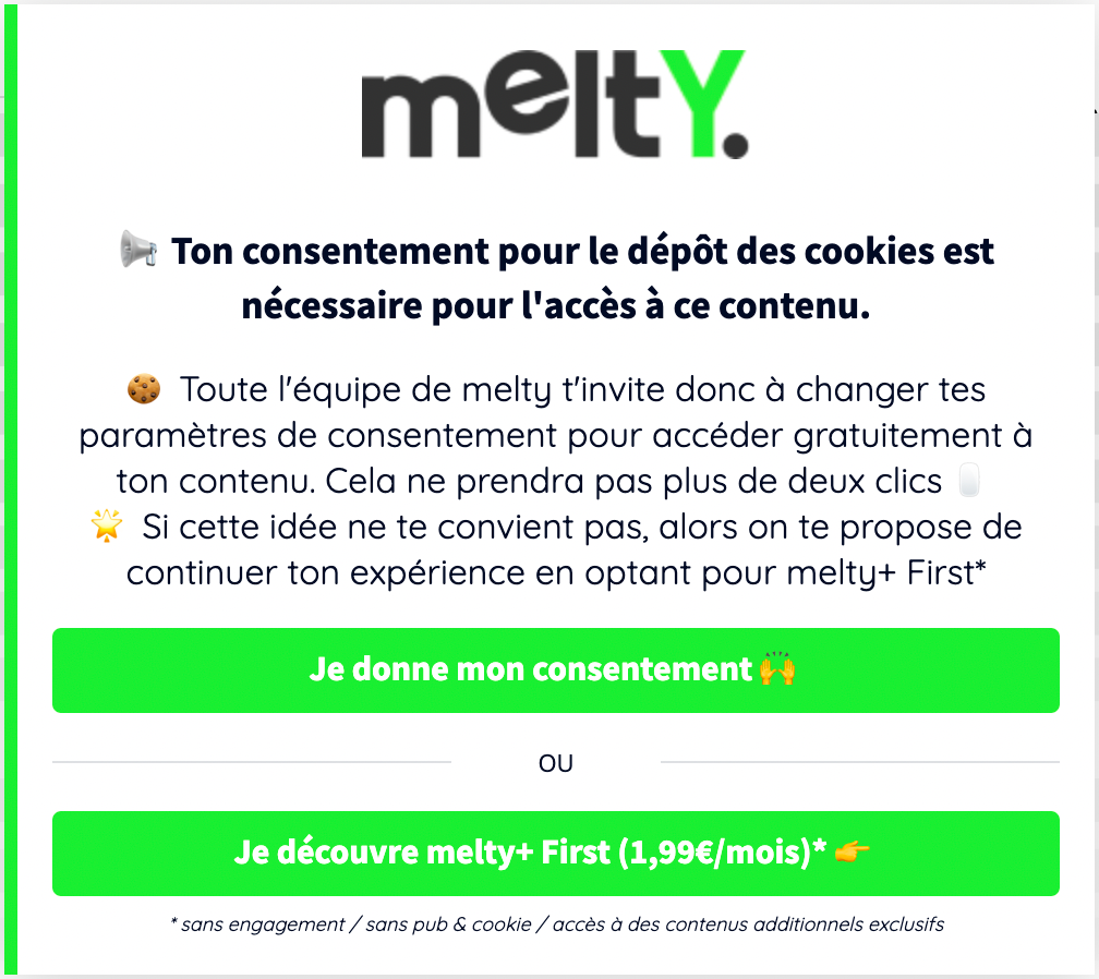
This is where a cookie wall comes in. Just like any other conversion wall, such as a paywall, a cookie wall appears at the content level, blocking the user and establishing a value exchange. In this case, the cookie wall provides users with a choice - in order to access content, you need to either accept cookies and tracking or provide us with another form of value, such as paying a one-time fee or subscribing.
Note, however, that this ‘alternative’ must be cookie-free for it to be legal.
Employing a cookie wall with alternative has become very popular in France following the new CNIL (a french body who regulates data privacy online) requirements that have made it obligatory for websites to put ‘reject’ at the same level as ‘accept’ on their cookie notice.
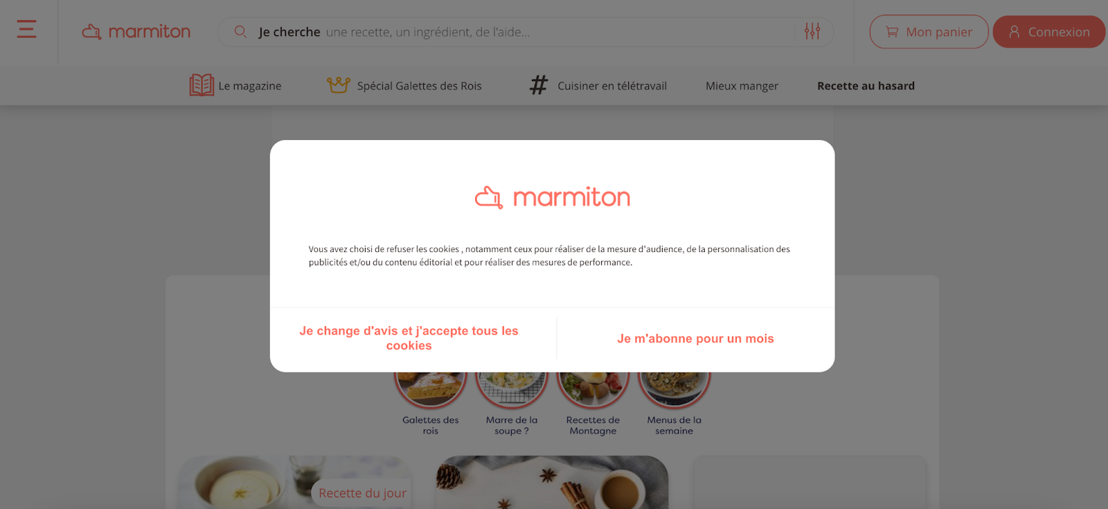
Melty, L’OBS and Marmiton, for instance, ask users to subscribe if they decline the use of cookies (or change their mind and give consent).

Prioritize a first-party data strategy
Aside from the above, there is a strategy that is hugely valuable with the nearing end to cookies and the decline in consent rates. Namely, collecting first-party data.
By prioritizing this strategy you’ll be able to understand your user’s behavior, track them across devices and sessions as well as increase ad-based monetization through targeting.
The best way to prioritize this strategy, and do so in a way that respects your user’s privacy, is to encourage them to create a free account on your website. From this, you gain value in two forms - you can collect the user’s ID (email) plus attributes to go along with this that you collect throughout their interaction with your site (demographic information, interests, etc). This can be achieved via a registration wall, blocking content and asking users to register in order to gain access.
All4, the online TV replay website of the British Channel 4, employs a registration wall that needs to be passed through before users can watch content. This not only benefits the content producer in allowing them to collect valuable first-party data, but it also improves the user experience through personalization and additional UX features, such as the ability to save content for later or resume a show where they left off.

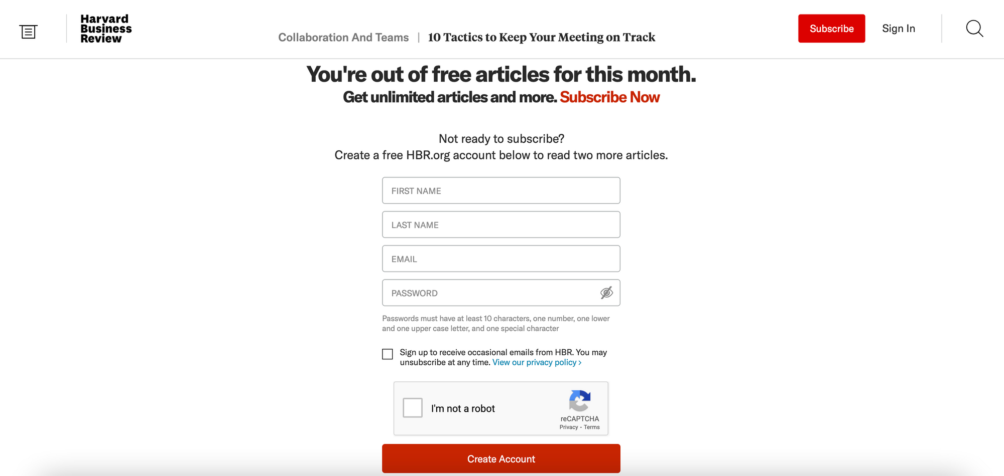
Harvard Business review employs a similar registration strategy but they use a metered model, meaning a reader has access to a limited number of articles before being blocked. They then allow the user to read a further 2 articles before then blocking them again with a paywall.
Registration therefore has multiple advantages for HBR - it not only allows them to prioritize a first-party data strategy and collect custom reader IDs, but it also increases user engagement, gradually leading them on a journey towards subscribing.
Other cookie and consent related content:


