

Registration has popularized over recent years as an effective strategy that benefits both readers and digital publishers. Whilst consumers get access to more content for free, gain additional value and build a personalized account space, publishers are able to boost ad revenue through data collection, increase engagement and propensity to subscribe as well as foster high retention rates through building strong relationships with users.
One of the most effective ways to convert anonymous users into members is through a registration wall whereby you establish a value exchange with your readers - content is blocked and users are asked to create a free account in order to gain access.
This article covers 6 essentials to building a high-performing registration wall, ensuring conversion optimization and enhancing user experience, to maximize the value of this membership strategy and achieve your revenue goals:
- Define a clear value proposition just as you would for a subscription offer
- Forefront the value that users will get in exchange for registration
- Reduce friction and only ask for the information you need
- Onboard your newly registered users just as you would for subscribers
- Maximize the value of registration to increase engagement
- Continuously monitor performance and optimize your registration wall
By implementing these essentials, you can create a seamless registration process that optimizes conversions and delivers an exceptional user experience.
✅Define a clear value proposition just as you would for a subscription offer
Your readers should understand why you are publishing content and why they should create a free account to access it.
🏆Best in class example: Pinterest

Pinterest’s value proposition goes further than “free access to content”, an incentive that many publishers rely solely on. Instead, they explain the value of this unlimited free access for users - it will enable them to access “the world’s best ideas”, positioning themselves as a source of inspiration. A good value proposition is essential for conversion optimization and a successful user experience.
✅Forefront the value that users will get in exchange for registration
Use clear and compelling language to communicate the benefits of registration, and make sure users understand what they will gain by signing up.
What benefits can you offer registered users?
- Ability to save content for later
- Follow topics and authors
- Join conversations (e.g. comment sections at the end of content)
- Be part of your community of readers (a feeling of belonging)
- Setup notifications and alerts
- Access ‘recently viewed’ content
- A lighter ad, or ad-free experience
- Exclusive content
- Access to your newsletter
🏆Best in class example: Reverso

The benefits listed directly on Reverso’s registration page increase the perceived value of registration and encourage users to sign up.
✅Reduce friction and streamline the registration process for a better user experience
Keep the number of clicks, typing and scrolling needed to a minimum with the goal of reducing friction and encouraging a user to continue through the funnel to registration. Make it as easy as possible for users to register by streamlining the registration process: avoid asking for unnecessary information.
Best practices:
- Consider offering social login options to simplify the account creation process
- Integrate funnel steps into the registration wall, such as form fields
- Collect minimal data, instead progressively profiling your users after registration
- Build a different registration journey for mobile devices, adapting to the smaller screen
🏆Best in class example: Sydney Morning Herald

Sydney Morning Herald allows users to sign up thanks to Google or Apple, which saves typing time and reduces friction.
🏆Best in class example: Channel 4 On Demand

Channel 4’s TV replay site, 4OD, only asks users to register with an email address and create a password.
✅Onboard your newly registered users just as you would for subscribers
Onboarding is often reserved for new subscribers, but leading your newly registered users through a similar process can prove hugely valuable for increasing engagement and ensuring they make the most of features you’re now providing them as a member.
🏆Best in class example: The South China Morning Post
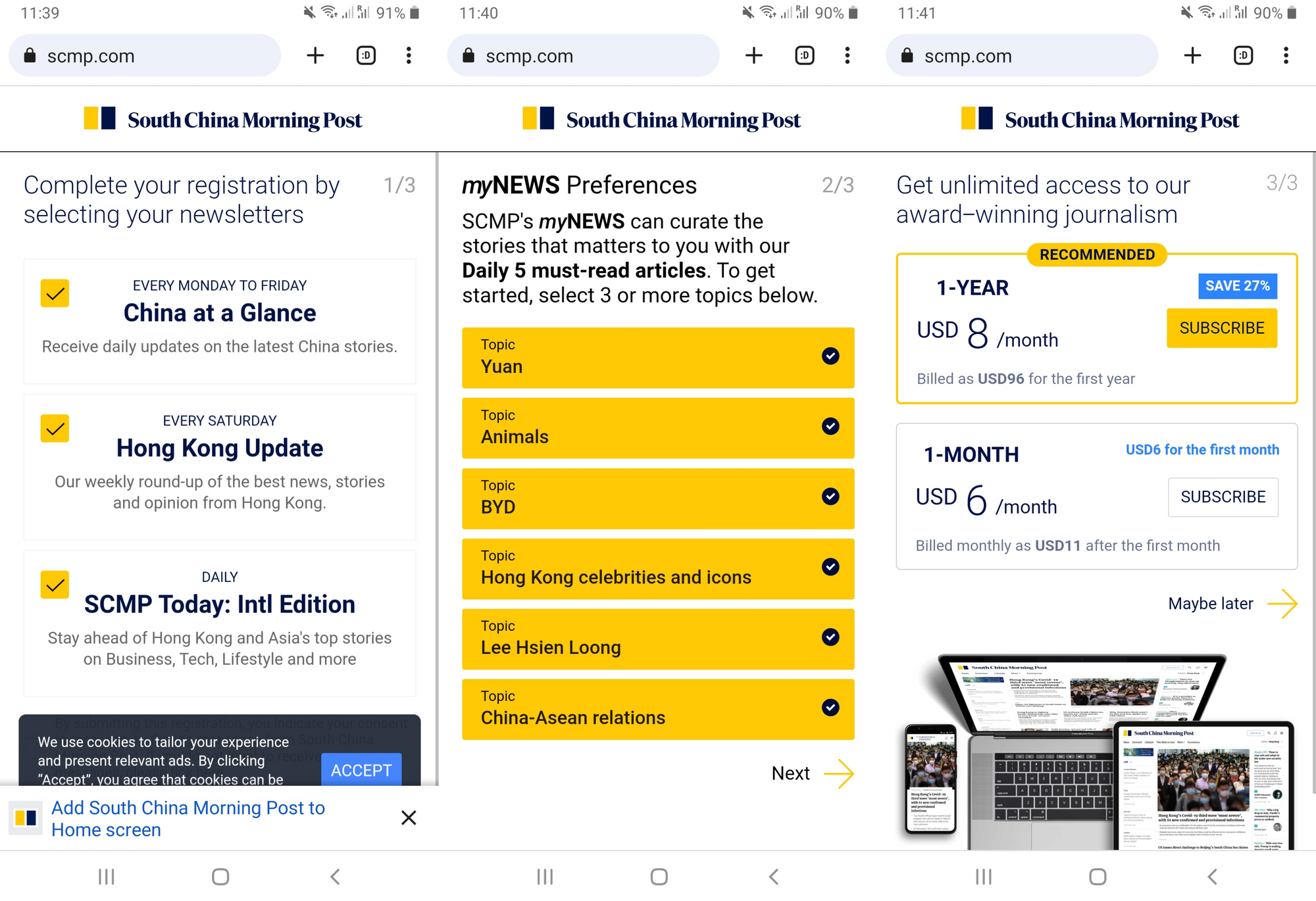
After registration, members on the SCMP are led through a 3-step onboarding process, encouraging them to sign up to their newsletters, follow authors or topics (as well as download the app) and consider paid subscription for unlimited access.
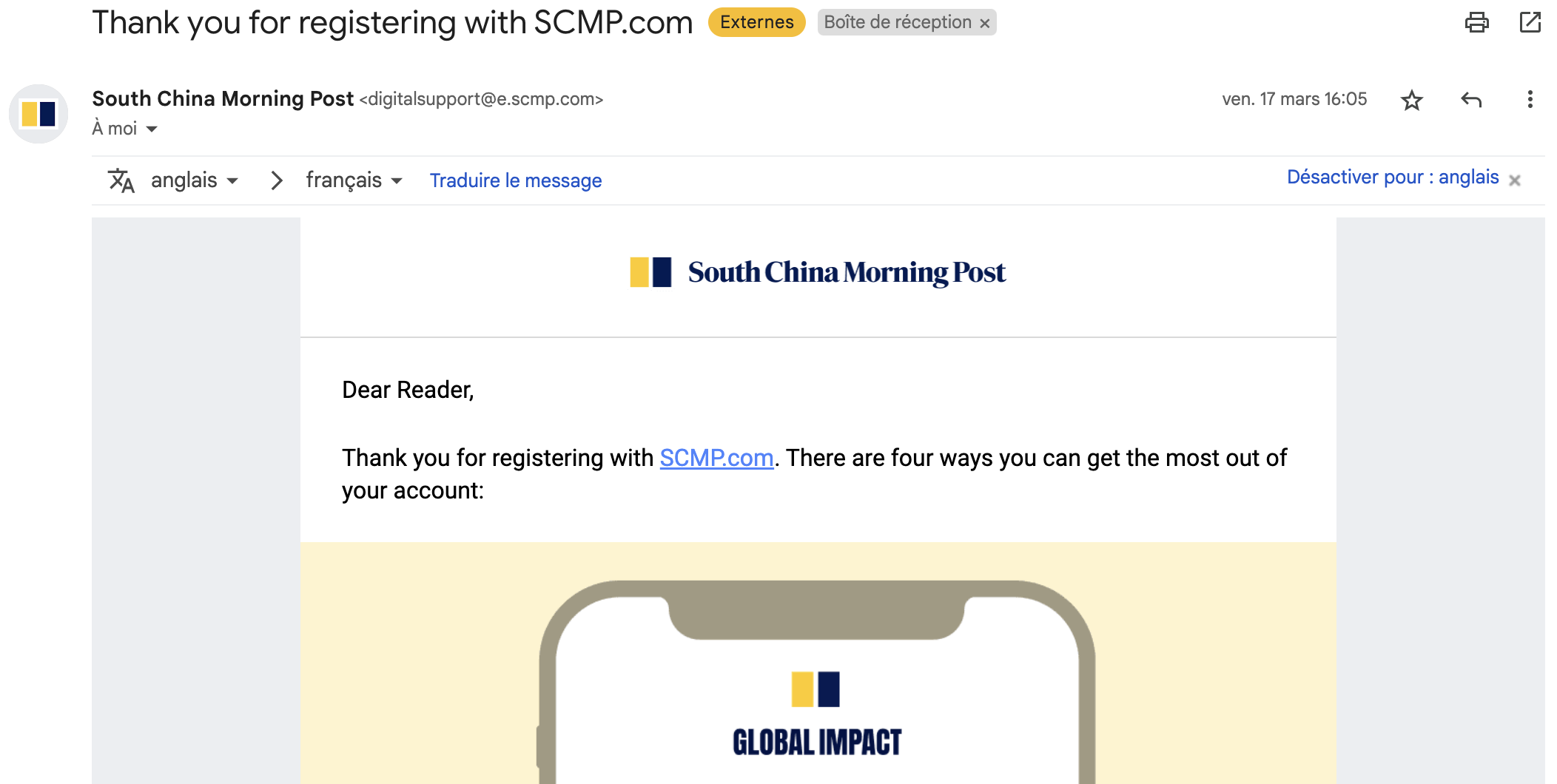
The South China Morning Post also sends out an email post-registration informing the user of 4 ways to make the most of their new account, supporting their onboarding efforts through an additional medium (email).
✅Maximize the value of registration through personalized content and newsletters for enhanced user experience
Registration provides you with a unique opportunity to engage with your audience. This can be done through personalized content, email newsletters, and other forms of communication to ensure best user experience that will make users come back to your site.
- Personalization: use the information collected during the registration process to personalize the user experience. For example, if you ask a user to provide their interests during registration, tailor content to their preferences.
- Newsletter: engage users through a regular newsletter to form habits and keep users coming back for more content
🏆Best in class example: The New York Times

The New York Times offers a variety of newsletters on different topics, such as politics, culture, and business. By allowing readers to select the newsletter that matches their interests, the content is naturally suited to the individual and will foster high levels of engagement and a good user experience. Newsletters help build a closer relationship between the reader and the publication and increase recency, frequency and volume of visits to the publisher's site.
✅Monitor performance and optimize the registration process through A/B testing for conversion optimization
Continuously monitor and optimize your registration process by analyzing user behavior and engagement metrics. Use this data to make informed decisions about how to improve the registration process and increase the value that it brings to your business (e.g. ad revenue, subscription, etc.).
One of the simplest, user-friendly optimization methods is A/B testing.
What elements of the registration wall can you test?
- Wording: Including the heading, value proposition points, CTA button wording
- Design: Such as the colors, CTA button placement
- Scenario: The user experience prior to registration, for instance employing a metered registration strategy (allowing access without account creation to a quota of articles) as well as the conversion journey post-registration
- Registration wall visibility: the position of the wall on an article - i.e. blocking just underneath the title or after a paragraph
Thanks to Poool’s Membership & Subscription Suite, you can set up, launch and manage your registration wall strategy with ease, creating personalized user scenarios as well as monitoring and optimizing the success of your strategy. Our Dashboard enables you to run A/B tests in minutes and to analyze results easily in the Dashboard’s statistics section.
Minutes is quite literally all it takes, you simply activate two scenarios within the same audience group and slide the dot to configure the audience distribution.

Here French publisher, Journal du Dimanche, tested two different colors on their wall designed for users on mobile devices, setting the audience distribution to 50:50.
Not yet a Poool client? We’d love to offer you a free demo of the Dashboard and a meeting with our consultancy team to discuss your current challenges, goals and how Poool can help you achieve them! Find a slot that suits you here.