We've all heard of (and been blocked by) paywalls online, but there's a new conversion strategy that's been growing in popularity over recent years - registration walls.
And it's pretty clear why. Registration walls allow for first-party data collection, support both subscription and ad revenue streams, create a more personalized user experience and a lot more. In fact, they're hugely valuable to publishers of all types of content and can provide a solution to the challenge of the cookieless future.
So which content publishers are employing a registration wall?
This article provides benchmark examples of some of the most successful registration walls employed around the world, with best practices and areas that perhaps need improvement.
Summary:
- What is a registration wall?
- What are the different types of registration wall?
- News publishers and magazines registration wall
- VOD and TV replay sites registration wall
- E-learning registration wall
- Brand's registration wall
🙋♂️ What is a registration wall?
A registration wall blocks content and asks or requires a user to create a free account on the publisher's website in order to get past.
Once a user has registered, the publisher will then be able to collect valuable data points, increase ad revenue through targeting and personalize the user's experience whilst helps increase engagement.
🙋♂️ What are the different types of registration wall?
Just like any conversion wall, there are 4 central types of registration wall, as well as an additional hybrid wall that combines registration and paywall.
- Hard registration wall
The toughest strategy where users are blocked completely from all content unless they create an account.
- Metered registration wall
These walls allow readers to access a limited number of articles before being blocked - for instance 2 articles for free and then the registration wall blocks the third article.
- Freemium registration wall
A freemium strategy means content is divided into free and 'premium', with free being open access to all users whilst 'premium' content is blocked by a wall and reserved for registered users. We say 'premium', however this content doesn't need to be paid for (i.e. via a subscription), it's simply for members-only.
- Dynamic registration wall
This is arguably the most effective wall as it adapts to the user based on their context or profile, such as their engagement level, location or device used. This is often used in the case of combining a registration and paywall strategy, where the less engaged users are led along a journey of registration followed by a paywall, allowing for content discovery and increased engagement. However, 'fan' users, who appear to have a higher propensity to subscribe, may be shown a paywall immediately.
Best Registration Walls from News Publishers and Magazines
The New York Times
Hard registration wall and paywall: As soon as a user clicks on an article to read, they're blocked by a 'sticky' registration wall that doesn't allow for scrolling.
The NYT strategy is to first present readers with a registration wall before later asking them to subscribe. This allows the publisher to achieve multiple goals simultaneously:
- Collect key data points, including the all important email address of their users
- Increase engagement through allowing for content discovery as well as leading new registrants through an onboarding journey of encouraging newsletter sign up and the downloading of their app
- Personalized user experience post-registration
- Targeted advertising meaning higher ARPU
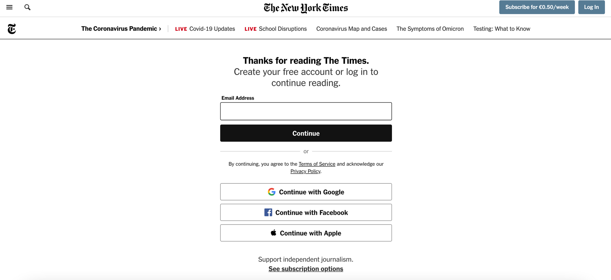
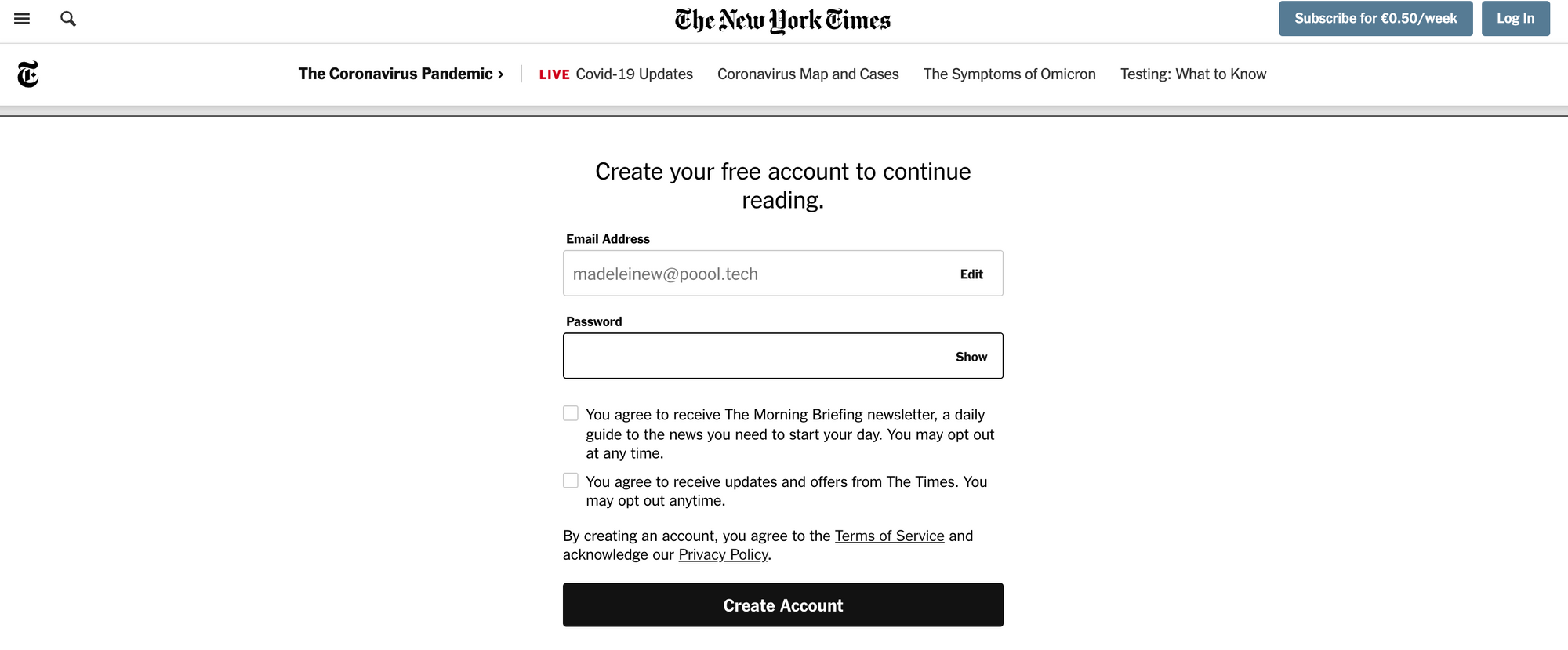
We're only asked to provide an email address and password, making for a simple conversion funnel.
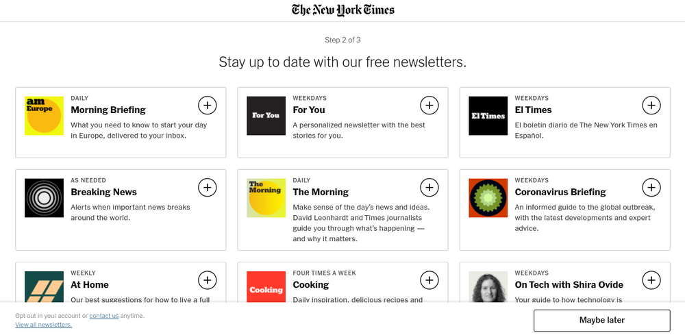
There are then 3 onboarding steps to increase engagement, encouraging the newly registered user to consume more content on a regular basis. This helps to make the user more likely to subscribe in the future as they see value in the New York Times' content.
Analysis of the NYT registration wall:
✅ Users can register with ease by using an existing social account, including Google, Facebook or Apple, facilitating the conversion process
✅ Registration allows for more content discovery: users can see what the publisher has to offer without needing to pay whilst the NYT can benefit in a variety of ways and encourage increased engagement to lead users towards subscription
❌ We aren't even able to access one article without being blocked by the registration wall (although this is free to pass through)
What if a user bypasses your registration wall???
Don't fret, there are ways to prevent this! Discover the wall blocking methods, how they influence bypassing and what else you need to consider in our blog post:

Harvard Business Review
Metered registration wall and paywall: Another hybrid wall model where readers are able to access 2 articles freely before being blocked by the registration wall. After creating an account, users can read 2 more articles before being blocked again, this time by a paywall.
For the Harvard Business review, a metered strategy is employed to allow for content discovery, gradually leading the user through an engagement journey. This proves hugely effective for increasing propensity to subscribe.
We're informed of how many articles we have left via a banner at the bottom of the screen. This helps to reduce frustration when the wall appears.
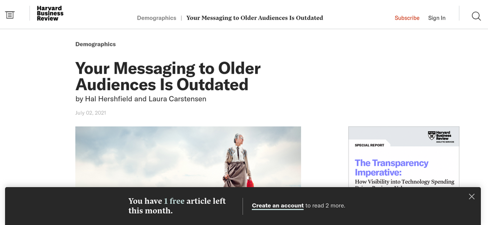
Subscription is continuously promoted as the way to have unlimited access to articles, but we're also given the option of creating a free account. The form is integrated into the wall itself, reducing steps in the conversion funnel.
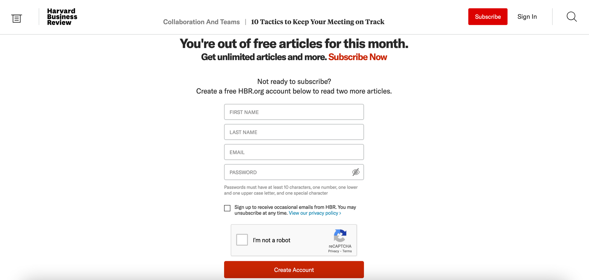
After another 2 articles (again with a banner at the bottom informing us of how many articles we have left) we're blocked with a personalized paywall.

It's also important to comment here on the onboarding journey that HBR lead their users through. For example, we're sent the below email the day after registering - it explains what we now have access to as a HBR member, encouraging us to make the most of our account.
This is a brilliant technique by the publisher to increase engagement and prove the value that they offer to users.

Analysis of the Harvard Business Review registration wall:
✅ Increased engagement through registration and an effective onboarding journey to lead users to subscribe in the future
✅ The banner reduces frustration by keeping the user informed of the HBR strategy
✅ Registration means a better user experience for members, including personalization, ability to follow topics, save content for later, access podcasts as well as sign up to newsletters (note that this is very important - you have to offer some value in exchange for registering)
❌ It's perhaps frustrating to create an account and then be blocked again 2 articles later, however this resets after a month and it's definitely less frustrating than a hard paywall
The Independent
Freemium/metered registration wall: It's slightly unclear what their strategy is exactly but a reader is blocked by an optional registration wall on their first article. If they choose not to create an account, they'll be blocked a few articles later with a hard registration wall (metered strategy). Although this experience differed slightly after a few attempts so perhaps the publisher also divides content into free and premium.
The British publisher, The Independent, takes an interesting approach to a registration strategy, blocking users first with an optional wall and then an fully blocking one.
This first wall includes the form fields making for a very easy registration, however they do ask for more information than the NYT for example. Interestingly, we can pass through the wall without creating an account simply by clicking 'I'll try later'.

The second wall is fully blocking and is a lot more persuasive, including information about what value we get in exchange for registering as well as emphasizing that it's free to create an account.
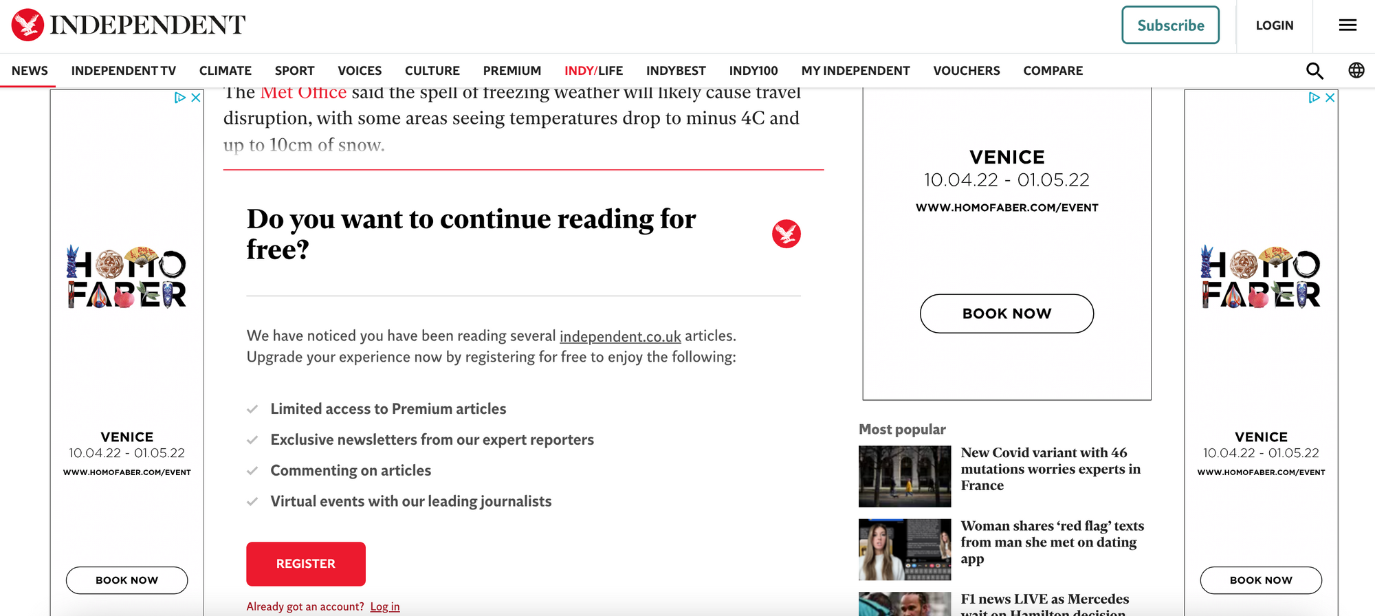
Analysis of The Independent registration wall:
✅ Optional wall allows for content discovery before the fully blocking registration wall
✅ The first wall reduces steps in the conversion process by including form fields in the wall itself, whilst the second wall clearly explains The Independent's value proposition and benefits included in registration
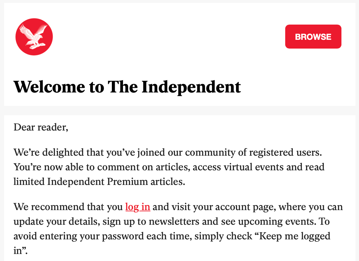
❌ After registering, we're sent an email confirming our account creation but, despite having provided our name, there's no personalization at all. This is a small detail that can make the reader feel a lot more valued as an individual and help to get the reader-media relationship off to a strong start
Boursier.com
Metered registration wall: Users are offered 4 articles for free before being blocked by the registration wall
Boursier, a French publisher covering mainly finance, business and political news, employs a very transparent strategy, informing users of how many free articles they have remaining via a banner at the bottom of the screen.
The banner explains how the publisher is offering us 4 free articles this month but that we can create a free account or sign in to access all content freely.
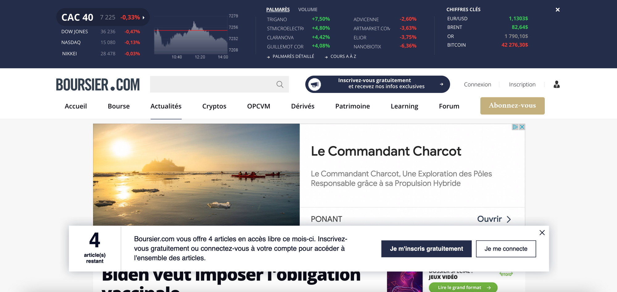
After these free articles, we're blocked completely on the article level with a registration wall.

Analysis of Boursier's registration wall:
✅ Strategy communicated very clearly with their audience, helping to reduce frustration when the user does eventually get blocked by the wall (they'll have been expecting it)
✅ Metered model allows for content discovery
❌ Perhaps Boursier could inform users of some of the other benefits of registering in order to help persuade them to partake in the value exchange
Did you know Boursier employs a registration wall with Poool?
The publisher has been able to implement their strategy, design the registration wall and user journey as well as AB variables, analyze performance and a lot more in the Poool Dashboard without the need for a single tech support! Total marketing autonomy!
Discover 10 reasons why Poool's solution will help you increase your ARPU just here:

Already convinced or want to find out more, as well as receive a free ROI calculation?
Book a demoRTL INFO
Optional registration wall: an interesting strategy where users are blocked by a registration wall but have the option of clicking 'later' (plus tard) and accessing the content without creating an account.
RTL INFO have significantly reduced the risks involved in blocking content with a wall by making their registration wall optional.
However, they do highlight that account creation is free and that it supports RTL in providing clear and regional journalism.

Analysis of RTL's registration wall
✅ Clear value proposition and bold CTA button
✅ Optional wall reduces the risks involved in blocking content with a wall
❌ However, this doesn't create much frustration for readers, meaning they could simply continue to click 'later'
Best Registration Walls from VOD and TV Replay Sites
ALL4
Hard registration wall: We're able to browse content freely, being blocked at the point of clicking play on a show or film.
All4 is the online replay website for the British Channel 4 who allow visitors to watch content for free after creating an account. They do offer a premium experience that has the benefit of being ad-free, however users are never presented with a paywall.
The registration wall is only presented after a user clicks play on the content itself. This increases the likelihood of conversion as the user has already been persuaded to watch the video.
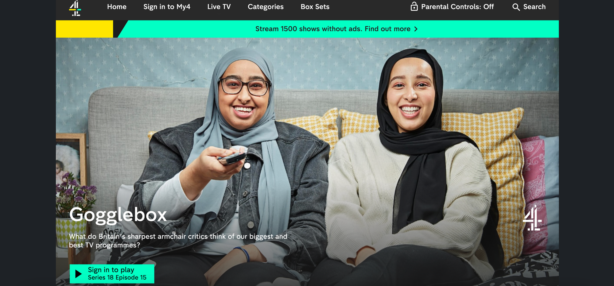
The play button clearly informs us that we have to sign in to play this content. By clicking this, the registration wall appears on the same page, requiring our email and password.

Once registered we're able to save content for later, access videos we've watched in the past, resume content where we left off and get personalized recommendations.
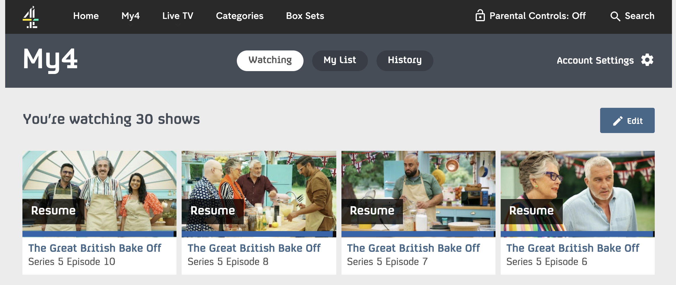
Analysis of All4's registration wall:
✅ Registration wall is placed after content discovery to increase conversion rates
✅ ALL4 make sure to provide personalization benefits for their registrants, ensuring there is a clear value exchange
❌ They don't tell us about the value in registration prior to creating the account. I.e. they don't communicate their value proposition very well
MYTF1
Hard registration wall: Users are able to browse all content before being blocked after clicking on play, however we aren't actually warned that we'll need to create an account or sign in to be able to watch.
The French TV replay website employs a hard registration wall meaning that all content is unaccessible without a free account.
TF1 do also offer premium access to content which is of a higher quality and ad-free, however users are never blocked by a paywall.

It's only upon clicking play that we're informed that we have to log in or create an account in order to access content.

After having filled out the registration form and confirming our email via a one-time link, we're presented with this page. At this stage, we have to click on 'Continue to MyTF1' which takes us back to the homepage. This is a pretty frustrating part of their conversion funnel because we registered in order to access a specific content and the publisher hasn't even taken us back to this content.
It's a small point but a good first impression goes a long way in your relationship with users.

Analysis of MYTF1's registration wall:
✅ Allows users to discover what content the website offers before registering
❌ We're never actually informed of what value they offer to registered users except that we'll be able to watch the content we're trying to access
❌ TF1 don't send newly registered users back to the content they were originally trying to access, which can be quite frustrating
Interested in finding out more about conversion strategies for VOD, video streaming and TV-replay sites? Check out our dedicated article on the blog:

Best Registration Walls from Social Media Platforms
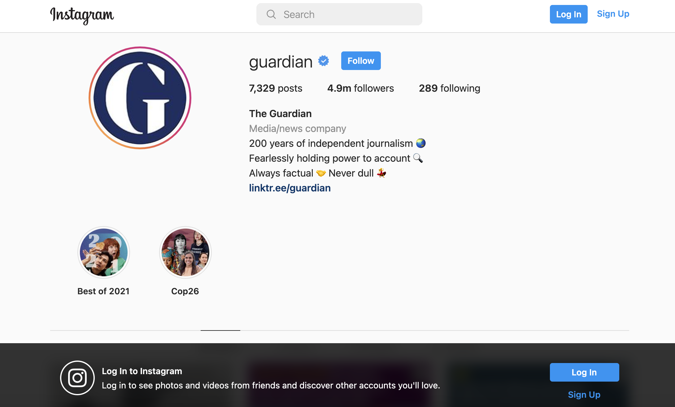
Hard(ish) registration wall: Although we're able to have a little scroll of Instagram accounts, we can only access the last dozen posts and aren't able to read the caption nor click on the image to enlarge it.
Social media platforms are interesting to analyze as they're often visited only by those who wish to create an account and post their own photos/follow friends or by anyone who already has an account.
For users without an account, the registration wall blocks them at the point of clicking on an image. the banner at the bottom of the screen makes logging in or signing up very simple.
This registration wall pop up appears once we click on an image. If we don't yet have an account, we have to click on 'Sign up'.
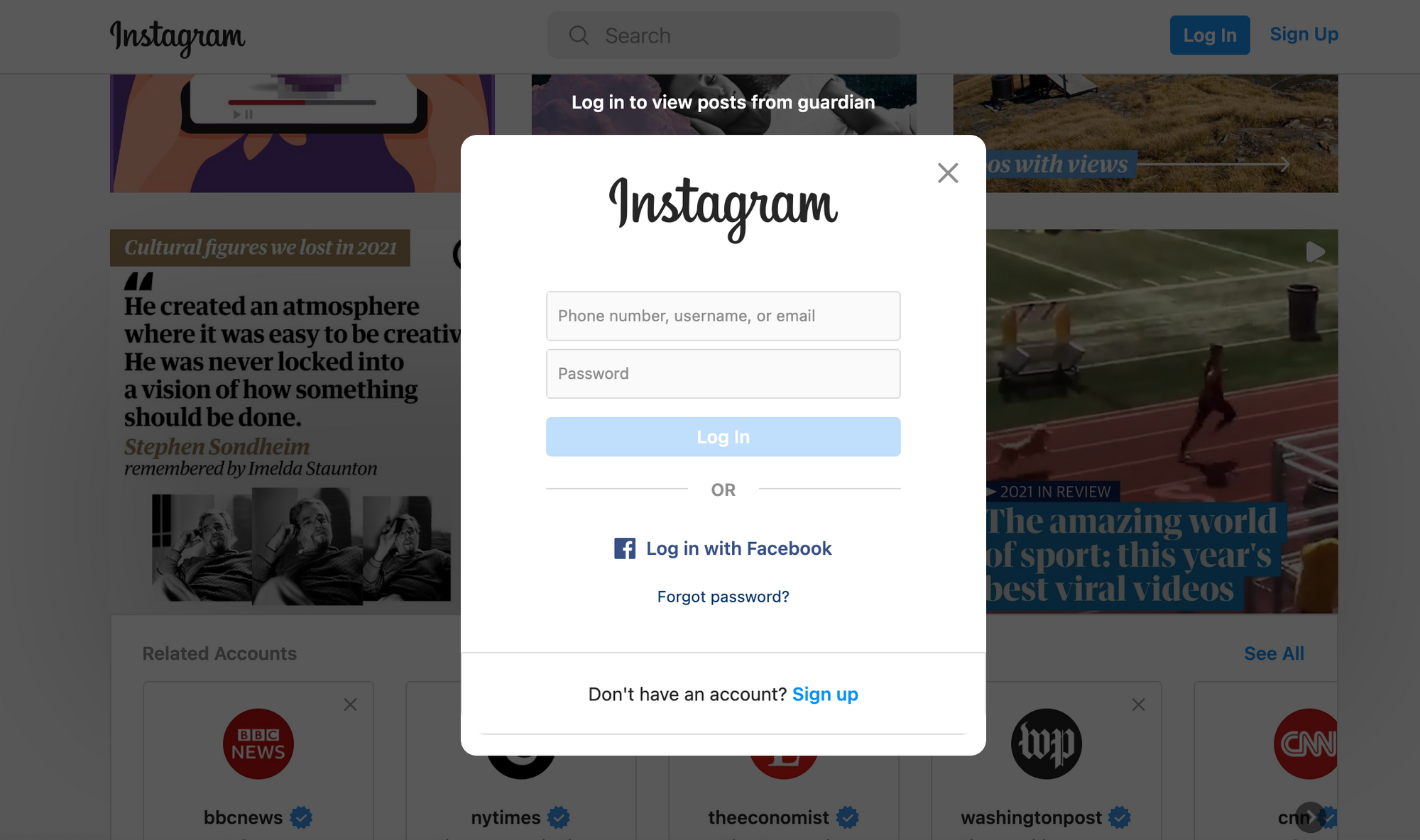
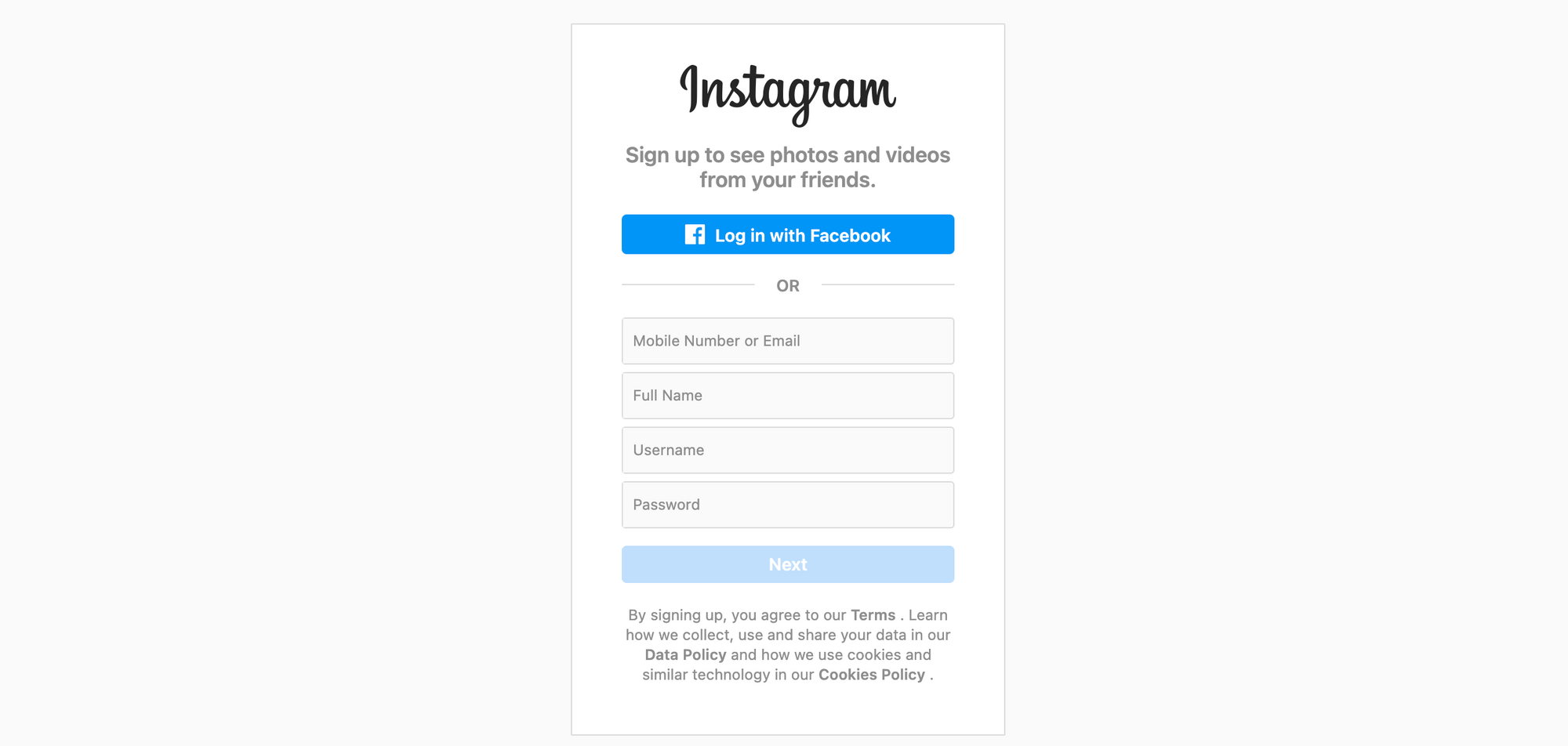
Analysis of Instagram's registration wall:
✅ Limited content discover despite the hard paywall strategy and clear value proposition, personalized based on the account that we're trying to access (here, The Guardian)
✅ Ability to create an account with an existing Facebook account
❌ Perhaps more clicks are required than necessary, making for a longer conversion funnel
Hard (ish) registration wall: We arrive on the website and try to scroll down to view more images but this blocks us with a registration wall
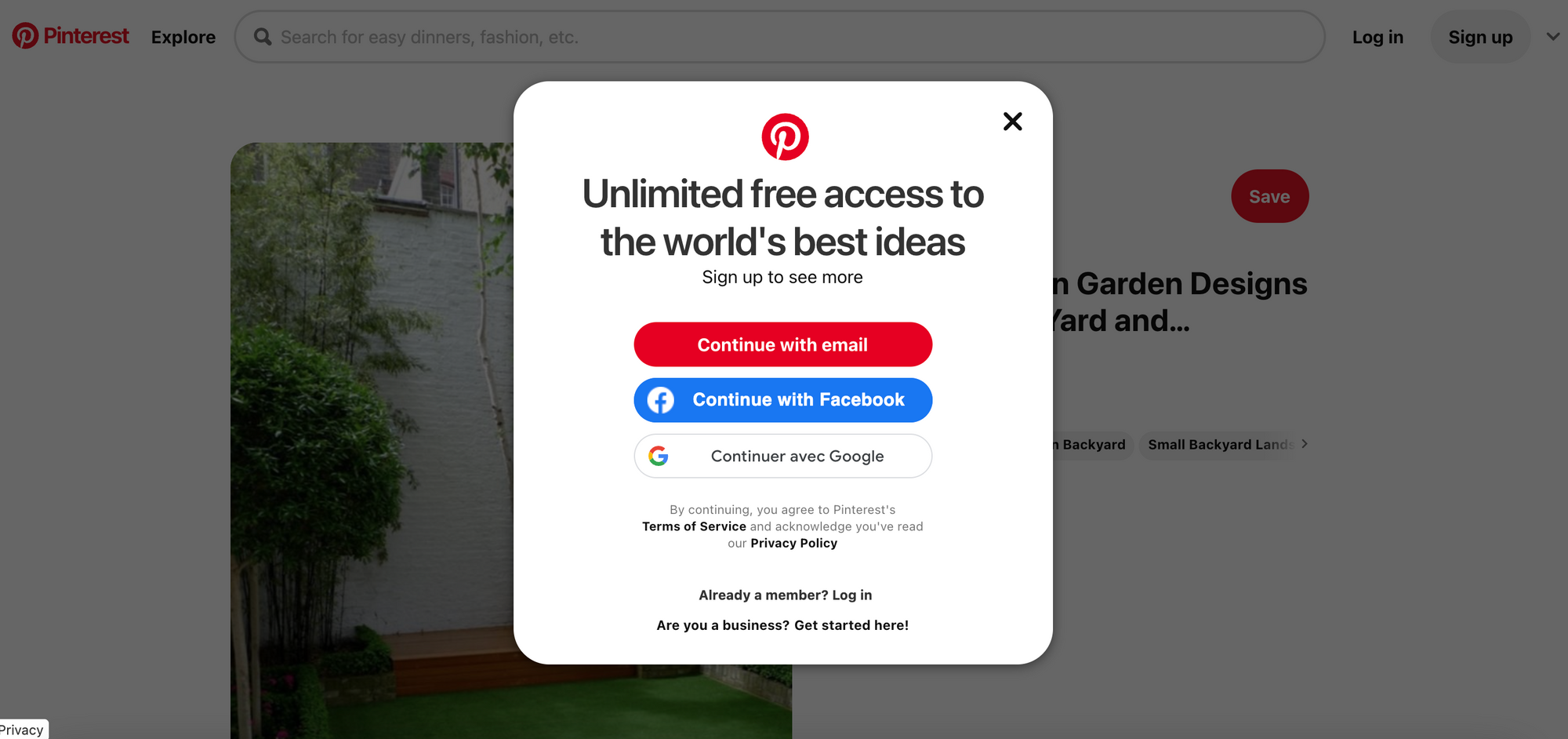
The Pinterest registration wall depends on how we access the website. On the landing page of Pinterest itself, we're presented with some images and are blocked by a wall if we try to view more.

Whereas, if we find a specific image that we want to view, we're able to access it freely but are blocked by this registration wall if we try to access more content or make use of the UX features (such as saving content for later).
We can close this pop-up but it just reappears soon after.
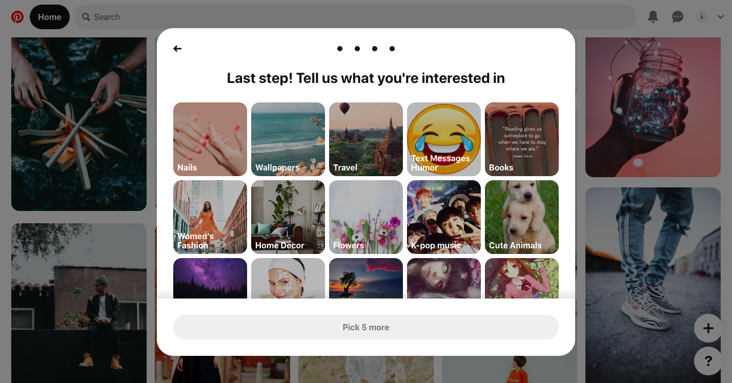
Interestingly, as part of the registration process, we're asked about the type of content that we're interested in. This onboarding allows Pinterest to show us content that we're likely to find valuable from day 1 of being a member, helping to increase engagement.
Analysis of Pinterest's registration wall:
✅ Clear value proposition and their wall allows for content discover
✅ Easy sign up with existing social media accounts (Facebook or Google)
✅ Onboarding process that fosters engagement and helps the user see value in Pinterest's content
❌ Pinterest don't outline some of the additional features and benefits of registering, except that it's free and we can have unlimited access. For example, they could tell us about the ability to save content or follow accounts.
Best Registration Walls from E-learning
Busuu
Hard registration wall: No content can be accessed without an account. The registration wall is placed directly on the landing page.
For this language learning website, anyone who wishes to try out their content needs to create a free account first. This allows them to benefit from first-party data collection and information about user behavior without the user needing to pay directly.
It's also extremely beneficial for e-learning sites to require registration in order to personalize a user's account and save information about what courses they'd already completed.
The landing page doesn't appear like a normal registration wall but instead asks us to select the language we want to learn.

Note that we haven't yet been told that it's free to register... this is perhaps an important point to highlight to encourage click throughs.
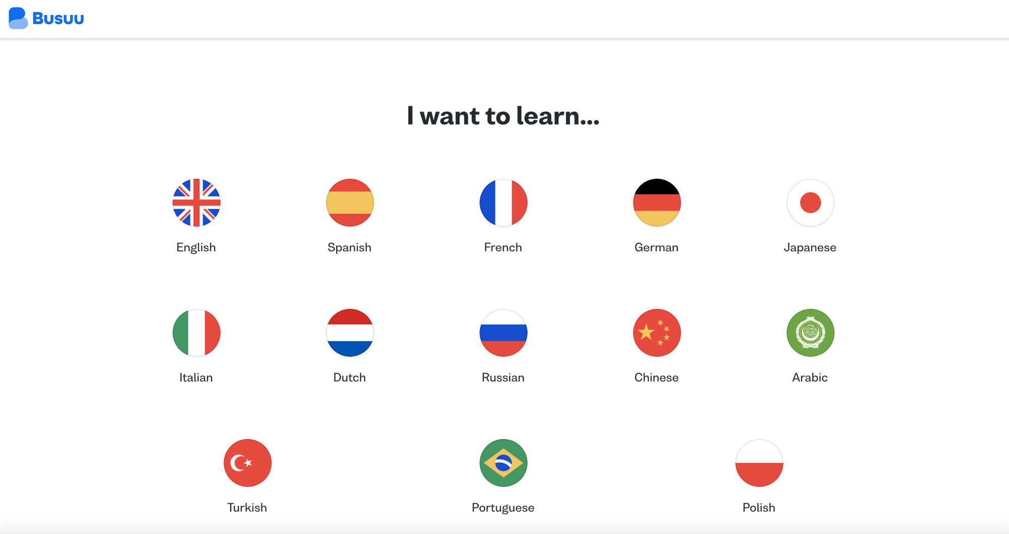
We then come to the registration form which seems to be the main wall. Cleverly, since they've already asked us which language we want to learn, the wall is personalized based on our choice. The value proposition is clear but still nothing about cost.
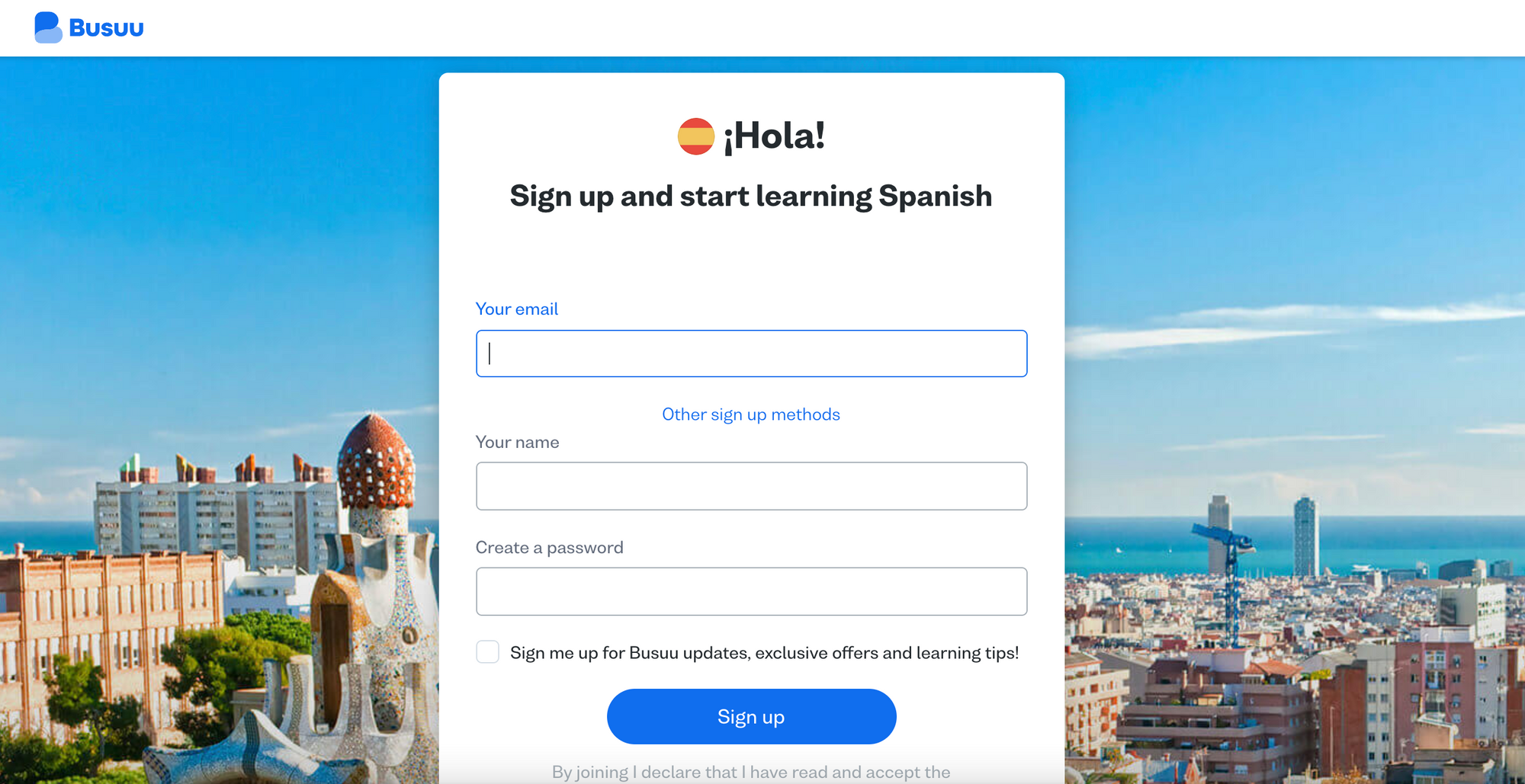
Analysis of Busuu's registration wall:
✅ 'Interactive' wall which asks for data straight away from the user, discovering which language they want to learn and personalizing the wall accordingly
✅ Clear value proposition
❌ No mention of cost of registering
❌ Lack of content discovery available
EdX
Hard registration wall: After choosing which course we'd like to join, we're required to sign in or create a free account in order to get started
Although employing a hard registration wall strategy, users are able to browse courses freely, discovering all the content that they offer on a wide range of subjects.
By clicking 'Enroll', we're required to register.
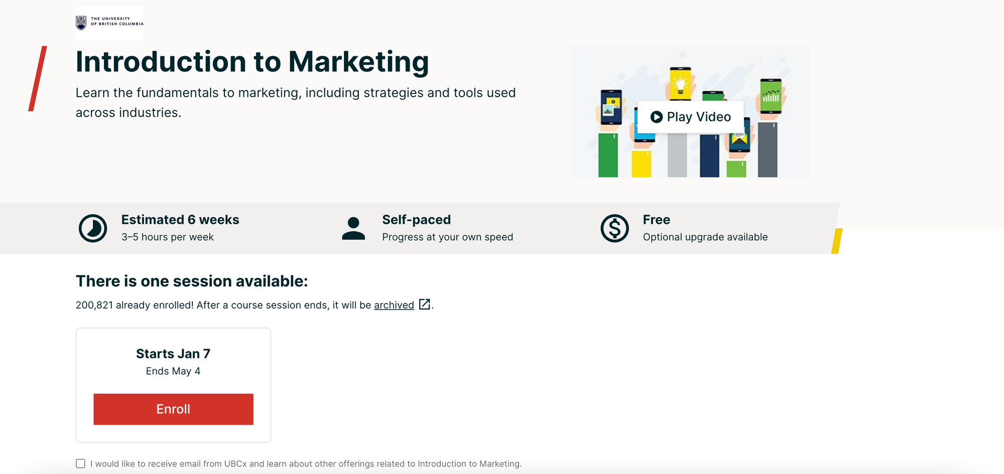
The wall itself includes the whole registration form, reducing steps in the funnel and making the process a lot simpler for users.

Note that edX do have some paid courses on offer, but all free content is blocked by a registration wall. For each course, the publisher clearly states whether it is free to participate or not.
Analysis of edX's registration wall:
✅ The publisher allows for content discovery so that users can see the value in their content before registering
✅ The registration form is integrated into the wall to facilitate the conversion funnel
✅ Once registered we can save courses, resume where we left off and be presented with personalized recommendations
❌ ...however they don't explain this value to users prior to registering, which is perhaps a missed opportunity to help conversion rates and present the edX value proposition
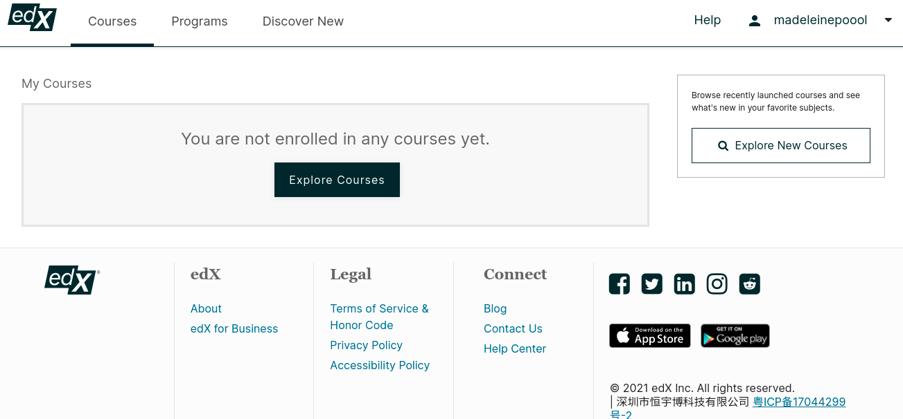
Discover more about registration and paywalls for e-learning sites and online courses in our other blog post:

Best Registration Walls from Brands
We're seeing increasingly more brands putting registration and data walls in place to increase the value of their blogs and content production.
Even Poool utilises our own solution to integrate a data wall into our content:
- An optional newsletter wall on articles to collect data for marketing campaigns and increase engagement through the monthly newsletter (image on the right)
- A data wall on white papers where a user has to fill out the form fields to unlock the content and be sent a PDF version via email (on the left)
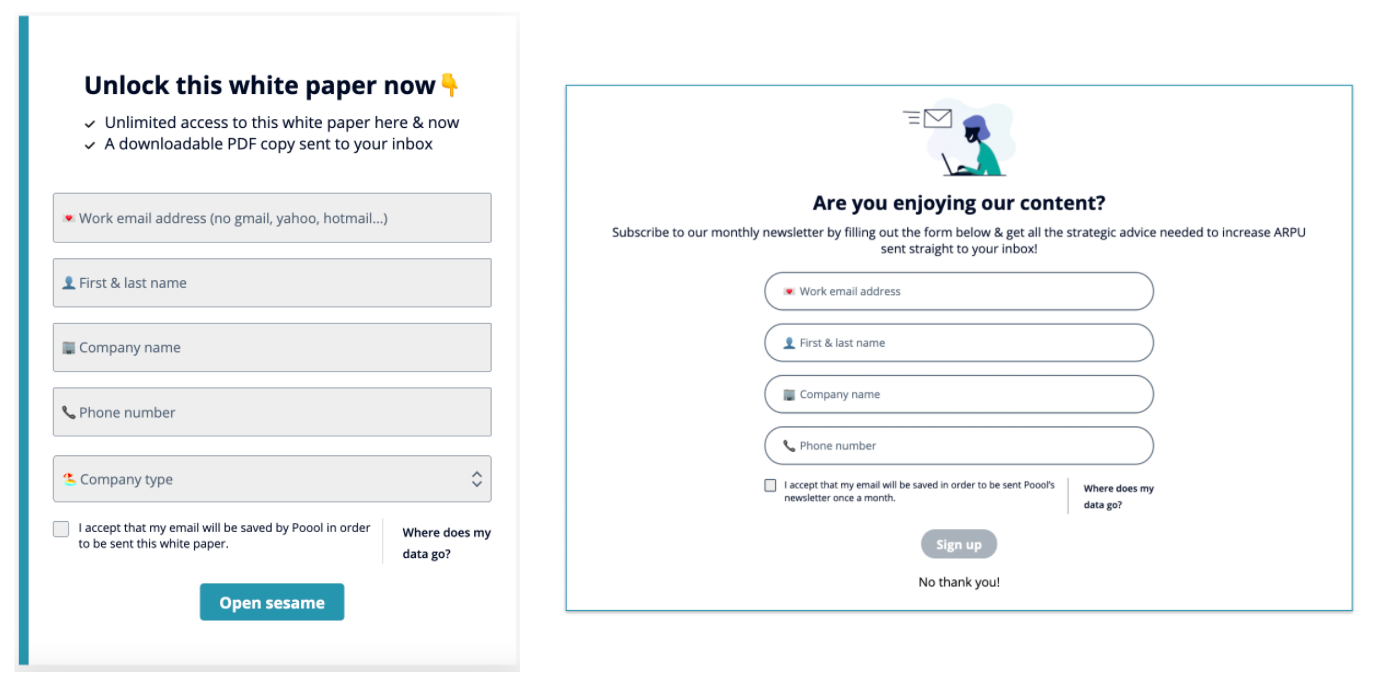
✅ Increase engagement through habit forming content (the newsletter)
✅ Collect data to inform our strategy and marketing campaigns
✅ Walls designed in the Poool Dashboard without a single line of code and continuously modified (in minutes) to avoid habituation
✅ Optional wall (with 'No thank you' option at the bottom) reduces risks of integrating a wall to both traffic and SEO
In need of a simple but effective solution to get your registration wall strategy on the road to success? Well, Poool's here for you!
Our Dashboard puts your marketing team back in control to drive your strategy forever, without ever having to call on the tech team for support. Segment your audience, build user journeys for each using our ready-made but fully personalizable wall options, carry out endless A/B tests with ease, analyze results and make changes in minutes.
👉 Tech integration in a matter of days
👉 Launch in less than a month
👉 ROI in under 90 days
Interested in finding out how Poool can help you become data-driven, solve the challenge of the cookieless future and increase your ARPU? Book a free demo and discover the Dashboard for yourself!
Book a demo

