To wrap it up:
- There are significantly more visits to content sites on mobiles, but very few conversions
- Many might only think of the conversion funnel itself as being the problem here, but what about the dichotomy between the context of content consumption on mobile vs on desktop?
- Employing a different engagement and conversion strategy according to device is the best way to maximize the value of mobile users
Prefer to read in the language of Molière? 🇫🇷 C'est par ici
The data is clear.
There are significantly more visits to content sites on mobile (78.2%) compared to desktop (15.9%).
However, there are far more conversions made on desktop (74.2%) than on mobile (11.3%).
The question then turns to why this disparity exists…
Is it about the journey to converting?
Or more about the paywall alone?
But, what’s often overlooked is the context of accessing content itself - how does the context differ per device and what implications does this have on conversion rates?
Let’s investigate.
The context of consuming content on mobile vs desktop
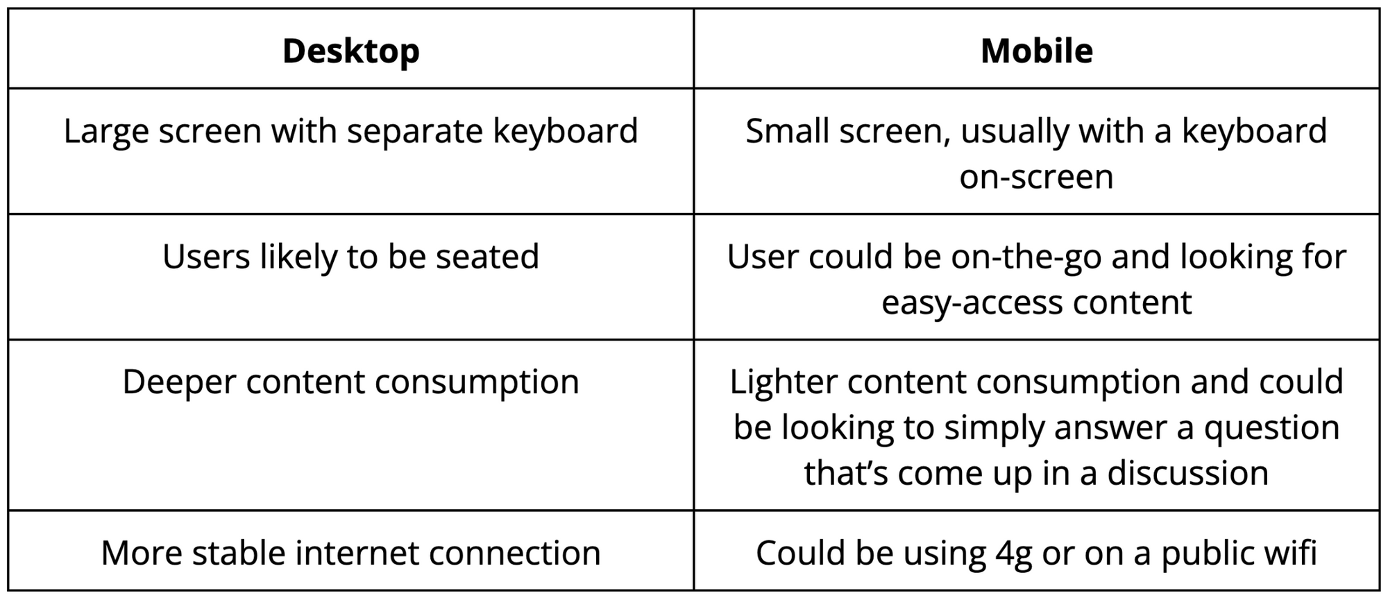
When we think about accessing content on mobile, 3 main situations come to mind:
- We’re on-the-go, such as traveling on public transport, and are looking for distractions to help pass the time
- We’re on social media, such as Twitter, and clicked on a link that brought us to a content
- We’re involved in a discussion or saw something that incited interest in a topic - for instance, we’re talking about a recent news story and want to find some specific information to complete the discussion
Each of these have implications on the user’s expectations for the user experience as well as how they’ll act on your content.
- Being on-the-go suggests light reading, perhaps flicking from content to content, with more interest in shorter pieces of content that can be consumed quickly
- Links from social media have obviously caught the user’s attention, but there’s an expectation that this content will be open and free to read as it’s a one-off click and they were already enticed by the title
- Content that a user wants to access based on a discussion-point is often a very specific search and not something they’d want to read on a regular basis - it’s a one-off, quick-win read
The common trend?
None of these situations involve enough engagement for the user to want to convert when faced with a paywall, perhaps explaining the low conversion rates on mobile.
Which makes us question why so many publishers are employing the same conversion strategy for mobile as they are for desktop?
The context for content consumption is clearly very different between the devices so why should these two types of users be led through the same journey?
Different device, different strategy
It makes sense doesn’t it. User behavior and context is different depending on the device, so your strategy should reflect this.
Instead of treating mobile users as if they were on desktop, let’s consider an alternative user journey that maximizes the value of these users despite their differing context.
1) First and foremost, increase engagement
Instead of directly presenting the paywall, allow your mobile user access to content to increase engagement and allow for content discovery, something that could pay off in the long run as they realize the value that you offer.
- Employ a metered strategy where users get access to a quota of free content per week or month
- Encourage users to activate push notifications, download your app, circulate on your site to consumer other content, etc
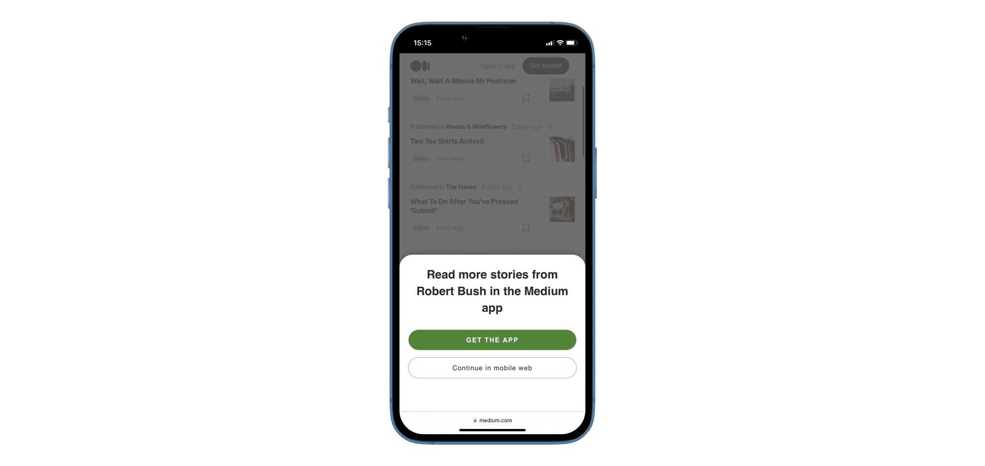
Medium uses a pop-up to encourage app download with the goal of being able to de-anonymize the user and increase engagement on mobile. The wording is also personalized to the content being accessed.
- Leave content entirely open but include a banner to increase the visibility of your premium offer
- Consider an ‘automatic unlock’ wall that is free to pass through but informs the reader that you’re offering them a premium content for free
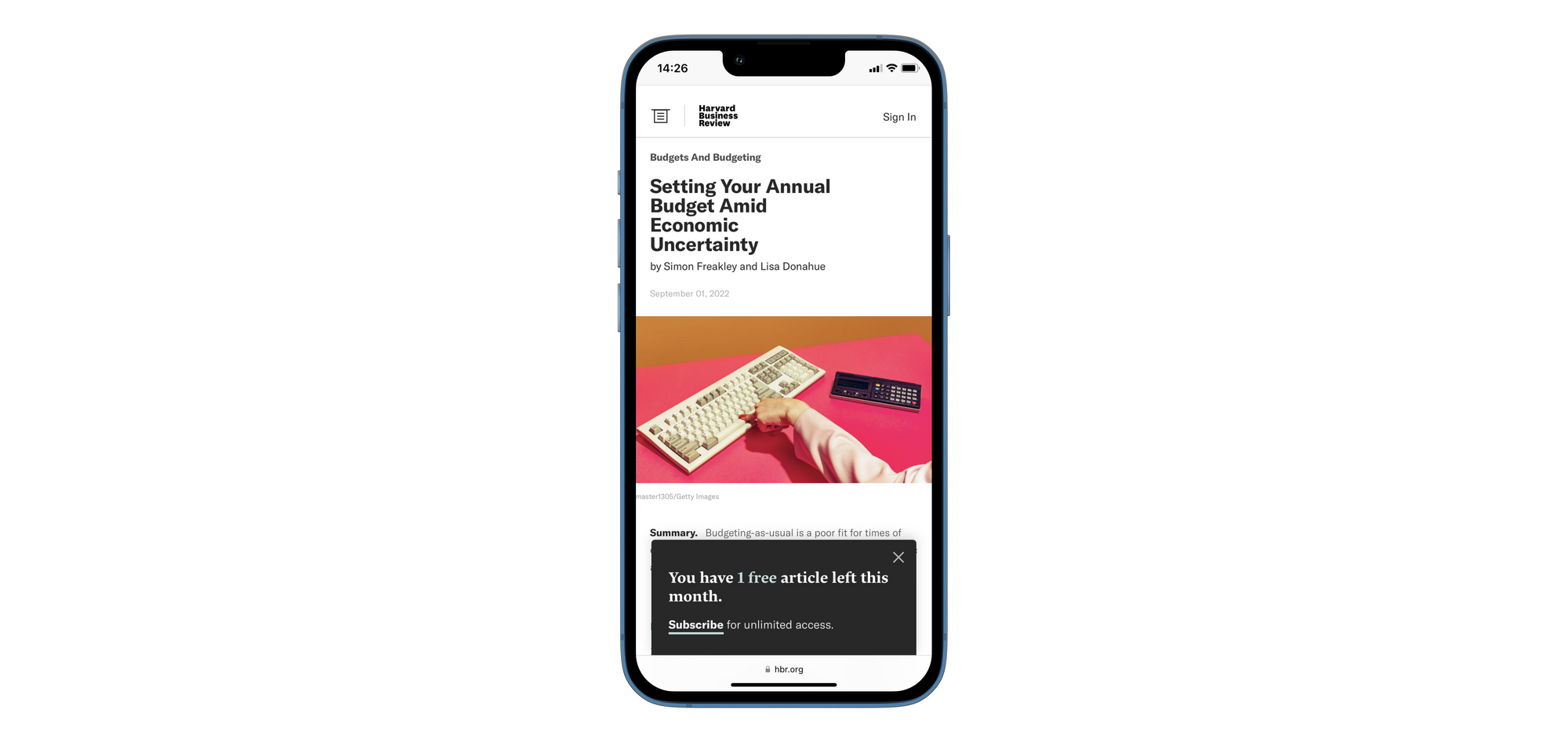
Harvard Business Review employs a metered strategy to allow users access to 2 articles for free per month, keeping users informed of this strategy via a banner.
2) Integrate soft conversion steps into the user journey
Conversions don’t always have to involve payment, and there are plenty of other, softer ways to increase the value of your readers, gradually bringing them closer to subscribing.
A newsletter wall, for instance, blocks content and asks users to sign up to your newsletter in exchange for access to content. This gives the user the chance to read your article for free, but also increases their frequency of visits to your site and helps to form a content consumption habit.
This is particularly the case if you develop a newsletter sent at the same time each day/week, either forming a new habit or fitting into an existing one. How about a newsletter dedicated to daily commuters for example, where you provide all the ‘distractions’ they need whilst en route to work?
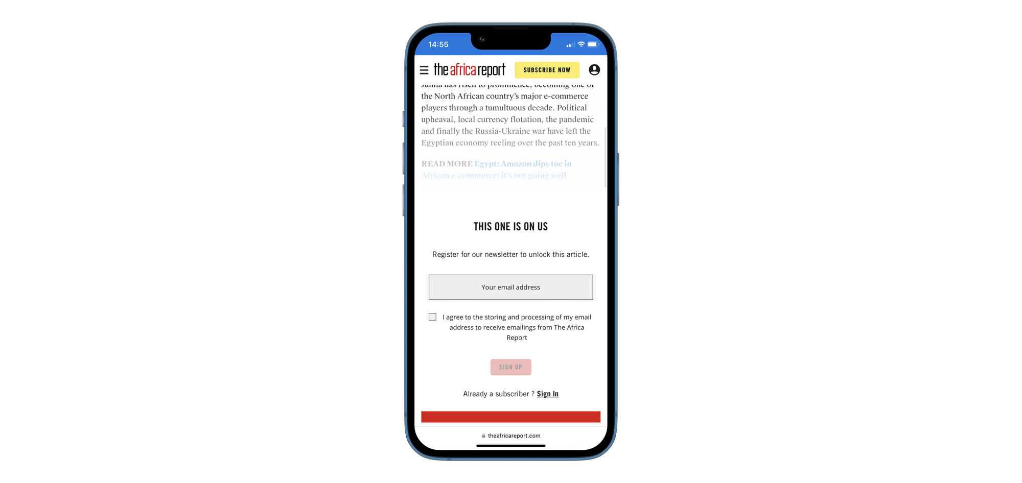
The Africa Report offers an article for free on mobiles in exchange for signing up to their newsletter. This whole ‘unlocking’ is done on the article itself meaning no redirections and very little effort required from the user.
⭐ Did you know: you can set this up in minutes in the Poool Dashboard, segmenting audiences based on device and building a soft engagement journey for mobile users.
Registration walls could be the next step in the funnel, converting anonymous users into registered members. This has a whole host of benefits, including increased ad revenue through targeting, first-party data collection, personalization, and more that will gradually increase engagement and propensity to subscribe.
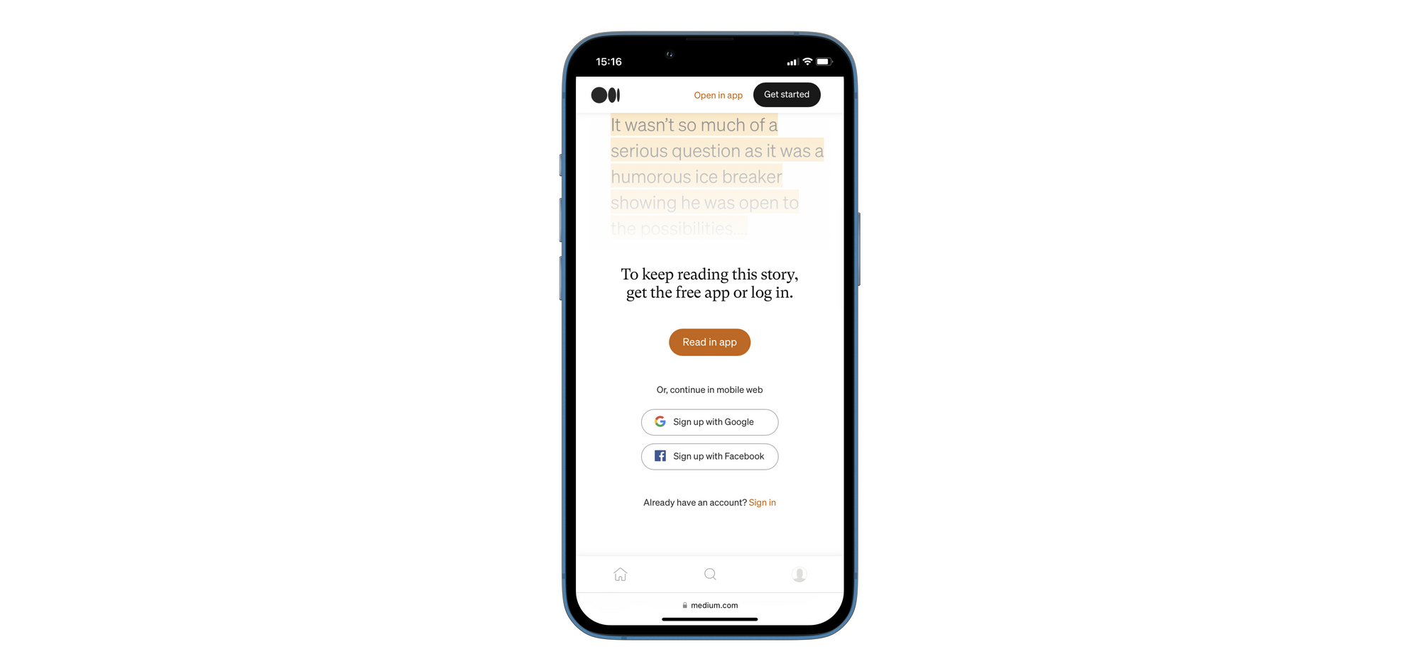
After reaching the limit of Medium’s metered strategy, a user is blocked and asked to either create a free account (facilitated by doing this with Google or Facebook) or download the app. Either way, the user is de-anonymized meaning valuable first-party data collection.
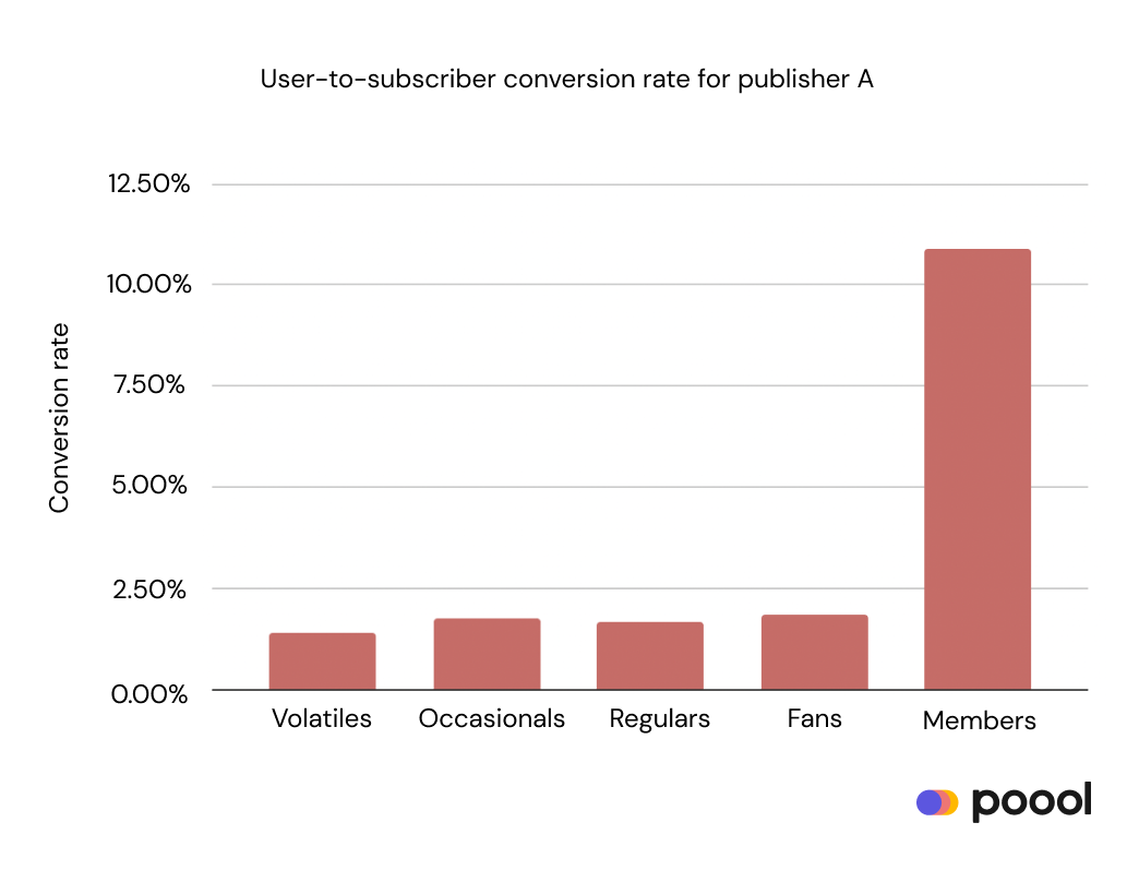
Note that registration walls are highly valuable for users on any device, proving to increase conversion rates and APRU.
3) Employ triggers for deeper personalization
Set up a trigger for users coming from social media or news aggregation sites to offer content for free to increase engagement and visibility of your offer with these audiences.
Le Journal du Dimanche in France set up a trigger for users coming from the news aggregator site upday to lead them through an adapted engagement journey to help users discover JDD’s content before presenting the paywall. Given that 9% of visitors come from this site, JDD wanted to maximize the value of these newly acquired audiences without immediately blocking them and asking for subscriptions.
4) Ensure your paywall is adapted to mobiles
Of course, the ultimate goal is to convert users into subscribers, and the paywall provides this perfect amount of frustration (accompanied by a high level of user engagement) to encourage conversion. But how do you optimize your paywall for converting mobile users?
- Offer more enticing subscriptions on mobiles, such as free trials or reduced cost for the first month
- Reduce steps in the conversion funnel by integrating them into the paywall
- Ask for less information in forms on mobiles and ensure fields are auto-filled
- Provide e-wallet payment options such as Apple Pay to instill trust and facilitate payment
- Make use of a user’s existing accounts on Apple, Facebook or Google to facilitate account creation
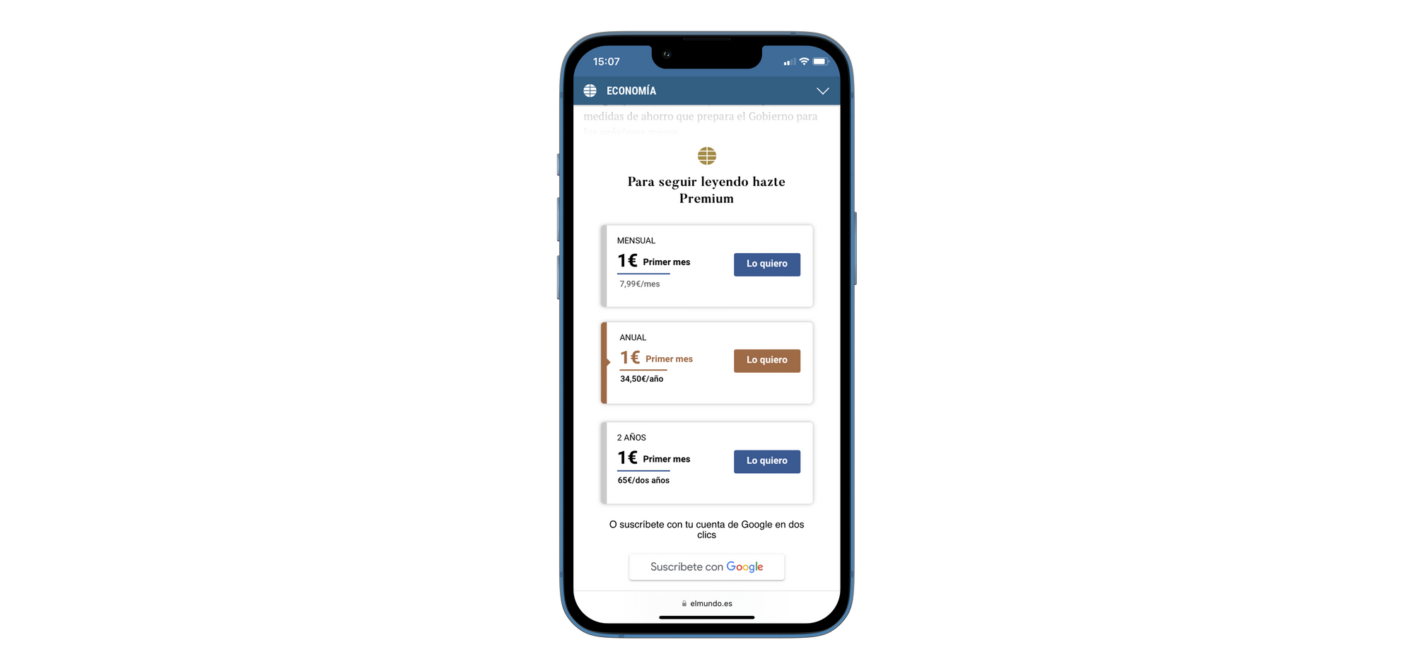
El Mundo has integrated offers into the paywall, displaying them vertically to suit the smaller screen, and users are given the option to ‘subscribe with Google’ to facilitate the process.
- Reduce the amount of text, more brevity, but make sure to forefront your value proposition
- Remove distractions - attention is hard to grab on mobiles
- Make a bold CTA button the centerpiece of your wall
When first launched, Le Petit Journal’s paywall for mobile users led to conversion rates increasing by 200%
You may also be interested in:


