The Poool Dashboard gives our clients the autonomy to drive their registration and subscription strategies with ease, designing walls, building user journeys, testing, analyzing and optimizing without the need for tech intervention at every turn. It really is the ultimate tool for content producers to turn their audience into business!
That’s why, today, we’re immensely proud and excited to announce the launch of a brand new version of the Poool Dashboard - one that will allow you to take your strategies even further than ever before.
In particular, we have 4 brand new functionalities for you to benefit from:
👉 Click&play design builder
👉 The trigger feature
👉 Modified Poool SDK (script)
👉 Scenario recommendations
Interested in experiencing these new features and Dashboard out for FREE for yourself? Book a meeting and demo with our team!
Prefer to watch rather than read? Discover our webinar where Caroline and Madeleine work through each of the new Dashboard features!
Click&play Design Builder (part of our Enterprise plan)
It’s been proven in a wide range of industries that design plays a key role in influencing consumer decisions, and this is no different for content producers aiming to convert users into members or subscribers.
Given this, we want to provide our clients with all the tools needed to build optimized walls and, importantly, be able to do so without having to rely on tech support (which can often hold marketing teams back from reaching their full potential).
Whilst our old Dashboard certainly did this, the brand new Design Builder will allow our clients to go even further, with ease and without code to ensure high click-through and conversion rates!
What’s new?
From today, instead of the basic panoramic or compact models, teams can autonomously construct every aspect of their wall just like a house, brick by brick.
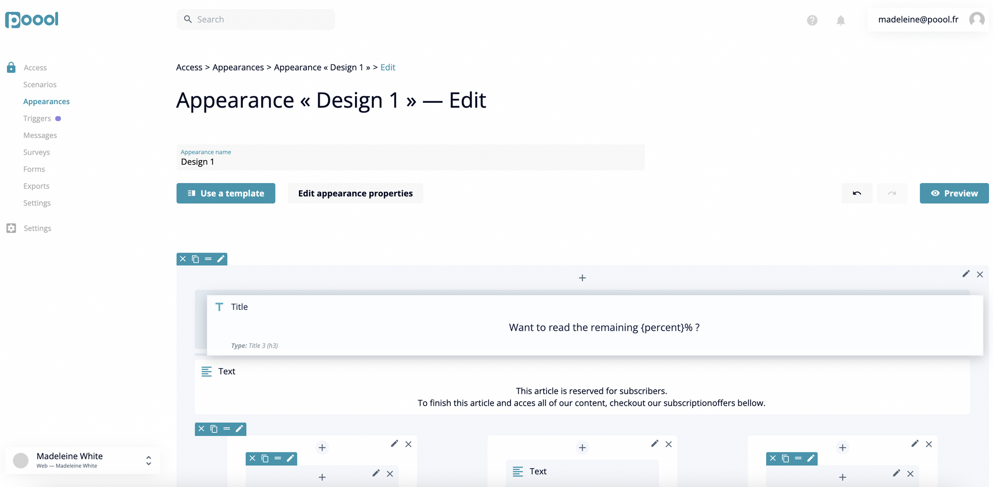
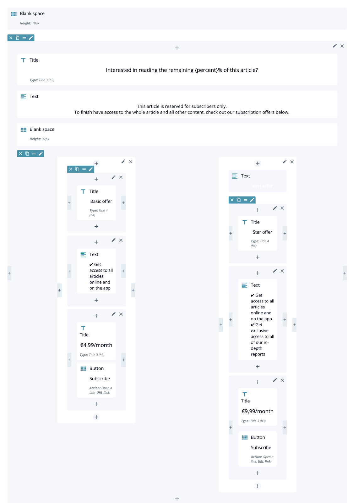
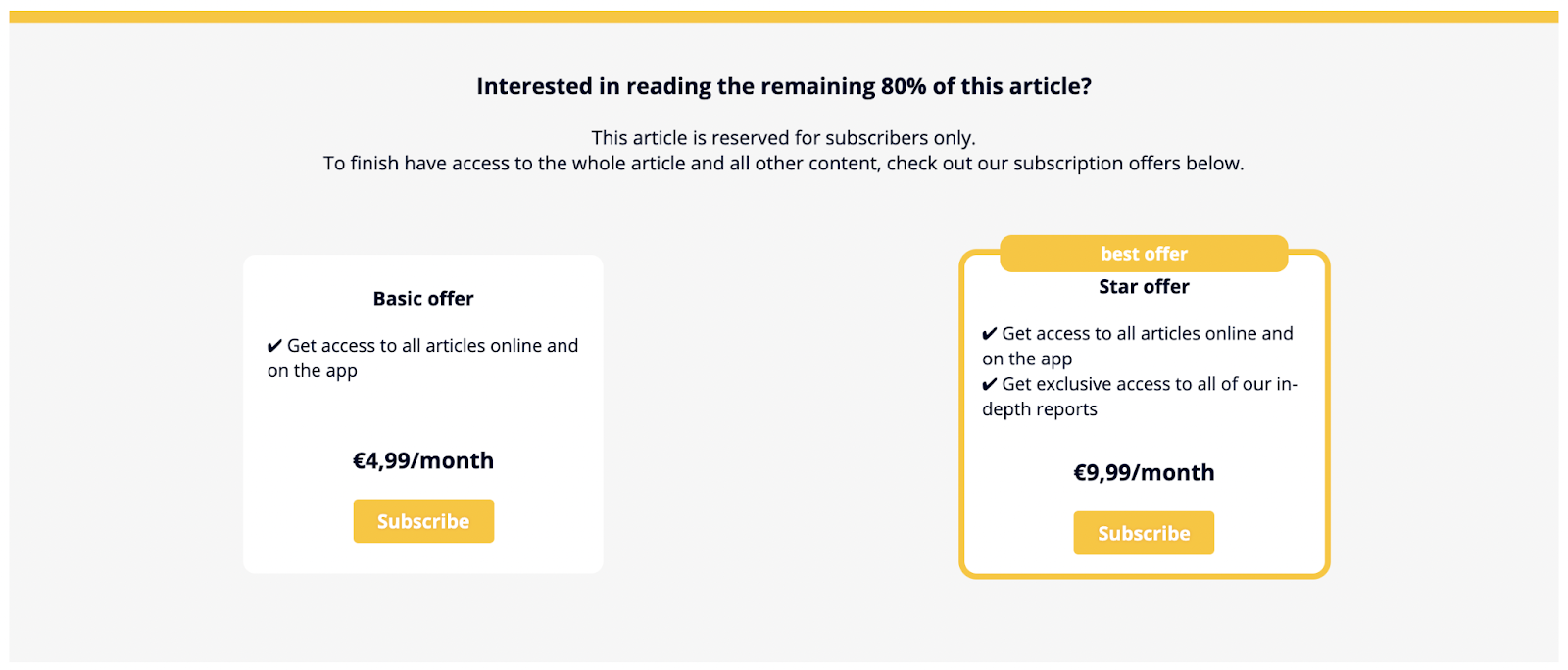
Within the ‘Advanced Appearances’ section of the Dashboard, your teams can use the ready-made but fully customizable components to build every section of the wall, adding in text, titles, buttons, black spaces and more into columns and rows, either starting from scratch or working from a template.
You can add as many components as you desire (including multiple buttons, previously only possible with CSS), modifying text, colors, spacing, responsiveness, etc to match your strategy and branding.
Triggers (part of our Enterprise plan)
You’re hopefully aware that no two users are the same, meaning that there’s no one-size-fits-all wall that will convert in every situation. Poool Access already allows for audience segmentation where you can create personalized user journeys based on their profile or context, for example according to their location, source of traffic or engagement rate.
However, the new Dashboard takes this ‘adapting to the user’ a step further thanks to the trigger feature.
What are triggers?
Triggers work due to a unique UTM source inserted into a URL. This means that you can set up an action to be presented to users coming from a specific source without having to get your tech team involved.
For instance, you could set up a widget for your readers coming from:
- Social media site, such as Facebook or Twitter
- News aggregator sites, such as Upday or Opera News
- Your partners’ site, to address these users in a special way
- A specific newsletter, for example if you were offering a seasonal sale
🚨 Note: As mentioned, it was already possible to segment audiences based on source of traffic (such as Facebook or Google using the custom contexts or groups), but this is very different to triggers. Source of traffic is information that comes from the navigator and is very general (i.e. all users coming from Facebook will get the same experience).
A trigger, however, is configured by your marketing team and is hugely more specific. It can be utilized within a unique Facebook campaign (for instance) to present these users with a specific action (with personalized design, messaging, etc).
Modified Poool SDK (script) (available for all clients)
This isn’t so much a feature but a rewriting of our script, separating the original poool.min.js into two, named Audit and Access.
A script, in short, is a program or sequence of instructions that’s interpreted by another program rather than the computer processor.
This original script worked well when Poool was first started, but splitting it in two will significantly widen the scope of wall potential for our clients.
To start with, this change means that you can load only what you need on the page and that tracking will be highly specific, applying only to data that’s valuable to you.
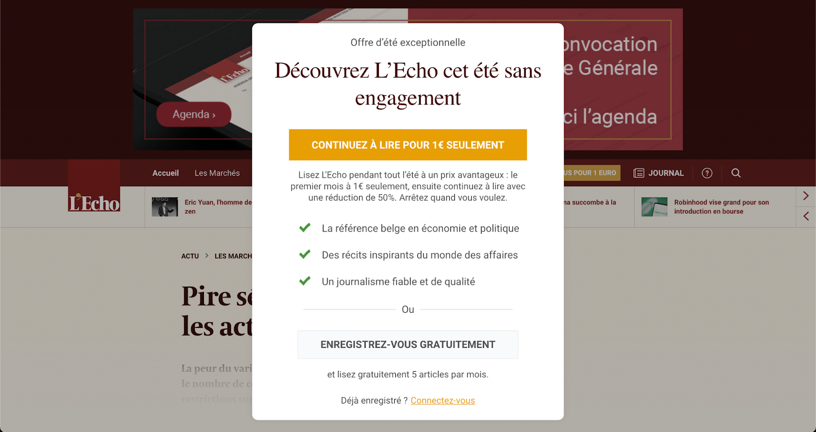
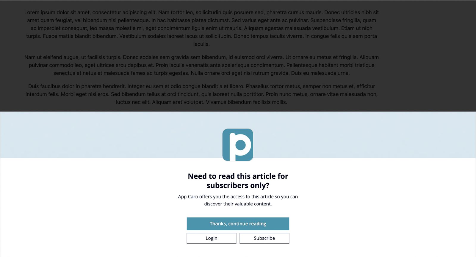
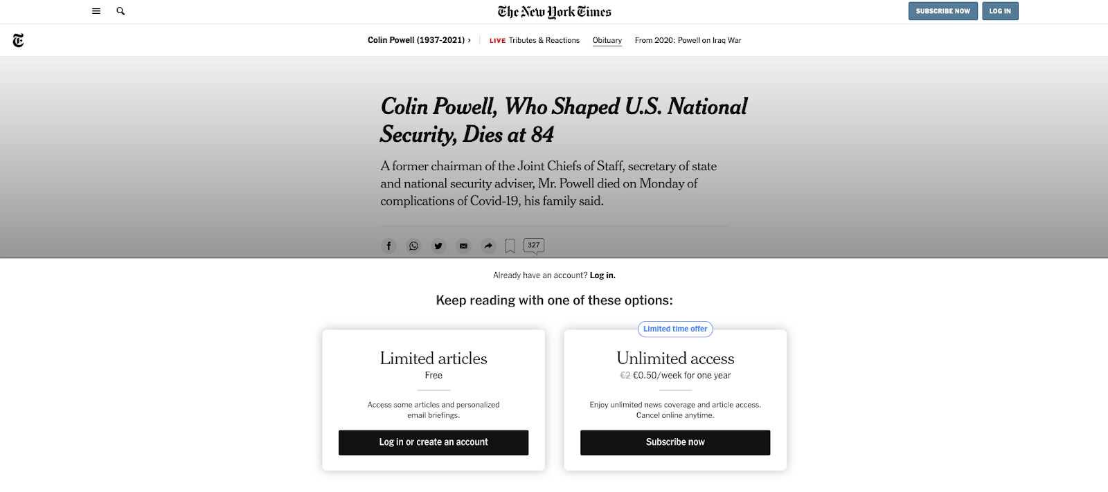
More concretely, the biggest advantage of this new script is that it allows you to be more flexible with your wall location (or even employ multiple walls on a single page). For example, you can now employ a banner wall model or centred wall, alongside the previous compact and panoramic styles available in the ‘Appearances’ section. This addition not only gives you more possibility when it comes to wall layout, but these styles also have a significantly higher visibility rate than other models, meaning you’ll be highly more likey to convert users into subscribers (we discovered this correlation in our Digital Media Review).
Centered wall model:
Banner style wall model:
Just like the hugely successful New York Times wall!
Scenario Recommendations
Clients have always been able to build their user journeys in any way they wish, action by action, using our ready-made but fully customizable widgets, such as Paywall, Newsletter subscription, Discovery pass and more.
It’s really as simple as dragging the widgets into the scenario, but, thanks to this new Dashboard, it’s now even easier to create an optimized journey!
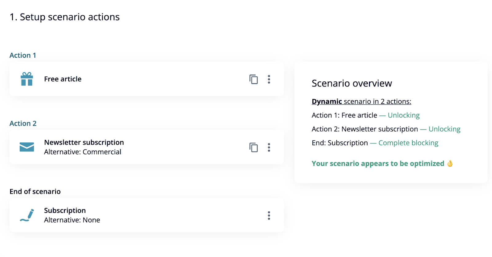
Once you’ve created a scenario, the Dashboard will now inform you of ways in which you can optimize the user journey based on blocking, partial blocking or unlocking actions.
“The most important thing is that the scenario drives readers towards the goal selected by a client, whether it’s subscription, account creation, data collection... An ‘optimal scenario’ is simply a coherent scenario. It means that there aren’t too many steps, so a reader can reach the end of the scenario in a reasonable amount of time, there’s no fully blocking widget in the middle of a scenario, partially blocking widgets (such as the Newsletter subscription) have an alternative and the last widget is fully blocking.”
- Caroline Douet, Poool’s Product Manager
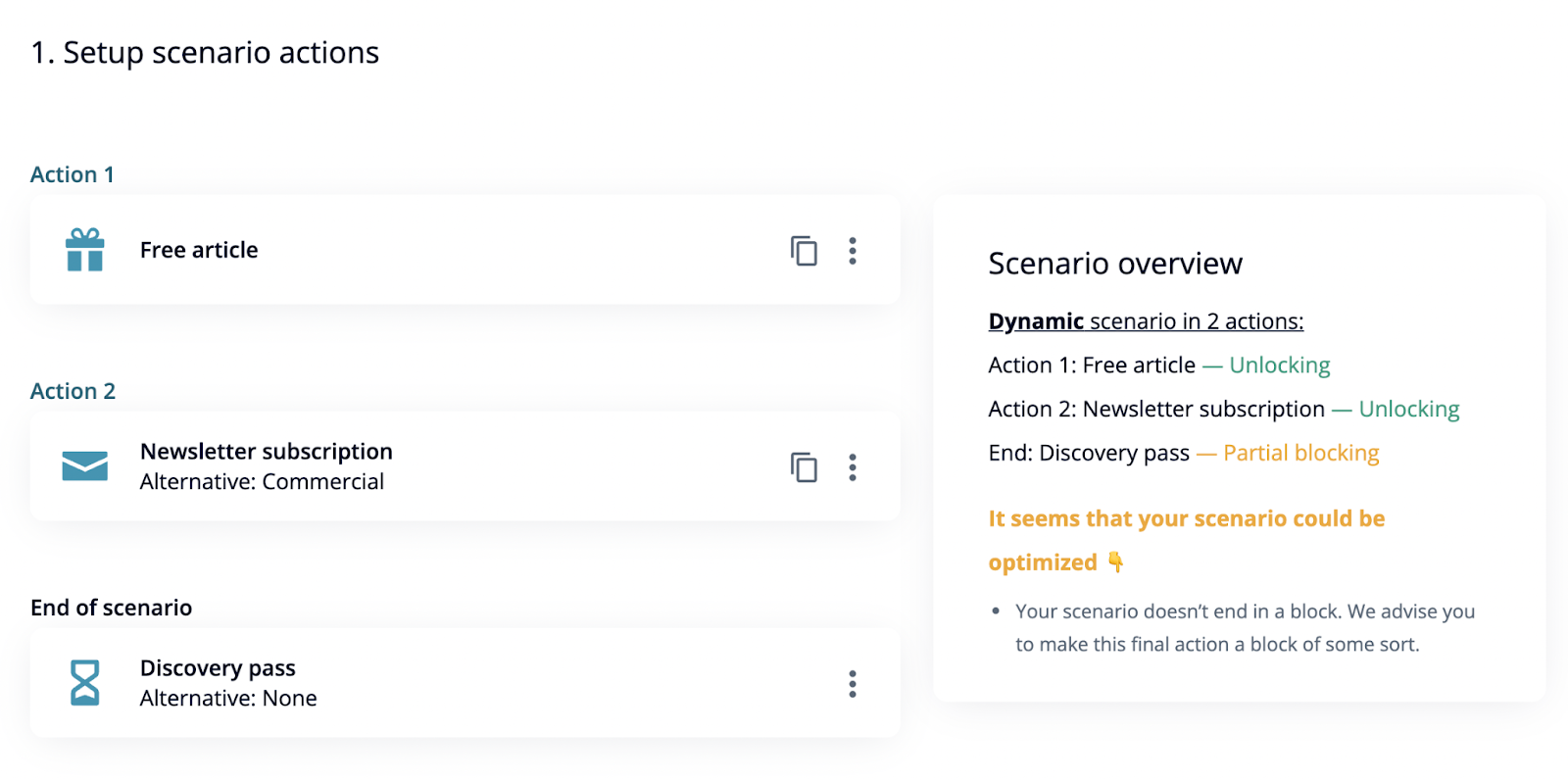
In the example above, we decided to build a journey that gradually engages our user by first offering a Free article (allowing for content discovery) before presenting a Newsletter wall that asks a visitor to register for our newsletter in exchange for an article. The last step in the journey is a Discovery pass that allows a user to try out our subscription-only content for a limited period of time. However, as shown on the information block on the right, this action is only a partial block, which is less likely to result in conversions.
If we change this final step to Subscription (a paywall), that acts as a complete block (requiring that the user pays to subscribe to access more content), then we’re told that the scenario is optimized.
Our team is hugely excited for this release and ready to see how you exploit the new features to increase conversion rates and turn your audience into business!
Already one of our wonderful clients and interested in having access to the design builder and triggers feature? Or maybe you’re not yet employing a wall strategy with Poool but are keen to it out to reap in the benefits?
Either way, book a meeting with our team and we’ll give you a free demo of the all new Dashboard!

