The importance of a registered member or subscriber's first few days and weeks after conversion shouldn't be underestimated.
It's your chance to:
- Welcome your user & thank them for converting
- Form a habit of consuming your content
- Increase frequency and recency of visits
- Collect first-party data to better understand your user
- Personalize the user experience and improve the service provided to them
- Educate users on what they now have access to
- Reassure, build trust and establish a relationship with the user
- Provide immediate value to help them feel confident in their decision to convert
In short: onboarding supports high retention rates and so high ARPU.
Prefer to read in the language of Molière? 🇫🇷 C'est par ici
With this in mind, we've created a list of subscriber onboarding steps to steal from some of the most successful content producers that will help you build the best user experience for your new subscribers.
2 things to note before getting stuck in:
- Make sure to define the goals for each step, prioritizing what you'd like to achieve and limiting the subscriber onboarding journey to 3-4 steps maximum onsite, with additional emails/communication being spread out across the weeks after conversion
- If you employ a registration model, we'd highly recommend leading new members through onboarding just as you would for subscribers. The benefits are the same and it can significantly increase the user's propensity to subscribe in the future
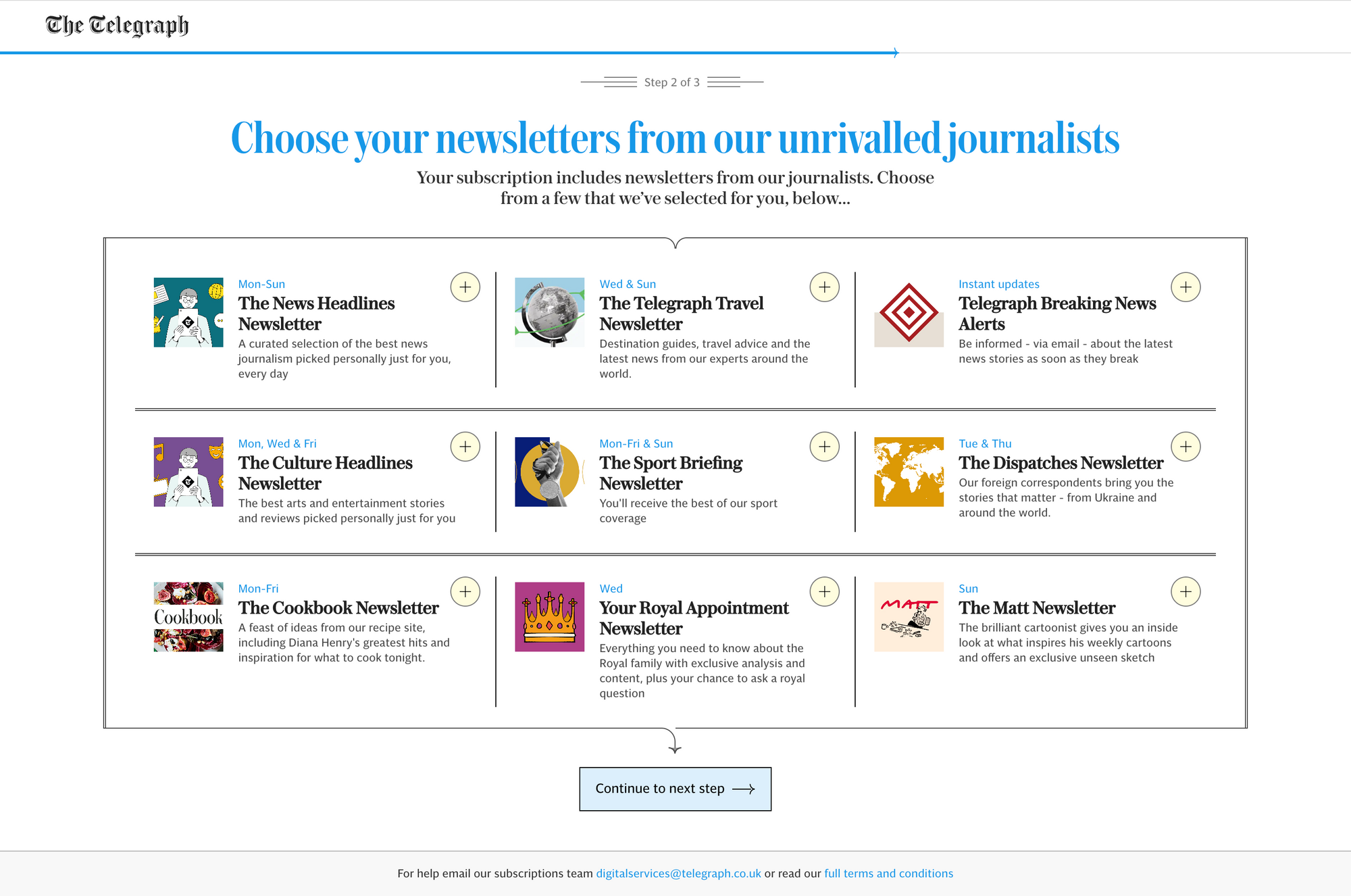
Newsletter sign up as part of the subscriber onboarding journey
Goals:
- Increase engagement through forming a habit (consuming content on a regular basis)
- Deliver value that matched their interests directly to their inbox
- Allow the user to personalize their own experience.
Benchmark example: The Telegraph
Small box for each newsletter detailing the frequency, title and short value proposition. One click is all that's needed to register to a newsletter.
Personalization
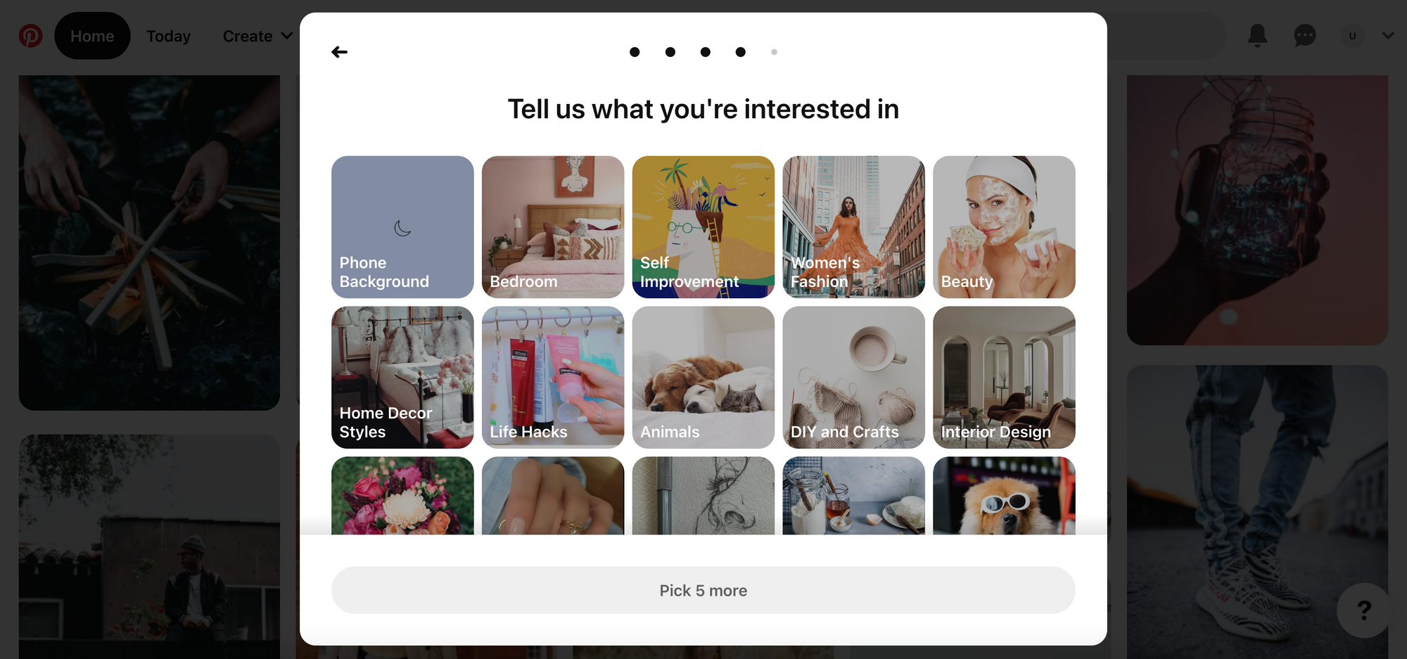
Goals:
- Improve the user experience
- Bring value to the user from the moment they become subscribers (through presenting content that matches their interests)
- Learn about the member/subscriber
Benchmark example: Pinterest
Easy-to-select, supporting visuals, wide range of options and each step is completed on the same page, making for a very smooth, simple user experience.
Download the app
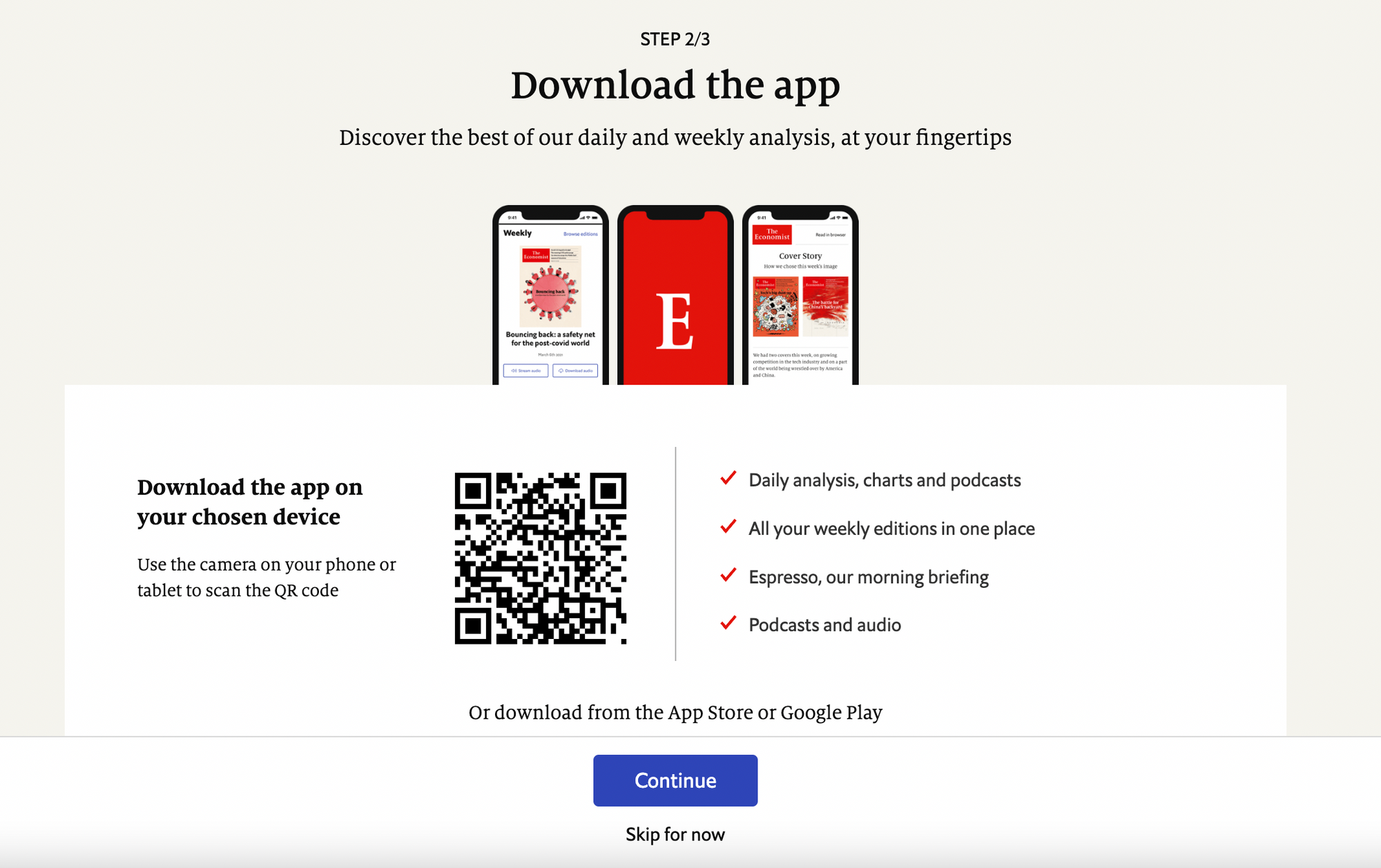
Goals:
- Make content available to the user at all times (in their pocket, on the go)
- Encourage a user to turn on push notifications to be alerted when new content is released
- Increase engagement
- Show users what they now have access to
Benchmark example: The Economist
QR code makes it simple to download the app and the list of benefits plus the value proposition ("Discover the best of our daily and weekly analysis, at your fingertips") help convince us.
Email from the editor
Goals:
- Thank your reader (make them feel valued)
- Start to build a relationship with your user
- Educate them on what they now have access to
- Deliver immediate value
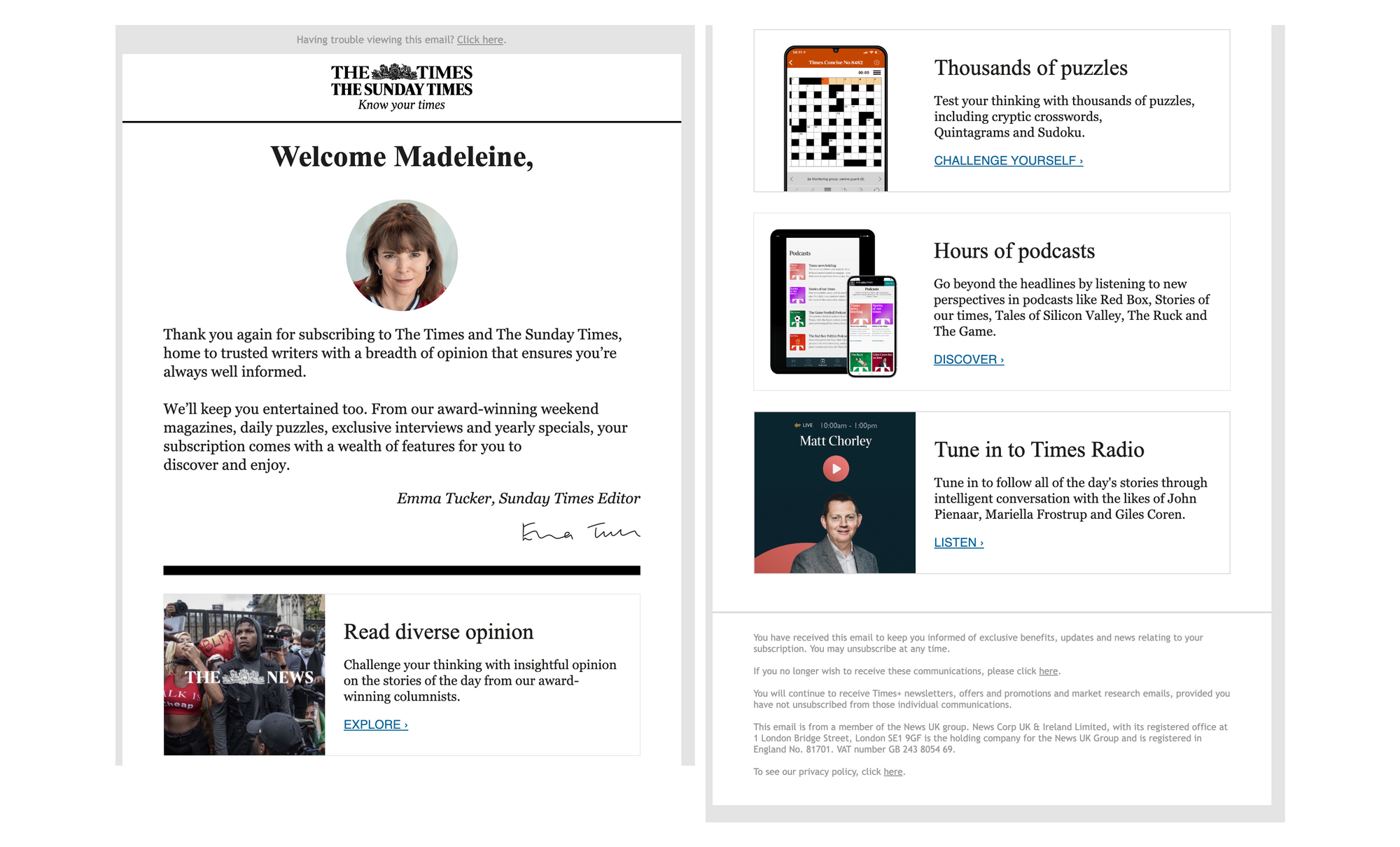
Benchmark example: The Times & Sunday Times
A variety of features that a subscriber now has access to, covering more than just traditional written content. Photo and signature from the editor gives a personal touch, helping to build a close relationship and give a face to your publication. Links and descriptions for each feature make uptake easy.
On-site navigation support
Goals:
- Show your user around, educating them on subscriber benefits
- Provide immediate proof of the value of their purchase
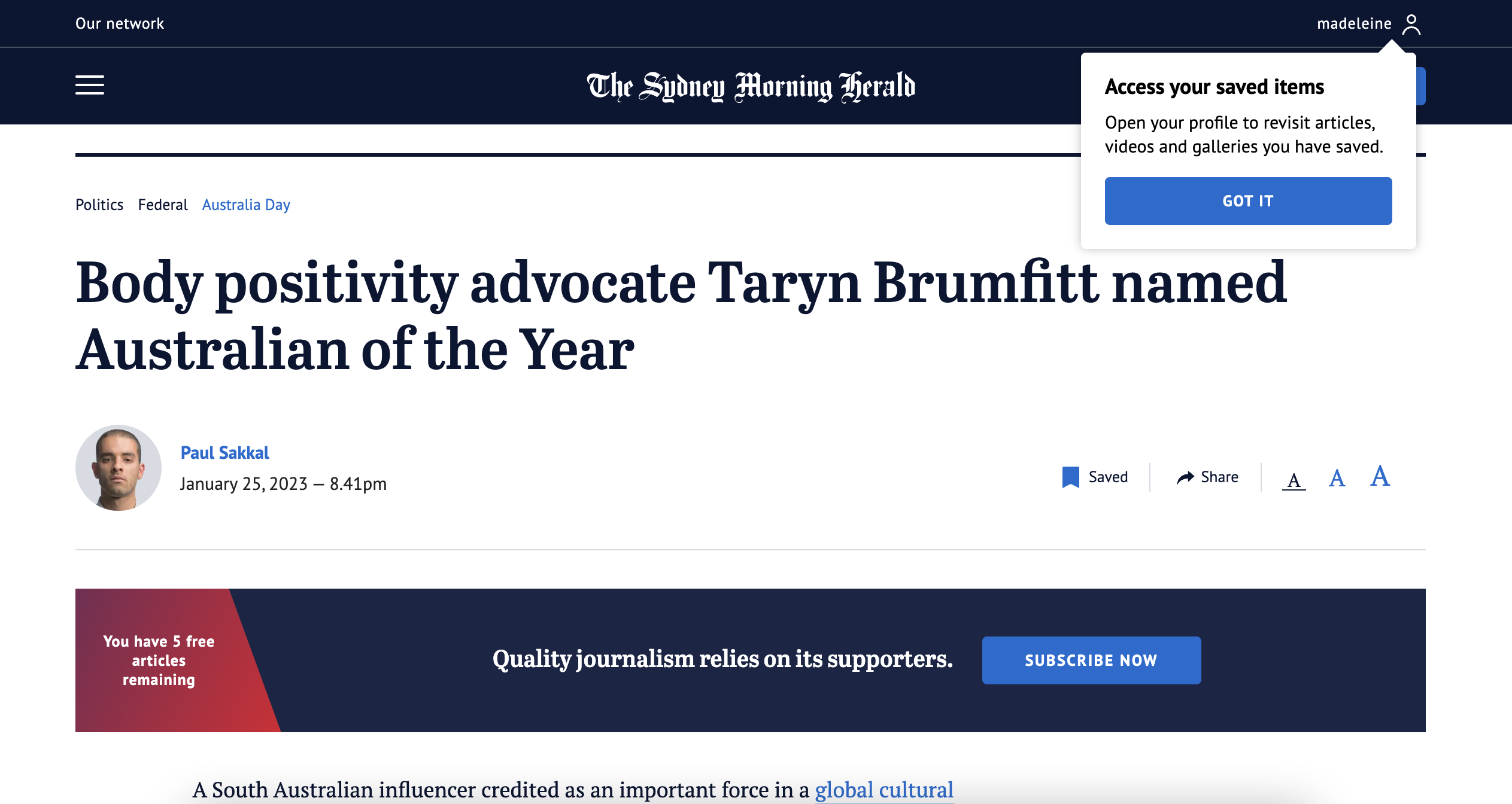
Benchmark example: The Sydney Morning Herald
SMH have a metered registration model, followed by a metered subscription model. Following registration, the user is led through a few onboarding steps including on-site navigation pointers showing UX features that registered members now have access to, such as the ability to save content for later.
Data collection
Goals:
- Improve the user experience and service provided
- Collect first-party data to learn about your audience
- Show the value of your offer
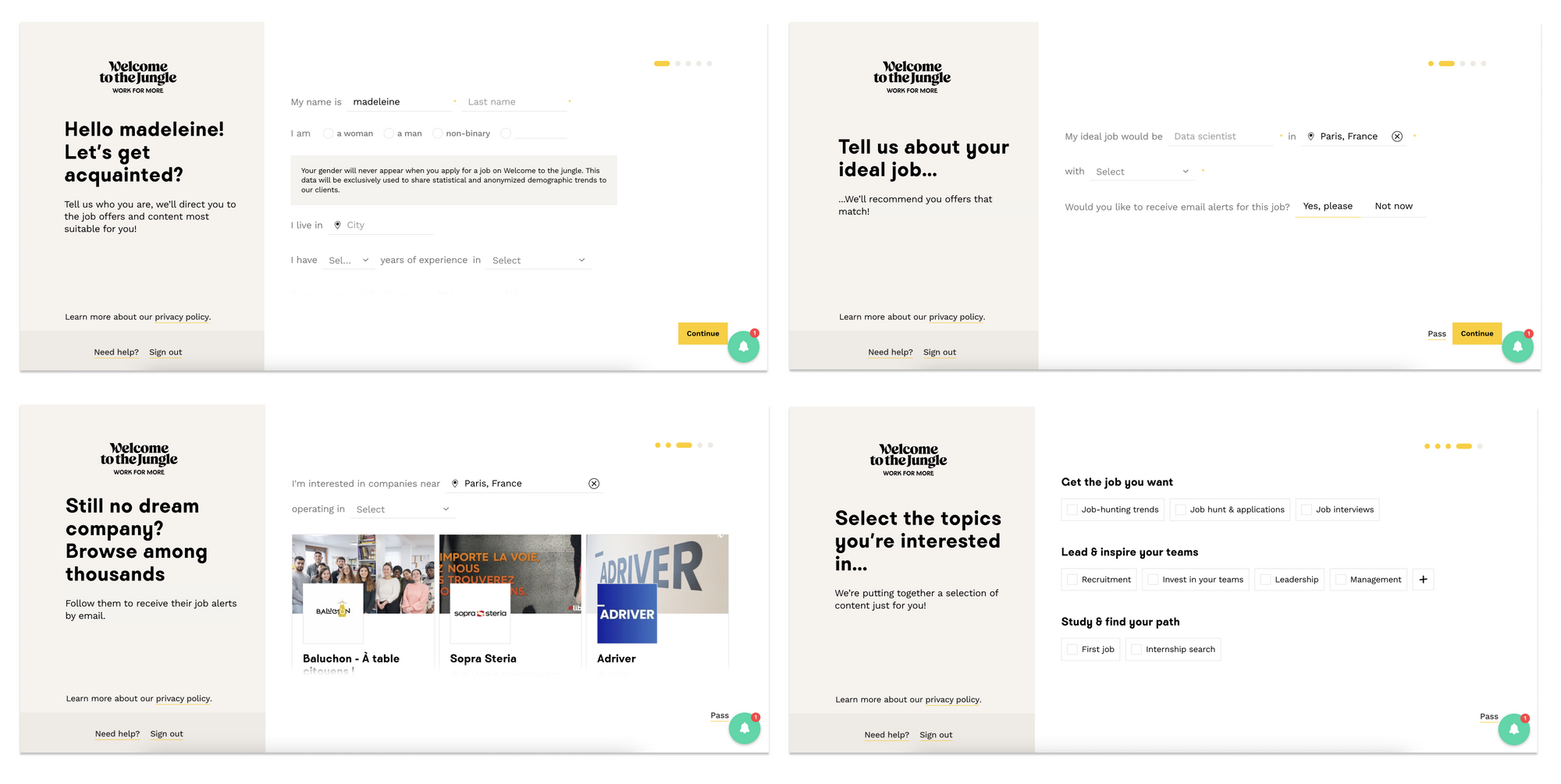
Benchmark example: Welcome to the Jungle
Although a brand publisher rather than traditional publisher, Welcome to the Jungle's onboarding journey is an interesting one to be inspired from. The data collection directly benefits the user (who will have more personalized job offers) and the publisher (who will better understand their audience). WTTJ are also quick to provide a list of potential job openings that match our search, proving the value of their offer.
You may also be interested in:
