
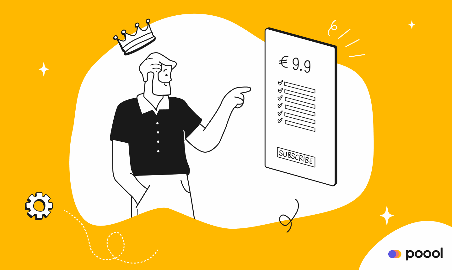
We’re sure you don’t need reminding of the importance of your subscription offers page. As one of the first steps in your conversion funnel, it’s your store front, the entrance for users tempted to subscribe, persuading them of your value and guiding them through to payment. So, to maximize the success of this page, we’re here to provide you with benchmark subscription offer pages from popular online media sites as well as ‘The Checklist’ to work through when designing this page.
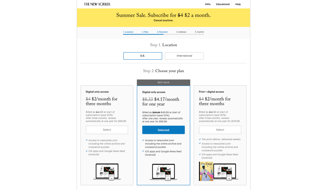
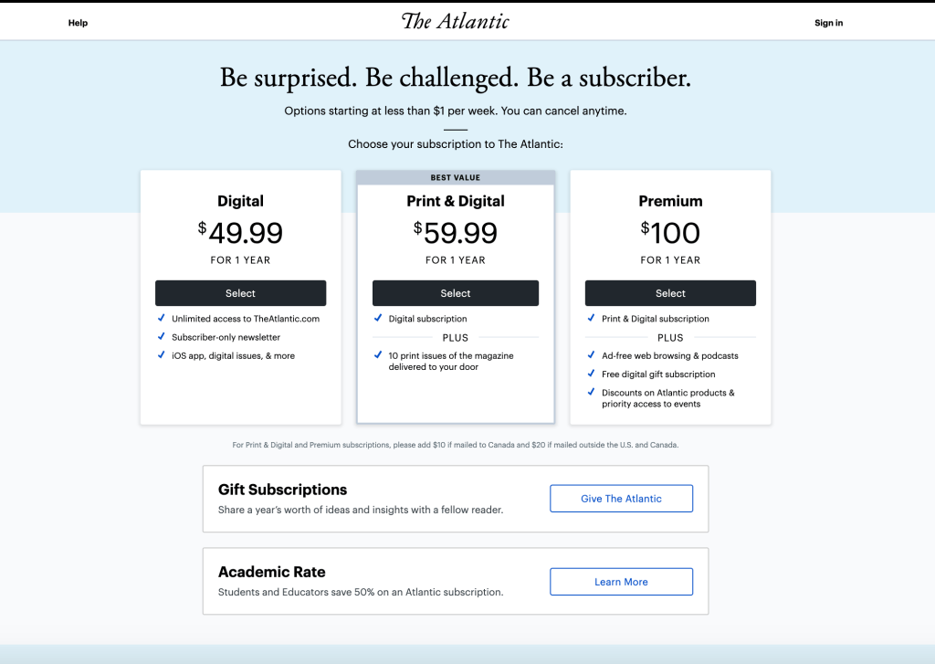
First, benchmarking to provide some inspiration:
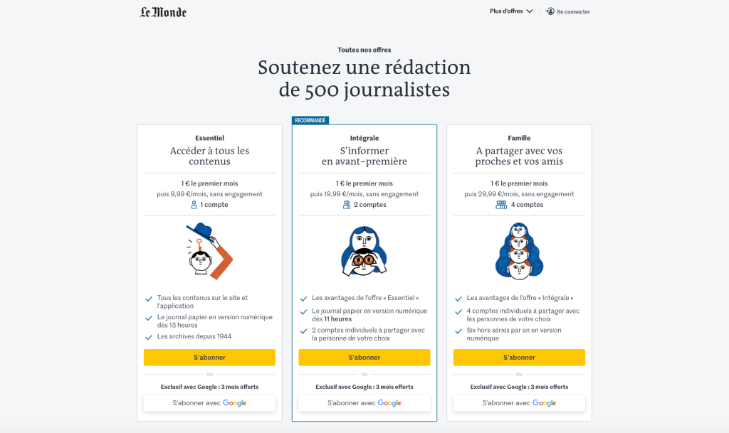
- “Support the work of 500 journalists” taking an emotive approach to frame subscribing as a way of helping Le Monde to continue their work

Interested in more benchmark examples and best practices for the whole subscription funnel? Take a look at our series 'From content to subscription' as well as the white paper summary, where we analyzed 11 success content producers and their user journey to subscription.
So now, the all-valuable checklist, the "how to"!
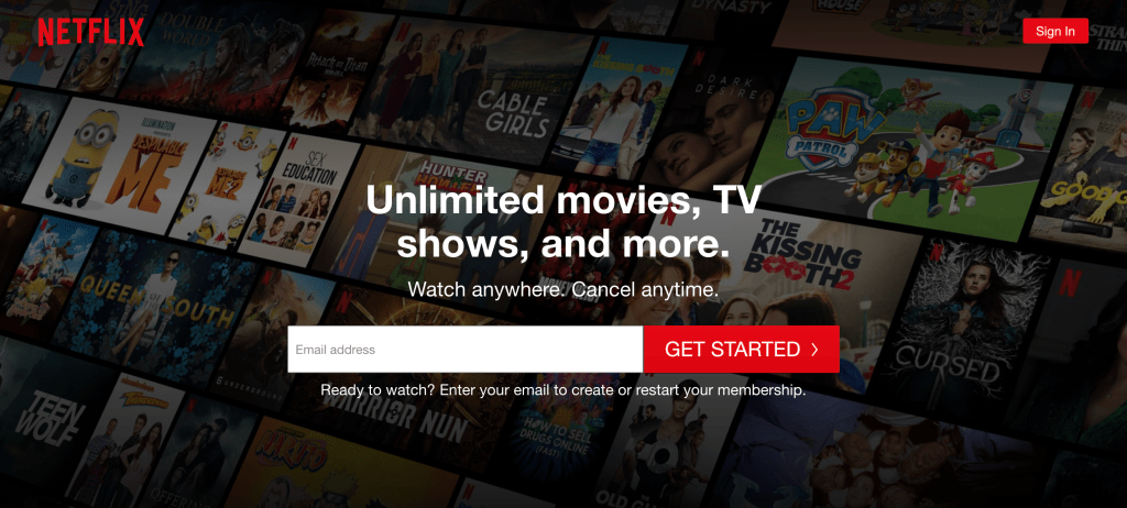
Firstly, no distractions on this page, nor on any of the stages that follow:
◻ No commercials
◻ No self promotion
◻ No anti-adblock
◻ Very minimalistic header and footer
◻ Keep scripts to a minimum too
Next, work on your value proposition:
◻ Remind users of the promise that you’re making to them and the value you’ll provide
◻ Convey to your users why they should subscribe - focus on benefits for the user rather than functionalities, price or supports
◻ Name your offers based on the role that they fill - avoid just simply saying what the offer includes
◻ Forefront positive feedback and opinions from other clients
In terms of UX:
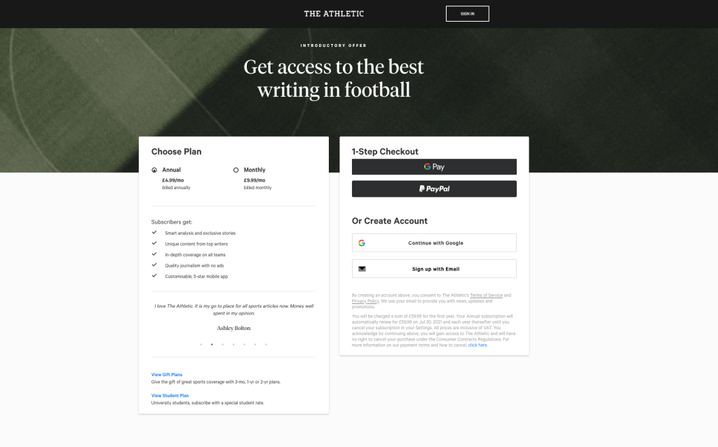
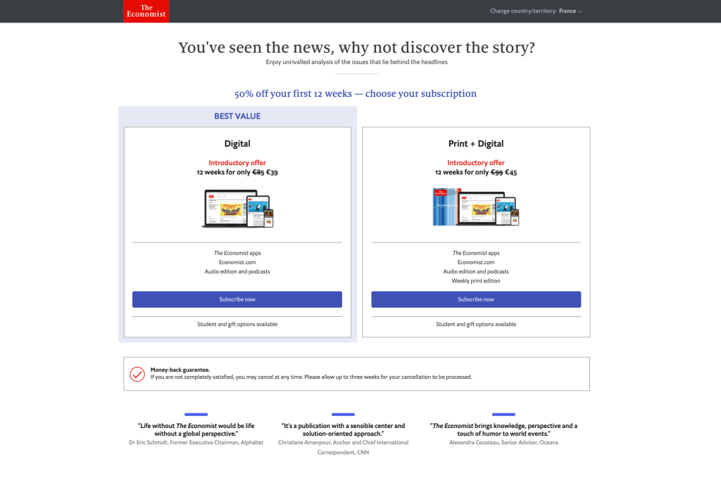
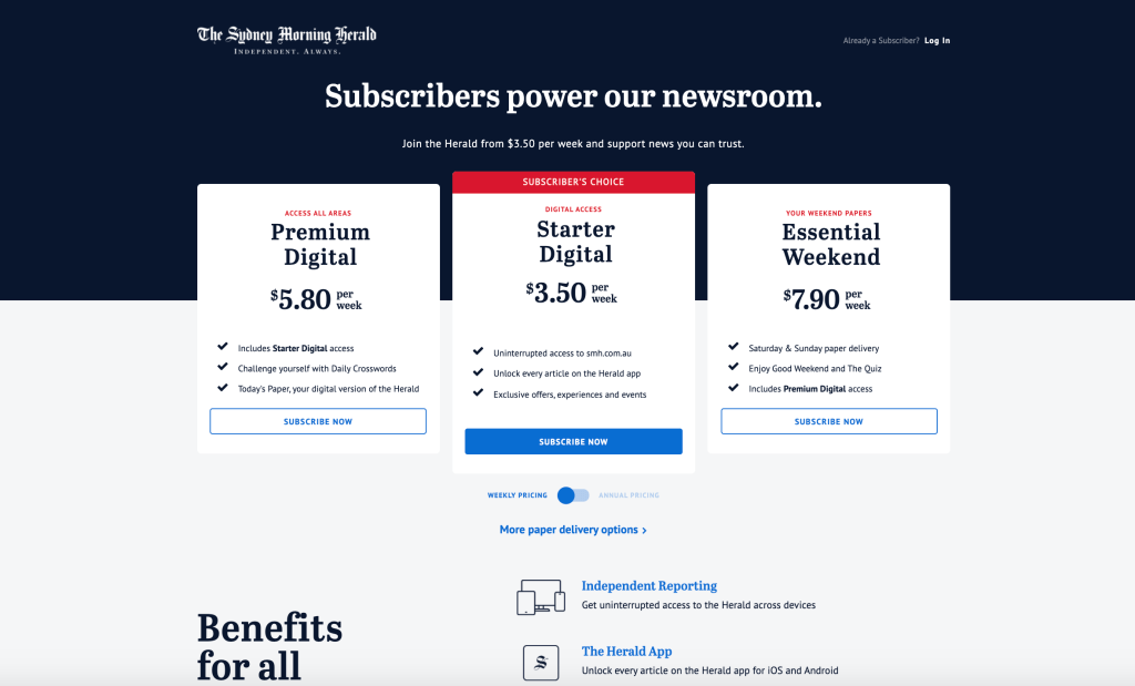
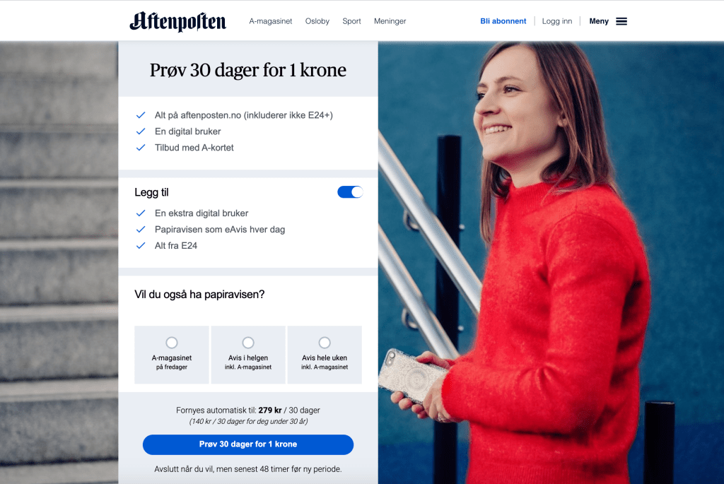
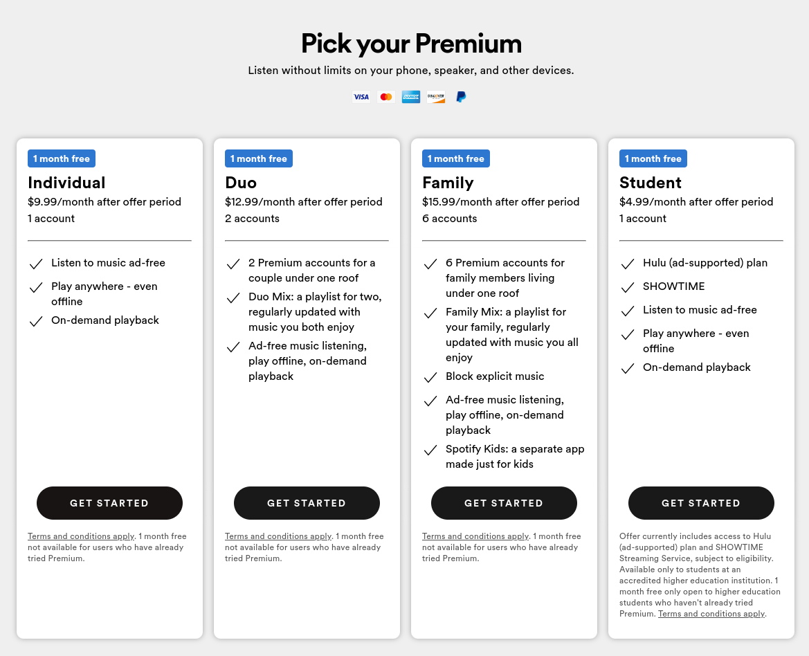
◻ Respect the magic trick of 3 - ideally, provide 3 subscription offers (2 is also a good amount) above the waterline on your page, not any lower
◻ Curved buttons tend to convert better
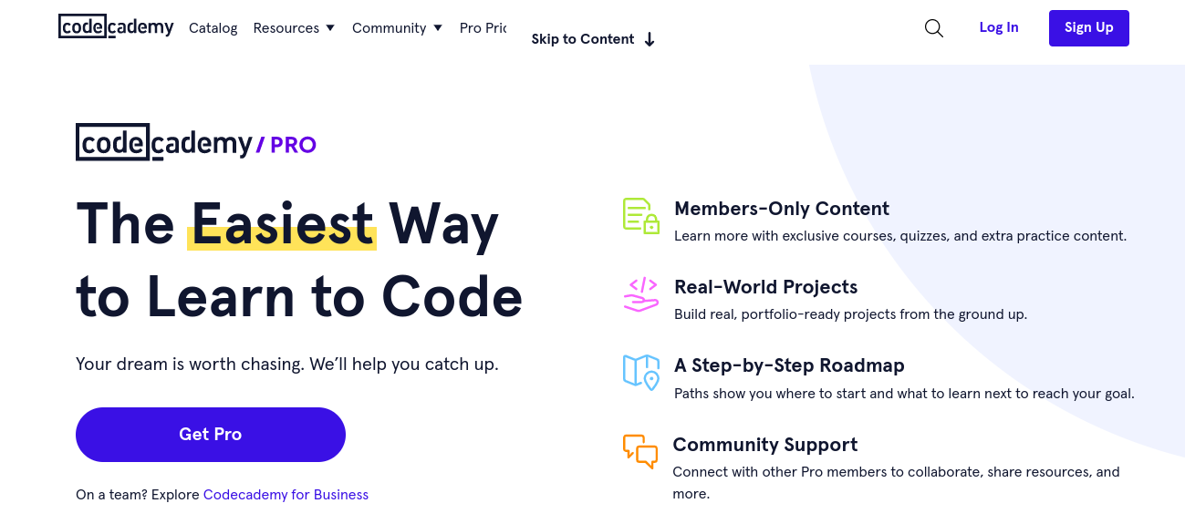
◻ A single button or link per offer, don’t dilute the user’s attention
◻ Draw attention to one offer in particular (by placing it in the center, highlighting it in another color, adding a ‘best offer’ label or maybe outlining it, as seen in the examples above)
◻ For the copy of your CTAs, use verbs that are a bit friendlier than ‘Subscribe’, such as ‘Select this offer’, ‘Join…’, ‘Register…’, ‘Let’s go!’...
For the description of your offers:
◻ Make sure the difference between your offers is clear - even at a glance, the benefits of each offer and what makes them different should be easily understood without having to read a large text. Visuals and illustrations are useful here to convey a message
◻ Your offers should also differentiate in terms of cost - don’t provide two offers which are the same price (or nearly)
◻ If your offer prices are round numbers, don’t add 00’s at the end (i.e. $4 not $4.00)
◻ Make use of the tick and cross icons to clearly show what’s included (and what’s not) in one offer compared to another
Reassure your users:
◻ Ensure that any offer commitments are clearly outlined, whether positive or negative, such as ‘Cancel anytime’
◻ Make sure to highlight the price to be paid now, when they’ll next pay, whether the cost will change (e.g. after a promotion or starting offer ends)
◻ Add a FAQ section, or part of one, to answer any questions they may have and emphasize that help if there if needed
◻ Remind users that payment is made securely
◻ As well as that you offer refunds if they aren’t satisfied with your subscription
◻ Offer ways for the user to contact you if needed, remembering to adapt these based on where the user is in the world. This could include a phone number (with opening hours), email address, contact form or even an online messaging tab. Reassure them that you’ll reply within 24 hours
And finally, don’t forget mobile-friendly offer pages! On average, you can expect about 60% of your traffic to be on a mobile device. However, the majority of sales are still made on desktop. The below graphs demonstrate this, with the left showing the audience per device used, and the right demonstrating sales per device.
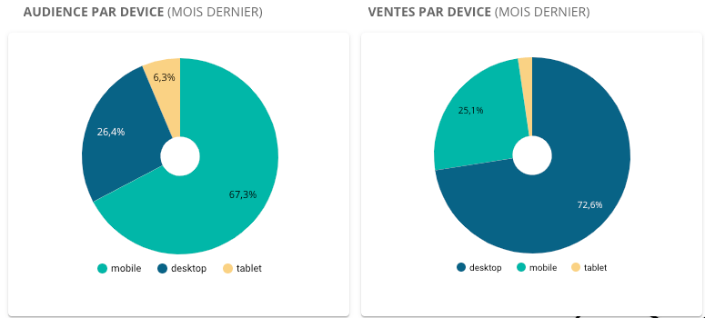
This divergence is likely partly due to web pages that aren’t adapted to mobile access. Therefore, ensure you design a dedicated mobile version of your offer page and test it on various devices.
Perhaps the most important aspect of an offer page (just like the majority of steps in your conversion funnel) is your value proposition. Not only does it show your identity and what makes you different to other businesses but it defines the promise that you make to your users when they subscribe. It outlines the value that you will provide them, highlighting ‘why’ they should continue to payment. To achieve this, we recommend working with Simon Sinek’s Golden Circle framework (shown below) as well as having a read of our article “How to define your value proposition”.

For more adapted advice and to hear about how Poool can provide the tools to launch a paywall and subscription strategy and make it a success, book a meeting and free demo with the team!
Book a demo