
“How can we optimize our conversion funnel to increase conversion rates?”🤷♂️
We’ve heard this sentence so many times from clients.
Even if content remains (by far) the most important factor influencing conversions, the user journey complexity, amount of information required, payment methods offered and more, still have a huge role to play.
And optimizing these is no walk in the park.
- How should I present subscription offers to users?
- Which payment methods should be prioritized?
- Should payment be requested before or after creation of the account?
After listening to our customers, we decided to come up with a series of articles called: ”From content, to subscription to content", in which we analyzed the conversion funnels of 11 content producers and digital media outlets. These included French and international sites, ranging from Quartz to the Athletic, as well as Netflix (VOD), Audible (audio) and The New York Times.
With this series, we wanted to help save you time in benchmarking. We also secretly hoped to find a pattern shared by all these publishers, some sort of ideal funnel that would be optimal for increasing your conversion rates. But that didn't happen. Each content provider had their own user journey, not surprising when you remember that they also have their own audience, identity, company goals, etc...
For this reason, we decided to provide a summary of these articles, giving a condensed overview of best practices observed in these 11 publishers. We hope this can save you some time and, most of all, help you in your own mission to creating the optimal conversion funnel for your business and, primarily, your readers.
We'll analyze every step of the journey from content to subscription and back to content. We have broken this down into 6 key steps:
- Block content via a paywall
- Presenting subscription offers
- Form (account creation and data collection)
- Payment
- Confirmation and onboarding
- Back to content
For each, we’ll ask the following questions:
- Why is this step important?
- What are the step’s objectives and key elements
- What indicators should be followed for this step
- And one or more pieces of advice from the team to enhance your performance
We’ll also add a summary of the summary of the summary (#inception), with a recap table of each of the 11 website paths. You’ll be able to get started on your own conversion funnel right away.
Let’s go!
Step 1 - The Paywall
The paywall is the first step between paid content and the reader. It may well be the first interaction with your premium offer, and it’s without a doubt the first time that the reader will be frustrated but also potentially interested in your subscription offer. To find out more about paywalls specifically, take a look at our dedicated article: 'What is a Paywall'.
Why is this step so important?
The one element that will have a bigger impact than a paywall on your subscriber acquisition strategy is the share of traffic on free vs paid content. This indicator represents the ratio between the number of premium articles seen by your readers and the total amount of articles seen (premium or not). The Digital Media Review (the paid content observatory that we co-created with GESTE) has allowed us to show the importance of this indicator on two levels:
- Traffic in the subscription funnel and conversions seem to partly correlate with the visibility of paid content. Blocked content with less than 10% visibility led to few or no clicks onto the subscription page. However, at 10-40% visibility, there was a sharp increase in paid content visibility. This is strongly linked to the surge in traffic in the subscription funnel and to the number of conversions.
- There is, however, a direct correlation between the frustration caused by the increase in paid content visibility and the exit rate from the website by users facing the paywall (graph below).
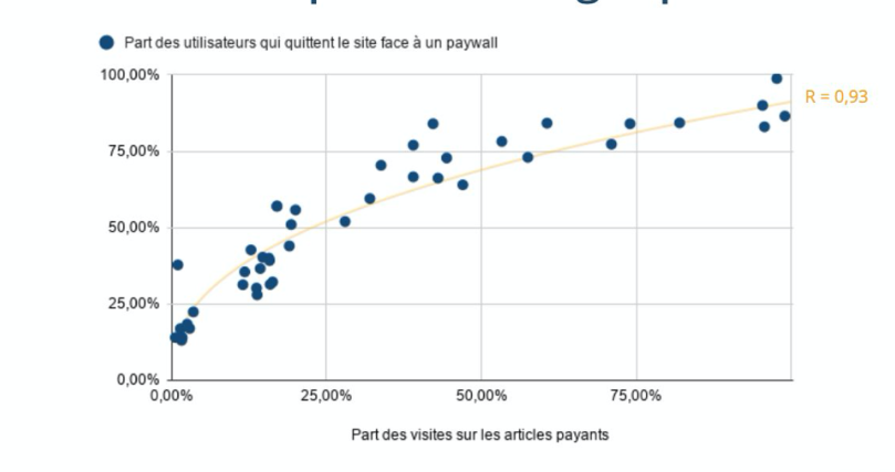
Concerning the paywall, the way it's displayed and the number of times it's seen by readers will directly impact the amount of visits to the subscription funnel, and thus on the conversion rate. So, you’ll need to keep an eye on this.
What are this step’s objectives?
There are three key objectives here:
- Raise the reader’s awareness and spark their interest. After 30 years of free internet, we must raise the public awareness to funding online content via subscriptions. We need to stop simply showcasing arguments surrounding frustration to convince readers. First and foremost, readers should be interested in your rationale, your added value and what you offer. They should crave the next step. For more information on this subject, please read this article on UX writing.
- Obviously, to drive traffic towards the subscription funnel. Raising awareness is important but it’s unfortunately not measurable. Therefore, the primary quantifiable objective is the rate of visits to the subscription funnel. The secondary one being conversion rate. If the paywall states that there is a 12 month free trial but in the next step the user discovers that this isn't offered, the click through rate (CTR) will be high but conversion will be weaker. Thus, in order to drive traffic to the subscription funnel, paid content visibility must be improved as well as paywall design and wording.
- Preventing users from leaving the website. Even though it’s often disregarded, it’s a very important indicator. The majority of editors with premium offers combine several business models simultaneously on their website (advertising, events, training, …). These other business models depend on traffic and engagement rates. If you block all of your content, there will be a 6-month subscription increase. You will, however, negatively impact all other business models and won’t get any new subscribers after these 6 months (once your loyal user base is converted). Monitor the website exit rates and if there's a sharp drop, keep an eye on the traffic share for your paid-for content.
Naturally, the indicators we recommend surveying at this step are traffic share for paid content, number of readers confronted with the paywall per month, paywall visibility rate and also its CTR.
Here are a few examples from which to draw inspiration and succeed in this first step.
The New York Times and the Washington Post have understood a key point here. In order for the paywall to be clicked on it must be visible. At Poool we have observed an average 50% paywall visibility for editors. This means that 50% of readers don’t see the paywall when they read a premium article.


Both editors get close to 100% visibility rate with this strategy.
The second important element, that has been well understood by The Financial Times and Quartz, is that, for the paywall to be clicked on, you need to create an enticing and clearly outlined value proposal.


As we can see with the Financial Times, the value proposal is clearly put forward and explicit (“Leverage our market expertise : Expert insights, analysis and smart data help you cut through the noise to spot trends, risks and opportunities”). The same goes for Quartz.
As a final example of good practice, we'd recommend simplifying the conversion funnel. We'll see this later, and have seen before in the Digital Media Review, but once a reader is in the subscription funnel, conversion rates remain relatively low (and it’s even worse on mobiles with a 1 to 5 differential VS desktop 😱). So, the simpler the path and the fewer the steps, the better (generally). The Financial Times and The New York Times are examples of this (pictures above). In the case of the Financial Times, one step of the funnel is 'saved' as the subscription offers are presented on the paywall itself and, once readers click, they are redirected straight to the form (account + payment). In the case of the New York Times, it's the account creation form that's integrated into the paywall.
If you wish to implement similar strategies for your paywall, book a free demo with Poool!
Our final recommendation for this step: it may be hard but, most importantly, you must find a balance between content discovery and interest with frustration generated by the paywall and conversion. This symmetry between engagement and frustration will allow you to create a durable stream of income. Setting up a dynamic paywall strategy will help you to adapt to the reader profile, the type of content or the source of traffic. Ultimately, it will get you loyal users and conversions all at once, by simply tailoring the content access experience.
Step 2 - The offers
The step that follows the paywall is (generally) the page presenting subscription offers. As we will see, this isn’t always the case and this step can be essential or completely useless according to context.
There’s no consensus regarding the offer presentation step. However, there are two main approaches that we've found at this point in the conversion funnel.
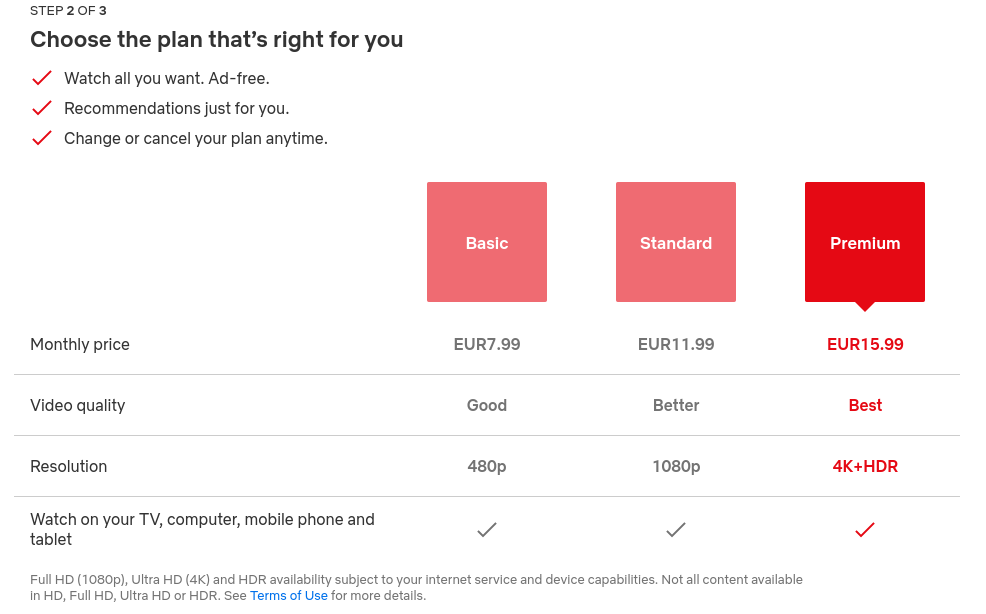
- Case 1: Showing a page presenting the offer(s) and taking this opportunity to showcase the media’s value proposal (even though this isn’t constantly done). This is the case of the New York Times and Netflix. For the New York Times, only one offer is put forward, whereas Netflix gives several options.

- Case 2: skipping the offer presentation page and leading the user straight to the next step (form, payment, …). For example, The Athletic or Quartz.
Another clarification: the type, number and order of the conversion funnel steps are an ongoing debate. During our benchmarking we have observed 3 points of view on the matter:
- The one page format like for The Athletic or Quartz
- The steps format like for Washington Post, The Times or Netflix
- The ‘hybrid’ format with an offer presentation page and one page for subscribing such as the New York Times
What is this step’s objective? (if you choose to implement it)
For those that use this offer presentation step, the objective is obviously to strengthen the value proposition and to direct the user to the most relevant offer. This may seem obvious, but it's important. Redirecting the user towards the most relevant offer implies that there are at least two offers that differ and a user will be able to weigh up the benefits of each, making an informed choice. If you choose to give multiple options, most media generally suggest 3 as optimal, with the ‘best value’ offer highlighted in the middle of the page. Pro tip: on mobile, put this offer forward, in first place and immediately visible on the screen.
The indicators that need to be followed are, naturally, CTR, time spent on the page (to measure traffic quality) and potentially also differences in performance (CTR and time spent) according to where the user has come from. For example, if they come from the paywall and have already seen the subscription page, behavior will be different and maybe the offer page will also be different according to this context.
Our final recommendation for this step: Should the user be directed to the subscription page or straight to the form + payment step?
And the answer is … 🥁🥁🥁 … there is no ‘one fits all’ answer. It depends on each publishers and the context in which the readers find themselves.
If you run a paying user acquisition campaign on users that don't necessarily know you well (e.g. on Facebook or Google), you’ll likely have to redirect them to the presentation offer page with a clear and explicit value proposal. On the other hand, if the user has already seen the subscription offers but left last time, you could offer them a solution perfectly suited to their profile and direct them straight to the form and payment step (with the offer pre-selected). To sum it up, keep both steps and run tests to see what works best according to the user context.
Pro tip: don’t rely on what others are doing.
Step 3 - The form (account creation and data collection)
Your reader clicked through to your paid content and was brave enough to click on the paywall to see your subscription offers. They selected the offer that suited them best and now they'll be directed to the form. They are now an intentional reader. Good job! All you have left to do is to close the sale.
Why is this step important?
There are two main reasons:
- It will allow you to collect the information needed to manage the user’s account (email address, password, etc)
- It’s also a dangerous step, because if you ask for too much or irrelevant information (e.g. asking for an address with a digital subscription) you risk chasing readers away.
So, what are this step’s objectives? And what are some good practices?
There are, once again, three viewpoints:
- There are those who ask for a lot of information, like the Financial Times and The Times. The Times asks for 9 boxes to be filled at the form stage, even for a digital offer. However, we imagine that this may be more of a technical limitation related to subscription solution constraints, rather than a desire from the marketing and product team.
- Those who ask for the bare minimum, such as email address and password. This is the case for Canal + and Audible. The Washington Post goes even further, only requiring an email address (a password is requested after having paid which simplifies the conversion process).
- Then there are those who ask for even less than the bare minimum: nothing 😱. This is the case with Quartz who asks for account information after payment.
Pro tip - A little something to improve this step is to offer a social sign-in, like The Athletic or the New York Times does. This will help boost conversion rates.

Indicators to follow at this stage are: the conversion rate to the next step (obviously) and the form completion rate for those who stop (to see where they stop).
Our final recommendations for this step:
1 - Don’t ask for too much. We always see the benefits in asking for additional information without necessarily measuring the hidden costs that this represents (i.e. negative impact on the conversion rate).
2 - Test, test and test again… Amazon, after 20 years of experience on the matter, still makes A/B tests on their conversion funnel. There will always be improvements to be made on your part too.
Step 4 - The payment
HERE WE ARE! The toughest part is behind us. The reader has been blocked by your paywall, seen the subscription offers, chosen one and filled in the form. You’ve won 🥳. Well, almost. There is still a minor detail. Paying.
Why is this an important step:
I think we all agree here. Not to state the obvious but the goal is to get the user to pay and complete their subscription.
This is of course true, but not as simple as it may seem...
What are this step’s objectives?
We’ve said it enough times, the objective is to turn the user into a subscriber. For this, we must:
1 - Offer a good payment method. Again, there are several options here:
- Some publishers offer just one payment method, like Canal + or Quartz
- Others offer several, like The Times or the NYT. Credit card is usually an option and sometimes Paypal or Amazon pay, like The Washington Post, owned by (surprise surprise) Jeff Bezos :)
2 - Reassuring your user! If they've arrived at this step, it means they are very interested in subscribing. But can still leave. That is why you should reassure them. Reassurance is generally a key element in a successful conversion funnel (this is true for media, just like it has been for e-commerce for a long time).
The Times is a great examples. Throughout the whole journey, they show this banner on the right, outlining the subscription offer, when it will start, contact information if the user needs support and billing details.

With Canal +, they offer secured payment as well as the possibility to cancel subscription at any time. Netflix states the same thing.

For Audible and The New York Times, as well as using standard reassurance elements (“customer care”, “secure transaction”), go further and explain the billing process in detail, including times when there are offers, indicating at every step that it’s ‘’non-binding’’ and that there is a ‘’cancel at any time’’ possibility.


At this step, we recommend following indicators such as:
- The exit rate (obviously)
- % of choice of payment method (VS any other)
- % of payment method conversion
- Conversion rate/choice rate. There may be one payment method making more conversions (volume wise) than another, but in reality the 1st method has a smaller conversion rate (conversion / number of times that method is chosen) than the second payment method
Another indicator to keep an eye on would be the ratio between the choice of a payment method and the Lifetime Value (LTV). A payment method may have a smaller conversion rate but a bigger LTV, hence producing more revenue. For example, this could be debit payment (which isn’t mentioned here, as none of the 11 editors in this study use it).
Our final recommendations at this step: There are 3.
- Always reassure your user (as in every step of the funnel)
- Suggest several payment methods. If you are a ‘small editor’, use third-party payment methods (e.g. Paypal) in order to comfort the reader (even Netflix does it)
- If you have the time and resources, find out which payment methods allow for the best conversion rate (compared to the number of choices) and ideally the best LTV. This means you can highlight a certain payment method and maybe even offer a discount if a user chooses it
Bonus. We’ve now seen that there are several types of subscription funnels, with or without a page presenting offers, with the creation of an account before or after payment, etc… Each funnel’s objective needs to be coherent with the publisher's business in order to enhance conversion rates. But, as we all know, the conversion rate of a subscription funnel is relatively low. Some editors, for that reason, look to improve the number of subscriptions by allowing one to do so directly on the article page.
This is the case with Alternatives Economiques, one of Poool’s clients, who allow users to create an account and to pay directly on the paywall, in just 1 click.
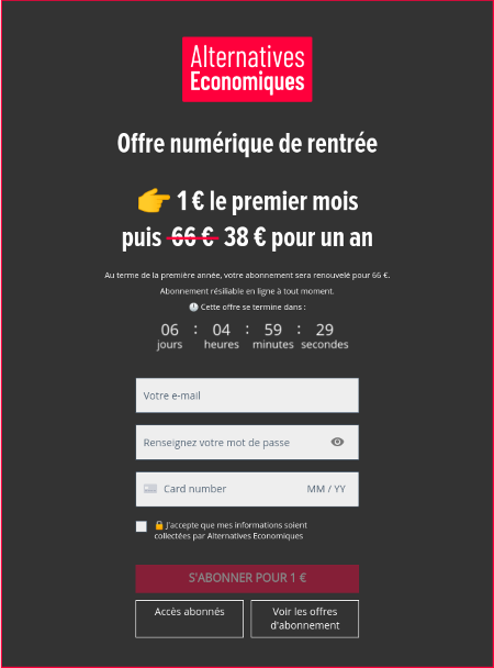
Here, the objective is the same. Improve the user experience and increase the number of subscriptions.
If you want to put similar strategies in place for your paywall, book a free demo with our team!
Step 5 - The subscription confirmation and sometimes onboarding
Why is this an important step?
We all know that it’s harder, and most costly, to gain a new subscriber than to keep an existing one.
Your newly subscribed reader's first experience with you will be the payment confirmation and potential onboarding. And there is nothing worse than buying something on an e-commerce website or subscribing to a media and not getting an order confirmation (via email or on the website).
The result is that you spend the first 5 minutes of your subscriber life trying to find out whether you are one (either by checking your emails or in an account section on the website). All that despite the fact that a simple email confirmation can create a satisfying experience leading to better retention.
What are this step’s objectives?
- Reassuring (yet again). As explained above, confirming a subscription is a reassuring element for the reader and a positive first experience. It isn’t always the case, although it’s becoming more common (thankfully). Here are the Canal + and Financial Times examples.


- Welcoming. It's obvious that confirmation is a good chance to speak to your new subscriber, to thank and welcome them. This can be done in a variety of ways. The Times thanks the reader and communicates their value proposition again.

- Onboarding. Some editors go even further and offer users the option to choose some key features, personalize their account or outline reading preferences. These types of initiatives allow editors to improve their subscribers’ engagement (which is crucial during the first few days) and reduce future churn.
For example, we can see that the New York Times encourages users to download the NYT app and subscribe to their newsletters. This is likely due to the fact that their data teams have observed that subscription to a newsletter or downloading the app in the first days is correlated to reducing the churn.


Or even Netflix who seeks to gather new users’ preferences to personalize their experience.

- Finalising account creation. A rarer objective but none the less interesting. This is the case of Quartz, who prioritize the payment step in the conversion funnel and only ask for account creation once payment is confirmed.


For this step, we recommend following these indicators:
- The post-subscription article reading rate. As we’ll observe later on, once the subscription phase is over, many publishers don’t redirect the readers to the article they were reading before subscription. A user who has just subscribed will obviously want to start using your site. If that’s not the case, it needs to be understood why. Is it due to a technical problem? Because of the user's path?
- The activation rate for your features if you onboard. If there's an onboarding offer (such as with Netflix or the NYT), it may be good to know the feature activation rates, to make sure that the right features are put forward and that activation has had a positive impact on their life-time value
Our final recommendation for this step
At a minimum, offer reassurance and welcoming. Providing a good user experience isn’t just a competitive advantage anymore, it’s a norm. Reassuring and welcoming is therefore the bare minimum in 2020 (at least do an on-site confirmation and an offsite welcome).
Step 6 - Back to content
Why is this an important step?
It may seem obvious, but if you're reading content and get blocked, the least that the publisher can do is redirect you back to this article once you’ve made the effort to subscribe. Again, this is a minor detail, but the reader has just subscribed and you need make a good first impression. Unfortunately, half the editors we observed in the benchmark, such as the Washington Post or the Financial Times, don’t redirect to the reader’s article after subscription.
What is this step’s objective?
It's very simple. Automatically redirecting users to their article or give them a choice of going back by themselves. An excellent example of this is that of Quartz.

Indicators to be observed at this step:
Like for the previous step, you’ll have to look at the post-subscription reading rate (number of new subscribers with at least one article read after subscribing / number of new subscribers). If your new subscribers don’t read articles, there's probably a problem somewhere.
Our final recommendation for this step:
“Just do it”
Summarizing the summary #Inception
We made a series of articles presenting the subscription path on 11 publishers' websites. We summarized this in a white paper (here). But we wanted to summarize that summary (#inception). That is, we've made a Google Sheet presenting a condensed version of the key information for each subscription path:
- The number of steps needed
- The steps’ order
- The number of clocks between 1st contact with paid-for content and subscription
- The number of offers put forward
- The amount of information requested
- The different payment methods available
- Our little bonus
The summary is available here.
Conclusion
As we've been able to observe throughout this summary, publishers have different methods of optimizing their conversion funnels.
With the New York Times aiming for 10 million subscribers online, the tempting option would be to replicate their subscription path. If you do make that choice, I predict a bit of short-term success, but very little on the medium to long term. What works for them won’t necessarily work for you. Each publisher has its own identity, audience and business model. Thus, its own conversion funnel.
As discussed in the introduction, we can now confirm that there is no single conversion funnel that guarantees optimal conversion rates.
However, we've shared a variety of good examples and best practices. We also want to end by sharing 10 methods that will help you in bettering your chances of building an optimal conversion funnel for your site:
- Have a mobile first design
- Have a simple and elegant path
- Put forward reassurance elements
- Limit the number of clicks to a minimum
- Remove as many distractions from the page as possible
- Have clear messages in the case of errors in the forms
- Always guide the user in their path (e.g. progress bar)
- Always show an order recap
- Offer the possibility of contacting support
- Always highlight and remind users of your value proposition
NB : This last point is very important because, as opposed to e-commerce, the user isn’t buying an offer but rather a value proposition.
To summarize, don’t take anything for granted. Go out there and make your conversion funnel work for you. And, if in doubt, test.
Interested in a paywall and subscription strategy? Book a free demo with our team now!