
This series looks at the paywalls employed by a variety of online content producers. The user journey, the amount of information required from the user, the payment methods offered and the ease of unsubscribing. These are all key to ensuring the success of a paywall, hence why we created this series and are analyzing the conversion funnels of these publishers.
Remember, however, that your most valuable tool to persuading a reader to take out their credit card and subscribe is your value proposition and content.
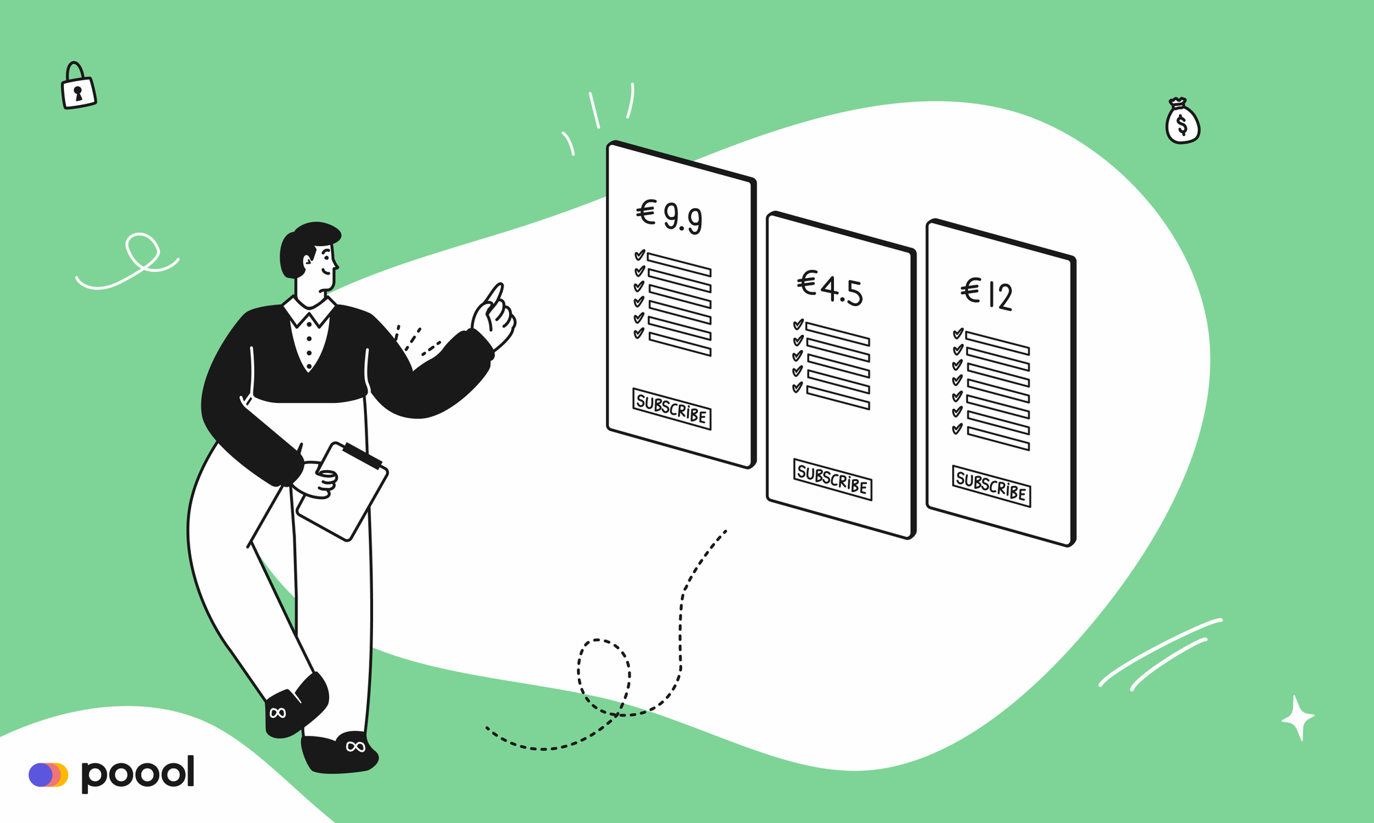
We'll cover:
- The Financial Times Paywall
- The Washington Post Paywall
- The New York Times Paywall
- Quartz Paywall
- Wired Paywall
- The Athletic Paywall
- Netflix Paywall (VOD)
- Canal+ Paywall (VOD)
- Audible Paywall (audio)
Interested in implementing a paywall and subscription strategy with the same success as these publishers? Poool have a simple, flexible platform to allow you to do exactly this, and without the need for tech support at every turn!
Book a demoToday: The New York Times!
What's the journey for a user who wishes to subscribe to The New York Times (NYT)?
- 10 clicks are needed to subscribe and return to content
- 2 scrolls are required
- 2 fields need to be filled out (email address and password)
- 2 payment methods are available (card or Paypal).
So, step by step.
Step 1: creating an account
We can read one article for free without being blocked by a wall, but are then required to either create a free account or subscribe to read on. We choose the free option (registration) and we created a password.
Then, instead of being redirected towards the article that we came from, we are asked two things.
Firstly, we're asked if we want to subscribe now or if want to continue without subscribing (we opt for the latter).
Secondly, we are then encouraged to subscribe to the NYT newsletters.
The first newsletter shown to us is the 'Morning Briefing' aimed at 'international readers' (more precisely, Europeans). From our location data, the NYT has understood that we were European readers and personalized the choice of newsletters accordingly.
A second screen invites us to choose from a wide variety of newsletters. We opted for the “maybe later” option.
Then, instead of being brought back to the article, yet another page suggests that we enter our phone number in order to receive a link to the app. At this stage, we have simply registered as a user and have been taken through many steps, with a lot of the publisher's KPIs being involved, such as increasing registered users and recipients of the newsletter as well as collecting 1st party data.
We opted for the “no, thanks, take me back to reading” option.
We are now, finally, redirected to the article that we'd been reading. We then browse the website and read a few more articles.
Step 2: The real “wall” (paywall)
Despite this long process, we are stopped again after reading a handful of articles.
The paywall hides the article text and informs us that subscribing will allow us to keep reading without being interrupted. However, we don't in fact have an option here as we can't close the wall and read on. So, we click on 'subscribe now'.
Step 3: login
We are directed to another page, with 'Account-Billing-Confirmation' across the top, showing us the 3 subscription stages.
As we've already created a free account, they welcome us back”and ask us to login. We don’t have a choice here between different subscription options, the Basic Digital Access seems to be the only one available.
Step 4: Payment
After having logged in, we're directed to the payment page. Two payment methods are available: credit card or PayPal. One scroll is needed to click on “purchase subscription”.
Step 5: Confirmation
We get shown a summary of our subscription package and payment as well as an offer on the upgraded version of our order.
We click on the discrete, grey button “Continue without All Access”.
Step 6: Newsletter options
We are yet again asked if we want to sign up to some of their newsletters. We opted for the “maybe later” option.
Step 7: app
Same goes for the app. We don't really get why they're asking us this again after we've already registered, but we click on the “no thanks, take me back to reading”.
Except this time, we aren’t redirected to our article but to the home page. After all of these steps, it would be useful to take us back to where we started.
We find the article we wanted to read.
That’s it, we’ve subscribed to The New York Times and were able to read our article!
Note that we didn't subscribe immediately but first registered, meaning that we came across the newsletter and app pages twice. This added 2 extra clicks to the user journey and definitely made the experience a lot longer. In our calculation of clicks needed to subscribe, we only included the number required to subscribe directly (without registering first).
To sum it up, here are the steps needed to subscribe to The New York Times:
- 10 clicks are needed to subscribe and return to content
- 2 scrolls are needed to see the payment form in its entirety and to log in when we are “welcomed back”
- 2 fields need to be filled out (email address and password) - option of adding phone number or not
- 2 payment methods (card or Paypal).
What about mobile devices?
The same subscription journey but a more mobile-friendly experience.
Interested in integrating Poool's Paywall into your site? Our Paywall platform allows you to segment audiences, block content differently depending on the user's context, A/B test journeys, analyze and optimize, all within our Dashboard!