

The goal: Reduce frustration, increase engagement and conversions.
To wrap it up:
- Work on increasing engagement prior to the moment that you present your paywall
- Segment audiences to adapt to the user and present walls that are less likely to frustrate
- Forefront your value proposition onsite and on your wall
- Catch user’s attention: be brief, avoid distractions, use bold CTAs and focus on benefits over functionalities
- Optimize your wall for mobile access
A paywall is a valuable tool for turning your audience into business, but there’s a lot to get right before you can successfully integrate one into your site and launch a subscription strategy. One of these is finding the balance between engagement and frustration, ensuring users convert rather than leave your site. In fact, frustrating users and reducing traffic is a huge worry for publishers before launching a paywall.
So, how can this problem be solved, how can you find the balance between engagement and frustration?
This article will cover 5 key areas to work on to reduce paywall frustration:
- Quantity of premium content
- Timing, when you show the paywall
- Transparency with your audience
- Effective copy on your wall
- Mobile optimization
- Soft conversion engagement steps
Quantity of premium content
Premium content refers to anything behind your paywall - content that requires a user to pay for subscription before gaining full access.
Of course, in order to promote your offers, it’s important to forefront this premium content and encourage traffic to see the value in subscription rather than simply being satisfied with what you offer for free. And, in fact, it’s been proven that the visibility of premium content has a direct correlation with conversion rates. However, there is a limit where the link no longer works (about 40% visibility) and many audiences will become frustrated. Having said this, the optimal visibility for a site will differ depending on audience, content and strategy, so whilst the Financial Times successfully has extremely high visibility with a hard paywall, this might not work quite as well for you.
To solve this, a balance needs to be found between engagement in premium content and frustration - one that suits your business model and stops at the limit that your audience appears to become frustrated. The best way to do this is through A/B testing - launch and iterate.
Aside from this, you can work on other techniques to reduce frustration caused by a high quantity/visibility of premium content:
- Allow users to explore your content and offers: provide proof-of-concept, either by employing a metered wall (offer a limited number of articles for free before the paywall), only block after a third/half of the content or by offering a free trial
- Improve the paywall design itself and communicate your value proposition: if you’re going to increase the number of times that a user is confronted with your wall then it needs to stand out and convince them to convert. Above all, it should forefront your value proposition to inform your audience of why subscription is worth paying for. You should also place the value proposition elsewhere on your site to help users understand your products and offerings before being presented with the wall, such as via banners or on the side panel
- Measure indicators: this is to find the perfect visibility rate for your content, audience and strategy. We recommend following these key indicators: traffic on paid content, click-through rate on your paywall and rate of departure from your site
Timing
It’s a tricky aspect of the wall to consider, and a decision that shouldn’t be taken lightly - when’s the best time to present the wall and ask for subscription?
Well, just like any purchase journey, a user has to be nurtured through the buyer funnel and proposed subscription at the point of consideration, when they’re already engaged in your content and have seen the value in your offers. One way to ensure this is to promote your value proposition throughout the user journey and ensure users are aware of which content is premium before arriving at the wall (making the paywall a lot less surprising).
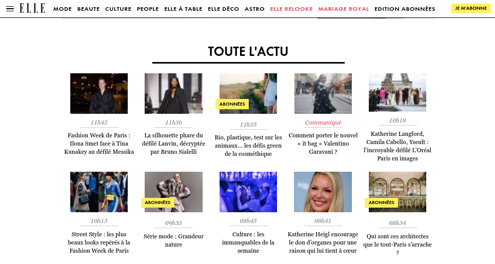
ELLE, for example, labels premium content in a yellow tag (‘abonés’/subscribers), creating a site-wide association between this color and subscription whilst also informing readers that an article will contain a paywall before they arrive on the page.
However, perhaps the most valuable technique for reducing frustration when it comes to paywall timing is audience segmentation. By grouping your users into relevant cohorts, you can build adapted experiences that nurture them toward subscription, reduce frustration and present them with the wall at a time that's most likely to convert them based on their context or profile.
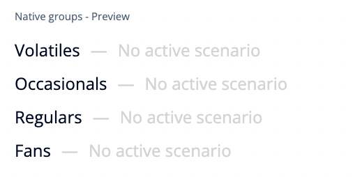
For instance, in the Poool Dashboard, we have a native segmentation (although it’s also very easy to create custom groupings) based on a user’s engagement level, splitting audiences into Volatiles, Occasionals, Regulars and Fans. These users are at different stages of the purchasing funnel, so whilst a hard, immediate paywall block may convert a fan who is very engaged and consumes your content on a regular basis, it may well turn a volatile or occasional user away from your site for good. Instead, we can build an engagement funnel for these users, such as by employing a registration or newsletter wall prior to the paywall or offering some premium content for free, gradually leading them to subscription.
Transparency
Your goal, from the moment a user first visits your site, is to build a strong and lasting relationship with them. And, one of the biggest factors at play in achieving this is ensuring they trust you. This comes down to communication and being honest with users about your strategy.
Your wall copy will, of course, play a role here (we’ll come to this later) but UX design throughout the user journey is also important.
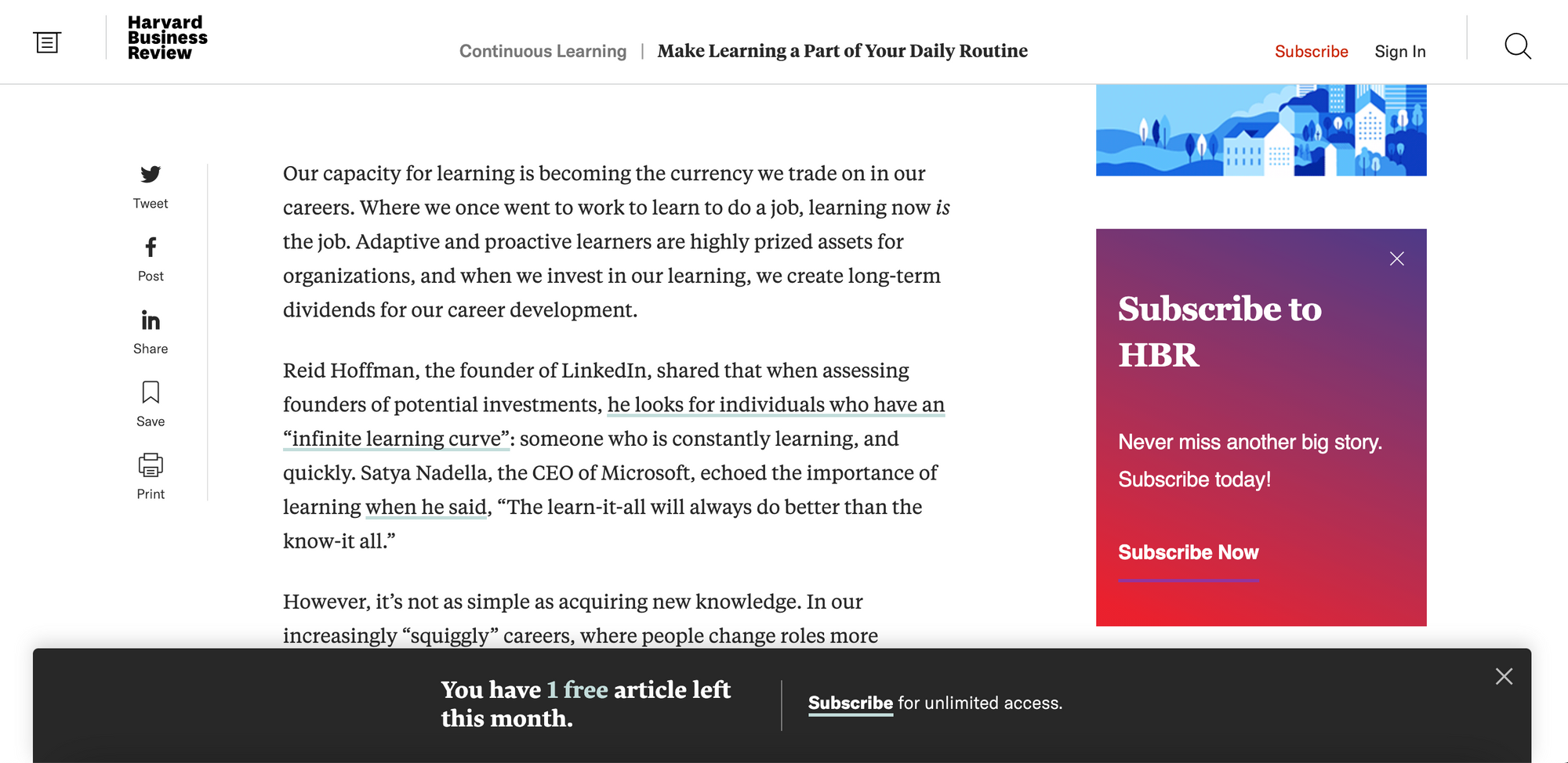
For instance, if you’re employing a metered wall approach (where you offer a limited number of articles for free before presenting the paywall), you should consider informing users of how many they have left, reducing the surprise and frustration when they reach the limit. This is the technique employed by HBR and Medium.

Copy
UX writing means choosing words that serve a definite purpose and take the user’s context into account. Specifically, whilst you want to convince them to subscribe and improve your content monetization through conversions, you also seek to solve user’s problems, understand their feelings and surpass their expectations. Effective writing that achieves these two aims will reduce frustration and increase conversions simultaneously.
Serving your marketing aim:
- Persuasive language that guides users to your CTAs without being harsh and direct (verbs that are friendlier than ‘Subscribe’, such as ‘Join’, ‘Select this offer’)
- Clear labels (including for form fields, e.g. what are your password requirements, such as needing to include capitals, numbers, etc)
- Focus on benefits rather than functionalities, price or supports (‘Unlimited access’)
- Highlight your mission and the value of what you do (‘Support the production of content’)
Serving your user’s needs, desires and feelings:
- Reassure (‘Cancel anytime’, ‘Secure payment’)
- Highlight value/benefits (‘Access all premium content’, ‘Exclusive newsletters’)
- Create a group belonging (‘Join our community’, ‘Become a member’)
- Write copy that matches your mission and encourages users to share your values (‘Support independent journalism’ appeals to users’ sense of comradery and responsibility to support you)
Mobile optimization
Today, according to research, roughly 44.1% of traffic worldwide is on a mobile device and increasingly more people are using their phones to order goods and services. Therefore, not optimizing your site for access on mobile devices means you’re missing out on a significant number of potential subscribers who are turned away by a frustrating UX on their phones.
Below are some benchmark examples of paywalls optimized for mobile access and techniques to employ to reduce frustration and increase conversions:
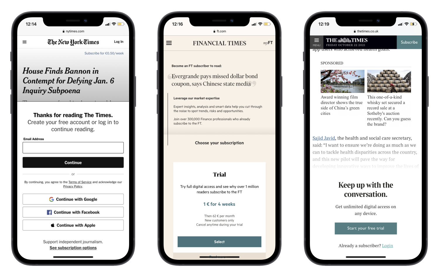
- A single line at the top that catches a user's eye and communicates your value proposition, like The Times - user’s attention is even harder to grab on mobile
- Limit text - be brief - and consider colors or visual aids to aid quick comprehension
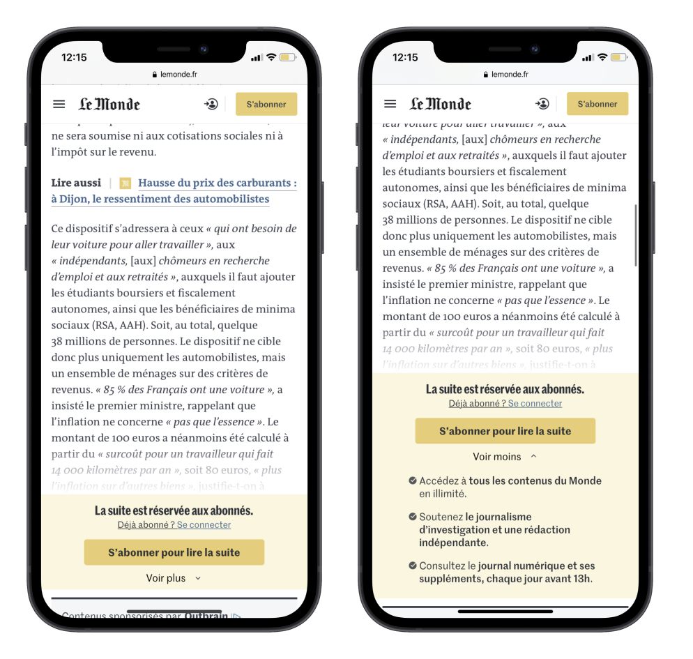
- Adapt the wall to the smaller screen size. Le Monde, for example, has a collapsible wall with the user being able to click ‘voir plus’ (see more) to read the benefits of subscription and more of Le Monde’s value proposition. Even still, limit this list to 2 or 3 ideally
- If showing subscription offers on your paywall, make sure users have to scroll down to view all offers, rather than across (like the FT)
- If asking users to login or create an account on your wall, offer easy sign in options with an existing social account, such as Facebook and Apple (like the NYT)
- Big, bold CTA buttons and clear, short headings for the paywall
Soft conversion engagement steps
Just as you can make the paywall itself less frustrating, you can also add steps into the subscription funnel to softly convert your users prior to the paywall.
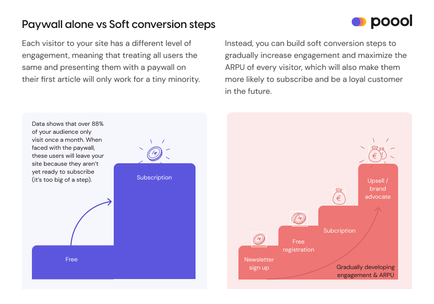
As mentioned in the introduction, the goal of a paywall is to find a balance between frustration and engagement, with just the right amount of each to convince a user to click through the wall and subscribe. Soft conversion steps therefore act as a way of increasing engagement so as to reduce frustration when the user reaches the paywall.
Think of running - showing a hard paywall immediately is like being thrown in the deep end and asking someone to run a 10k without ever having run before. However, with soft conversions, you encourage them to start by walking, then jogging then running, gradually increasing engagement to lessen the frustration experienced when confronted with the wall.
So, what are examples of these soft conversion steps?
- Registration wall: blocks the user and requires that they create a free account on your website in order to access content. A registration wall is perhaps the most valuable soft conversion tool that has a hugely wide range of benefits for digital publishers, including first-party data collection, wide personalization potential, increased ad revenue and, of course, boosted engagement to lead a user to subscribing
- Newsletter wall: ask your audience to sign up for your newsletter to deliver content straight to their inbox and create a habit to increase frequency of content consumption. Discover the benefits of newsletters in this article: The Newsletter Comeback
- Survey walls: exchange access to content for your user’s opinion
- Discovery pass or offered article: allow users to discover premium content for free to ensure that they see value in your product and want to subscribe when faced with the paywall
You may also be interested in:
 Madeleine White
 Madeleine White