
One of the most important parts of Poool’s mission is to create solutions that are entirely adaptable to a company’s strategy, branding, content and audience. A wall should be able to fit seamlessly into your site, designed to attract your target audience and achieve the goals that your company set out to reach.
That’s why our Dashboard gives marketing teams full autonomy to customize every aspect of the wall design, wording and user journey without having to rely on tech support. And, thanks to our new design builder, it’s about to get even easier to make beautiful walls that engage, convert and monetize!
So, today, we thought we’d show you the endless design possibilities available to our clients via the Dashboard as well as demonstrate the importance of a well-designed wall for conversion rates. This article will take examples from 4 of our successful clients, analyzing the design choices made and picking out best practices for you to apply to your strategy. We’ll look at the walls employed by:
- ELLE
- Welcome to the Jungle
- Alternatives Économiques
- Le Journal du Dimanche
We’ll also throw in some top tips from our consultancy team for you to take away with you as well as a bonus sneak preview of what's now possible with our design builder!
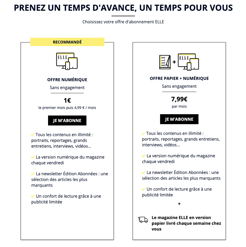
ELLE
We’re very thankful to have been able to work with ELLE for a good few years now and it’s been a pleasure to see the development of their paywall and subscription strategy.
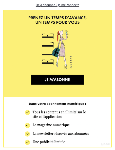
Their initial design consisted of a sleek, classy paywall, employing neutral colors that matched the ELLE branding and house style. The buttons clearly defined, outlined in black to forefront the CTA and encourage conversion.
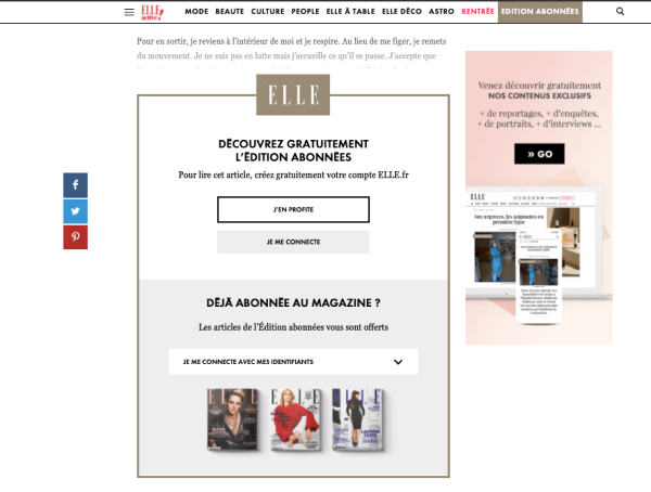
However, they decided to alter their wall design approach to increase conversions and ensure the wall stands out on the page, taking attention away from ads and other distractions. Their new strategy exploits this bright yellow color to represent subscription across their site, being employed for paywalls, CTA buttons in the menu bar and banners on premium articles.
The team have also been able to run temporary, seasonal wall designs to reduce habituation - if users become too accustomed to something, then its impact is significantly damped. Therefore, continuously varying design increases wall visibility, its impact on the user and click-through rates.
For example, ELLE were able to run temporary summer and back-to-school wall designs with ease via the Dashboard that allows changes to be made and launched in minutes. Importantly though, the team ensured that their establishment of yellow signifying subscription remained intact by using this color for CTA buttons and integrating it into each image.
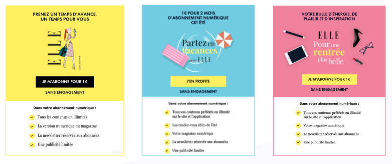
ELLE also carry out A/B tests on a frequent basis to ensure the design and wording is optimized for conversion. This is highly recommended, not just for the launch of your paywall strategy but on a continuous basis - A/B testing is an extremely user-friendly but highly valuable optimization method. Despite a test often only increasing conversion rates by a minor percentage, the culmination of these improvements, over even a short period of time, will have a significant impact on your revenues.
Key takeaways from ELLE’s paywall design:
👉 Place a clear and well-defined value proposition at the forefront of your wall
👉 Centralize the call to action button in colors that stand out compared to the background
👉 Decide on a site-wide use of a single color to represent subscription
👉 List key benefits of the subscription offer on the wall itself
👉 Continuously alter and optimize your paywall through A/B testing, temporary and seasonal designs
“It’s very important to regularly modify your designs and wording on your walls to reaccelerate your click-through rates and avoid readers being fatigued with seeing the same wall again and again and again...”
- Marion Wyss’ top tips, CMO @ Poool with 10 years experience in the media industry.
 Madeleine White
Welcome to the Jungle
Welcome to the Jungle employs a registration wall on their premium articles, reserving these for members only.
When a user tries to read a premium article, the text smoothly blends into the WTTJ registration wall (shown below). Just like ELLE, they’ve chosen a single color to represent registration and they do well to highlight the fact that this is free by underlining ‘gratuitement’ (for free) in this same color.
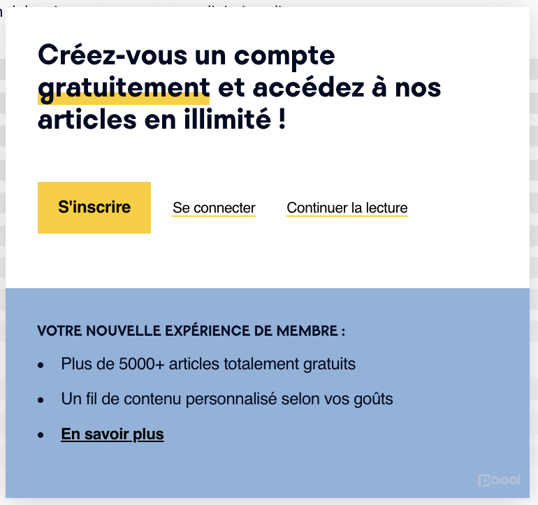
The colors are also infitting with the brand’s house style (yellow and black, just like their logo) as well as font and wording thanks to the complete personalization possibilities in the Poool Dashboard.
Importantly, the team have ensured that the CTA button uses the brightest, most prominent of their brand colors to call the reader’s attention to this part of the wall.
WTTJ have also made use of the CSS functionality in the Dashboard. Although we ensured that marketing teams have full autonomy for driving their wall strategy without dev (from designing, launching and testing to optimizing), we also made sure the Dashboard allows our clients to take personalization even further through CSS.
Key takeaways from WTTJ’s wall design:
👉 List the main benefits of registration or subscription on the wall
👉 Make use of your house colors and font to fit the wall seamlessly into your website
👉 Use CSS to take personalization even further
👉 Put emphasis on the CTA button and the fact that it’s free to create an account (or on the reduced/low cost of a subscription offer)
“WTTJ’s design of the wall in two seperate blocks is hugely effective - thanks to this clever UX work, both the value proposition and action for the user to follow are easily understood in a second.
The publisher has listed the central benefits of registering, without being too exhaustive that some readers abandon the process (keep in mind how an online user’s attention span is VERY limited, especially on mobiles).
What I appreciate in particular about WTTJ’s wall:
The clarity and concision of each element, which generally leads to more optimal results
The link “En savoir plus” (Find out more) is useful for users interested in discovering all the relevant information and simultaneously lightens the text on the wall”
- Anthony Ribeiro, Consulting Lead @ Poool, 7 years experience working with publishers
Alternatives Économiques
Alternatives Économiques take a different wall approach depending on the user’s propensity to subscribe, presenting less engaged visitors with a newsletter wall or free articles to discover content and increase frequency of visits, whilst those who seem already likely to subscribe will come across a hard paywall.
They employ our compact wall model which increases wall visibility and ‘pops-up’ midway through an article (or at any point chosen by the publisher).
The colors employed match AE’s branding, with the most bold colors being reseved for the CTA button and key phrase.
The team have also clearly worked hard on the messaging, calling on their users to support quality, independent journalism, appealing to people’s sense of responsibility, comradery to support something that they enjoy reading. This is a proven way to successfully convert users and get them on board with your mission, building a relationship that will last.
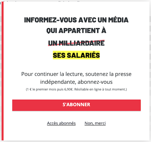
They’ve also exploited Poool’s Stripe integration option which allows our clients to ask for payment directly within the wall itself. Alternatives Économiques are a brilliant example of how to do this well, requiring minimal information from their users, minimizing steps in the conversion process and thus making it easy for a reader to subscribe, increasing conversion rates.
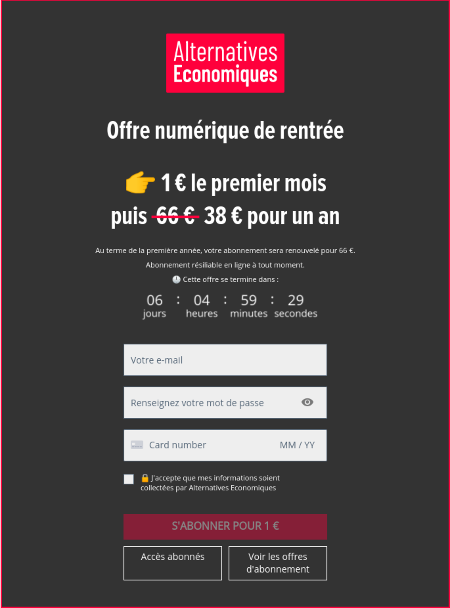
In addition to this, the team have very cleverly created a sense of urgency through a countdown clock on the wall, highlighting that this reduced offer is for a limited time only, paired with the normal price crossed out, encouraging readers to subscribe now to make the most of this saving.
In terms of UX, using white text on a black background is an effective highlighting tool for calling out short text that user’s are likely to skim read - white reflects all the colors of the visible light spectrum into the eyes, making it appear bright and distinct against its backdrop, making it perfect for this context.
Key takeaways from Alternatives Économiques wall design:
👉 Employ colors that match your branding
👉 Create a sense of urgency to encourage conversion (through wording and design)
👉 Integrate steps in the conversion funnel into the wall itself to make it easy for your user to register or subscribe
👉 Optimize UX to increase wall visibility and reduce habituation
👉 Write copy that matches your mission and helps to persuade your readers to share these values - e.g. AE aim to gain support from their users to continue to provide independent journalism
“Reducing steps in the subscription or registration funnel is key to ensuring a better customer experience and therefore a higher conversion rate.
Instead of redirecting readers to yet another page, publishers should consider and test in-wall conversion experiences.
Now, walls not only allow you to display the value proposition but also to collect data about the customer, make payments and more.”
- Stéphane Père, CRO @ Poool, 20 years in the media industry
Poool
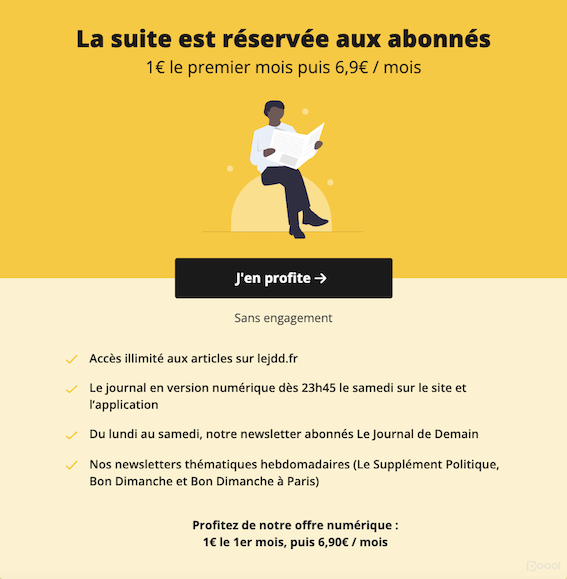
Le Journal du Dimanche
Le JDD employ a gradual engagement strategy to nurture readers towards conversion through employing a newsletter wall prior to the paywall.
Just like ELLE and WTTJ, they’ve developed an association between a single color and subscription - you can see this trend amongst the most successful publishers, and note how it’s always the brightest color chosen for this role.
Their wall therefore stands out clearly on the page, with the CTA button in the center and a list of key benefits of their subscription offer, helping to convince a reader to convert by emphasizing the value that they’ll receive. This is incredibly important - a paywall creates a value exchange with your audience, so you have to clearly and persuasively convey the value that your reader will get in exchange for the subscription cost, otherwise they won’t likely want to participate in the exchange.
The team also continue to carry out A/B tests on their design and wording to optimize conversion rates and ensure their readers aren’t becoming too accustomed to the same wall.
For example, they recently carried out tests on the color of the wall on mobile devices. This is all possible within the Dashboard - a publisher can create two alternative designs and launch an A/B test within minutes, configuring which user segment these designs will be tested in (here, the test was on users accessing the website on mobile devices). Results can be analyzed within the Dashboard itself and marketing teams can make any alterations to the wall with ease based on the test outcome.
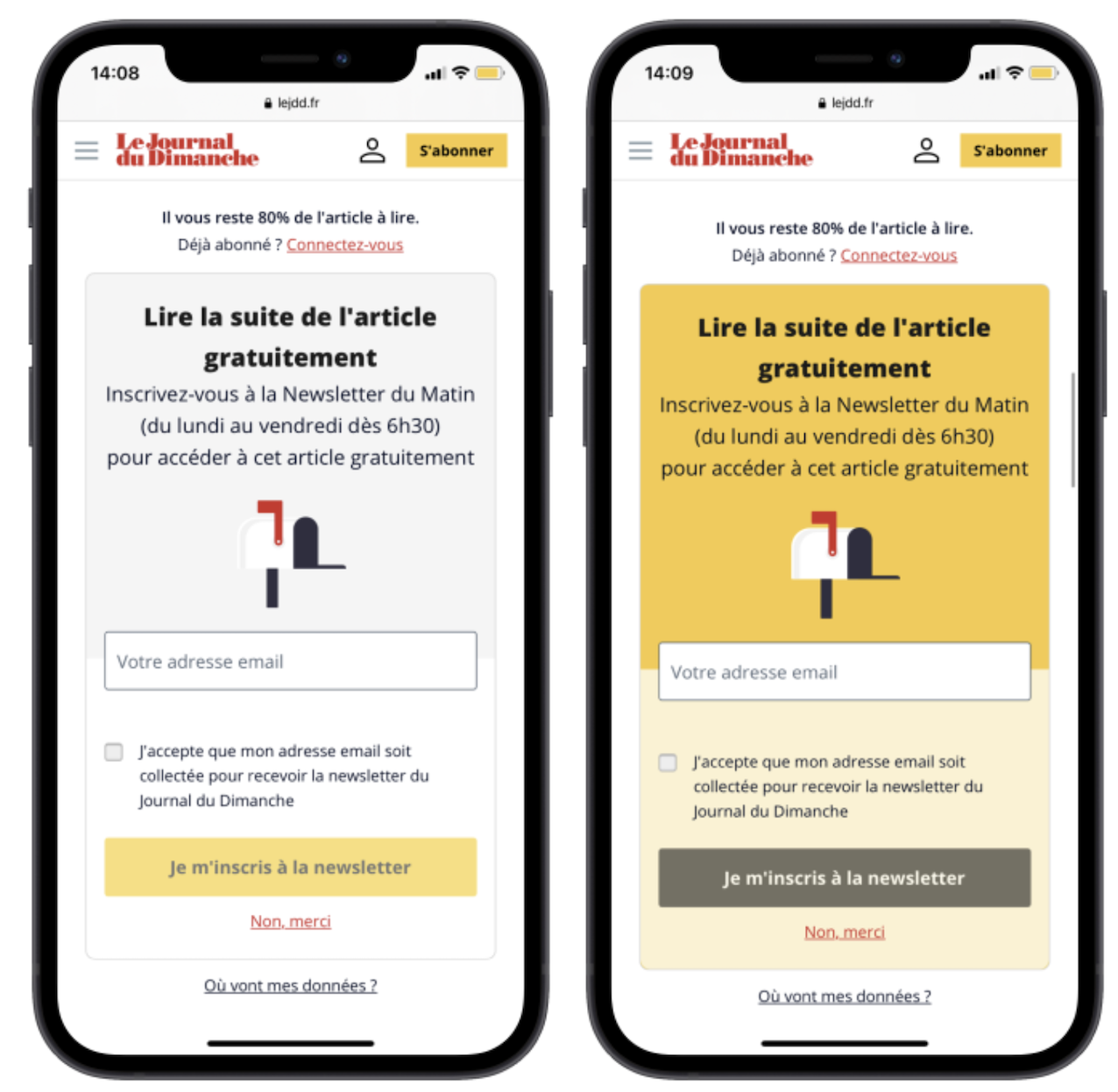
The test above involved the JDD newsletter wall which asks a user to sign up to recieve their newsletter in exchange for access to an article. Thanks to the ‘Form’ design section of the Dashboard, the team at JDD have been able to integrate an email collection field into the wall itself, reducing the number of clicks needed for a reader to register.
What’s more, they’ve employed an alternative image for this wall compared to the paywall. The image aids comprehension of the text, allowing a user to skim read the wall and understand the value exchange in less time, with minimal effort. Small techniques such as this go a long way in increasing CTRs.
Key takeaways from le JDD wall design:
👉 A/B test continuously to increase click-through and conversion rates
👉 Consider using images to support comprehension of the text when skim read by your users
👉 Collect data in the wall itself (such as email) to not only reduce steps in the funnel but also spread out the form fields and make it appear easy to complete (a long form with multiple fields can discourage a user)
👉 Don’t forget about the value exchange that your wall creates and how your design/copy should highlight the value that you’re offering
“Having the ability to manage a subscription strategy is not an easy task. We know this. However, we strongly believe continuous testing combined with a strong value proposition and a reduced funnel will help you to build a successful subscription strategy.
We may not have Coca Cola's secret formula, but we are sure Poool's testing capabilities will give you very interesting insights!”
- Jimena Llama, Customer Success Manager @ Poool
Poool
Poool's Brand New Design Builder
Our team is constantly working hard to continue to bring you new features and products that facilitate and assist in your job of turning audience into business. So, today, we’re proud and hugely excited to announce the soon-to-be-released design builder!
◀️ Before, as you’ve seen in this article, our Dashboard allowed for complete personalization of wall designs, but marketing teams were limited unless they employed CSS and had some tech help.
⏭️ Now, however, you can build your wall, piece by piece, just like a lego house, adding in blocks for headings, text, buttons, etc to completely personalize wall designs! And it's CODE FREE!!! 🤯🤯🤯
To give you an idea of what’s possible, our team ran a competition for the best wall design! Here are some of the entries:
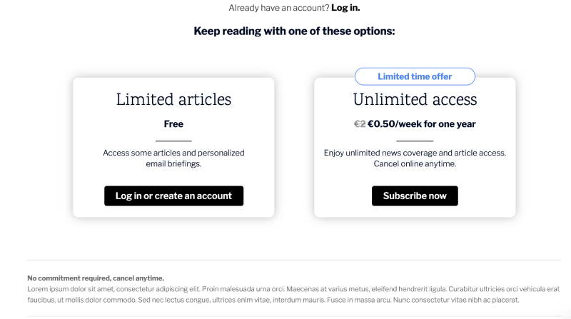
This first wall includes the subscription offers themselves, reducing the number of clicks/steps in the funnel whilst simultaneously highlighting the value in their offers.
Below, this paywall inspired by Le Monde takes the form of a banner, clearly showing the advantages of subscription and CTA button in the center.
And these two designs take inspiration from the NYT style paywall - one with the offers integrated into the wall and the other in the form of a banner - but both were made by one of our marketing team in the new Poool Dashboard without any tech intervention!
Overall, these examples from some of our successful clients really show how far you can go with the Poool Dashboard whilst also highlighting the importance of a well-designed wall for maximizing conversions.
Interested in trying out the Dashboard for yourself? Book a free demo and meeting with our team now!