

It’s always been clear to content producers that converting users into subscribers is valuable to their business. However, more recently, focus has shifted slightly and many are realizing the benefits of registration models to turn unknown audiences into leads and engaged users.
By simply requiring that visitors to your site create a free account in order to gain access, you can collect first-party data, understand their behavior and personalize their experience, not to mention better sell subscription offers or products in the future.
There are two approaches to this model.
- A registration model can be used alone (as the end goal of a content producer being to convert audiences into registered users)
- Or it can be used as an initial step (soft conversion and increased engagement) before a paywall, therefore playing a role within a subscription strategy
Due to the increase in popularity of registration walls, and the ever more valuable benefit of being able to track users and collect first party data (we’re sure you’re aware of Google’s announcement about the end of cookies), we decided to study the registration journeys of 11 successful content producers online. In this series, we analyzed what the user has to do in order to create a free account, what this gives them access to, how the content producer conveys their value proposition and whether the journey was different on mobile devices.
Just like our other article series (about the journey to subscription), we thought it would be valuable to bring all our findings together and directly compare these content producers in order to share some examples and best practices with you.
We’ll work through every possible stage of registration that we’ve seen in our analysis, from content to registration to content:
- Content discovery
- Registration wall
- Form (account creation)
- Confirmation and onboarding
- Content
- (a) Free forever or (b) paywall
Although this is the funnel that we typically see on content producer’s websites, it differs hugely across companies with some blending two stages into one, missing steps out or adding in extras. It all depends on your strategy, content and audience. For example, onboarding may not be relevant for you (just like My TF1 who want to get their user back to the content as quickly as possible) or you may find that merging two stages makes for a better user experience (as HBR do by placing the form within the registration wall itself).
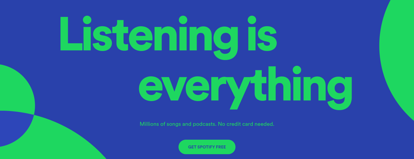
You’ll also notice that there are two options for the end of the registration funnel. Some content producers only employ a registration wall and allow users to access content for free forever (such as Instagram and Pinterest), whilst others use it as the first stage in their subscription strategy and present users with a paywall at a later stage (The NYT and HBR). Spotify actually combines the two and allows users to continue to use the free version forever but constantly promotes their subscription offers which are ad-free, have additional features and provide a significantly improved user experience.
For each step, we’ll look at:
- What this stage is and why it’s important
- Examples from our 11 successful content producers
- Best practices to bear in mind
Step 1: Content discovery
What is this stage and why is it important?
As you’re aware, walls create a value exchange between you and your audience - whilst they provide you with first-party data, monetization opportunities and more, you have to give them something in return. Therefore, this stage allows you to prove this value, let users discover and engage in your content to ultimately persuade them to create an account. Without this stage, it might be hard for your audience to understand what they gain from registering.
However, some publishers don’t allow for much content discovery at all but solely communicate an effective value proposition to their audience. This is the case for Spotify, for example, who employ a registration wall as a first step (not allowing for content discovery) but forefront their value proposition to ensure users are aware of what registering gives them access to.
Examples:
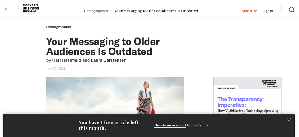
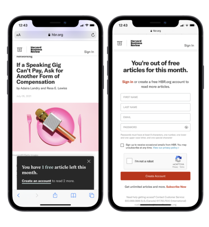
Harvard Business Review employs a metered registration wall meaning that users have access to a small number of articles before being blocked and asked to create an account. This allows for proof of concept and engages users before presenting the wall.
Importantly, HBR is very clear about this metered approach and informs users of how many articles they have left as well as what they gain from creating an account. This reduces the frustration created by the registration wall and helps to develop a relationship with the user built on transparency of how their site works.
Alternatively, MY TF1 allows their audience to browse all content and are only blocked by the wall once they try to play a video. This means that, by the time they’re faced by the registration wall, they already know that they want access to this content. The user is therefore highly more likely to create a free account so as to view the video.
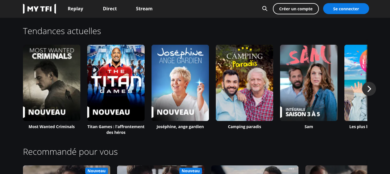

The wall is on the video itself and informs us that we simply need to create an account in order to view all content on their site.
Best practices:
- Clearly define your value proposition and communicate it to your audience
- Allow for content discovery as a way of proving your value (although an effective value proposition will do this for you) and engaging your audience to encourage registration
- Find the right time to present the registration wall: there’s a balance between giving too much content to users who don’t have an account and presenting the wall too soon. It’s therefore important to test and aim to find the sweet spot between engagement and frustration
- Be transparent with users to help them understand the process and reduce frustration
- There are many ways to approach this step but, importantly, you have to find the one that’s best suited to your strategy, content and audience
Step 2: Registration wall
What is this stage and why is it important?
This is the block where a user is confronted with a registration wall and required to create an account in order to access content. It’s obviously important within a registration strategy as it forces the value exchange that brings the benefits to you as a content producer.
This stage could be on your landing page (like Pinterest), presented in the first piece of content that the user tries to access (The NYT) or shown after a certain amount of time/content (HBR). What’s more, the wall can differ in terms of what it contains. Whilst Pinterest and Glassdoor integrate the form into the wall itself (reducing a step in the process), the NYT’s wall allows a user to choose between subscribing for unlimited access or registering for free to be able to read a few more articles.
Examples:
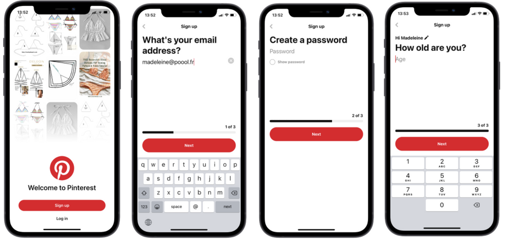
Pinterest, who allow non-registered users to browse a few images before being faced with the wall, have reduced a step in the process and integrated part of the form into the registration wall itself. They also add the option of using an existing social media account to sign up which facilitates the process for the user as well as allows for data-sharing in some instances.

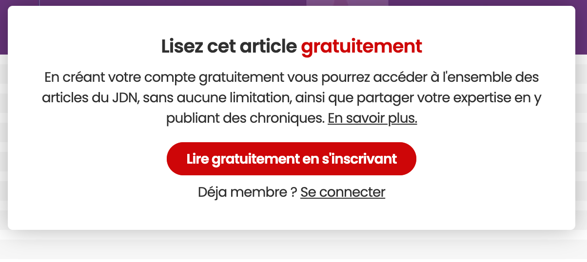
Alternatively, Journal du Net’s registration wall is placed halfway through an article, cutting a user off after having (hopefully) engaged them in the introduction of the content.
Best practices:
- Continue to communicate your value proposition with users to encourage them to move through the process
- Highlight that it’s free (this definitely helps to increase click-through rates)
- Consider combining other stages into the wall, such as the registration form or even just part of it (splitting up the form does increase the number of clicks but makes it seem a lot more manageable for the user)
- Provide a ‘Login’ button for existing account holders
- Measure the visibility of your registration wall (on your website in general as well as on a page)
3. Form (account creation)
What is this stage and why is it important?
This is an important stage for two reasons. Firstly, it allows you to collect valuable information about your user and start building up a profile to inform your strategy. Secondly, however, it’s a common friction point for content producers who ask for too much information from a visitor. Therefore, there’s a balance to be found between not profiting from the opportunity to collect data and asking too much of your audience.
Some content producers require the bare minimum (name, email and password) whilst others ask for more specific information relating to the content they produce (B2B or professional companies might ask for a job title for example). This all depends on your strategy and audience.
Examples:
To sum up our analysis of this stage, below is a table of each content producer, how many fields they place on the form and what information is required of the user.
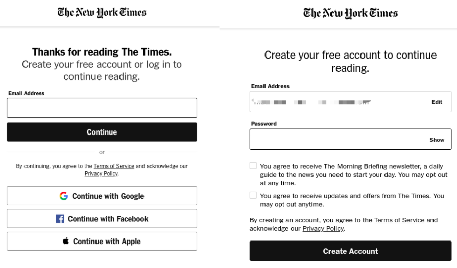
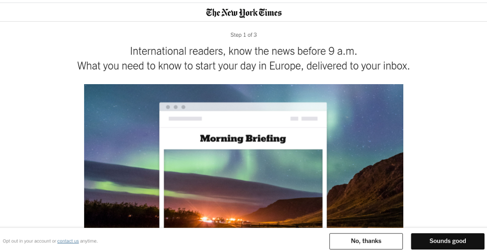
The New York Times is a great example of a publisher making the process very simple for their users. All we have to do is provide our email address and create a password. We also have the option of signing up with a social media account which could facilitate registration even further.
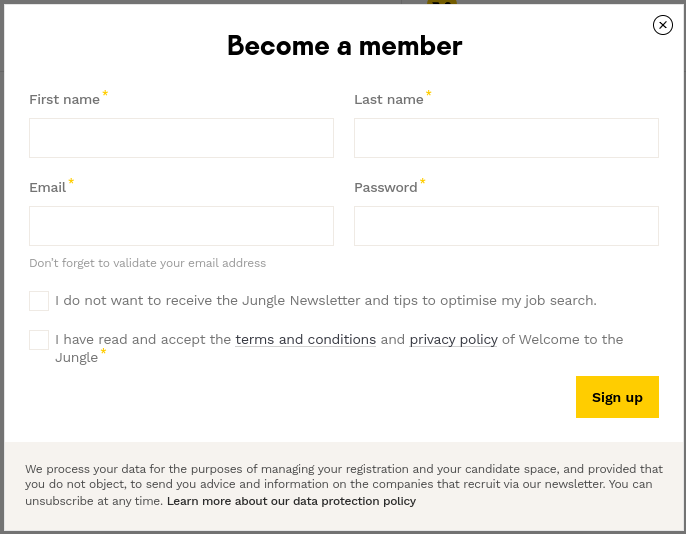
Welcome to the Jungle uses a similar technique but requires first name and surname too. This provides the added benefit of allowing WTTJ to personalize the user's account page and email marketing with their name. Importantly, despite the extra fields, the form is all one page without any scrolling or clicking through. This makes the process a lot easier and shows the user that after these few fields, they’ll be registered.
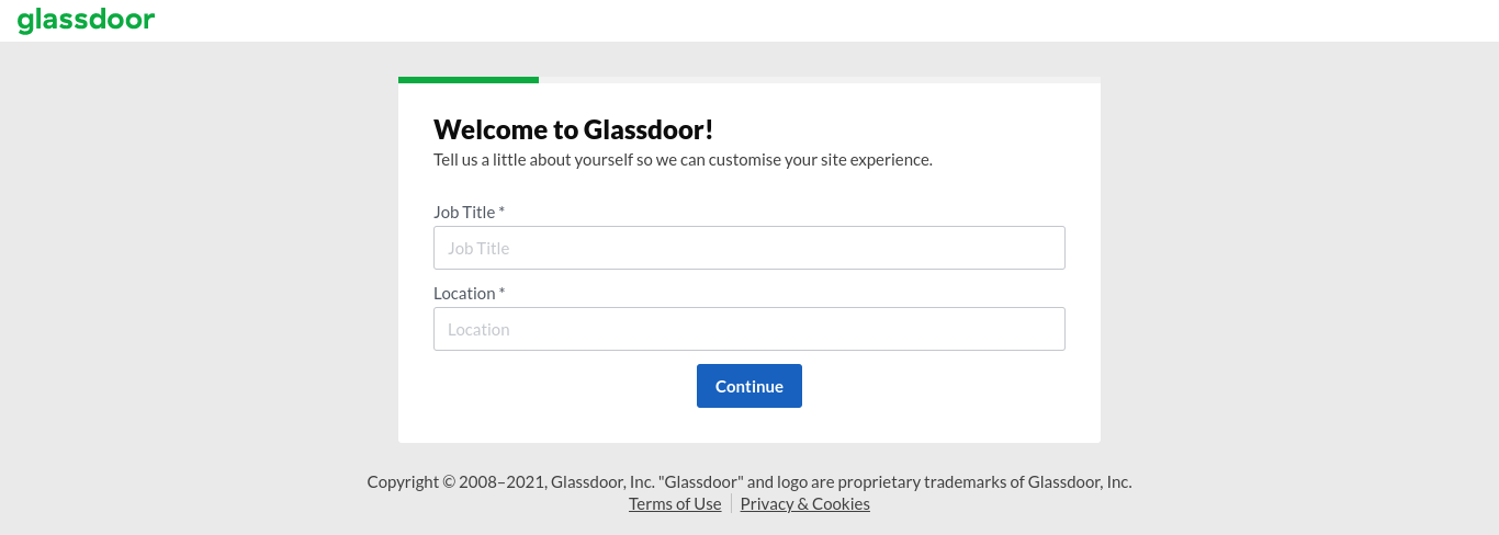
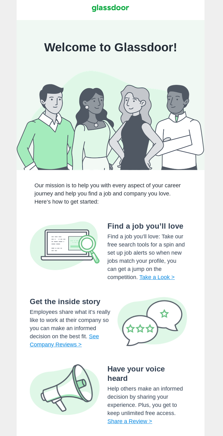
A content producer that’s taken a completely different approach is Glassdoor. There’s a lot of information required to register on their site - 9 obligatory fields split between 3 stages. Users are required to provide:
- Job title, location, employer and type of contract
- Information about salary
- A rating of employer and what type of work they do, but this step isn't mandatory
Although a great deal of information and effort is required from a visitor to register (which suggests it’s not a very good practice), it’s important to note that this is a slightly different case than other content producers analyzed. The content provided on Glassdoor is made up of contributions from their users, including insights into salaries and honest, anonymous reviews about working for a company. Therefore, without members being required to answer questions such as these, they have no content to show them after registering.
Having said this, Glassdoor doesn't inform users of the reason why they ask so many questions. After finishing the registration process, we can see that it’s valuable to their business to have all that information about our career, but this may be too late. The long form may put users off continuing, especially as some of the data required is fairly personal (e.g. salary). Conveying your value proposition and reassuring your audience is therefore hugely important for not only increasing conversion rates of anonymous visitors to registered users but also for starting to build a strong and lasting relationship with them.
Best practices:
- Offer the option of registering with an existing social media account, such as Facebook or Google, to facilitate this stage and reduce the amount of information that the user needs to provide
- Consider asking solely for their email and password, the bare minimum, and collect other data later on when they interact with your site. This user profiling means a less demanding initial form at the registration stage but that you can still gather data over time to inform your strategy
- Reassure users by highlighting the value that they get in exchange for creating an account, helping to persuade them to go through the conversion tunnel
- On mobile, ensure that the form is either all on one page (like HBR) or is mobile friendly with easy-to-fill-out sections (like Pinterest)
4. Confirmation and onboarding
What is this stage and why is it important?
Confirmation involves informing the user that they’ve successfully created an account and welcoming them to the community, whilst onboarding requires a user to answer some more questions or provide information in order to personalize their account space, increase engagement and improve their experience from the moment they arrive on the website.
This stage is very dependent on your strategy, content and audience, demonstrated by the huge variation that we’ve seen amongst these 11 content producers. Some just confirmed the creation of our account, others didn’t even do this and some led us through an onboarding process.
Examples:
Open classrooms confirm our account creation simply with a banner at the top of the screen, informing us that our username and password will be emailed to us. This is a useful technique to reduce the number of fields in the form section and it’s great that they tell users about the email, welcome them personally (with the user’s name) and make them feel like they’ve joined a community of learners on this site.

Alternatively, Glassdoor welcomes their users via email, detailing a list of things possible on their site. This helps to ensure users make the most of all features on Glassdoor and provides easy access to these through links within the email. However, this is the first time that Glassdoor tells us about what’s possible on their site (when it’s a bit too late) so we’d recommend highlighting this value proposition earlier on in the process.
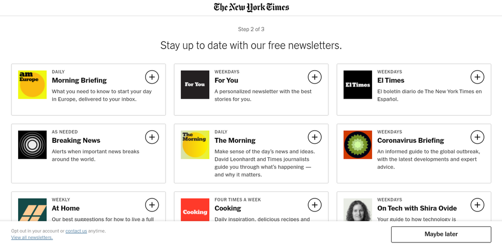
The New York Times, however, employs an onboarding process with the goal of increasing engagement and ultimately leading their audience to subscription. User’s are initially presented with the Morning Briefing newsletter before then being able to sign up for a variety of other newsletters produced by the NYT. This technique allows the publisher to create a daily habit in the user’s life, which increases frequency of visits to the site and engagement in their content, both of which are proven to increase chances of conversion to subscription. Note how easy they’ve made it to sign up to multiple newsletters by simply clicking on the plus symbol.
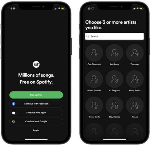
Spotify also chose to incorporate an onboarding process, asking newly registered users to select 3 or more artists that they like. This allows Spotify to personalize content to the user from the moment they arrive on their site, making for a more adapted and engaging experience. Interestingly they only do this on mobile devices and not on desktop.
Best practices:
- Choose the right confirmation/onboarding process for your strategy, content and audience. The approaches taken in the examples above might work well for those content producers but not as well (or even negatively impact the user experience) if employed on your website. This stage therefore works best when adapted to your business
- Any additional stages/questions for your users must add value in some way, otherwise it damages the user experience. Spotify’s onboarding allows them to personalize content and present playlists and artists that appeal to the user’s taste in music, improving their experience from the moment they start using their account
- Make the most of this chance to increase engagement and, in particular, create habits. Just as paper versions of content were a part of people’s morning routines with breakfast, content producers should aim to become a part of their audiences daily routines so as to increase frequency of visits, engagement and so retention
- Aim to make the user feel welcomed and reassured that they have successfully created an account
- You can measure your onboarding activation rate (i.e. whether your users go through the onboarding process and sign up to newsletters etc or skip it) to see whether it’s seen as valuable to your users. For confirmation emails, you can track the CTR as well as possibly use behavioral tracking to see what information would prove valuable to newly registered users
5. Content
What is this stage and why is it important?
This is a hugely important stage which is often forgotten. Your user is now registered and gone through the whole process in order to access your content, often a specific article or video where they were blocked by the registration wall. Therefore, now is the time to take them back to this content and facilitate access for them.
Examples:
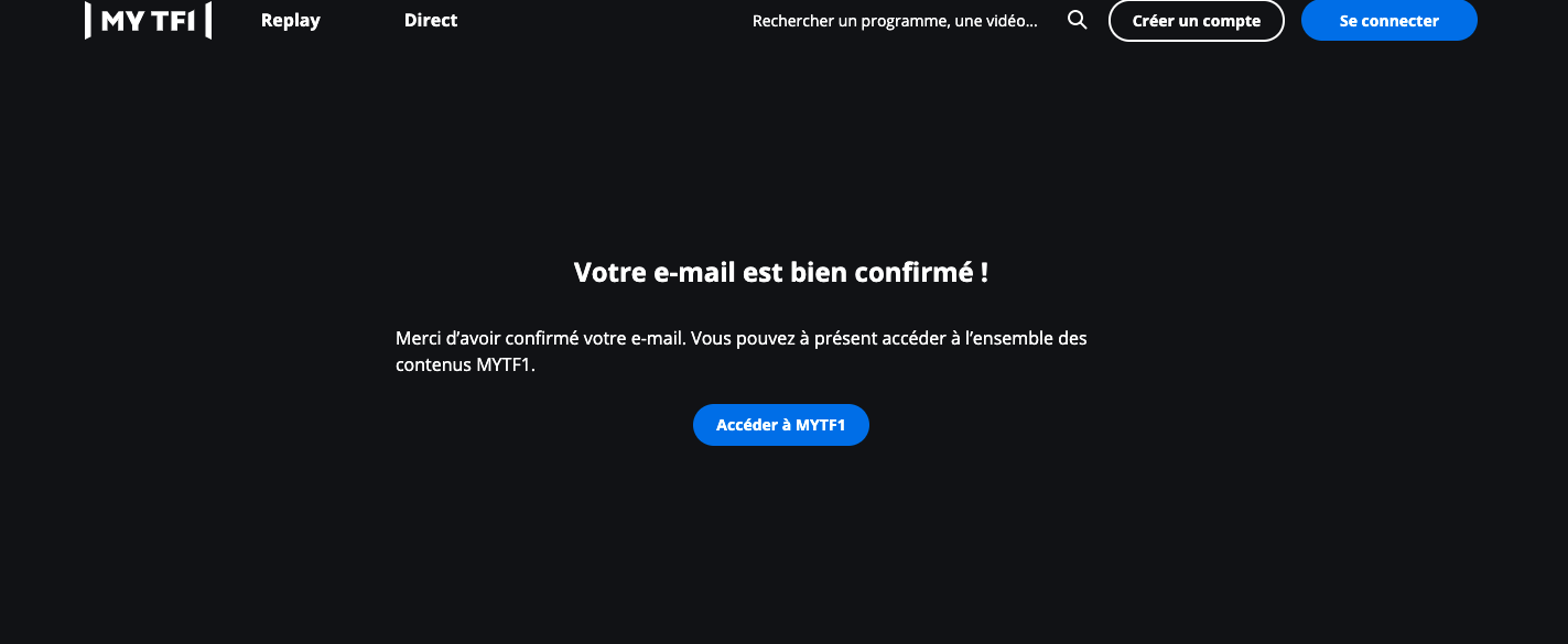
My TF1, for example, asks a user to fill in a form and then confirm their email by clicking on the link. This leads them to the page below and, by clicking on ‘Access MY TF1’ they’re redirected back to the home page. This is pretty frustrating and means that the user has to try to find the content that they wanted to access again.
JDN, however, takes the user straight back to the article where they were blocked, making it easy for them to continue reading and consume content as a registered user.
Best practices:
- Simple. Take the user back to the content where they were blocked. Not doing so makes for a bad first impression of your site and doesn’t encourage the user to consume content on your site
- Here, you can measure the post-registration reading rate and use the fact that they can now be tracked to see where they see value in your content with the goal of providing personalized recommendations to improve their experience on your site
6a. Free forever
What is this stage and why is it important?
Here, we’re talking about content producers who are employing a registration wall alone (without ever blocking the registered user with a paywall). Note that this doesn’t necessarily mean that they don’t employ a subscription strategy as well, but that the registered user can continue to use the free account forever without ever being forced to pay.
In this registration-only strategy, the end goal for the content producer is to collect valuable 1st-party data, perhaps monetize from advertising (which is more profitable if ads can be targeted to specific user profiles) and build strong relationships with their registered users.
Examples:
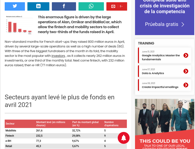
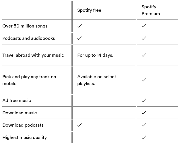
Spotify is an interesting example to analyze as they offer a free version of their platform as well as a subscription offer which has additional features and is ad-free. The free version therefore acts as a proof of concept, demonstrating the value that they have to offer but simultaneously limiting the user experience so as to promote the paid subscription packages. For example, the free version includes ads which interrupt the user when listening to music or podcasts and often promotes the benefits of Spotify’s subscriptions, which include the ability to download music, unlimited skips and no ads.
They provide a clear table on their site to demonstrate the value in paying for premium. This, plus the constant ads on Spotify free reminding users of the benefits of premium, help to encourage conversion to subscription without the need for a paywall to block users and force payment. It allows Spotify to continue to provide a free platform whilst simultaneously promoting conversion and monetizing their audience through diverse revenue streams (ads and subscription).
Best practices:
- Highlight that you’re offering content for free
- Despite the lack of subscription offers, ensure that you’re providing valuable and engaging content that retains users on your platform.
- Consider employing a subscription strategy alongside your registration wall in order to diversify your revenue streams and offer your most loyal consumers a better user experience
6b. Paywall
What is this stage and why is it important?
Differently to above, these content producers block registered users for a second time (with a paywall) and require that they pay to subscribe in order to access content. In this strategy, the registration wall provides a form of soft conversion which has a number of benefits:
- Increases engagement and form habits (which we know leads to higher conversion rates)
- Allows for 1st-party data collection to inform your strategies even if the user doesn’t go on to subscribe (e.g. discover what type of content is seen as the most valuable by your users)
- The registered user’s experience can be personalized in order to maximize the chances that they’ll pay for your content
- Once you’ve built a profile for each user, you can present them with a subscription offer that’s most adapted to their interests and needs, ultimately increasing conversion rates
Examples:
Harvard Business Review employs a metered registration wall before a metered paywall, where we’re blocked each time after reading a certain number of articles. At each stage, we’re informed (via a banner at the bottom of the screen) of how many articles we have left, reducing the frustration created when the wall appears. After registering, we’re faced with a paywall (after accessing 2-3 articles) that’s personalized by directly addressing the user and highlights that subscription means we’ll never be blocked again.
Their approach allows for content discovery, first-party data collection and means that they can better sell subscriptions in the future (with adapted recommendations)
Alternatively, Ornikar uses their registration wall for proof of concept, providing users with a small taster of what they could access with subscription. Even throughout the registration process, we’re encouraged to convert and the low cost of subscription is forefronted at every opportunity. They also make the most of email collection to promote subscriptions via email to any users who register for free.
Registration therefore acts as a trial for users, allowing the content producer to collect data and email addresses whilst offering a taster of their subscription offer.
Best practices:
- Make the most of the benefits of a registration wall for increasing engagement and softly converting an unknown visitor into a registered user before requiring payment. Importantly, requiring users to create an account means you can track their behavior and use findings to inform your strategy, personalize their experience and better sell subscription offers
- Test, test and test again. In order to ensure that your registration process is valuable and encourages engagement, conversion and, ultimately, retention you should test different strategies and continuously optimize (i.e. not just launch and leave)
- Track the number of unknown users who subscribe compared to the number of registered users. This will give you an idea of how successful the registration process is and whether it plays a valuable role in your strategy. You can also add in KPIs about sign up rates for newsletters and generally track engagement pre-subscription to make sure that you’re putting your time and effort into the places that encourage conversion
Overall, this analysis has been very insightful for understanding the registration journeys on a variety of successful content producers’ websites.
However, it’s important to remember that every business is different, with its own strategies, content and audience. So, although it might be tempting to replicate some of the approaches shown in this series, we highly advise that you make the user journey to registration unique to your business whilst bearing in mind the best practices highlighted above.
With this in mind, what are the 10 key takeaways from this series that you can apply to your own registration journey?
- Have a mobile-friendly design (we all know that mobile is increasingly chosen over desktop)
- Make everything easy for the user: reduce the number of clicks, scrolls and form sections to fill out
- Highlight that registration is free (this obviously helps conversion rates)
- Make the most of other ‘soft conversions’ such as newsletter signup to increase engagement
- Ensure that every stage has a clear purpose and isn’t just there for the sake of it
- Find a balance in the form stage between asking for too much and not collecting 1st-party data
- If you choose to employ onboarding stages, make sure that they provide value: e.g. improving the user experience or increasing engagement
- Place your value proposition at the forefront of every stage: why should the user register? What value will you provide to registered users?
- Personalization will take you far (it’s pretty much an expectation for online users today): this includes before, during and after registration Test, test and test again: launch and then iterate to find the best approach for your business. As stated above, you won’t know what works best for you and your audience until you try different options, analyze performance and adapt. (pst, A/B testing is super easy with Poool’s solution and we have a free demo so you can find this out for yourself)
- Test, test and test again: launch and then iterate to find the best approach for your business. As stated above, you won’t know what works best for you and your audience until you try different options, analyze performance and adapt. (pst, A/B testing is super easy with Poool’s solution and we have a free demo so you can find this out for yourself)