Move over paywalls, there’s a new kid on the block, registration walls, and they’re not going away anytime soon! In fact, registration walls can prove incredibly valuable to all types of content producers and help in turning audiences into business whether a publisher employs a subscription strategy or not.
That’s why, today, we’re here to provide the 3 steps to follow in launching your registration wall strategy - where to start, what to do (what not to do), best practices and more.
- Step one: Define your value proposition
- Step two: Establish the value exchange
- Step three: Form a strategy for the registration journey
2 things first:
🙋 What is a registration wall?
A registration wall is employed by digital content producers to block users and ask or require them to create a free account in order to gain access to content. It therefore establishes a value exchange between the media and their audience.
🙋 And how is a registration wall beneficial to publishers?
- First-party data collection: solve the challenge of the cookieless future by encouraging account creation and gathering high quality data from your own audiences. Not only does this allow you to employ a first-party data strategy, but you can learn about where your users see value in your content, what a single user consumes most, etc, using this data to inform business decisions and better monetize your audience. You’ll additionally be able to collect email addresses through the registration form for marketing campaigns, newsletters and more
- Increase engagement: frequency of visits and engagement are essential KPIs to track for a reason - they directly correlate with high CLV and revenues - so finding ways to increase these metrics should be prioritized. Encouraging registration is an extremely effective way to achieve this thanks to the personalization abilities made available after account creation, the data collection, increased value, etc that keep the user wanting to come back for more
- Build strong relationships (loyalty): fostering loyalty (based on frequency of visits like above) means your user will return to your content over that of another company. If they have an account space on your site, with personalized recommendations that match their interests and added value in exchange for registering (i.e. their needs are ‘fulfilled’), they’re highly more likely to remain loyal to you
- Improve user experience through personalization: in order for your registration wall to work, you need to provide value to your audience in exchange for them creating an account. The simplest way to do this is by improving their experience on your site through personalization (which is now possible as your user logs in on every visit and you collect data about their profile and context). This could include AI content recommendations, UX features such as saving content for later or simply adapted messaging
- Boost monetization in other forms: aside from the more indirect monetization benefits, a registration wall can have a huge impact on revenue from advertising, subscription and selling of other products/services. Thanks to the data collection, you’ll be able to charge more for targeted ads, boost engagement to gradually lead members towards converting into a subscriber as well as sell/upsell in a way that’s adapted to the user (and so more likely to be a success)
Overall, through registration, you’ll be able to develop a strong relationship with users, foster engagement and loyalty as well as prioritize a first-party data strategy, which, when combined, could be the key to unlocking your content’s monetizing potential.
Launching your registration wall 3-step process:
- Define your value proposition
- Establish the value exchange
- Form a strategy for the registration journey
1. Defining your value proposition
Just with any product, defining your value proposition should be the number one step. It’s essential for convincing a user to register rather than turn away and potentially register on a competitor's site.
🙋 What is a value proposition?
A value proposition is a promise of value to your audience, telling your audience why they should complete an action or purchase a product on your site. It’s most often made up of a headline, a subheading (2-3 lines), short bullet points (usually 3) and a visal support which, combined, clearly convey these 3 points:
- What problems your product solves
- What value it provides to a user
- Why they should choose you over a competitor
How do you define your value proposition?
Considering the importance of this first step, it can seem tricky to get started in defining your value proposition. However, the value proposition canvas is a useful framework to guide you through the process ensuring you cover each of the 3 points effectively:
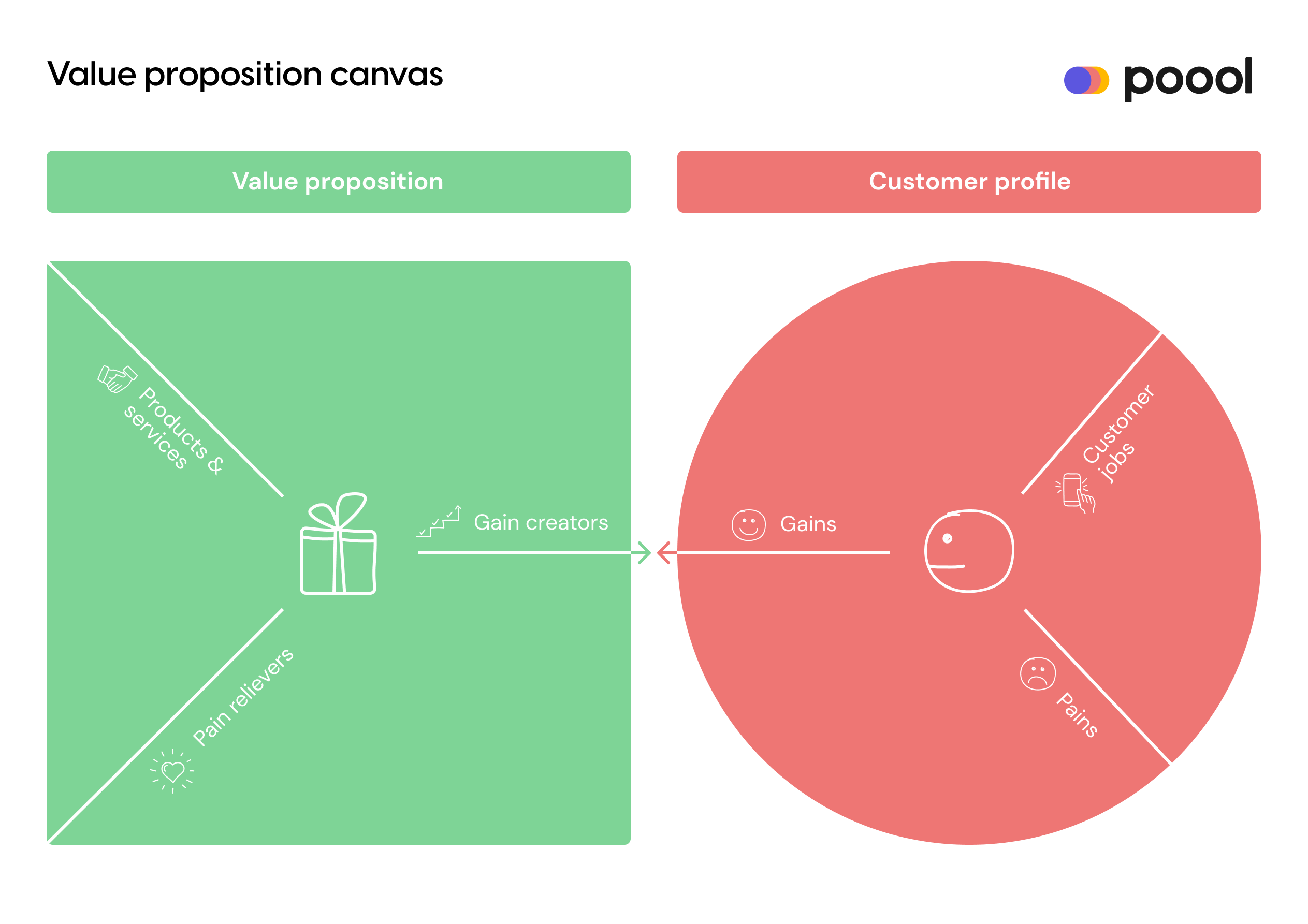
Firstly, start with the right side, identifying your customer’s major jobs-to-be-done, the pains they face when trying to complete these jobs and the gains they get through doing them.
Next, you move to the left and define the key components of your offering, specifying how you relieve your customer’s pains and create gains for them to benefit from.
This should prove highly insightful for you to adjust your strategy and products based on your customer analysis, with the ultimate goal of finding a product-market fit.
Specifically, in the context of a registration/membership product, you can provide value to users in the form of member benefits and rewards (exclusive content, ability to comment/join discussion groups, personalized home screen and recommendations, newsletters, etc) as well as a shared, higher purpose value motivation (such as supporting independent journalism).
The next step is to then bring this together and communicate your value proposition with your audience, integrating it into your website and (later) your wall copy. To ensure you convey your vp clearly and make it easily understood, be sure to…
- Use the language of your audience
- Be clear & precise (a user should be able to understand your VP in a quick read)
- Avoid jargon, hype and superlatives
- Forefront concrete benefits and rewards
This is by no means simple, but, to facilitate the task, we highly recommend A/B testing your value proposition on site and later on your wall to discover the wording that is most comprehensible to your audience and best resonates with them, encouraging them to partake in the value exchange (i.e. convert).
💡TOP TIP 💡
Whilst developing your value proposition, you should aim to use your registration strategy launch to become a customer centric organization, if you aren’t already.
“For publishers...‘customer-centric’ means a primary focus on serving the needs of a customer segment rather than searching for a customer segment for a product or product type” - Targeted Media Services Network
Users are no longer simply passive readers of information, without any direct contact or interaction with the publisher. Instead, with technology and membership strategies, users go beyond the traditional consumption of content and now become a part of the publisher themselves. Consumers today expect to be able to engage with your company, interact with you and feel involved in a larger community with shared values.
This means that publishers need to switch to becoming customer centric, listening to and involving their audience at every opportunity. Not only will this help to restore the human element to publishing (after all, your company are humans speaking to and writing for other humans) but it will also increase engagement, brand loyalty and build strong, lasting media-reader relationships, which all significantly impact your ARPU and revenues.
What are some of the key qualities of a customer-centric organization?
Well, according to Targeted Media Services Network, there are 5:
- Use a variety of customer retention metrics (e.g. the proportion of visitors that are repeat consumers, how long a user remains registered and active, etc.)
- Ability and desire to track CLV (registration helps to track the entire lifetime of a user on your site)
- Processes built to enable successful customer outcomes (i.e. solving their pains and providing benefits through registration)
- A culture that respects the consumer (this includes data collection and privacy, so ensure you are respectful and transparent with what you collect and how you process data)
- Ongoing investment in customer insights (a registration wall allows for 1st party data collection and a deep understanding of user behavior, a hugely valuable tool to becoming customer-centric)
Some of these, such as tracking retention, may not be relevant until after launching your strategy. However, by being aware of the importance of this approach and the techniques needed to make it a success, you’ll be able to get started on the right foot and put the measures in place to do all of the above from day one - ultimately, it’s easier to build your strategy from scratch with a certain approach than having to rebuild part of it in the future to adapt.
2. Establish the value exchange
Employing a wall strategy means establishing a value exchange between you and your audience. For paywalls, this involves users paying (monetary value) in exchange for access to your premium content. However, when it comes to registration walls, the exchange can vary slightly depending on your business model.
The value for the publisher: This tends to be first-party data collection and ID authentication, with registration providing a way of turning unknown visitors into leads whose behavior can be analyzed and movements tracked, a valuable way of preparing for the depreciation of third-party cookies. In addition to this, it can also allow you to increase ad-based revenues through targeting, boost engagement to guide users towards subscription as well as improve the user experience which will lead to stronger, longer lasting reader-media relationships. For something so simple, it really can be hugely beneficial to your business.
The value for the user: Importantly, you mustn’t forget to prove value for your audience to make the exchange possible. Without providing and highlighting the value to your users, you’re unlikely to persuade them to go through the registration funnel.
“Registration for the sake of harvesting marketing information will ultimately alienate consumers from the brand. Registration for the sake of unlocking extra features can have the opposite effect.” - Computing for Geeks
Some potential member benefits to choose from:
- Exclusive access, such as newsletters, content, events (online or in person)
- Personalization UX features including saving content for later, resuming where they left off, content recommendations
- Discounts or free trial to subscription packages
- Belonging to a community
- Ad-free experience
- A shared, higher purpose value such as supporting your business - being honest with your users and highlighting that your content is worth supporting can be beneficial to both parties and doesn’t even cost your audience a penny
Equally, you can combine the value for users with the value that you seek to gain from registration. For example, allowing users to comment on your content and debate with others will increase engagement, as will a member-only newsletter which can establish a habit and boost frequency of content consumption, ultimately having a positive impact on your revenues (see this article on engagement as a north star KPI for digital publishers, explaining how essential it is to increasing your revenues and ARPU)
3. Form a strategy for the registration journey
The journey towards registration will differ depending on your strategy and value exchange established as well as perhaps the audience segment (you may, for example, employ a registration strategy on only your less engaged user segments). However, after our analysis of 11 of the most successful content producers employing a registration wall (available just here), we found that the journey is typically as follows:
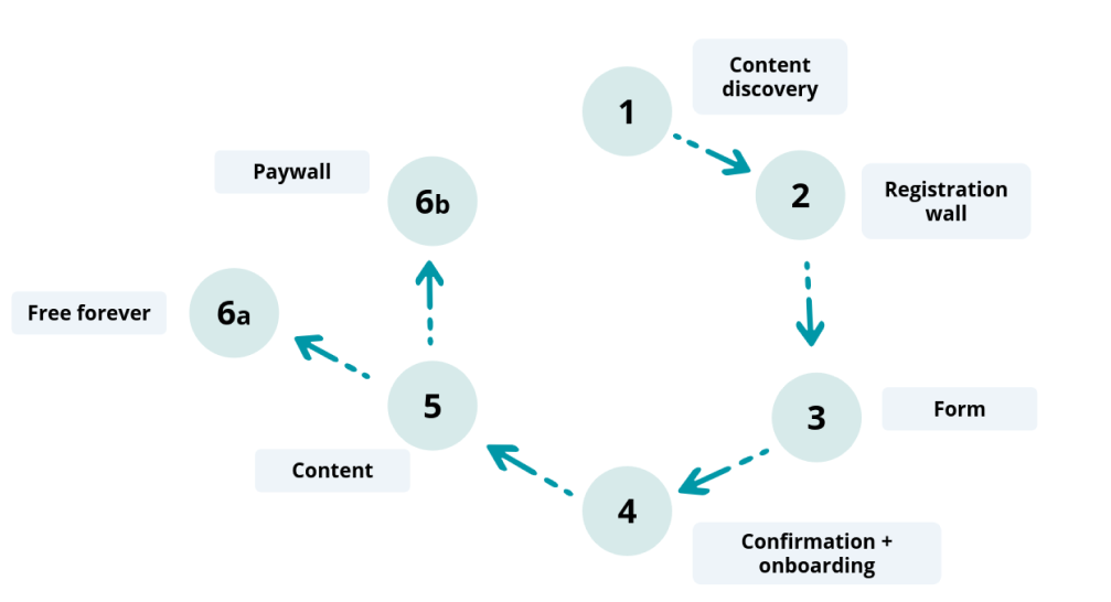
A) Content discovery:
Just as with a paywall, the user has to be persuaded of your value proposition and engaged enough to pass through the wall and create an account. This is all about finding the balance between engagement and frustration, often coming down to the wall model employed - hard, metered, freemium or dynamic.
Hard registration wall - a visitor to your site doesn’t get access to any content before being hit with the registration wall.
✅ High CTR and visibility of the wall (which correlates with conversions)
✅ Normalized amongst entertainment content producers where the user experience can be significantly improved through creating an account such as TV replay sites, audio streaming services and social media (often placed on the landing page itself, e.g. for Instagram and Pinterest)
❌ Doesn’t allow for content discovery and may turn less engaged users away
Metered registration wall - a user will get access to a limited number of articles per week/month before being blocked by the wall.
✅ Allows for content discovery and consumption prior to being hit by the wall meaning engagement is increased and the user is more likely to click-through the wall
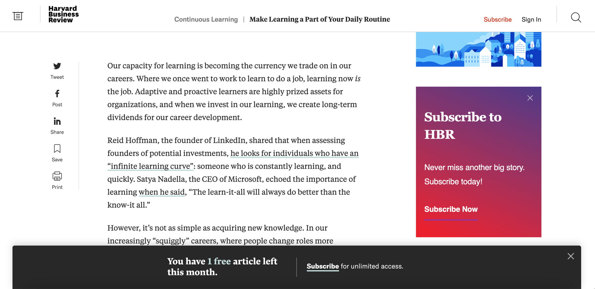
✅ When done well, frustration is reduced - for example, Harvard Business Review who employ a banner on their content to inform a visitor of how many articles they have left to consume before being blocked
❌ Not as easy to employ or useful for entertainment sites where a visitor lay only want to consume one video or show
❌ Visitors may consume their free content and then leave or return on another device/in incognito mode to avoid the wall
Freemium registration wall - some content is placed behind the wall whilst the rest remains completely unblocked (i.e. content is divided into free and premium).
✅ Allows for content discovery
✅ Users are able to see the value in your premium offer as it’s directly compared with free content
❌ Work needs to be done on ensuring high visibility of premium content to avoid visitors only consuming free content
Dynamic registration wall - Audiences are segmented based on user profile or context and presented with an adapted journey that is the most likely to convert that individual into a member. The most typical segmentation for registration walls is based on the user’s engagement level.
✅ Adapted to the user (i.e. more likely to lead to high conversion rates)
✅ More engaged users could be presented with a hard wall (this audience is less likely to be frustrated with this model) whilst less engaged users can be left to discover content before hitting the wall ensuring they don’t become frustrated and leave your site
✅ Segmentation can be based on any variable that suits your goals: engagement level, source of traffic, device, etc
✅ Very effective alongside a paywall strategy
❌ Requires more time and data analysis before setting up BUT is more effective in the long run
As with anything, this depends on your strategy but we highly recommend a dynamic wall model to adapt to your individual visitors and present them with a journey that is the most likely to convert them into a member.
Did you know that Poool’s Audience Conversion Platform allows you to employ any of these models as well as present your audiences with adapted user journeys thanks to our native and custom segmentation feature?
Present volatile users with a metered registration wall, Occasionals with a discover pass and Fans with a hard paywall - or whatever actions match your goals, the possibilities really are endless.
AND we have a free demo available! Try out the Dashboard for yourself and see how it will benefit your business, help you prepare for the cookieless future and convert your audience into business.
Book a demo💡TOP TIP 💡
How do you make your launch risk-free?
It can be a worry for content producers launching a wall strategy that the block can have a negative impact on ad-based revenue, SEO performance or traffic. Firstly, however, the benefits of a successful wall strategy can far outweigh the negative impact on other areas of business and effectively prepare you for overcoming some of the many challenges facing digital publishers today (cookieless future, the reducing value of ads, increasing number of ad-blockers used, etc).
What’s more, there are a few techniques to employ when launching to reduce the risks involved.
👉 Initially launch a registration wall on only a small percentage of your audience
👉 Choose to only present a registration wall to your most engaged users at first
👉 Employ a ‘Suggestive’ or ‘Informative’ wall rather than making registration obligatory (i.e. add a ‘No thank you’ button to the wall)
All of these are possible on the Poool Audience Conversion Platform and can prove hugely valuable for reducing risks, gradually launching, analyzing audience reactions to the wall and developing your strategy accordingly.
B) The Registration Wall:
So you’ve chosen the registration wall model from above and now your visitor is hit by the wall. The next step is to design an effective registration wall that encourages clicking through and conversion to a member.
To get an idea of what makes a successful registration wall, below are some benchmark best practices from digital publishers currently employing this strategy:
The Independent:

✅ Clear value proposition title and supporting subheading
✅ Highlights that it’s free to register
✅ Bullet pointed benefits of account creation
✅ Bold CTA button, calling attention to the ‘Register now’ button more than the “I’ll try later”
Interestingly, their registration wall is optional and we can simply click on the right-hand button to avoid having to create an account.
Medium:
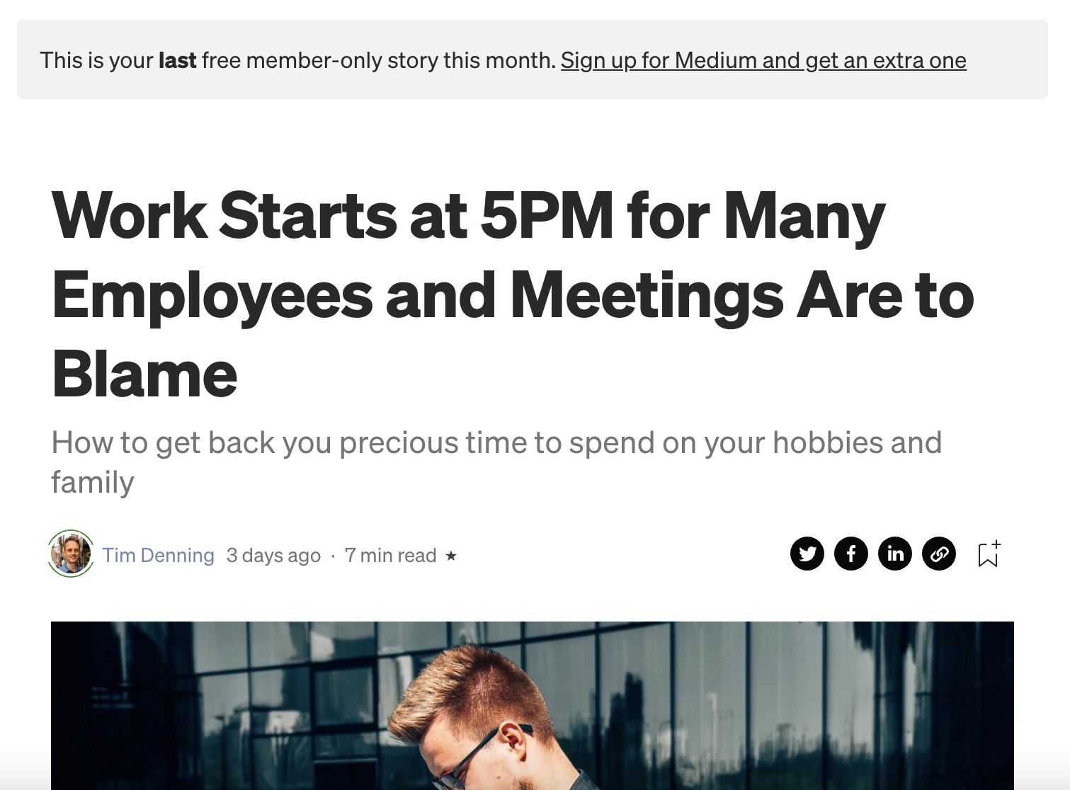
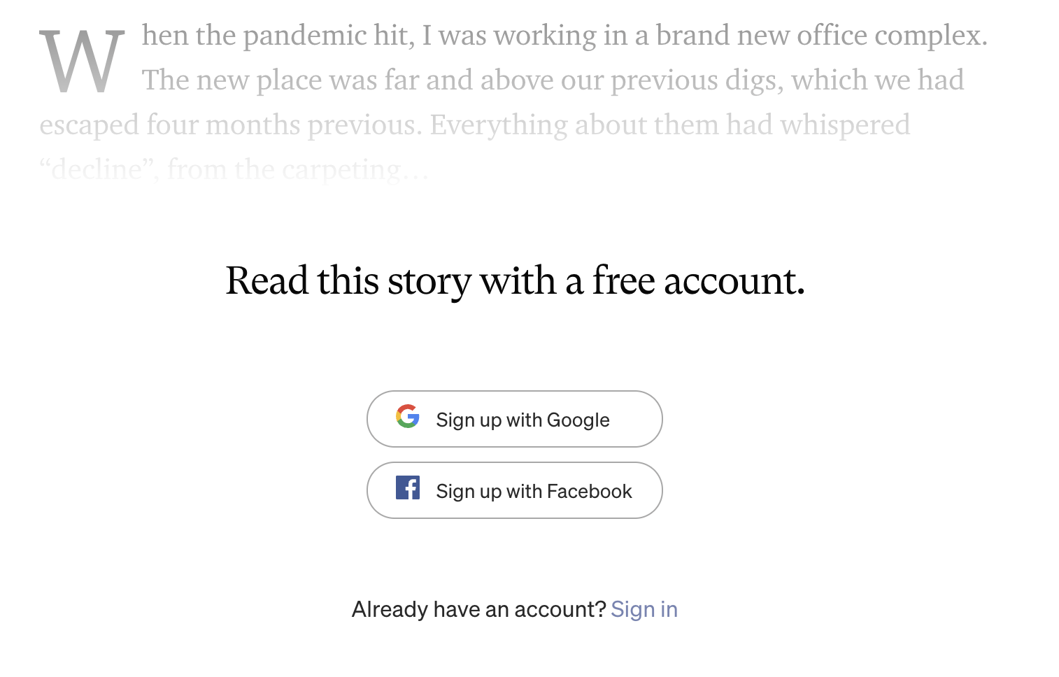
✅ Informs us when we’re on our last free member-only article for the month
✅ Facilitates the signup process by allowing us to register with Google or Facebook (reducing friction and signup within the wall itself
✅ Wall is high up in the content, meaning high visibility rate
❌ What if we don’t have a Google or Facebook account? (There may indeed be people in this category!)
Welcome to the Jungle:
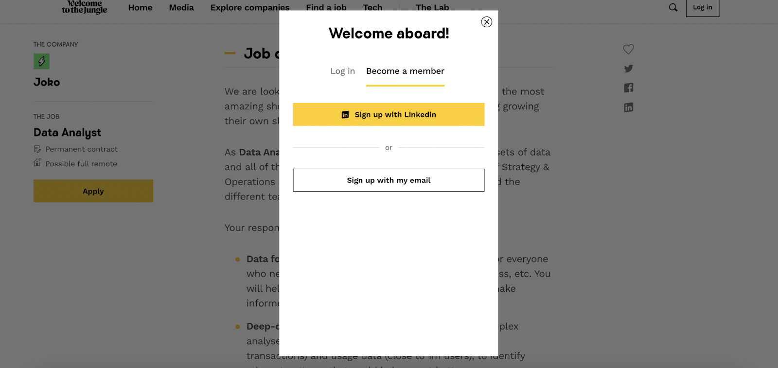
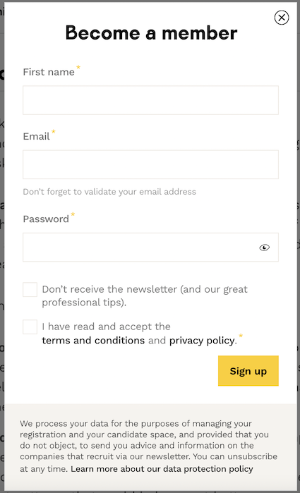
✅ Registration wall appears as a pop up once we click on ‘Apply’
✅ Allows us to register with Linkedin (a social network that’s relevant to the publisher) or email, with the signup process being within the wall itself (reducing clicks required)
✅’Become a member’ creates a sense of community
Pinterest:

✅ Wall on the landing page meaning very high visibility rate
✅ Form integrated into the wall itself, reducing steps in the process, and option of signing up with Facebook or Google
❌ We aren’t informed that it’s free to register nor what the specific benefits of account creation are, although their value proposition is clearly about ‘getting ideas’
The Guardian:
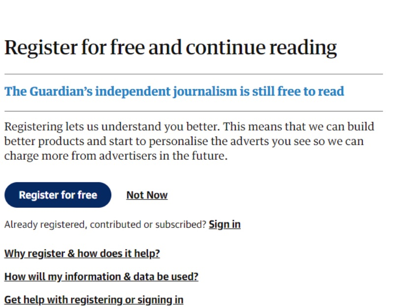
✅ Highlights multiple times that it’s free to register
✅ Honesty - The Guardian is honest about how registering benefits them, helping to build trust with their readers and make them understand the value exchange. For users, it’s free but they are now aware that this action is supporting the publisher’s independent journalism
✅ FAQ links to reassure and allow readers to learn more
This article on The Guardian’s website explains their reasoning for employing a registration strategy and how they approach it. The overall takeaway is that being honest and open about how your strategy and value exchange works is hugely beneficial to gaining support from your audience.
C) The form
Although this is often integrated into the wall itself (like some of the examples above, helping to reduce the number of steps in the process), it can be considered as a separate stage given its importance for providing you with an ID for your new member.
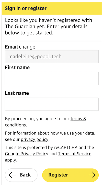
The goal of this step is primarily for the user to create their username and password, allowing them to log into their account in the future. It’s also for you to collect some data about the user to help inform your strategy. For example, you could simply ask for first and last name (like The Guardian) to keep the process simple for your users whilst also allowing you to personalize messaging in the future thanks to this data collection. Alternatively, you could ask a wide range of questions, like Glassdoor who uses this data to add to their content about employment and salaries (although we wouldn’t recommend having this many questions, especially not making them obligatory). Read more about Glassdoor’s registration journey here.
D) Confirmation and onboarding
This is often assumed to be reserved for the paywall journey, but confirming account creation is important for reassurance and building the reader-media relationship whilst onboarding is hugely beneficial for increasing engagement, ensuring your users make the most of their account and the content that they’re now entitled to.
Confirmation best practices:
- Thank your users for registering and supporting your business
- Confirm their email address
- Reassure users of the benefits they’re now entitled to
- Add a link to a support page or information about how to get help if the user forgets their password or has trouble with their account
Onboarding best practices:
- Use both the webpage and emails to carry out the onboarding process
- Make the most of this to increase engagement, such as by encouraging newsletter sign ups, providing links to new areas of your website that they can now access or promoting your app
- Perhaps offer a guided tour of their account page, showing them the UX features that they can now use
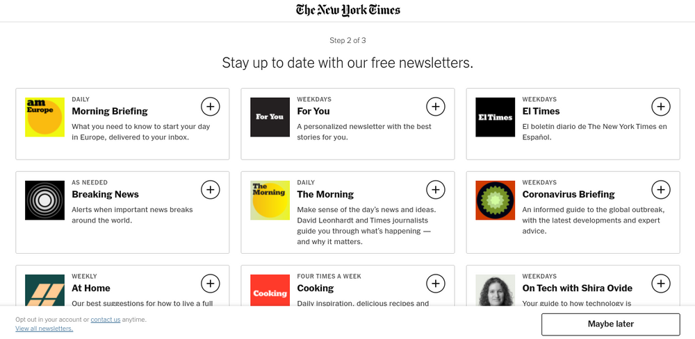
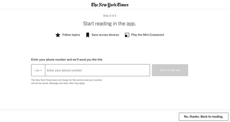
The New York Times’ onboarding process is the same for registration as it is for subscription - new account holders are encouraged to sign up for some of their free newsletters, with the publisher aiming to form content consumption habits in their reader’s lives, as well as download the NYT app and turn on push notifications.
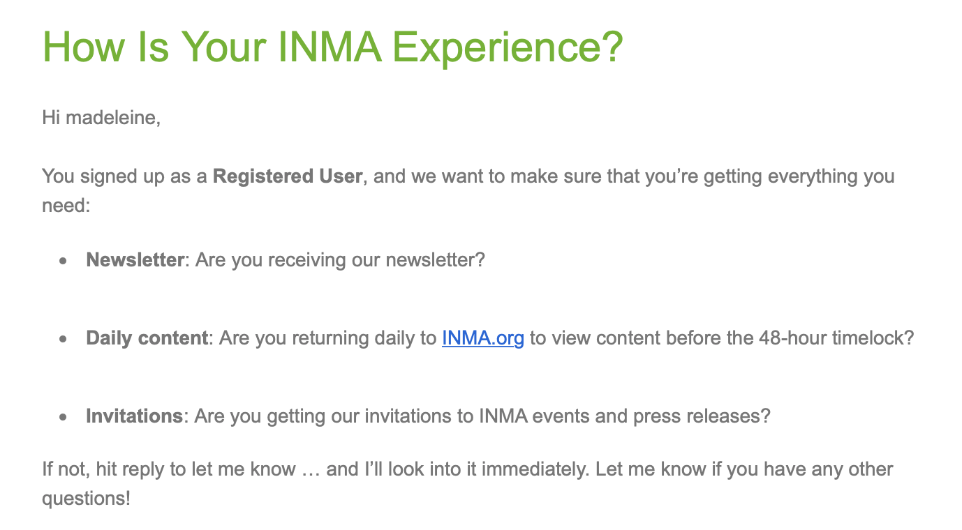
INMA goes a step further and sends an email one week after registering to check that the user is making the most of their account benefits. This is a useful reminder to members to continue to consume and engage in content (in a variety of ways). It’s also personalized and addressed from a single employee at the company, making the email feel more intimate and helping to establish that all important relationship with their audience.
E) Content
The simplest step that is very often forgotten - sending your user back to the content that they hoped to access before being blocked by your wall. It can be very frustrating to have gone through the account creation process and then have to refind the article, video or other content that you hoped to access in the first place.
We therefore recommend sending newly registered users back to this content or providing them with options.
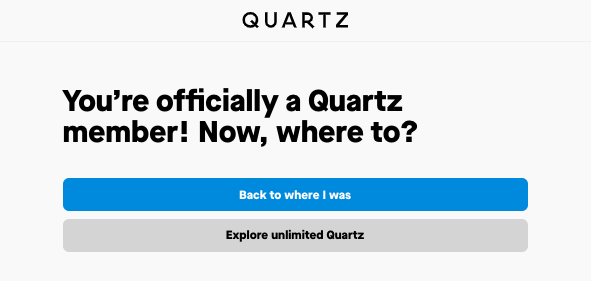
Although an example from their subscription (rather than registration) funnel, Quartz gives a great example of allowing users to go back to where they were or exploring other content.
F) Registration alone or subscription strategy
The user journey can now go in one of two directions, depending on your strategy.
If you don’t employ a paywall and subscription strategy alongside registration, the user journey ends here and you’ll utilize account creation and ID authentication to benefit your business without your audience paying a penny (such as by monetizing from targeted advertising, collecting first-party data to inform your strategy, etc).
Alternatively, you could be employing a registration wall as a soft conversion step prior to your subscription strategy (either with or without a paywall).
In this instance, the central goal of the registration wall will likely be to increase engagement and gradually boost recency, frequency and volume of visits so as to make your user more likely to subscribe in the future. This technique makes a huge amount of sense when you consider the difference between a hard paywall alone, where users are expected to subscribe instantly, compared to soft conversion steps that lead them towards converting.
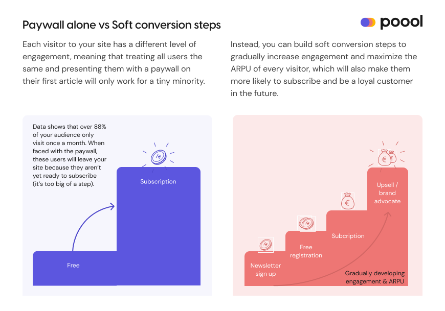
Engagement is therefore an important metric to track and seek to increase throughout the user journey, from the moment they first visit your site to the moment they (hopefully) subscribe and remain as a loyal, paying consumer, with registration providing a very valuable stage in this process.
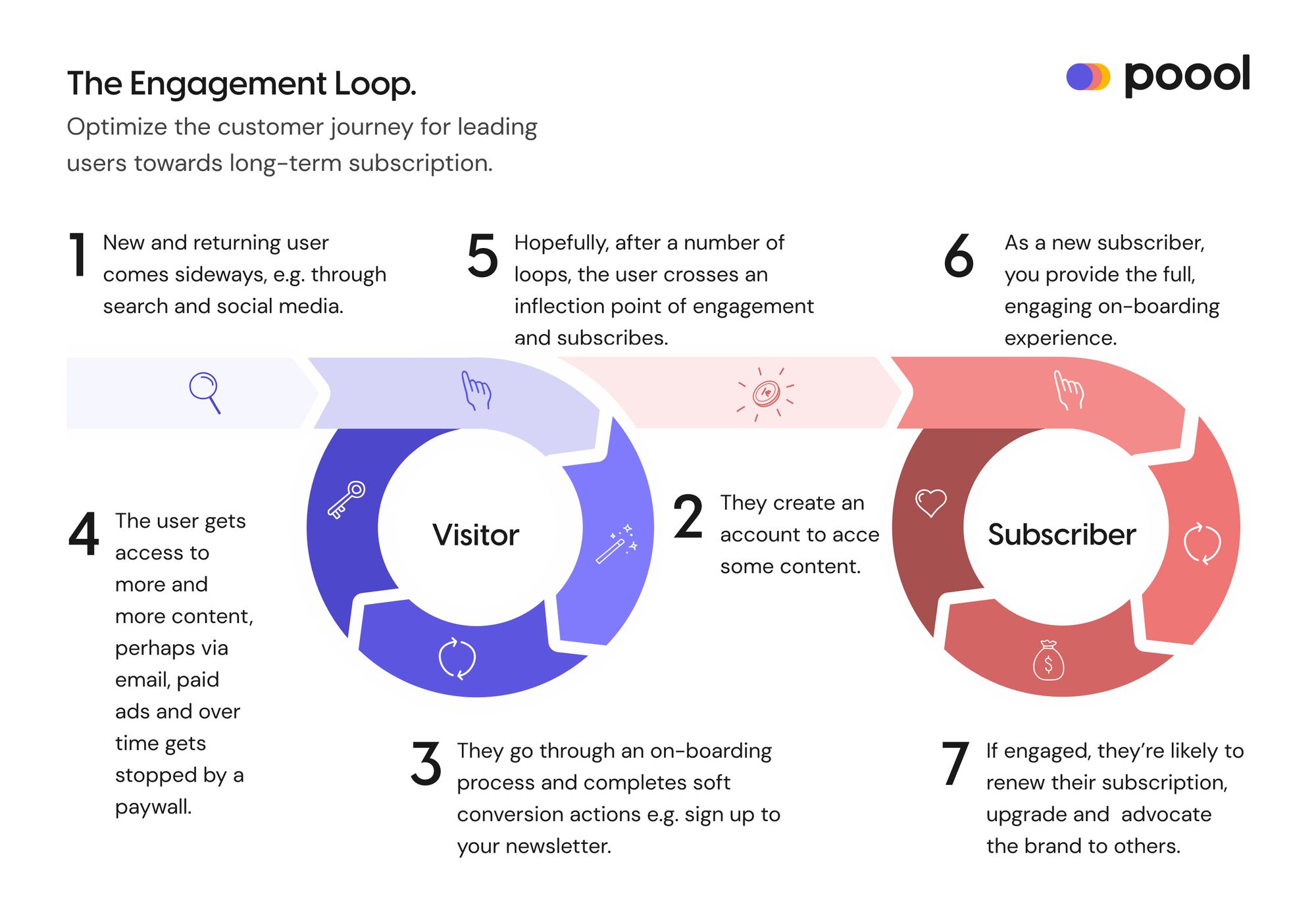
In fact, we named engagement as our north star KPI recently, and this applies to any content producer, whether employing a registration or/and subscription strategy, of any type of content.
Discover what engagement really is, how to track it and how to increase it in this article!

Once you’ve worked through the above steps and established your strategy for each, you’re ready to launch!
Some final takeaways to bear in mind:
👉 Launch gradually on just a percentage of your audience, on a single user segment or make your wall optional initially to reduce risks on other revenue streams, traffic and work done on SEO performance
(You can additionally consult this white paper on walls and SEO to discover how you can maximize the value of your wall whilst limiting its impact on SEO.)
👉 Keep the registration process simple, reduce friction, forefront your value proposition and highlight that it’s free to create an account
👉 Make the registration process mobile friendly! According to Statistica, “over 90 percent of the global internet population use a mobile device to go online”, meaning that not optimizing your website for mobile access could potentially lead to you missing out on a huge number of registered users.
👉 Increase engagement as your ultimate, overarching goal - Regardless of the business model, user engagement correlates with conversion and retention rates, both of which have a direct impact on your revenues. So, by increasing engagement, you’ll be able to better monetize your audience and develop strong, lasting relationships with your users. This should also be tracked throughout the funnel and within each engagement group (VORFMS - Volatiles, Occasionals, Regulars, Fans, Members and Subscribers).
👉 Collect first-party data gradually over the user’s lifetime on your platform rather than all at once in the registration form stage. It means forms can be kept short (reducing friction at the account creation stage) but that you can still gather valuable information about your users as they interact with your content. This is called progressive profiling.
👉 Give value back to your users - we’ve said it before but we’ll say it again for good measure! Whether this be exclusive content, UX features or personalized recommendations (like Netflix’s AI homepage that’s adapted to each user’s viewing habits), registration should benefit your audience and provide them with value, otherwise the registration wall (and value exchange) won’t work!


