Since The New York Times' first wall in 2011, paywalls have been playing an increasingly vital monetization role for many online publishers, generating revenue directly from readers. And whilst the oldest wall model, the hard paywall, is still proving successful for many digital publishers, there's some simple (yet hugely effective) techniques to optimize this strategy.
What is a hard paywall?
A hard paywall model means all content is blocked and reserved for subscribers only. It's the strictest paywall strategy that can prove highly effective for convincing readers to subscribe, but can equally put your traffic at risk of leaving as they never have the chance to discover the value of your content.
Financial Times is arguably the most famous and successful publisher employing a hard paywall. Whilst a reader can browse the homepage freely, they'll be blocked whenever they try to access an article.

However, this article will also be valuable for those employing a freemium paywall model, where content is divided into free vs premium, with the latter being blocked by a paywall.
Are hard paywalls effective for every publisher?
With the advances in more 'smart' and dynamic models, hard paywalls are increasingly rare. However, they can still prove valuable to your paywall model as a way to force your most engaged readers to subscribe.
But what about the rest of your audience?
Our research has proven that up to 98% of your users aren't yet engaged enough to convert... With a classic hard paywall model, these users will simply turn around and leave your site.
Which is why we've come up with a list of optimization techniques for you to apply to your hard paywall, with concrete examples and best practices to put in place to better convert your users into subscribers.
When we talk about ‘optimizing a hard paywall strategy’, what precisely do we mean?
Many would jump into thinking that optimizing a hard paywall is simply about increasing the number of conversions. However, conversion is only the final step in the user journey and many more areas need to be considered in order to optimize every angle of your hard paywall strategy.
Let’s consider the steps that a user goes through to convert. For each, we can translate them into KPIs, making the steps easier to analyze and so optimize:
- Step 1: Reading a premium article - This is all about the (non-subscribed) users who try to read a premium article and the visibilities of these article.
KPI = Percentage of traffic on paid vs free articles & percentage of users exposed to the wall per month
- Step 2: Seeing the paywall - This refers to when users are confronted with your paywall.
KPI = Percentage of paywall visibility on-page
- Step 3: CTR (clicking through the funnel) - This one’s pretty self explanatory. How many users click onto the wall and go through the subscription process
KPI = CTR
- Step 4: Conversion - The final step. How many users end up becoming a subscriber?
KPI = The conversion rate
This article will work through each of the 4 steps, with the goal of optimizing every aspect of your hard paywall.
Let's go 🏁
Step 1: Reading a premium article
KPIs:
- Percentage of traffic on paid vs free content
- Percentage of users exposed to the wall per month
This translates into the visibility of paid content. So, here, we’re comparing the number of visits on paid articles to the number of visits on free articles (not premium). In short, whilst research shows that high paid content visibility is valuable for increasing conversion rates, this is only up until a certain extent and balancing this KPI with a freemium paywall model (instead of hard) can prove advantageous to increase engagement before blocking a reader.
We analyzed this KPI in our Digital Media Review (DMR), a quarterly publication that provides data analysis from over 75 publishers, with a focus on paid content and gaining subscribers. After its first year, we summarized 10 key insights from the DMR, with the first 2 relating to paywall visibility.
Insight #1: Premium and online subscriptions are taking up increasingly more space in publishers’ strategies.
Insight #2: And, therefore, readers are more frequently presented with a paywall.
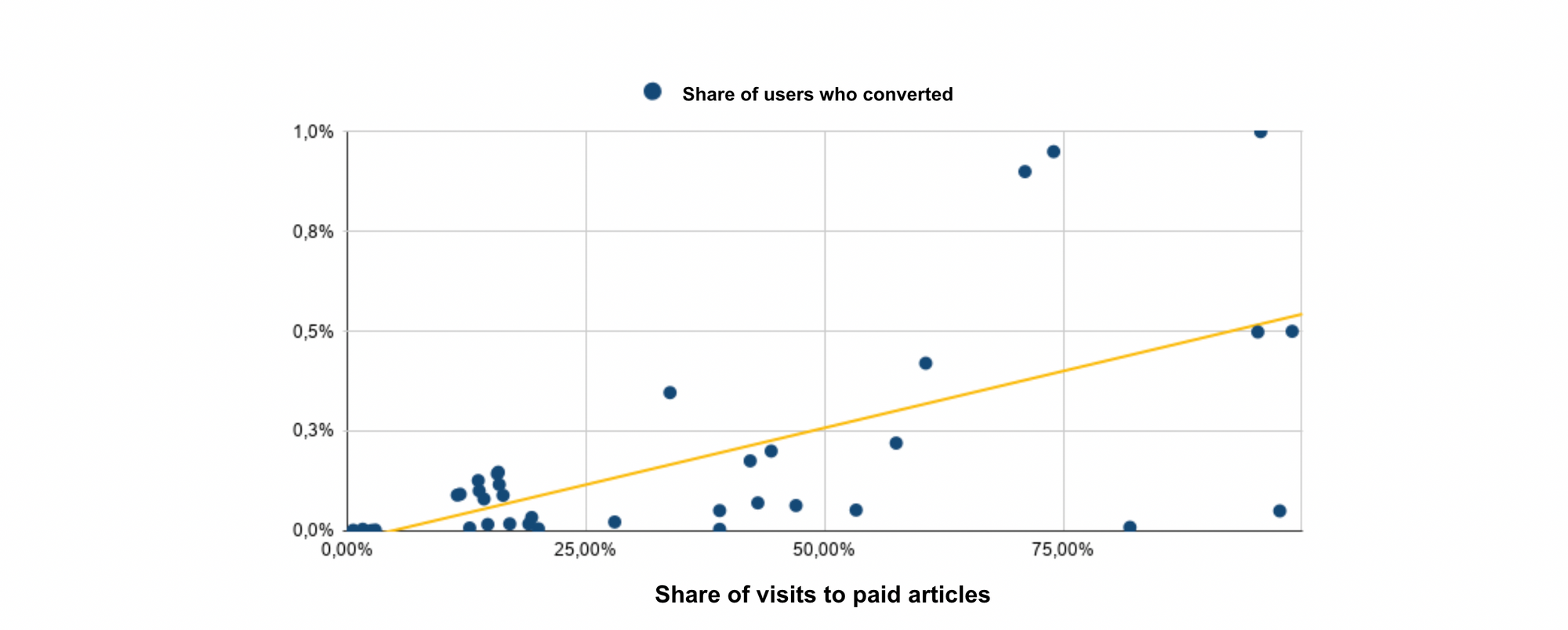
This shows how the more articles that include a paywall, the more users will see the paywall. If more users see your paywall, you’ve got a greater chance of having a high conversion rate.
Increased visibility = increased subscribers
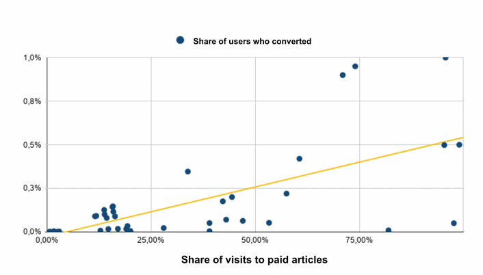
What’s more, we found that the traffic in the conversion funnel and the conversion rate seems to correlate with the visibility of paid content. On a website with lower than 10% visibility of paid content, the number of visits to the subscription page is very low. Conversely, media with 10-40% visibility of paid content have a significantly higher number of visits to the subscription page (and so a higher conversion rate).
The Financial Times (yet again) provides a great model here. In order to access any article, a user has to subscribe. Therefore, their premium content visibility is extremely high, helping them to have gained a very large number of digital subscribers.
Actionable advice: We’d recommend increasing the visibility of your paid content which will, in turn, increase the number of users who see your paywall. However, you should test this KPI and analyze its results in order to find the optimal visibility rate for your business, audience and content. The Financial Times' strategy, at 100% visibility, might not work as well for your company and audience.
Find out more about paid content visibility on The Audiencers:
Step 2: Seeing the paywall
KPI:
- Percentage of paywall visibility on-page
This refers to the visibility of the paywall on premium pages. I.e. what percentage of users who are on a premium article actually see your paywall? We’ve found an average of 30-60%, however this differs hugely across publishers with success stories at both extremes.
Test out different designs
The Boston Globe’s paywall acts like a banner that covers the lower section of the screen and blocks a user from scrolling. This would result in an extremely high visibility rate and is considered a rather aggressive approach that ensures every visitor to this page is confronted with the paywall.
Le Figaro however, uses the paywall to cut a reader off mid-article, allowing them to discover part of the content and so helping to show the value of subscription.
Alternatively, Rosetta Stone (a language learning platform) doesn’t allow any access to the site without a user subscribing - i.e the paywall acts as their landing page. This is a fairly risky strategy as a user doesn’t have any idea of the value being offered in exchange for subscription, but it’s definitely an approach that is more suited to an e-learning platform than a news journal site.
Overall, if your paywall is at the bottom of a long page and a user needs to scroll all the way down in order to see it, your visibility rate is going to be low. Conversely, using a paywall that stops a user from scrolling at all (like The Boston Globe) would result in an extremely high visibility but could cause frustration. As usual, it's a balance between frustration and engagement that only tests can help you find.
Special offer pop-ups
To increase the visibility of your subscription offers in general, you can also consider banners and pop-ups that present discounts, sales or your most popular offer to a user. This can not only be a great way to show more users the paywall (and funnel) but also speed up the conversion process as the pop-up could skip the ‘paywall’ and ‘choosing an offer’ stages, which ultimately makes subscribing even easier.
The Wall Street Journal, for instance, presents this pop-up to users wherever they are on the site, promoting a very low subscription offer and reassuring users (in bold) that they can cancel anytime.

Actionable advice: try out a variety of designs and paywall placement to see which brings you the optimal paywall visibility rate, keeping in mind that higher doesn't necessarily mean better. As usual, A/B testing is key here.
Step 3: CTR (clicking through the funnel)
KPI:
- CTR (Click through rate)
The click through rate refers to how many of your users actually click on the paywall and go to the subscription process. Optimizing in this area can be done in a variety of ways, but we’re going to focus on wording choice and making your paywall more dynamic.
Test out different wording
Your choice of wording can be the difference between losing a user’s attention or persuading them to subscribe. Most importantly, you need to effectively communicate why you exist and what value you'll provide to readers. This can be achieved through a value proposition.

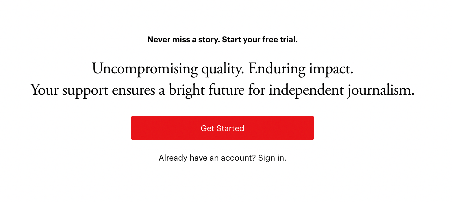
The Athletic, for example, focuses on the quality of their journalism and how it will have a lasting impact on the reader.
The text also communicates that by subscribing, a user is also doing their part in supporting independent journalism. This angle is one that's being increasingly employed by publishers to place subscription in the same category as philanthropy and donations, appealing to our desire to support those that need it whilst also gain something in exchange.
Medium’s paywall, on the other hand, is personalized to include the registered user’s name (the site employs a registration wall before the paywall) which draws our eyes to the wall and makes us feel that we’re being directly addressed by the company.
Make your paywall more dynamic
What is a dynamic paywall?
A dynamic paywall adapts itself to the user's profile or context, whether that be their location, device, content-type or level of engagement.
This is achieved through audience segmentation - you choose how you'd like to segment your users before building adapted experiences that are best suited to convert that type of user. This can include the wall design, wording or even the journey (e.g. a hard paywall alone or a registration wall then a paywall).
The way that you segment your audience can be anything that matches your strategy and business model, but let’s look at 3 commonly employed examples: segment your audience based on content-type, location or level of engagement.
- Depending on content-type
This involves grouping your audience based on the type of content that a user is reading when faced with the wall. This is often employed by publishers using a freemium paywall model which splits their content into free vs premium (find out more about paywall types here). In this instance, the scenario for a user on ‘free’ content wouldn’t involve a paywall, whereas the ‘premium’ articles scenario would.
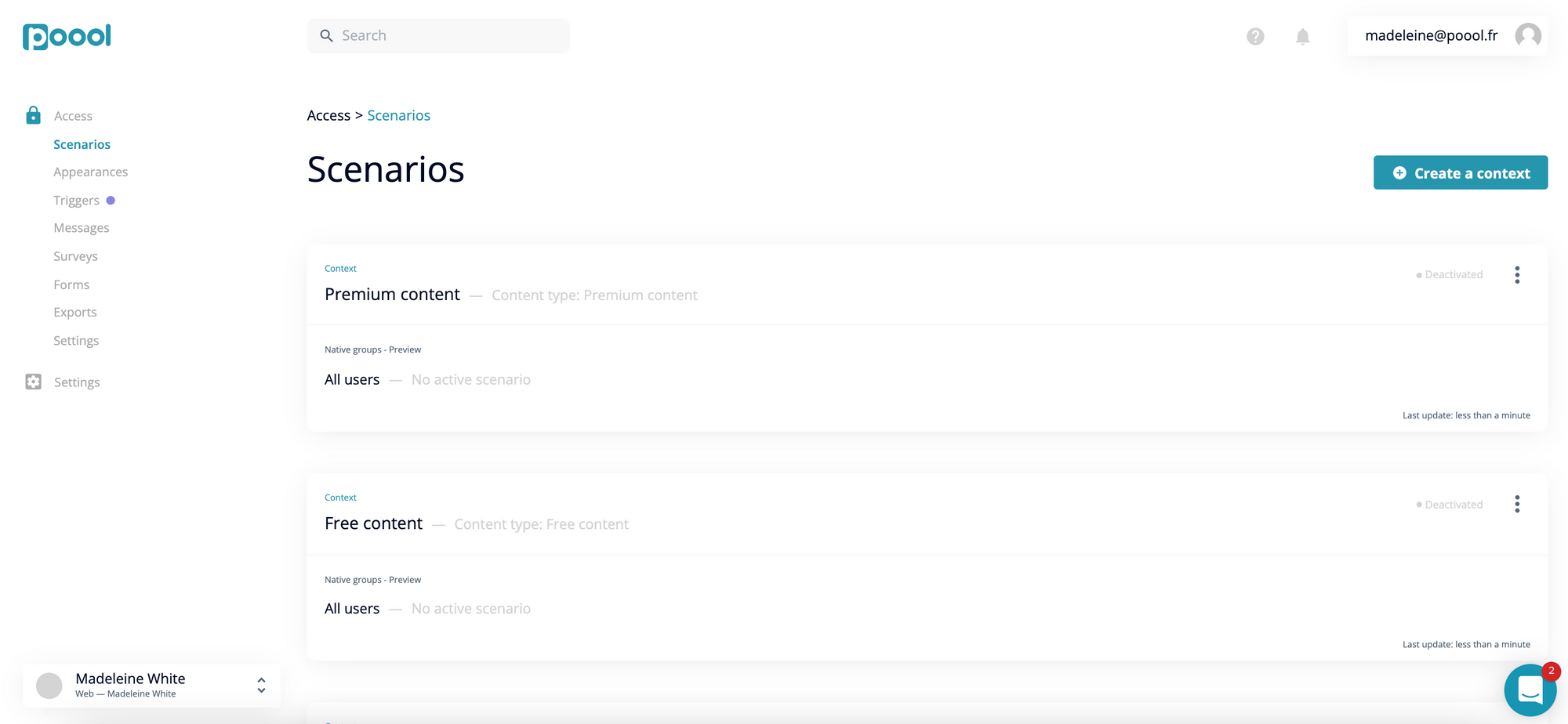
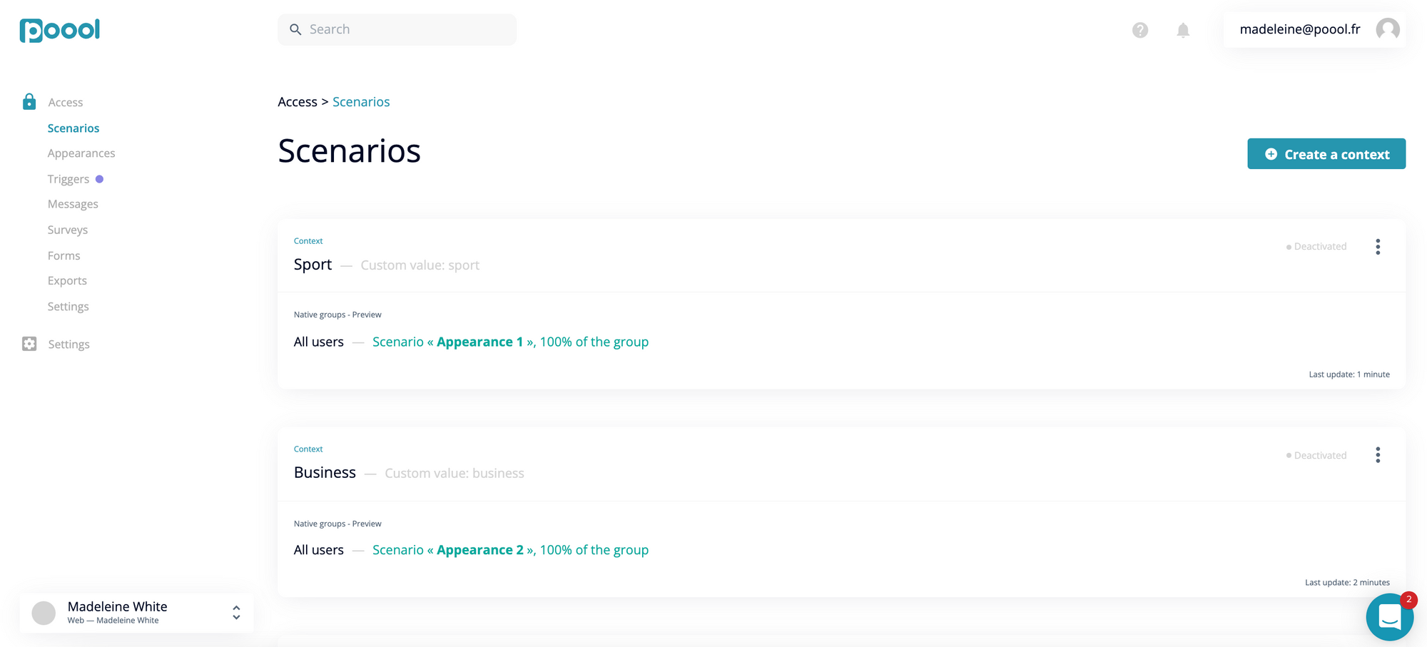
Alternatively, for a hard paywall model, you could decide to employ a different scenario depending on the topic. A user trying to access an article discussing business would therefore be shown a different paywall than a user wanting to read a sports article. The example below shows (in the green text) that users in the ‘Business’ context will be shown appearance 1 whilst those in the ‘Sport’ context will be shown appearance 2.
This is something employed by the French publisher, Le Figaro, who adapts the value proposition text to the content.
For news content:
In the world news content:
2. Depending on location
This is a very useful context, especially for content producers who have an international reach. Even the very simple alteration of currency can make an important difference for your user.
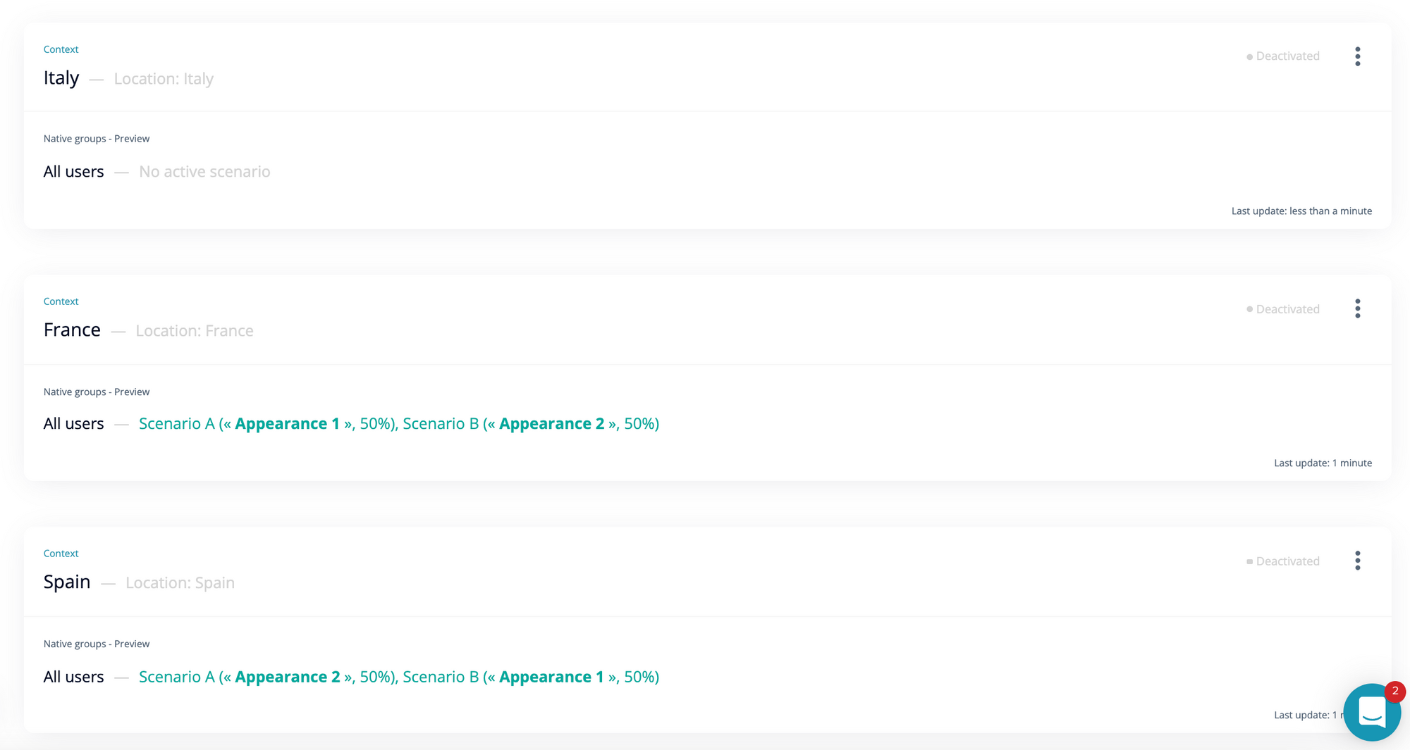
We can see below that The Financial Times. Despite being a British publisher, they adapt the currency to Euro when the user’s location is within the Eurozone.
This can be done very simply by segmenting audiences based on their location:
3. Depending on level of engagement
This is arguably the most valuable dynamic wall strategy as you can find a better balance between frustration and engagement.
At Poool, we divide audiences natively based on their level of engagement - Volatiles (the least engaged), Occasionals, Regulars and Fans.
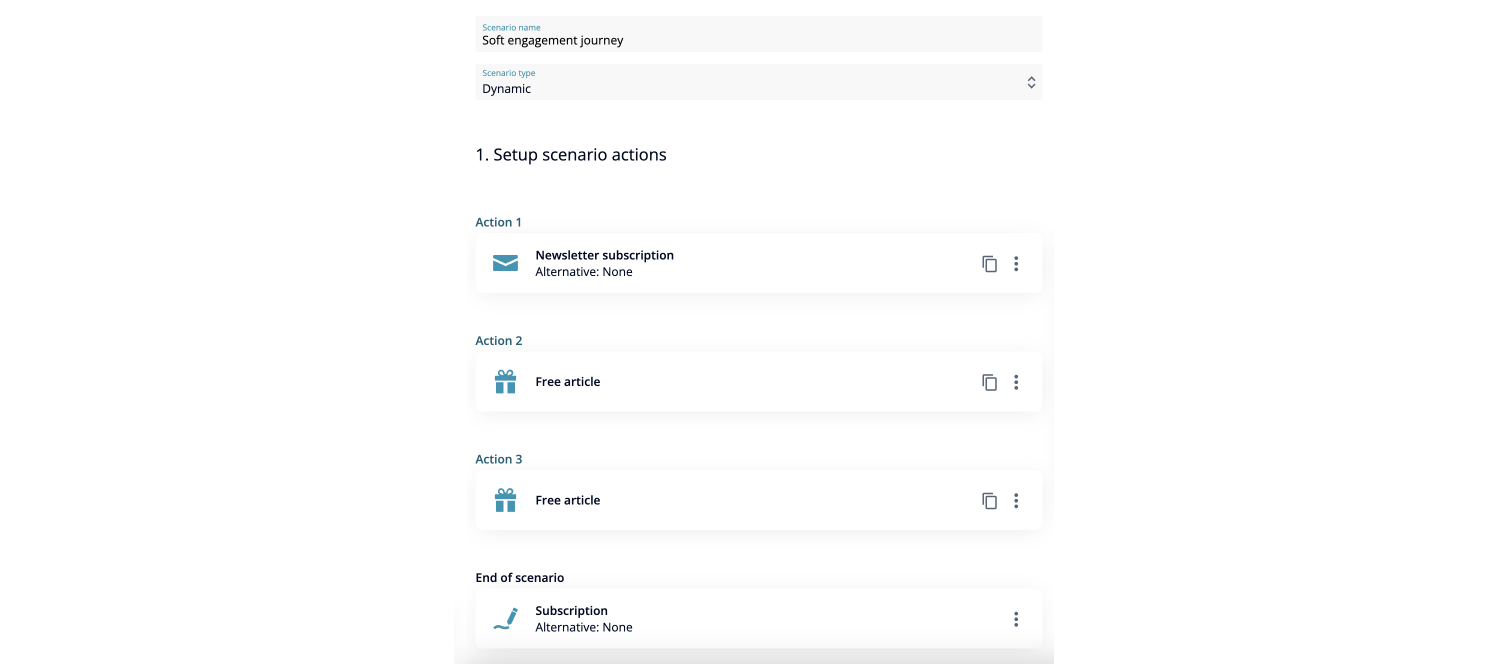
For your Volatile readers, you can build an engagement journey that gradually increases frequency and volume of visits to then later present the paywall to encourage subscription.
We'd recommend a newsletter or registration wall (brilliant for collecting data and increasing engagement) before offering some content for free and then presenting the paywall.
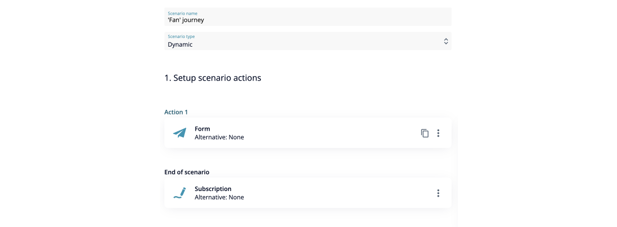
For Fans, who already come to your site on a regular basis, will have high levels of engagement meaning you can 'frustrate' them a little more to encourage subscription.
For instance, a registration wall (to collect first-party data) before blocking with the hard paywall could prove effective.
However, the key is A/B testing to find the optimal journey for each user segment.
Actionable advice: personalization is becoming increasingly important; it’s now an expectation of users online, rather than something that makes you stand out from the crowd. That said, the way that you utilize a dynamic wall can make a huge difference for a user and finalize their decision to subscribe to you over a competitor. We’d recommend trying out some of the segmentation factors above, but also experimenting with custom segmentations (that can be defined in the Poool Dashboard) as this allows you to customize the dynamic wall to match your business goals and strategy. And of course, continuously A/B test with different audience segments (e.g. location vs device) as well as within different contexts (e.g. test two appearances within the same group).
Finally, even if you choose not to employ your wall dynamically, ensure that you have a mobile friendly version that is adapted to the device throughout the funnel (not just at the paywall stage).

Step 4: Conversion
KPI:
- Conversion rate
The paywall is only the first step in the conversion funnel, and we’re certain that you want users to get further than simply clicking on the wall. So, how can you optimize the funnel as a whole and make sure your readers become subscribers?
Present subscription offers directly on the wall
What better way to improve the funnel than to shorten it. Reduce the time, effort and clicks needed to subscribe and highlight straight away that you have a variety of offers available with different pricing options.
The Financial Times is a great example here (again). A user selects the article that they want to read from the home page and is presented with this screen. The article title is the only part of content presented, with the subscription offers placed right below.
Digiday also takes this ‘offers in the paywall’ approach. This wall blocks content mid-article and includes their 3 subscription options, skipping the offer page stage of the conversion funnel.
Integrate payment into the wall
How about going one step further and adding payment into the paywall? This takes out yet another step and speeds up the process making it even quicker and easier for your reader to get back to the content. Alternatives Economiques, one of Poool's clients, increased conversion rate by 40% with this technique!
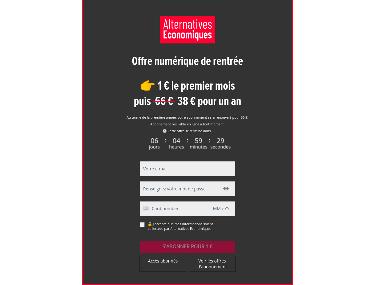
This is possible to achieve within the Poool Dashboard through the ‘Form’ widget. When you go to ‘Scenarios’ and start building a user journey, you can select which widgets to add. Select ‘Form’ from the list on the right and then choose ‘1 click payment’ (like below) in the form settings.
Collect email addresses in the paywall
For such a small change, integrating an email address collection box into the paywall can be hugely beneficial. Not only does it shorten the funnel and allow you to take steps out of the conversion process, but it also means that you collect valuable first-party data at the first opportunity.
Not all users will make it through the whole funnel. However, if a user gets to the payment stage before changing their mind, you’ve already collected their email address. You’re now able to send a little, personalized email reminding them to subscribe, or even just email them asking why they left.
Netflix's paywall is directly on their landing page and includes email address collection. This has the added benefit of skipping some of the funnel steps if the email address was previously registered, making subscription even easier. If a user gets past this stage, but then doesn’t complete the process, they’re sent an email reminder which reminds the user of the benefits of Netflix.
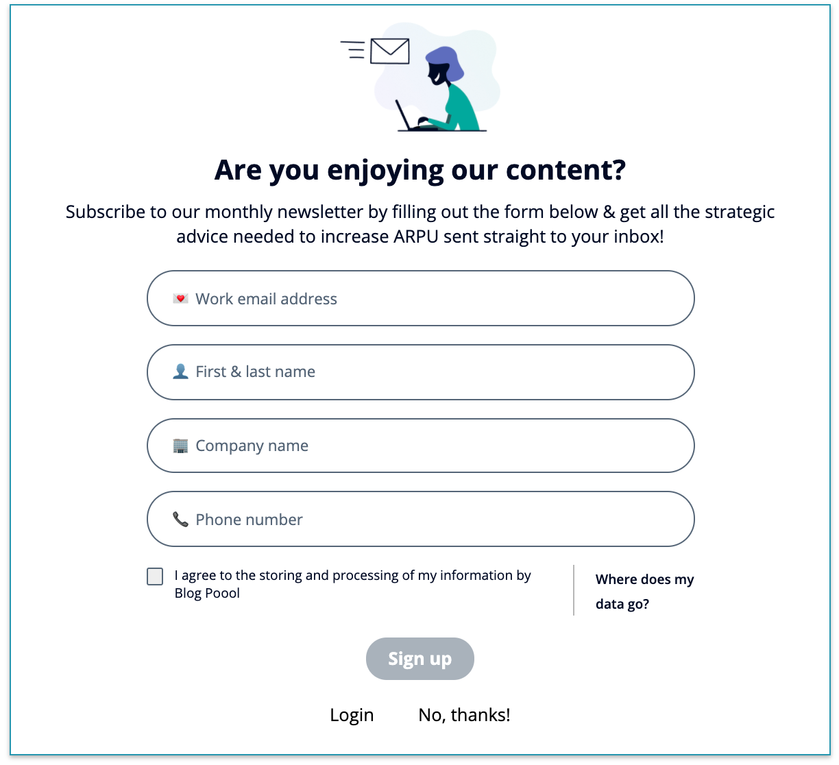
Using the Poool paywall platform and Dashboard, you can collect users email addresses in the paywall itself using the ‘Form’ widget. Remember that you can alter messaging and appearance of this widget in the relevant sections from the left and then by selecting the ‘Form’ widget as the one you want to modify.
Offer sign-up with existing social accounts
It’s highly likely that your user already has either a Google, Facebook, Apple, etc account. So why not make use of this to shorten the process even further.
Although they use a registration wall instead of a paywall, Skill Share sign-up is a good example. It provides multiple options to get started (including simply using their email address) and so speeds up the process by not only including Facebook/Google/Apple sign up but also integrating this into the landing page itself, taking out a step in the funnel.
Actionable advice: Overall, there’s a lot of options for your hard paywall and conversion funnel as a whole. For each of the alterations discussed, we highly recommend A/B testing, analyzing and then optimizing not only now but constantly. What works now may not be as effective in a few months (unfortunately). And keep in mind the wider view of the user’s journey to subscription and beyond. For example, if you ask for registration before presenting the paywall, you could automatically fill out some of the form areas, as you’ve already collected this information, further simplifying the process.
An overlooked area to remember here is post-subscription. Small actions such as sending the reader back to the article that they wanted to read, sending an email and billing confirmation, etc. can make a huge difference. It's a lot easier (and cheaper) to retain readers rather than acquire new ones, so this stage of conversion should definitely be up for optimization too. A KPI to track here is the post-subscription reading rates.
Once more, always remember that there is no one-size-fits-all paywall. The Financial Times may have seen huge success thanks to their strategy, but the main reason why it’s worked so well is because they have adapted it to their business, content and audience (and continue to do so). This is why testing is so important.
Still not sure how to get started in optimizing your paywall? Or just interested in getting some more personalized advice? Book a meeting with our Audience Conversion Experts!
You may also like:


