A/B testing is the number 1 strategy to optimize your paywall click-through and conversion rates, allowing you to discover what performs best for your unique audience, content and business model.
Given its value, our consultancy team is here to share benchmark examples and insights from some of the A/B tests carried out by Poool clients.
However, it’s important to remember that every publisher is different, meaning test variables and results may not be the same for your strategy. Having said that, it’s useful to consider what others in the industry are testing to take inspiration for your own tests!
In this article:
- France Antilles - value proposition
- Le Journal du Dimanche - color
- Bio à la Une - CTA button text
- ELLE - paywall format
- Neos Kosmos - wording and visual
- Quotidien & Tageblatt - altered wording for a national event
- Le Petit Journal - value proposition length
Are you a French reader? 🇫🇷 Keep on reading here!

Quickly, what is A/B testing?
A/B testing, or split testing, is a marketing technique that works by comparing the performance of two versions of a single variable (such as scenarios, wall layout, colors, copy) to discover which leads to the highest conversion rates. The variant being tested is called the ‘control’ whilst the variant that is argued to give a better result is called the ‘treatment’.
France Antilles
Hypothesis to test: Does the length of the value proposition and text on a paywall influence CTRs?
Variable: Wording (value proposition length)
Goal: Increase click-through rates across all audience segments
Control (version A): Detailed value proposition detailing the key benefits of subscribing in 5 bullet points. The wall also had two CTA buttons, one for the average individual reader (‘Try our digital offer at 1 euro for 30 days’), the other for group subscription offers (‘Request a personalized offer’).
Treatment (version B): Here we have a simple single sentence value proposition aiming to create a community around shared cultural values with just one CTA button (‘Continue reading’) which moves the focus away from payment.
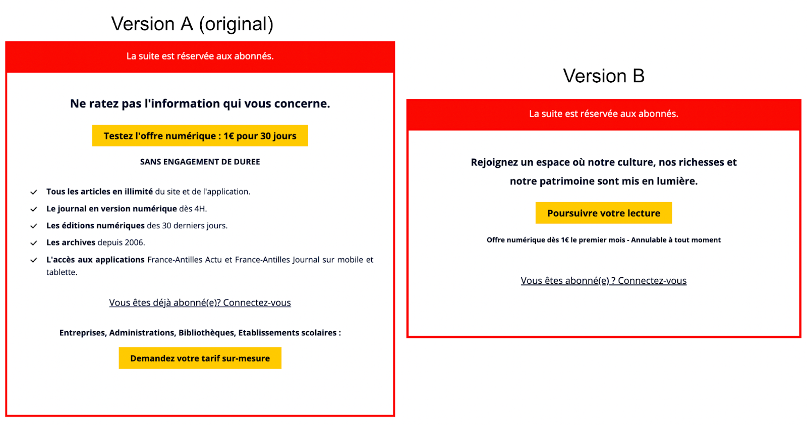
Result: Version B, the wall with a shorter but more personalized value proposition, performed 5x better on average than version A, and this was the case across all audience segments and websites (the publisher has 3 in total).
💡 Top tip: we wouldn’t recommend modifying multiple aspects of the wall in one go (e.g. the CTA button text and value proposition text) as this takes the focus away from analyzing and optimizing a single feature in one go.
Le Journal du Dimanche
Hypothesis to test: Does the color of the JDD Newsletter Wall influence CTRs on mobile devices?
Variable: Color of the wall
Goal: Increase CTRs on mobile devices (where an increasing percentage of users access their site but where conversion rates still remain low)
Control (version A): Gray wall with yellow CTA button
Treatment (version B): The inverse, so yellow wall with gray CTA button
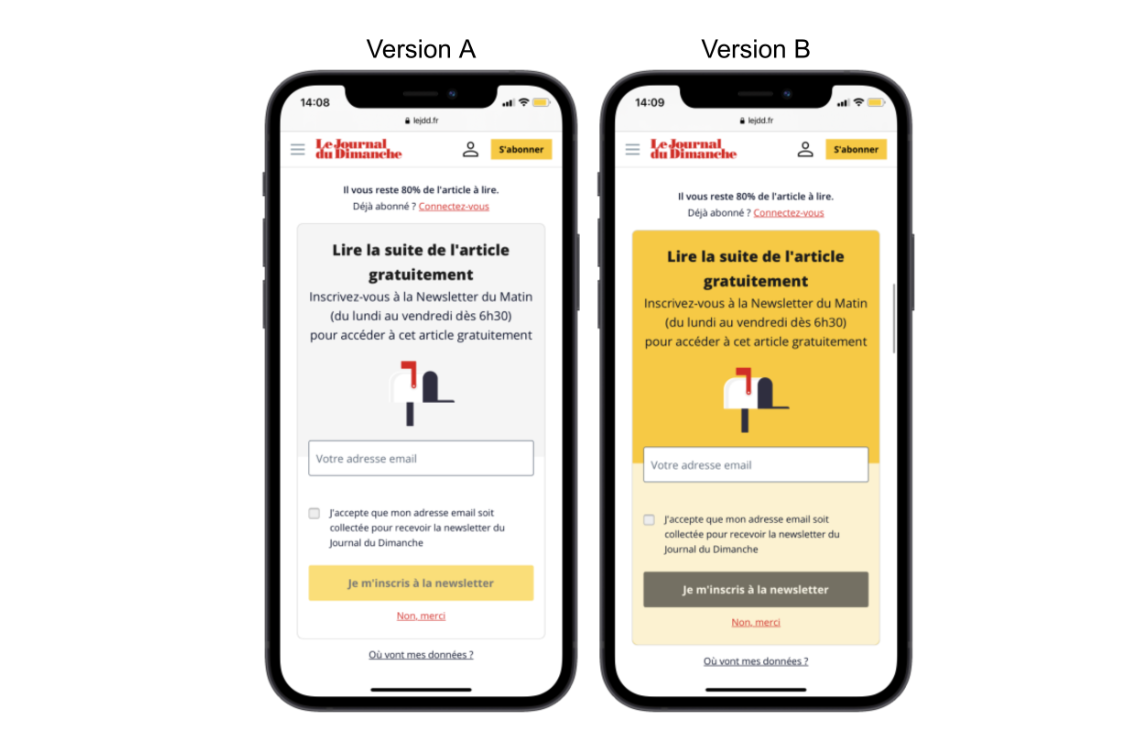
Results: The yellow wall far out performed the gray, persuading the team to employ version B over the other.
Bio à la Une
Hypothesis to test: Does the text on the call-to-action button influence CTRs?
Variable: Text on the CTA button
Goal: Increase CTRs and discover the focus that works best for each audience segment
Control (version A): CTA button text ‘Discover our offers’
Treatment (version B): CTA button text ‘Subscribe’ (note that ‘Je m’abonne’ has become a common phrase in France associated with subscriptions for digital publishers)
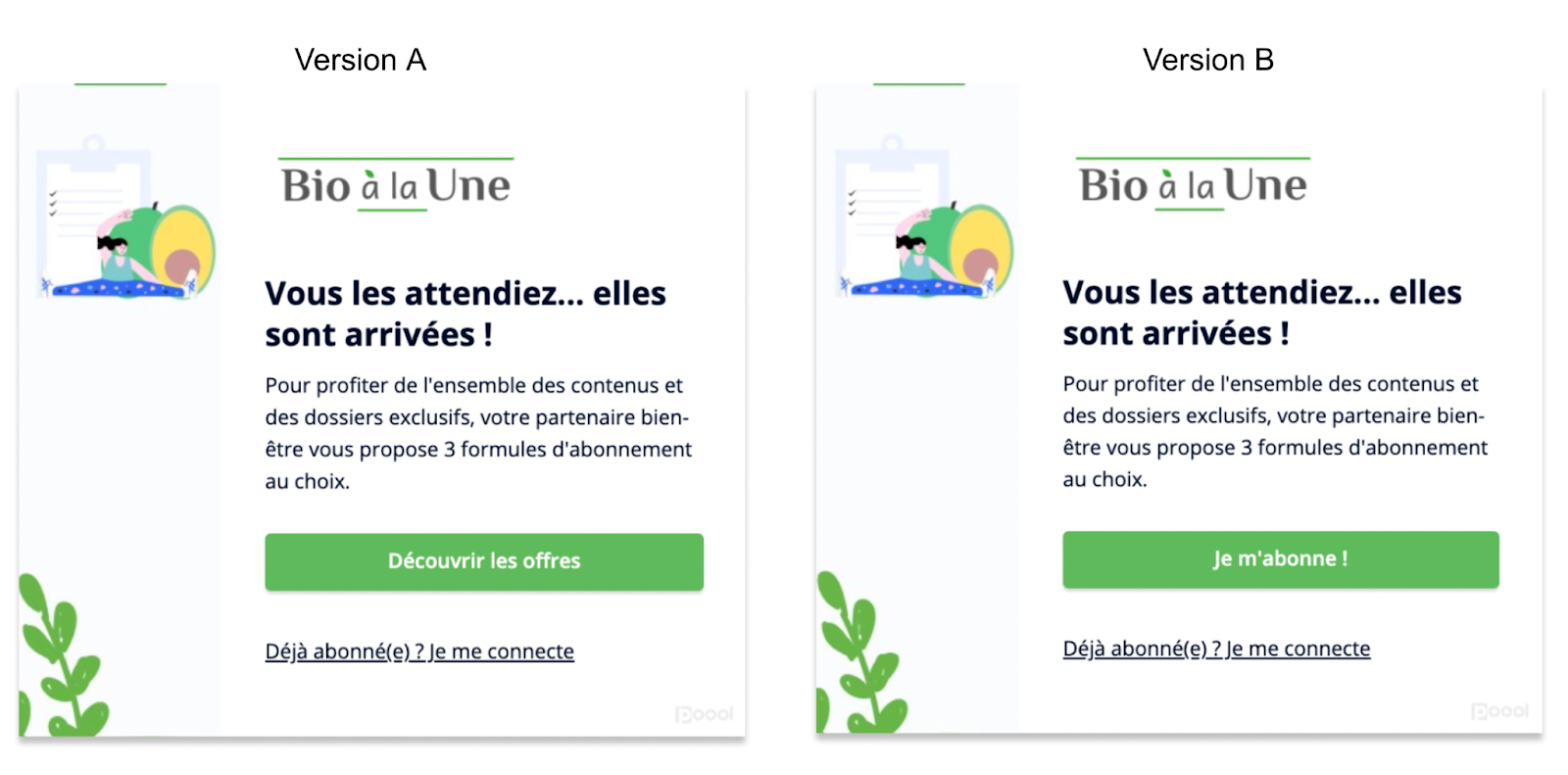
Results: Version B has a higher click-through rate amongst less engaged users, whilst version A performed better for fans who are highly more engaged.
💡 Top tip - segment your audiences and run your tests on each individual group because you may well get different results based on the ‘type’ of reader. For instance, you could split users based on the device used, engagement level, location or whether they’re anonymous or known visitors.
ELLE Magazine
Hypothesis to test: Does the wall format make users more likely to click-through the paywall?
Variable: Paywall format
Goal: Increase click-through and conversion rates for all user segments
Control (version A): The standard upright rectangle
Treatment (version B): A banner version
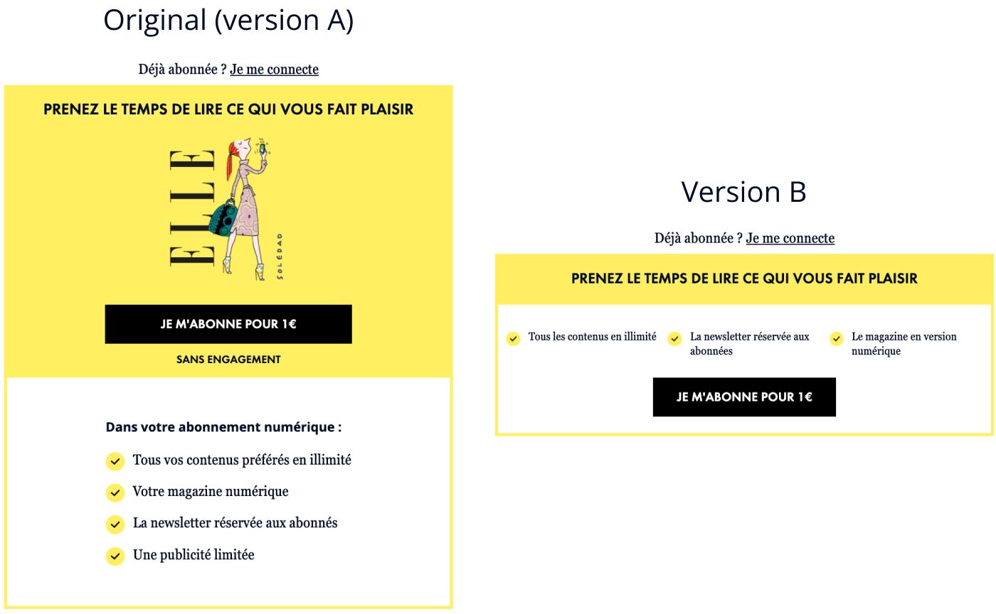
Results: The original format worked slightly better amongst volatile (less engaged) users whilst the banner version significantly improved conversion rates amongst occasional readers.
💡There are SO many ways to optimize your conversion rates aside from just A/B testing! Discover 6 ideas in our blog post:

Neos Kosmos
Hypothesis to test: Does a different tone of voice on the paywall influence conversion rates?
Variable: Wording on the wall
Goal: Increase conversion rates
Control (version A): The original wording details what Neos Kosmos’ premium offer gives a subscriber access to
Treatment (version B): This version takes a more ‘support our work’ approach, appealing to a user’s emotional and cultural attachment to Greek culture in Australia
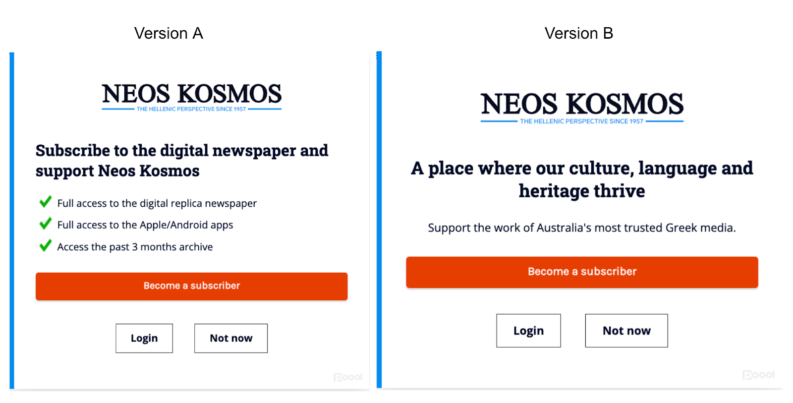
Result: 16% increase in conversion rates with version B
Second Neos Kosmos test
Hypothesis to test: Whether the visual employed on the paywall affects conversion rates
Variable: Visual
Goal: increase conversion rates
Control (version A): The publisher actually moved from the version above (with no visual) to one with a visual, testing which version led to higher conversion rates. Version A was an image with immigrants arriving on a boat
Treatment (version B): This version is of a Greek building
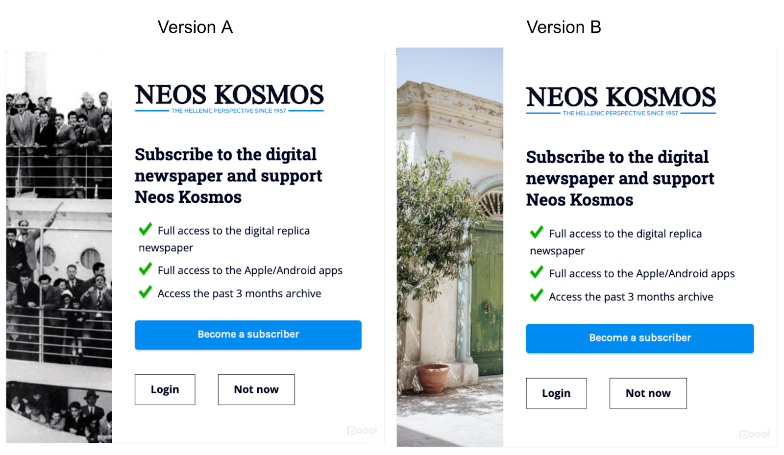
Result: 13% higher conversion rates on version A with the boat
💡 Top tip - Do as Neos Kosmos has done - A/B test continuously! You may increase conversion rates with one test but who's to say that another version couldn't increase them even more?
Quotidien & Tageblatt
Hypothesis to test: Whether CTRs increase when messaging is altered for a special event/national holiday
Variable: Text
Goal: Increase click-through rates
Control (version A): The original wall
Treatment (version B): A special version of the wall for Press Freedom Day. This wall was presented to readers over a 5 day period from April 30th-May 4th on both Quotidien and Tageblatt
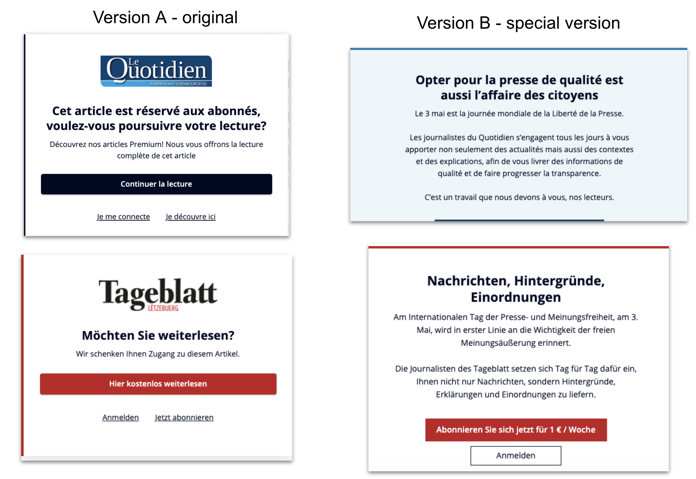
Results: The results are very positive. There was a clear increase in click-through rates on the paywall, showing the importance of a contextualized message that’s aligns with the media's identity.
For Le Quotidien, CTRs increased by up to 18%, whilst Tageblatt saw an increase of up to 4%.
Le Petit Journal
Hypothesis to test: Does the length of the value proposition influence CTR AND does the result differ based on the type of content?
Variable: Wording
Goal: Increase click-through rates
Control (version A): The original wall with value proposition points and a focus on supporting the publisher (i.e. subscribe to support us)
Treatment (version B): A shortened version without the bullet points and a focus on the fact that the user hasn’t finished reading (i.e. subscribe to continue)
On premium content -
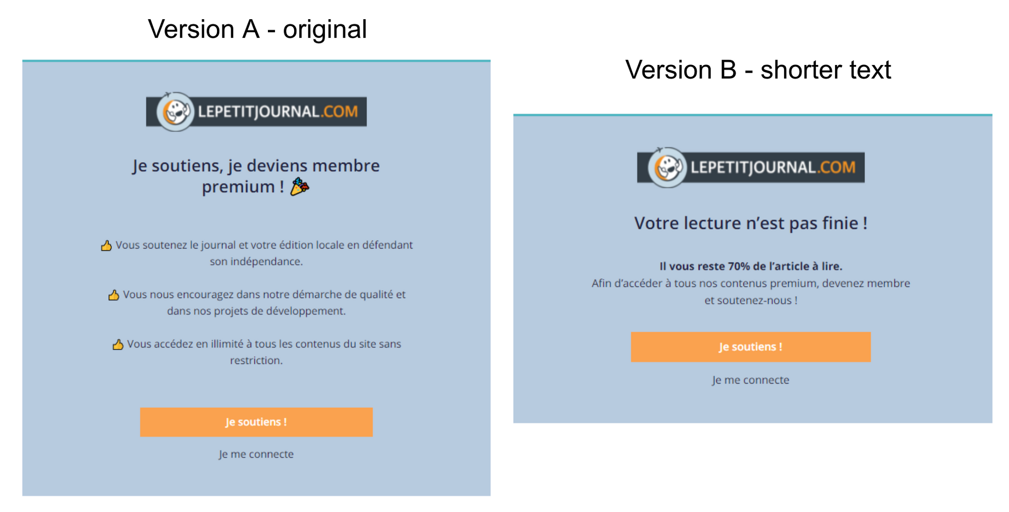
Results: Version B had 23% higher click-through rates
On free content -
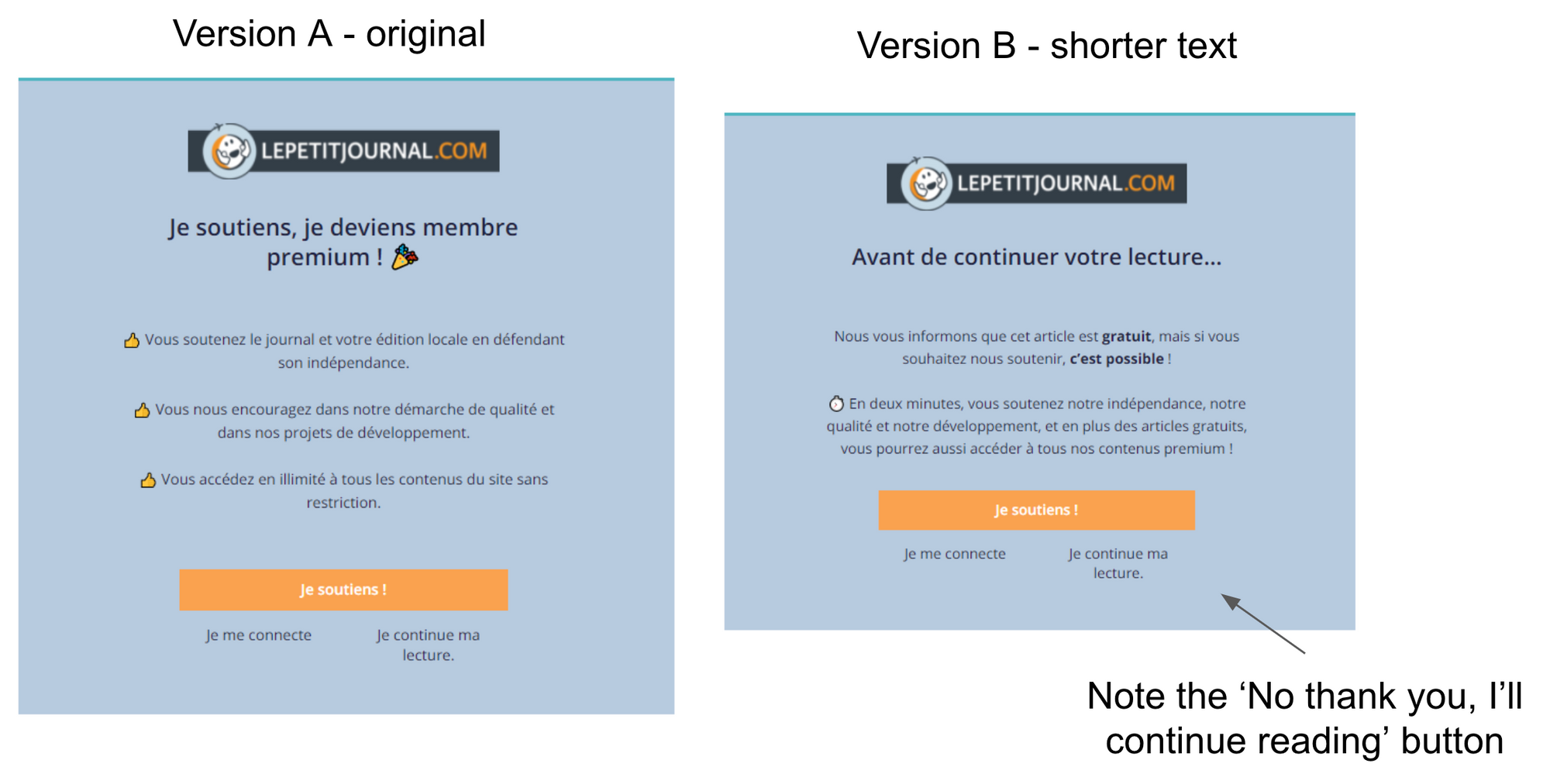
Results: Version B had 59% higher click-through rates
Discover Le Petit Journal's full success story:

You may also like:


