Given the value of 1st party data, it’s becoming increasingly popular for publishers to ask users to register on their website. A registration wall does just this, blocking access to content and requiring registration before continuing.
Once a reader has created an account, their behavior can be analyzed across devices, providing important and actionable insights to the content producer. What’s more, registration brings a user one step closer to subscribing, so it can also play a huge role in a paywall subscription strategy. For readers, having an account on a site means more personalization, ultimately improving their user experience as a whole, and so encouraging them to subscribe.
This is why we’re back with a new article series! Our first one covered the user journey to subscription (including The Washington Post, Netflix and Audible) whilst this one will analyze the journey of an anonymous reader into a registered user. We aim to see what motivates readers to become members and how the different publishers employ a regwall.
By now we hope you’re aware that the most important aspect to turn readers into members, and even subscribers, is your value proposition and content. This is what our series is all about, understanding the number of clicks, scrolls, amount of information and time taken for a reader to create an account, but also to understand the value proposition and why the publisher wants users to do this action.
Remember, any online content-producer can employ a registration wall, including editorial publishers, broadcasters, e-learning platforms and more. To highlight this fact, our ‘From content to registration to content’ series includes a wide range of different publishers.
We’ll cover:
- The New York Times
- Glassdoor
- Journal du Net
- Harvard Business Review
- MY TF1
- WTTJ
- Spotify
- Ornikar
- Open Classrooms
To find out more about registration walls, see our blog post on 'What is a Registration Wall?'. You might also like our other article series on the subscription conversion funnel, with a white paper to summarize our findings, available here.
Interested in implementing a registration strategy with the same success as these digital content producers? Poool have a simple, flexible platform to allow you to do exactly this, and without the need for tech support at every turn!
Book a demoSo, let’s start.
Today: Open Classrooms
Open Classrooms is a french online vocational training website, with a version available in both French and English. Courses are free to access after registration but there are also paid ‘paths’ that can be taken.
We’ll analyze:
- The user journey to register
- Open Classroom’s value proposition
- Why Open Classrooms uses a registration wall
The user journey to register:
- 5 clicks are needed to register and view content on desktop, 6 on mobile
- 1 scroll is needed to see the registration form in its entirety on desktop and mobile and no scrolling on the app
- 4 fields need to be filled out to create an account + 2 questions to answer on desktop
So, step by step.
STEP 1 - The user arrives on the website
A user arrives on the site and immediately sees Open Classrooms' value proposition. We’re able to browse classes in the ‘Training programs’ section but are asked to login or sign up to view the content in its entirety.
Interestingly, there’s no specific ‘sign up’ button on the home page, only the ‘sign in’ one for already registered users.
STEP 2 - Creating an account
By clicking on ‘Sign in’, we’re taken to a page for users who have already created an account and we’re required to click ‘Sign up for free’ to be taken to a page specifically for non-registered users.Although they do highlight that it’s free to sign up, the additional clicks required here makes the user journey slightly longer than is needed.
In the registration form, a user needs to provide:
- First name
- Last name
- Email address
This is very little information, facilitating the process. The user is emailed a password that they can then change later in their account settings.
Open Classrooms also integrates the options of signing up with an already existing social account, including Facebook, Google and Apple, which not only makes it even easier for a user to register but also means Open Classrooms can gather data from this other account.
STEP 3 - Confirmation and personalization
After filling out the form, the user is directed to a personalization stage. This green banner pops up at the bottom of the screen, welcoming us directly (personally addressing us), confirming that they’ve sent us an email with our username and password as well as creating a sense of belonging by involving us in their ‘community’. This immediately helps to develop a close relationship with the new user, an extremely important part of a registration strategy.
This page also has two personalization stages where users are asked to answer multiple choice questions to help the company to present them with the right content for the user. This is a great way to ensure that the user finds what they need on the Open Classrooms website from the moment they can access content. The fact that the questions are multiple choice and have clear options to choose from, each with a relevant illustration, make them easy to answer and require little effort from the user.
STEP 4 - The user is logged into their account and sent their password via email
The user is (usefully) automatically logged into their account and sent an email containing their username and password.
The account home page provides a recommendation of courses based on the question responses in the registration process. Once a course has been started, the user will also be able to see this on the home page and resume content where they left off.
Courses are mainly free, but longer courses (diploma training programs), require a fee that is paid monthly for just that individual course.
The user now has access to content for free!
With all courses, we can see the title, subject area, amount of time needed to complete it and the level. When clicked on, we get a more complete description of the course. Content is entirely personalized and we have easy access to any courses that we’ve already started. This all makes for a very good user experience.
The fact that the courses are free to access is brilliant and, even though some cost money, these are highly developed and specialized courses with a certificate at the end and are still significantly cheaper than their university (in-person) equivalents.
Value proposition
It’s very important to analyze the publisher’s value proposition too, as it shows what a registered user is or isn’t entitled to.
Open Classrooms’ value proposition is clear from the landing page, however they don’t really highlight that their courses are free until we click on ‘Sign in’ and then see that we can register for free. Perhaps this is so that they can promote their paid courses over the free ones, but it doesn’t let us know that we can discover some content without paying.
Interestingly, the app gives a different value proposition - ‘Transform your career by earning an accredited online diploma’. This is a lot more clear about what we gain from their platform, however the concept of free courses is still lacking.
Open Classrooms value proposition:
- Open Classroom provides vocational training courses to help users become more employable or improve their skills for a current role
- Users can access most classes for free
- Users can use the platform without ever being forced to pay or leave, but diploma courses are premium content and require a fee to be accessed
Why do Open Classrooms use a register wall?
There isn’t just one answer here and we can only assume, but we imagine that integrating a regwall meets several goals simultaneously.
- Collect first-party data (see our white paper 'First-Party Data and Registration Walls')
- Gather possible leads to sell paid courses
- Improve the user experience - creating an account means they have a personalized home page with recommendations suited to their interests and can resume content where they left off
- It provides a way for users to discover content for free and see the value in paying for a premium course
And what about on mobiles and the app?
The mobile version (on browser) is the same as on desktop but more scrolls are required to view the form in its entirety.
However, the app provides a significantly better mobile experience than on a browser.
On opening the app, we are immediately faced with a login or sign up page which removes a step out of the registration funnel. The form is the same but there’s no personalization questions this time.
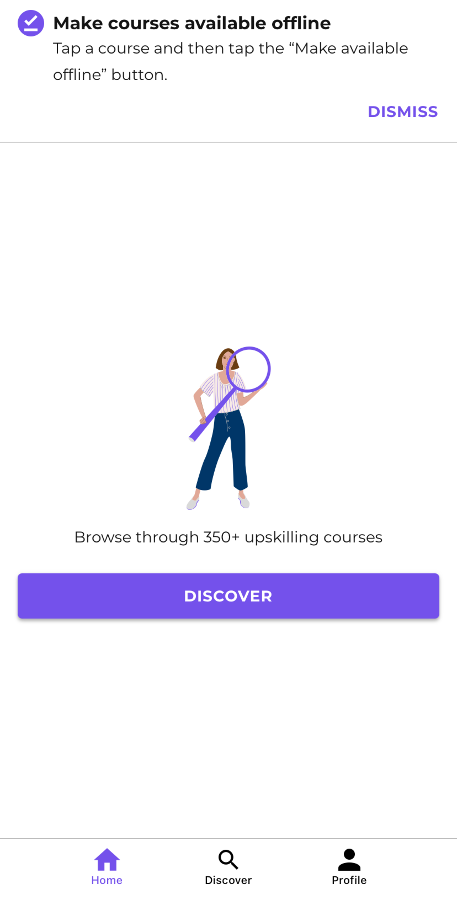
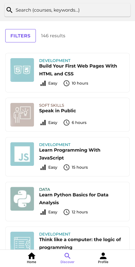
The layout of the app is different - the ‘Home’ page shows current courses, ‘Discover’ allows us to browse content and ‘Profile’ lets us view and configure our account. We also have the added value of being able to access classes offline.


