Given the value of 1st party data, it’s becoming increasingly popular for publishers to ask users to register on their website. A registration wall does just this, blocking access to content and requiring registration before continuing.
Once a reader has created an account, their behavior can be analyzed across devices, providing important and actionable insights to the content producer. What’s more, registration brings a user one step closer to subscribing, so it can also play a huge role in a paywall subscription strategy. For readers, having an account on a site means more personalization, ultimately improving their user experience as a whole, and so encouraging them to subscribe.
This is why we’re back with a new article series! Our first one covered the user journey to subscription (including The Washington Post, Netflix and Audible) whilst this one will analyze the journey of an anonymous reader into a registered user. We aim to see what motivates readers to become members and how the different publishers employ a regwall.
By now we hope you’re aware that the most important aspect to turn readers into members, and even subscribers, is your value proposition and content. This is what our series is all about, understanding the number of clicks, scrolls, amount of information and time taken for a reader to create an account, but also to understand the value proposition and why the publisher wants users to do this action.
Remember, any online content-producer can employ a registration wall, including editorial publishers, broadcasters, e-learning platforms and more. To highlight this fact, our ‘From content to registration to content’ series includes a wide range of different publishers.
We’ll cover:
- The New York Times
- Glassdoor
- Journal du Net
- Harvard Business Review
- MY TF1
- WTTJ
- Spotify
- Ornikar
- Open Classrooms
To find out more about registration walls, see our blog post on 'What is a Registration Wall?'. You might also like our other article series on the subscription conversion funnel, with a white paper to summarize our findings, available here.
Interested in implementing a registration strategy with the same success as these digital content producers? Poool have a simple, flexible platform to allow you to do exactly this, and without the need for tech support at every turn!
Book a demoSo, let’s start.
Today: Pinterest
Pinterest is an American image sharing and social media service. A user can create an account in order to discover images, save them to personalized boards, send them to friends as well as share their own images.
We’ll analyze:
- The user journey to register
- Pinterest's value proposition
- Why Pinterest uses a registration wall
The user journey to register
- 4 clicks are needed to register and return to content
- 1 scroll is needed to see the registration form in its entirety, except on mobile where two scrolls are necessary
- 3 fields are required to create an account
So, step by step.
STEP 1 - The user arrives on the website
A user arrives on the Pinterest website and decides that they want to access the content. If they start looking at the photos displayed on the landing page, the user will be faced with a register wall. There's also a 'Log in' or 'Sign up' button in the top right-hand corner.
STEP 2 - Creating an account or logging in.
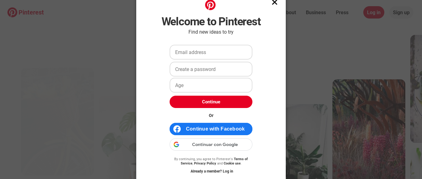
The user is then required to fill out the form in order to gain access. This is either on the landing page itself, if the user scrolls down, or displayed as a pop-up if the 'Sign up' button is clicked on.

Users are required to fill out the following information:
- Password
- Age
Alternatively, they can use an existing Facebook or Google account to register.
Users aren't required to provide a lot of information (only 3 fields). This makes it very quick and easy for them to create an account, meaning they're more likely to complete the process. What's more, the use of a Google or Facebook account could make this even simpler as well as provide Pinterest with more data about the user.
STEP 3 - Welcoming and account personalization
While most of the sites we analyzed don't welcome new users, Pinterest does and very well. A pop-up appears to welcome us, with the user's name included, but also allows us to personalize our account in order to help our home page to meet expectations and show content that's relevant to our interests.
At this stage, the site asks us a few more questions:
- Gender
- Language and country
- What we’re interested in
STEP 4 - The user can access content
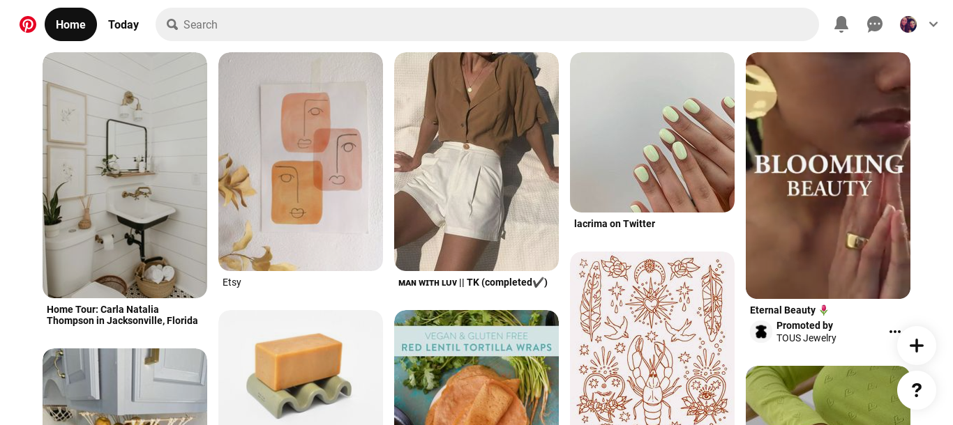
The user is redirected to a mood board (their account home page) where content is displayed to match their interests, chosen in the previous step. As a registered user, they're now able to:
- Visit the main feed
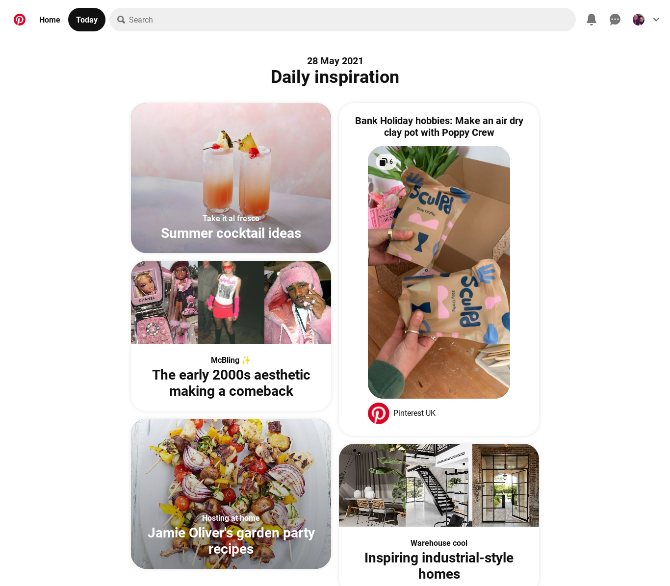
- View photos from 'Daily inspiration' feed
- Search for a specific image type using the search bar
- Publish their own content
- Follow people as well as their boards
The 'Home' board adapts itself based on what images the user searches for and saves in order to provide a personalized experience and present the most relevant content.


All its features are available for free once the account is created.
Value proposition
It’s very important to analyze the publisher’s value proposition too, as it shows what a registered user is or isn’t entitled to.
Pinterest’s value proposition isn’t actually that clear or explicit when we register. At no point is the user explicitly told what they get from registering, they're left to discover this for themselves through using the site post-registration.
Pinterest’s value proposition :
- Users can share photos
- They can access photos published by other users
- They're able to create boards and save images into each
- Similar to other social media sites, users can follow people as well as specific boards that interest them
Why does Pinterest use a register wall?
There isn’t just one answer here and we can only assume, but we imagine that integrating a regwall meets several goals simultaneously.
- Collect first-party data (see our white paper 'First-Party Data and Registration Walls')
- Improve the user experience - account creation allows users to personalize their Pinterest, have access to content they want to see, share content and save pictures to boards
- Personalization - as well as the user being able to save content themself, pinterest also adapts to their preferences and shows images that they think will interest them (based on data collected about the user's behavior)
And what about on mobile and the app?
The mobile version (on browser) is the same as on desktop but more scrolls are required to view the form in its entirety.
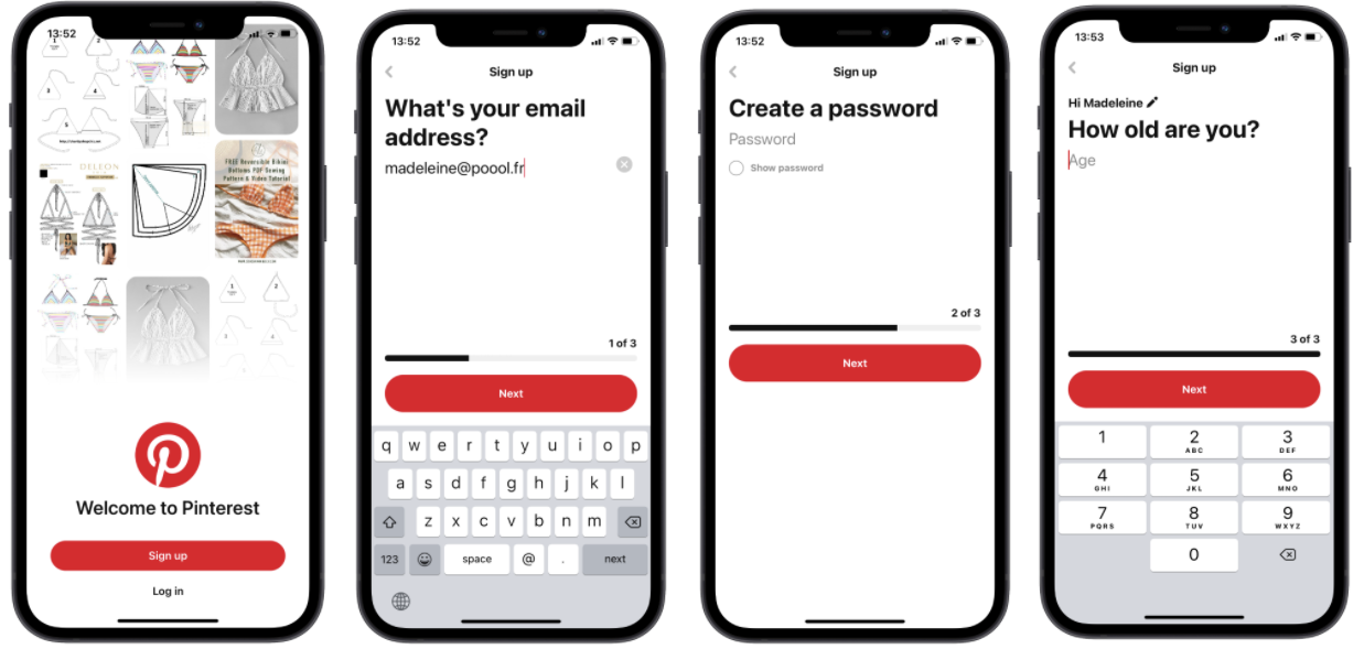
On the app, the registration process is very smooth and each stage of the process is on a separate page.
We're told how many steps are left to complete (1-3) and are, again, only required to fill out 3 sections. Interestingly, there isn't the option to sign up with an existing social account, but logging in on the app can be done with Apple, Google or Facebook.

