Paywalls have been around for a while now, providing a monetizing solution for content producers online. They block access to content and ask readers to pay for a subscription. However, there’s an alternative wall for publishers that requires a different ‘value exchange’ from users - Registration walls.
A registration wall, also known as a regwall or regiwall, blocks content and asks users to register as a user on the publisher’s website for free.
Perhaps the most valuable part of a registration strategy lies in the de-anonymization of users, allowing for the collection of first-party data to learn about your audience. However, the advantages of a registration wall don’t stop there...
The advantages of a registration wall:
- Gather first-party data - understanding user behavior is, after all, one of the keys to a successful business model. This will give you valuable and actionable insights, as well as help you overcome the challenge of a cookieless future.
- Targeted advertising for increased ad-revenues
- Personalized user experience to provide a better user experience and build lasting relationships with your audience
- Drive revenue in other forms, such as growing newsletter subscriptions or social followings
- Increase your subscription conversion rate - if the end-goal is to gain paying subscribers, registration walls are a hugely beneficial soft conversion step to increase engagement before presenting a paywall
- Solve leaky paywall issues by tracking a user across devices
- Grow a registered user base in order to more easily sell a product or service in the future (this is particularly the case with brand publishers using a registration wall, such as Welcome To The Jungle who might want to sell B2B products if that’s relevant to the user’s profile)
Note that registration walls can be used by any content producer online, including news broadcasters, TV-replay platforms, brands and social media sites. To highlight this fact, examples in this article include Instagram (social), Busuu (e-learning) and All4 (TV-replay).

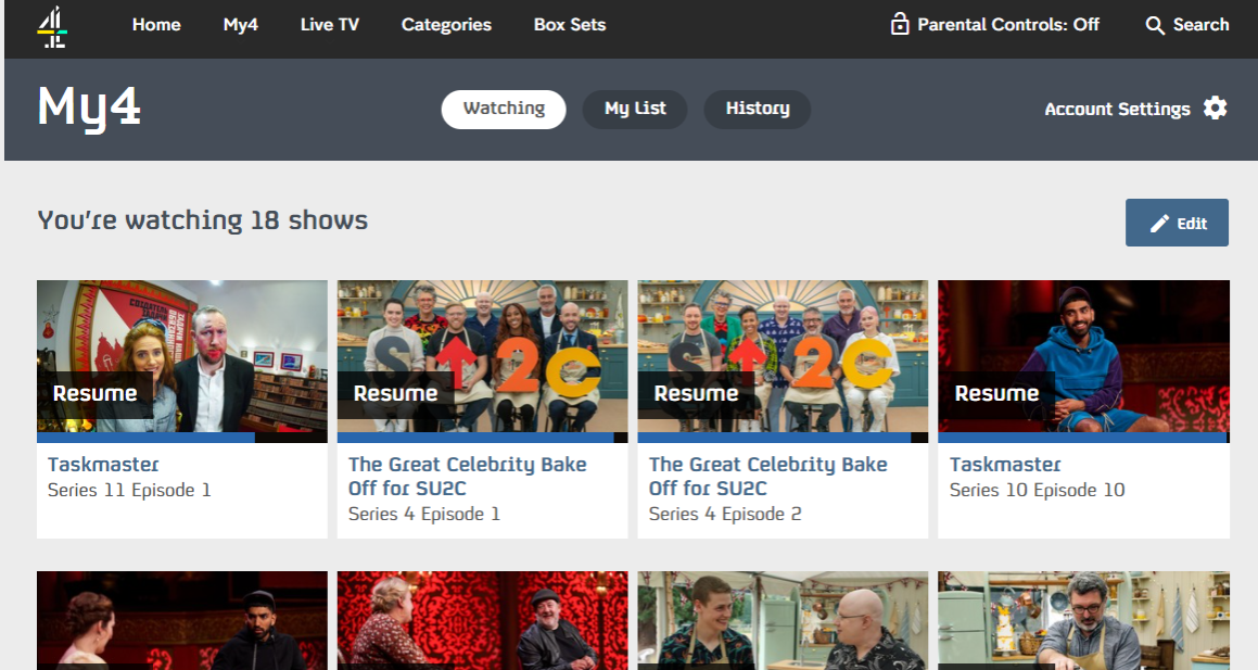
Channel 4/All4 Registration Wall
Channel4.com (All4) is a British TV-replay website that requires a user to register for free before being able to watch any show or film.
User experience: Cleverly, they leave visitors to browse content and discover All4’s value proposition, only showing the registration wall once they click ‘play’. At this stage a user is presented with a block on the content, stating ‘sign-in’ or ‘register to watch’.
Benefits for users: Registration is free and provides a significantly better user experience. For example, a signed-in viewer can resume videos where they left off, save content for another time as well as configure account settings to completely personalize their experience.
Benefits for the publisher: For Channel 4, registration means the collection of 1st party behavior. They can track users across devices to see their viewing habits, use targeted advertising and, ultimately, monetize their audience and continue to improve services for the future, based on these valuable insights.

Instagram Registration Wall
There are many misconceptions surrounding walls for content producers, one of them being that they’re solely for online journalists and news broadcasters. However, the majority of social media sites, including Instagram and Pinterest, utilize registration walls to collect first party data and encourage users to return to their site.
User experience: If you wish to view an account or group of photos on Instagram, after a few scrolls down the page, you’ll be required to register as a user for free. Something to note from this form, and a good practice, is the option of registering with another existing social account, such as Facebook or Google. This makes the process significantly quicker and easier for users, further encouraging them to register.
Benefits for users: Easy registration process, benefits of having an account with Instagram such as posting photos, following friends, saving photos, etc.
Benefits for the publisher: A lot of data can be drawn from a social media account, not only helping the publisher to understand user behavior but also to target advertisements which increases their revenue.

The Guardian Registration Wall
The Guardian has always been a strong advocate of free journalism for all and a registration wall helps them to continue in this way.
User experience: The wall pops up mid-article, explaining to a reader (very honestly) that registering means the publisher can increase their advertising revenues, which ultimately contributes to their survival. A reader is therefore persuaded by the fact that they can support The Guardian without paying a penny.
Benefits for users: It’s not actually obligatory for a user to register, unlike the other examples, but the sincere tone and emphasis on ‘free’ makes for a convincing argument. You can register using an existing social account, including Google, Facebook or Apple. Readers are also able to decide which newsletters and information they’d like to receive by email, configuring this in the ‘my account’ section.
Benefits for the publisher: Particularly as a provider of free journalism, asking users to register means that The Guardian gets a different type of value from readers, namely 1st party data, targeted ad possibilities, their email address (for marketing) and also brings the user one step closer to subscribing or donating. The data also means that The Guardian can gain a better understanding of what makes a reader subscribe and optimize their funnel, leading to an increased conversion rate.

Journal Du Net Registration Wall
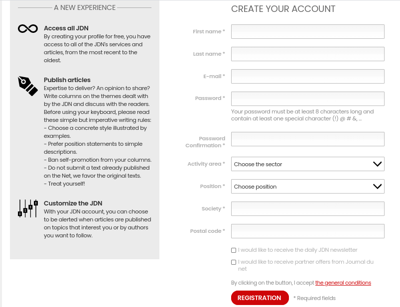
JDN is a French publisher who employs a regwall to ask a reader to register before continuing.
User experience: The wall doesn’t appear on all articles but will automatically be shown if a user accesses a few articles in a row. It blocks content from below the title and requires a reader to create a free account.
Benefits for users: It’s free to register (this is repeated 3 times and written in red) and all the advantages of creating an account are listed beside the registration form. Differently to previous examples, JDN asks for a fair bit of information from a user, including their area of work and zip code. Although this obviously provides the publisher with more data and insights, there’s definitely a point at which you can ask too much and discourage a reader from registering.
We’ve written an interesting white paper on optimizing your conversion funnel to turn users into subscribers. Even though the focus here is on paywalls, section 3 discusses forms, including best practices and which indicators to track to ensure optimization. We’d recommend taking a look!
Benefits for the publisher: The additional information in the form naturally provides additional information for the publisher about their readers. User behavior on the JDN site can be tracked, providing them with valuable and actionable insights.

'Read this article for free. By creating your free account, you'll be able to access all articles on JDN limitlessly as well as share your expertise by publishing stories yourself.'
Find out more about the user journey on the JDN website to create an account here.
Busuu Registration Wall
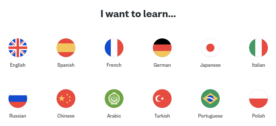
Busuu is a language learning website and app. Like many other e-learning platforms, they ask you to sign up as a user before seeing any content, such as lessons or learning games.
User experience: Before even asking for an email address or name, we need to select which language we’d like to learn so that the right content can be provided. Many sites like this one also have initial language tests to tailor content to the user’s level as well as allow them to resume lessons where they left off across devices. On their main sign-up stage (entering email and password), Busuu offers a simpler and quicker registration process by allowing users to use an existing social account. They’ve also already personalized the experience based on which language you choose to learn (here we chose spanish). Small touches like this can go a long way in building a relationship and loyalty with your audience.
Benefits for users: Personalized experience based on which language you want to learn and your current level. You can also work through lessons on the app or desktop, with progress being saved on your account.
Benefits for the publisher: Here, the goal is not simply to gather 1st party data but also to provide a completely personalized user experience. This personalization creates loyalty from users as well as helping Busuu to continue to optimize their site based on analyzing their user’s behavior.


The New York Times Registration Wall
The NYT is an interesting example to analyze as the publisher employs a slightly different registration wall strategy compared to what we’ve seen so far.
User experience: Unlike the other regwalls, this wall is part of a larger chain of walls leading the reader to subscription (i.e. a paywall). After accessing a few articles without any blockage, this registration wall appears, asking the user to either create a free account or subscribe. However, note that the registration option only gives access to ‘some’ articles, suggesting that the reader will once again be cut off even after creating an account.
Benefits for users: Account creation can be done using an existing social account or email address. Readers can also sign up to the daily newsletter as well as other, more specialized free newsletters. However, once registered, we’re still pushed to subscribe and don’t get unlimited access.
Benefits for the publisher: Although it can be frustrating for a reader to register but not get unlimited access, this is a useful strategy to use for the publisher as it allows The NYT to collect first party data (through account creation) even before the user subscribes. What’s more, a registered user is one step closer to subscribing, so the regwall ultimately helps work towards their end goal of increasing the NYT subscriber base. They’ve also already collected your email address, a more direct way of presenting you with subscription offers that can be personalized to your profile.
To find out more about paywalls, we have a dedicated article on our blog: ‘What is a Paywall? Definition, Examples and Best Practices’.

A final 7th ...Poool Registration Wall
That’s right, Poool’s dynamic paywall solution can be used as a registration wall strategy to integrate into your site!
User experience: With our Dashboard, you’ll be able to configure every step of the user journey, choosing from ready-made widgets that you can present to your readers. These widgets include requiring that a user creates an account, signs up to your newsletter, watches an advert to access content or one of the various other options. What’s more, our solution allows you to segment your audience into different cohorts based on the user’s context (such as device or level of engagement) and design a different user journey for each, ensuring that you present the optimal widget actions to each type of user.
Benefits for users: A user journey that is completely personalized to their profile. Our walls are also very simple for a user to pass through, so it makes their life very easy.
Benefits for the publisher: An easy, quick and smooth integration into your site. Complete personalization of text, colors and branding on the wall. Design every step of the user journey. All the benefits of utilizing a reg wall (first party data collection, targeted ads, etc) as well as the option of adding a paywall to the journey, encouraging users to pay to subscribe.
Here’s an example from La Croix International who have created a chain of walls which leads a reader to subscription. This stage of the journey blocks content and requires that a user signs up to the newsletter for free in order to continue reading.
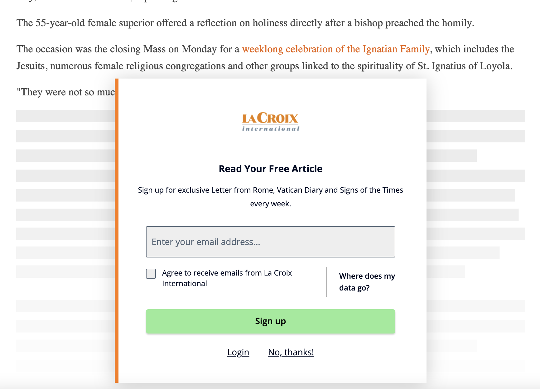
To read more about how La Croix International used Poool’s paywall to increase conversion rates, engagement and traffic simultaneously, take a look at our blog post.
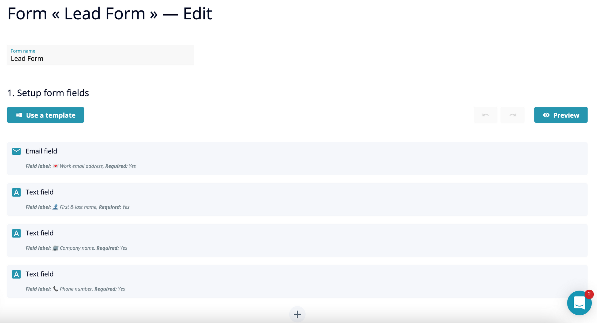
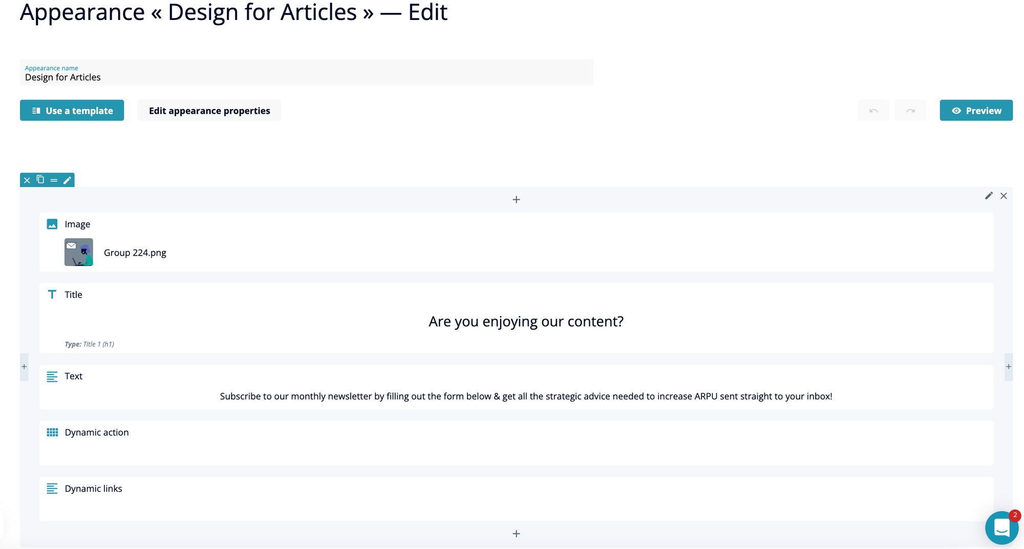
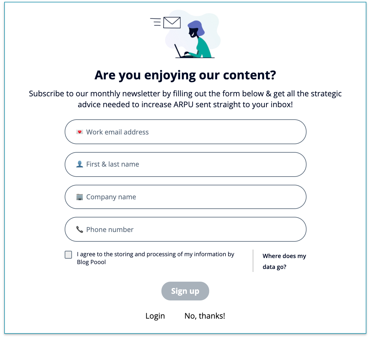
We also use a registration wall ourselves on the Poool blog! Thanks to our no code design and form builders, our marketing team have had complete autonomy to create a lead generating registration wall for articles.
Using the form field options, we can ask for any information desired from our readers.
The no code design builder also allows us to configure the wall wording, colors and format through making use of ready-made but fully customizable blocks that you simply have to add into your design.
Other clients who are successfully using a regwall include Boursier and Welcome To The Jungle.

The wording here is really fitting with the WTTJ brand and gives a reader encouragement to register by highlighting that they’ll ‘be back to reading in no time’.
You may also be interested in our other content on registration strategies:

