Given the value of 1st party data, it’s becoming increasingly popular for publishers to ask users to register on their website. A registration wall does just this, blocking access to content and requiring registration before continuing.
Once a reader has created an account, their behavior can be analyzed across devices, providing important and actionable insights to the content producer. What’s more, registration brings a user one step closer to subscribing, so it can also play a huge role in a paywall subscription strategy. For readers, having an account on a site means more personalization, ultimately improving their user experience as a whole, and so encouraging them to subscribe.
This is why we’re back with a new article series! Our first one covered the user journey to subscription (including The Washington Post, Netflix and Audible) whilst this one will analyze the journey of an anonymous reader into a registered user. We aim to see what motivates readers to become members and how the different publishers employ a regwall.
By now we hope you’re aware that the most important aspect to turn readers into members, and even subscribers, is your value proposition and content. This is what our series is all about, understanding the number of clicks, scrolls, amount of information and time taken for a reader to create an account, but also to understand the value proposition and why the publisher wants users to do this action.
Remember, any online content-producer can employ a registration wall, including editorial publishers, broadcasters, e-learning platforms and more. To highlight this fact, our ‘From content to registration to content’ series includes a wide range of different publishers.
We’ll cover:
- The New York Times
- Glassdoor
- Journal du Net
- Harvard Business Review
- MY TF1
- WTTJ
- Spotify
- Ornikar
- Open Classrooms
To find out more about registration walls, see our blog post on 'What is a Registration Wall?'. You might also like our other article series on the subscription conversion funnel, with a white paper to summarize our findings, available here.
Interested in implementing a registration strategy with the same success as these digital content producers? Poool have a simple, flexible platform to allow you to do exactly this, and without the need for tech support at every turn!
Book a demoSo, let's start.
Today: The New York Times
The New York Times is an American daily newspaper based in New York City with a worldwide readership. Founded in 1851, the Times has since won 130 Pulitzer Prizes, and has long been regarded within the industry as a national "newspaper of record". It is ranked 18th in the world by circulation and 3rd in the U.S.
We’ll analyze:
- The user journey to register
- The NYT value proposition
- Why The New York Times uses a registration wall
The user journey to register:
- 6 clicks are needed to register and view content on desktop and the same on mobile
- no scrolling is needed to see the registration form in its entirety on desktop, mobile nor on the app
- 2 fields need to be filled out to create an account
So, step by step.
STEP 1 - The users arrives on the website
The users arrives on the New York Times website and wants to read an article. However, when they click on an article they are blocked by a registration wall which forces them to create a free account or subscribe.
The New York Times' value proposition is really implicit from this first step. Readers know from the start what they will get if they register or subscribe. This isn't the case for all the content producers that we've analyzed so far.
STEP 2 - The users must create an account.
Like we said before, the user is blocked by a registration wall which forces them to create an account to access content. They can log in to an existing NYT account, register via email or use their Facebook or Google account.
Why do they offer this many ways to register? Simple - when the readers register via a facebook or apple account, the NYT can gather data from these social accounts in order to better inform their strategy. What's more, the reader doesn't need to input as much information as normal so the registration process is facilitated.
We choose to register with our email address and are surprised to find we only need to create a password in order to complete the form process.
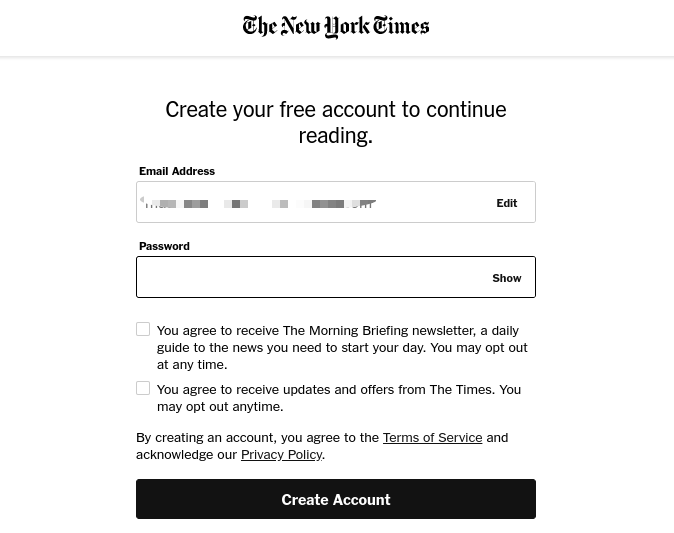
Registration is very quick and easy. The form is very short, no scrolling is necessary to see it all.
Before the next step, we're presented with a promotional page about their subscription offer. Even as a registered user, we're still limited to how many articles we can access whilst subscription provides 'unlimited articles' and 'priority access'. The registration wall is therefore a first step in the NYT subscription strategy as a way of bringing users closer to subscribing, learning about their behavior and collecting other data points about their audience.
Read about the journey to subscription on The New York Times website in this article.

STEP 3 - Onboarding
The user is now given a 3-step onboarding process where they're asked if they want to receive a morning briefing via email, sign up to any other newsletters or be sent a link to the NYT app. This step is useful for increasing the engagement of registered users and highlighting the value of the NYT in order to eventually convert them into subscribers.
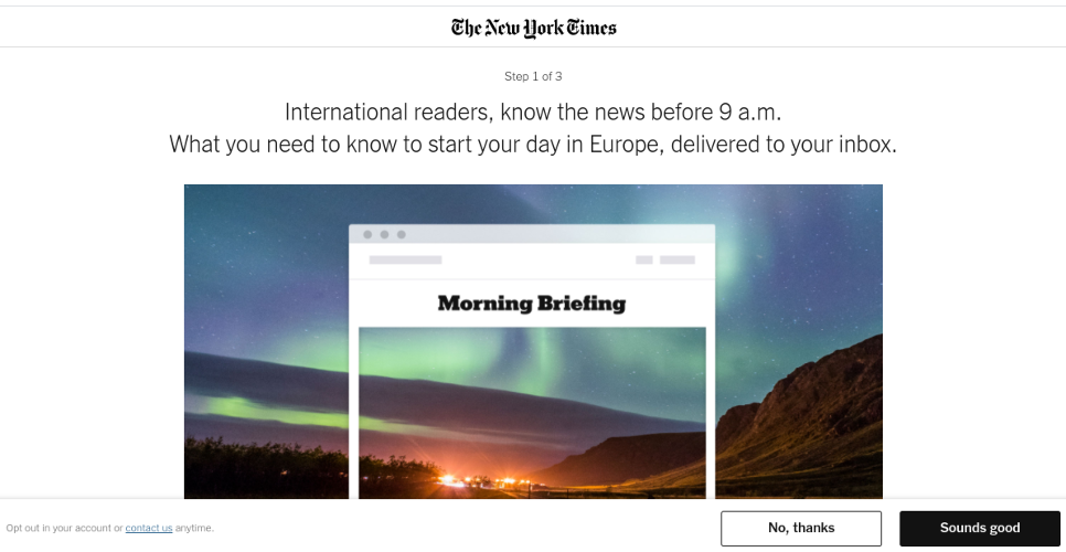
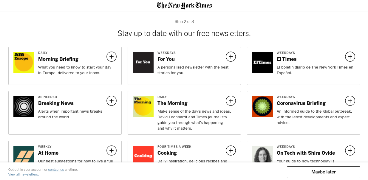
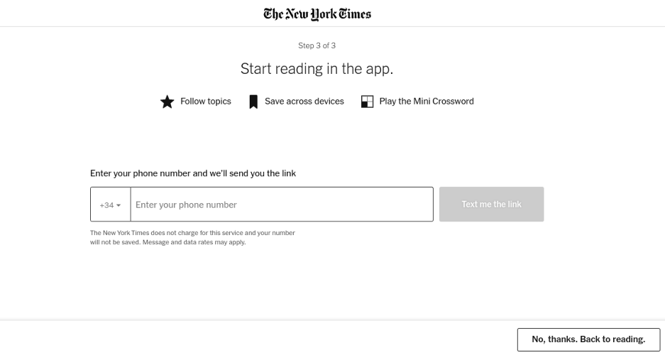
Importantly, this final step allows us to go back to where we were blocked by the registration wall.

STEP 4 - Users can access the content
The reader has registered and they can now access the article they wanted to read.
It's extremely simple to create an account on the NYT website. This is a real positive because it reduces the risk of readers abandoning the process. It's also beneficial for the readers who can access the content they want to read very quickly.
Value proposition
It’s very important to analyze the publisher’s value proposition too, as it shows what a registered user is or isn’t entitled to.
The value proposition of The New York Times is very clear. When the user creates an account, they're made aware of what they can have access to. They know that they can access some of the content for free or have unlimited access for $0.50/week.
The New York Times' value proposition:
- Users can access all content for $0,50/week
- Users can use the platform without ever being forced to pay or leave
- Users can access a certain amount of content for free
- Users can start or cancel subscription whenever they want
- Registration can be completed in very few steps
Why does The New York Times use a register wall?
There isn’t just one answer here and we can only assume, but we imagine that integrating a regwall meets several goals simultaneously.
- Collect first-party data (see our 'First-Party Data and Registration Walls' white paper)
- Track interactions with the site and learn about a user's wants, needs and interests
- Improve the user experience - creating an account means they have a personalized account space and home page with content that matches their interests
- Targeted advertising - by requiring account creation
- Brings users one step closer to subscribing
- Increases engagement through promoting their morning briefing email and newsletters
What about on mobile?
It’s exactly the same journey on mobile, same steps, same time same information required.
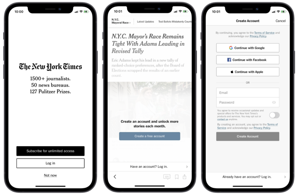
On the app, it's been optimized for mobile usage and promotes registration or subscription at a much earlier stage. When we first open the app, we're asked to subscribe or login but also given the option to select 'Not now'. We can read one article freely and are then are required to create a free account.
Again, we're offered the option of registering with Google or Facebook as well as Apple on Iphones. The email option is slightly different and a step is removed by having the whole form on this page.
