With print and ad revenue continuing to fall in value, digital publishers have been looking for new ways to monetize their content.
For this reason, paywall and subscription strategies have been growing in popularity over recent years, allowing content producers to establish a predictable and recurring revenue stream with their users.
In this article we look at some of the best examples of publishers employing a paywall in 2022, analyzing the type of paywall strategy used and how they've made this strategy a success.
Prefer to read in the language of Molière? 🇫🇷 C'est par ici !
In this article:
- What is a paywall?
- What are the different types of paywalls?
- News publishers and magazines paywall
- VOD websites paywall
- E-learning platforms paywall
Interested in implementing a paywall strategy with the same success as these digital content producers we'll benchmark? Poool have a simple, flexible platform to allow you to do exactly this, and without the need for tech support at every turn!
Book a demo🙋♂️ What is a Paywall?
A paywall is employed on digital publisher's website to block content and ask users to pay to subscribe in order to gain access.
🙋♂️ What are the different types of paywalls?
There are 4 central paywall types but plenty of hybrid examples are starting to emerge.
- Hard paywall
The toughest paywall strategy where users are blocked completely from all content unless they pay to subscribe. Think the Financial Times.
- Metered paywall
These paywalls allow readers to access a limited number of articles before being blocked - for instance 2 articles for free and then the paywall blocks the third article.
- Freemium paywall
A freemium strategy means content is divided into free and premium, with free being open access to all users whilst premium content is blocked by a paywall and reserved for subscribers.
This is arguably the most effective paywall as it adapts to the user based on their context or profile, such as their engagement level, location or device used. This often involves the use of other walls to increase engagement prior to the paywall, such as a registration wall (requiring account creation) or a newsletter wall (asks for newsletter subscription to pass through).
You may also be interested in:

Best Paywalls from News Publishers and Magazines
The New York Times
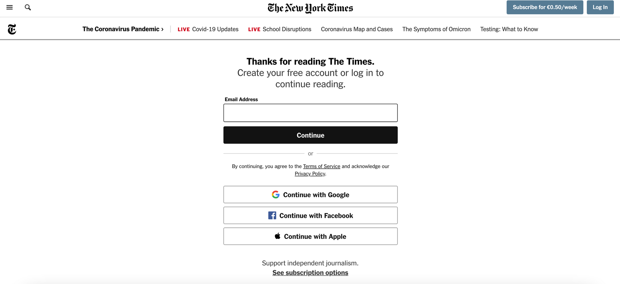
Dynamic paywall: users are first blocked by a registration wall (requiring them to create a free account to get past), allowing them access to one article, before a paywall appears on the second article.
The American publisher, The New York Times, is well known for being one of the first to employ a paywall strategy (way back in 2010), severely limiting access to content without paying for a subscription.
The registration wall blocks a user on the first article accessed, asking them to create a free account. This allows the NYT to collect a user's email address and encourage them to sign up to the publisher's newsletter with the goal of increasing engagement.
This is then followed by a paywall blocking the second article. The user can't even scroll down the page as the paywall blocks the entire content.
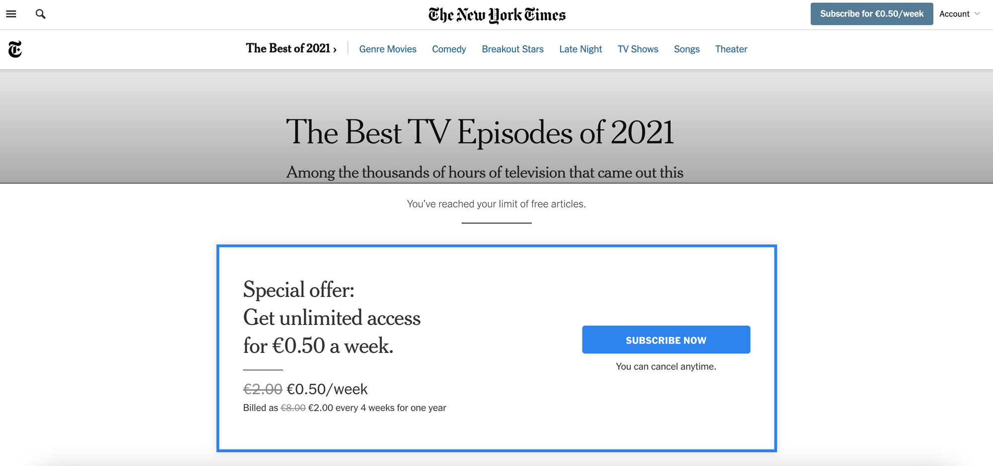
Analysis of the New York Times paywall:
✅ Registration wall increases engagement and allows for collection of email addresses (reader ID)
✅ Both walls are 'sticky' meaning they don't allow for scrolling. This results in a high paywall visibility rate
✅ The registration form is integrated into the wall itself (reducing a step in the funnel) and requires very little information from the user (making it easy to complete)
❌ Users are limited to just one free article (by registering) which allows for a very limited content discovery
A user bypassed your paywall?!? 😱😱😱
Discover how to avoid this happening, why it's maybe not such a terrible thing and what else you need to take into consideration in our article:

Financial Times
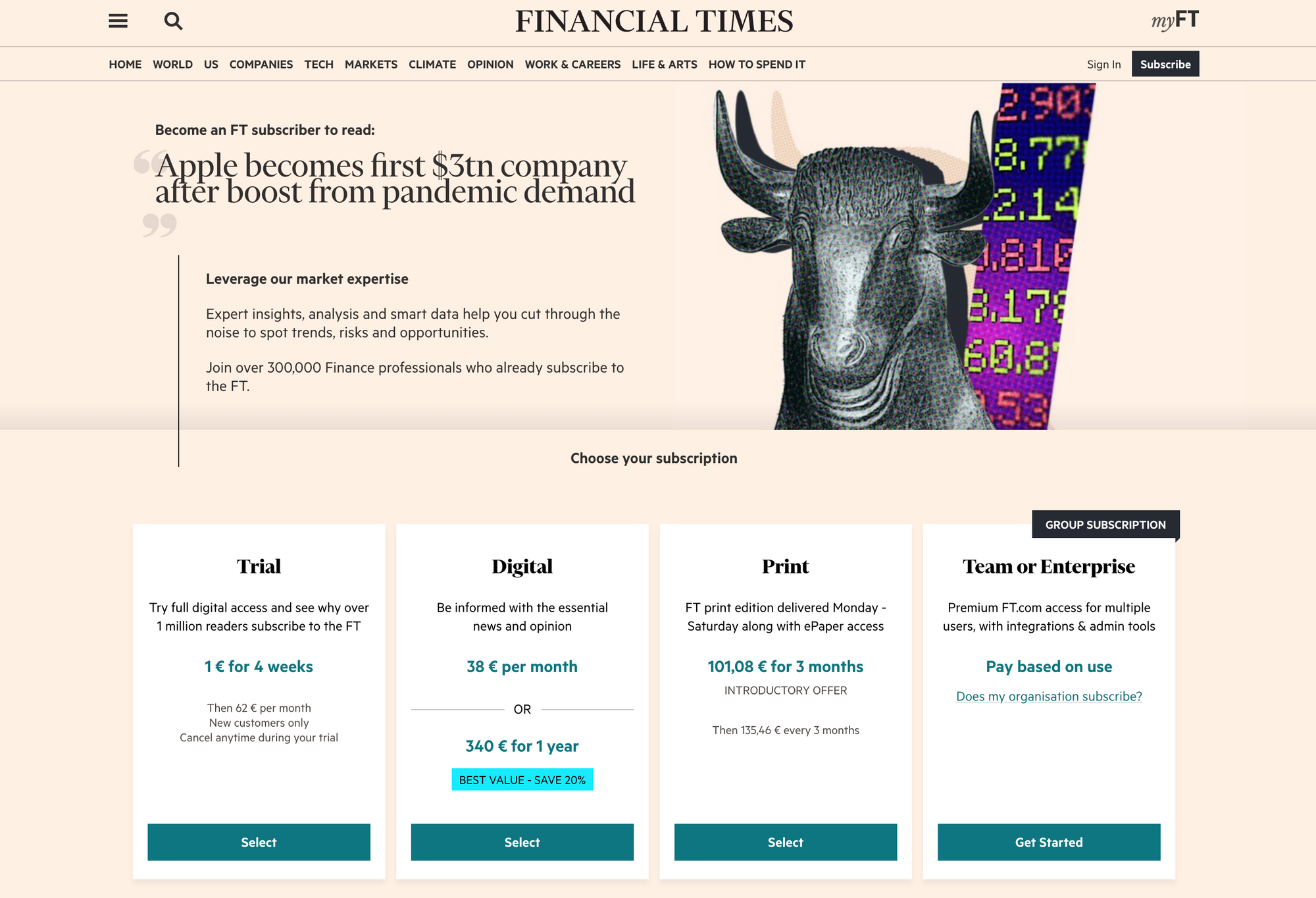
Hard paywall: no content can be accessed on the FT site without purchasing a subscription
Covering financial news in the UK and internationally, FT are renowned for their extremely hard, but hugely successful, paywall strategy. With over 1.1 million digital subscribers they've cracked reader revenue, partly thanks to their niche topic focus and monopoly of their market but equally due to their hard paywall.
Once a user clicks on an article that they want to read, they're faced with the full-page wall blocking the entirety of the article.
Analysis of the Financial Times paywall:
✅ High visibility rate thanks to the hard paywall strategy, which works well for a niche topic focus
✅ Subscription offers are included on the wall itself to reduce a step in the conversion funnel
✅ Clear value proposition
❌ Doesn't allow for content discovery (proof of concept)
Harvard Business Review
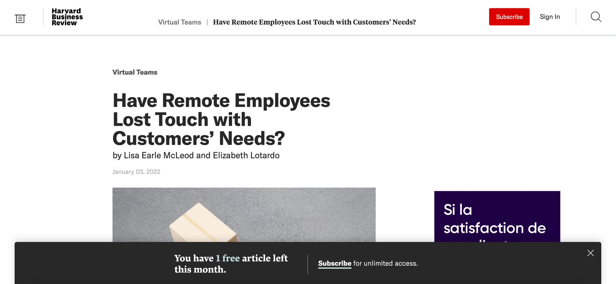
Metered registration wall & paywall: readers are able to access 2 or 3 articles for freely before being blocked by a registration wall. They then have access to another 2 articles before being stopped by the paywall.
The Harvard Business Review approach consists of two steps: registration followed by subscription, allowing users to discover the publisher's content for free.
First, the metered registration wall. To keep users informed of the HBR strategy and to reduce frustration when faced with the wall, a banner at the bottom of the screen tells them how many articles they have left.
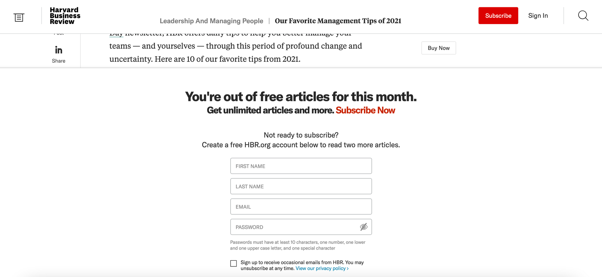
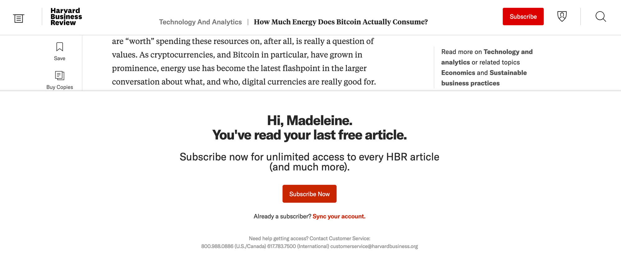
Followed by the metered paywall.
Analysis of the Harvard Business Review Paywall:
✅ Registration alongside a metered approach (allowing for content discovery) increases engagement, whilst the metered paywall banner also reduces wall frustration, working nicely together to increase propensity to subscribe
✅ Account creation allows HBR to collect first party data and custom reader IDs
✅ The paywall is personalized with the already registered user's name and clearly outlines the value proposition (subscribe for unlimited access)
❌ The metered wall resets every month, so users can return every month to access more articles. This wall is also fairly easily bypassed by using incognito mode
ELLE
Freemium paywall: content is divided into free and premium, with the latter being marked with a yellow tag and blocked by a paywall
The French digital magazine allows non-subscribed users access to a large percentage of their content but reserves certain articles for paying premium users. In order to reduce wall frustration, ELLE mark their premium content with a yellow badge, informing users that they'll be blocked by a paywall.

Upon clicking on a premium article, a paywall blocks the content after a few paragraphs, allowing the user to engage in the text before being denied access.
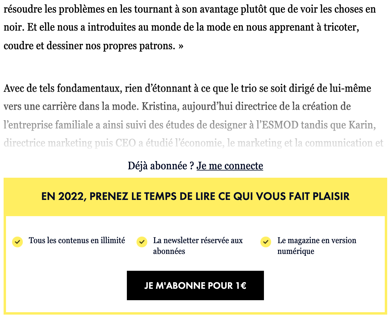
The publisher also regularly changes their wall (based on seasons, sales and national holidays) to reduce habituation.
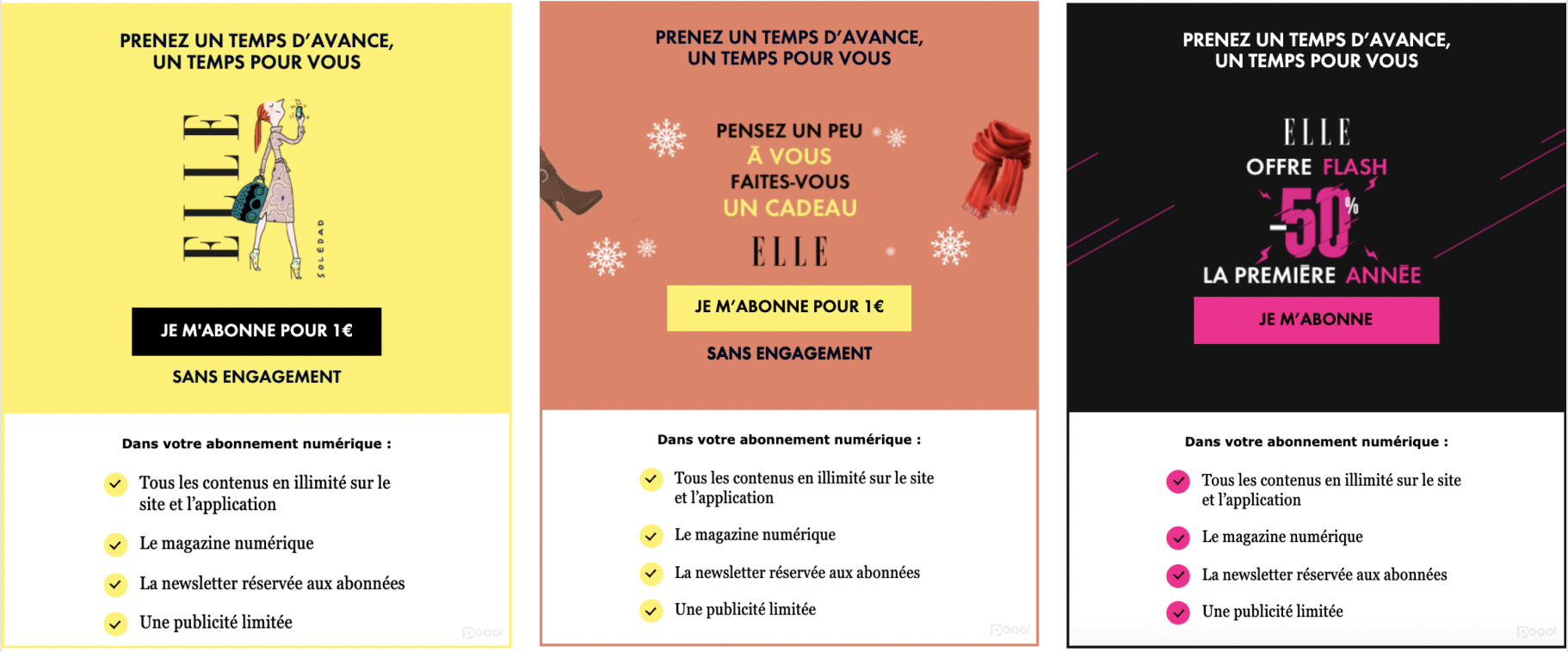
Analysis of ELLE's paywall:
✅ The freemium approach allows for proof of concept whilst highlighting the value in ELLE's content
✅ The publisher's value proposition and benefits of subscription are clearly marked out on the paywall, with a bold CTA button
✅ A constantly improved and updated wall to increase conversion rates
❌ Users can access content without paying (which can be a good thing) and paywall visibility will likely be lower than than of FT or the NYT
ELLE's paywall strategy is employed thanks to Poool's Audience Conversion Platform solution! Their marketing team have had complete autonomy to configure, build, launch and drive their paywall with ease via the Poool Dashboard, including designing the wall itself with our new no code design builder.
Check out their success story here!
We also offer a free demo and ROI calculation so you can discover the value of a paywall for your company! Just book a meeting with our team here.
The Economist
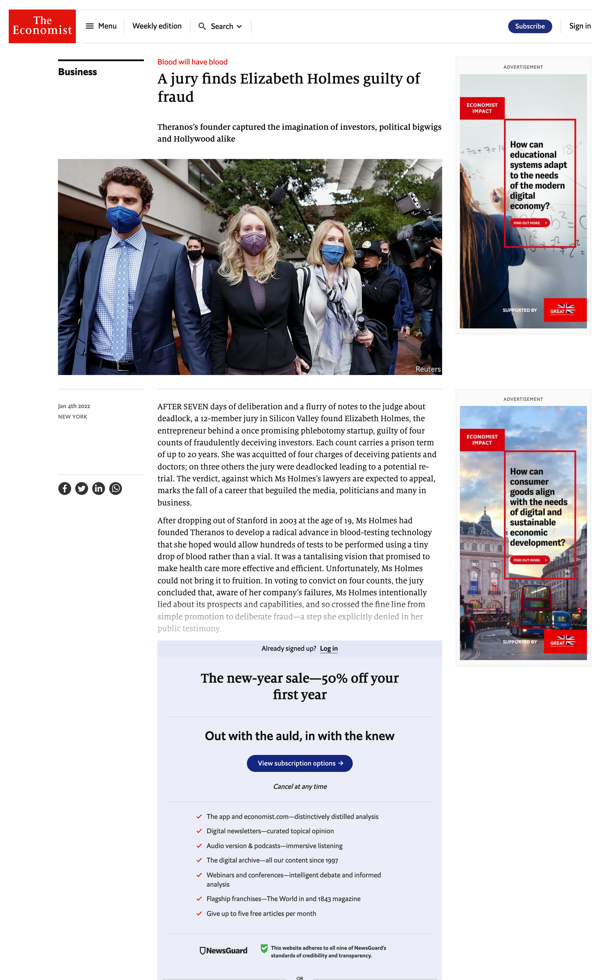
Hard paywall: users can freely browse content but are blocked midway through their first article.
Although users are able to discover the entirety of The Economist's content on their site, they're blocked after a few paragraphs on their first article accessed. This has clearly been a success for the British publisher as they currently stand in the top 10 paid news subscription websites.
Users can actually access a decent part of the article freely but the block is hard and stops readers in their tracks.
Analysis of The Economist's paywall
✅ Clear benefits of subscription and trust is built through highlighting that users can cancel subscription at any time as well as with the inclusion of the NewsGuard mark
✅ Bold paywall that fits with the publisher's house style
✅ The hard paywall approach increases conversion rates but The Economist equally allows for content discovery and proof of concept through leaving the initial 2 paragraphs unblocked
❌ Lower paywall visibility rate due to the reader needing to scroll down the page to see the wall
The Sydney Morning Herald
Metered registration and paywall: 5 articles are offered to anonymous users before they're required to create an account. Access is then given to an additional 2 articles per month before a hard paywall block.
The Sydney Morning Herald offers a generous number of articles for free (5), allowing for content discovery and reducing the frustration experienced by volatile readers who simply want to access a few 'central news headline' articles.
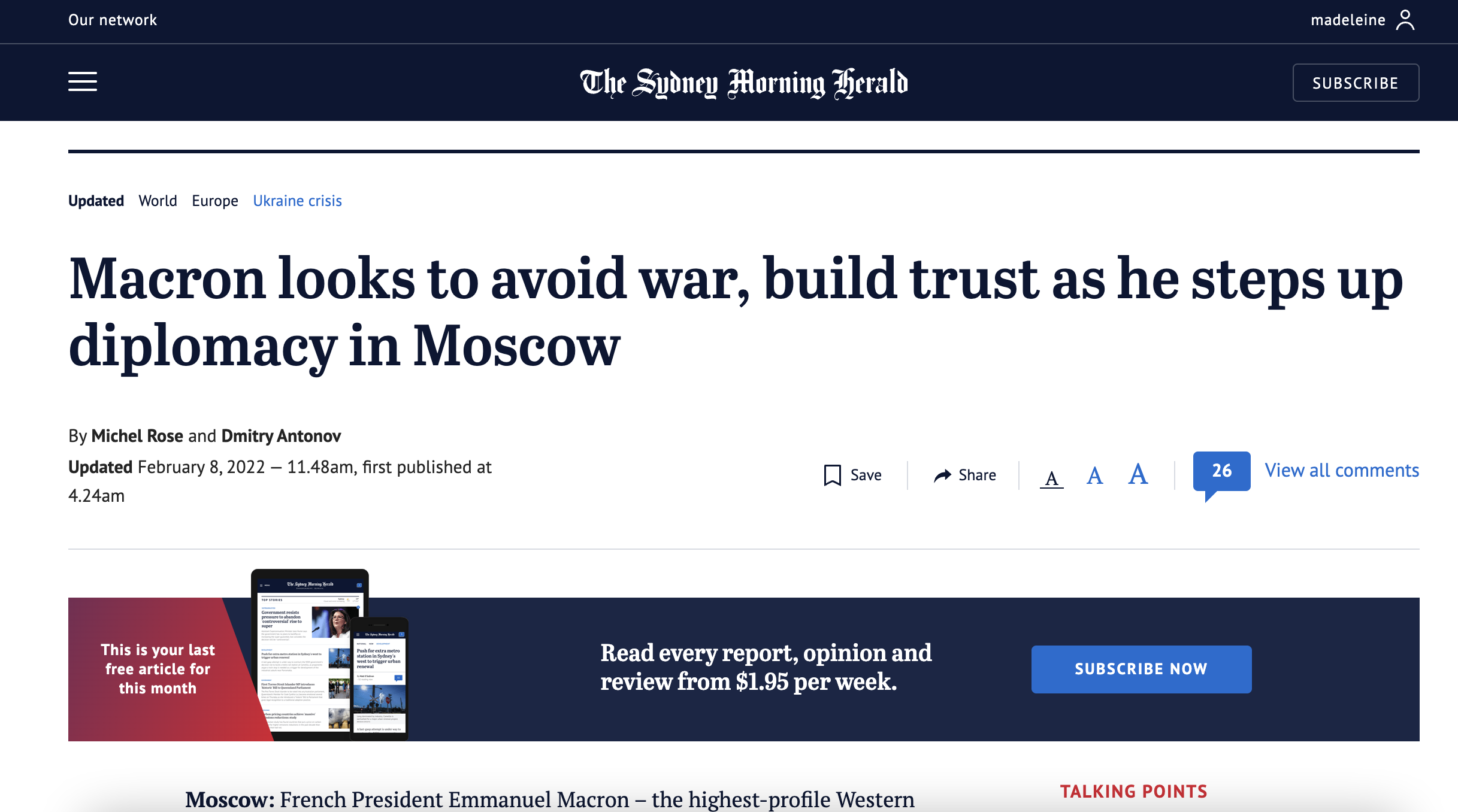
However, for the more regular visitors, a registration blocks them after reaching the quota number of articles. To reduce frustration, a banner informs us of how many articles we have left, firstly at the bottom of the screen...
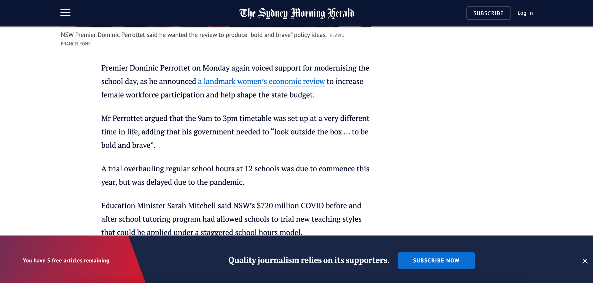
...And then at the top of the article, covering all visibility possibilities. It also provides a chance to promote their subscription offer again prior to the wall.
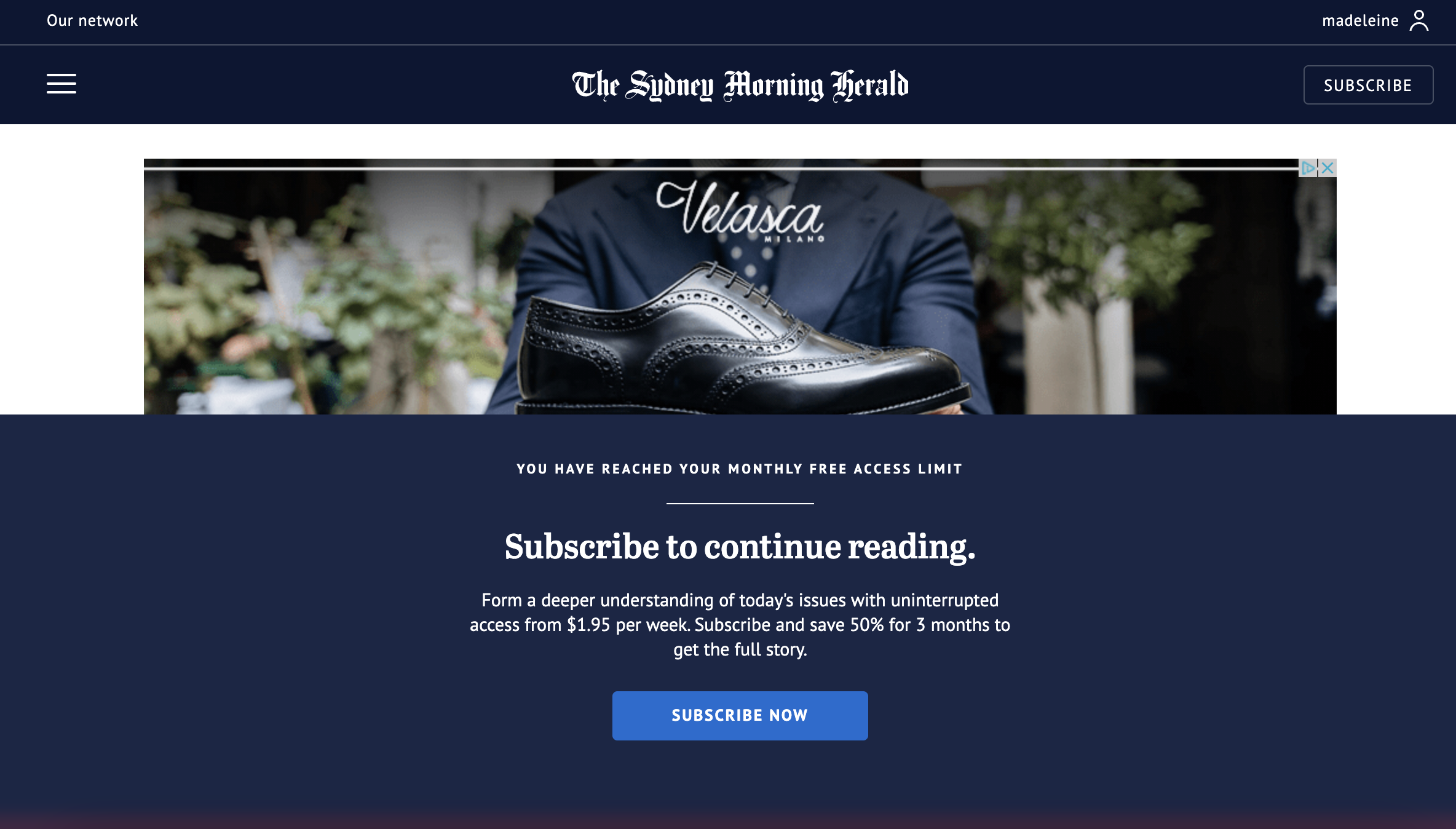
Later, after registering, an anti-scroll paywall blocks us and asks for subscription. This type of hard paywall has 100% visibility given that we can't read any part of the article, which often wouldn't be recommended but users at this stage will be logged in members who are highly engaged and have been made aware of The Sydney Morning Herald's metered strategy.
Analysis of The Sydney Morning Herald's paywall
✅ Well developed reader engagement strategy that gradually leads users through a journey towards subscription
✅ No frustration for volatile users who simply want to read one or two articles - this is recommended for news-based publishers who want to maintain their traffic
✅ Banners to keep users informed of their metered strategy and reduce frustration
✅ High visibility rate of the paywall when it does appear to users
EBRA/DNA
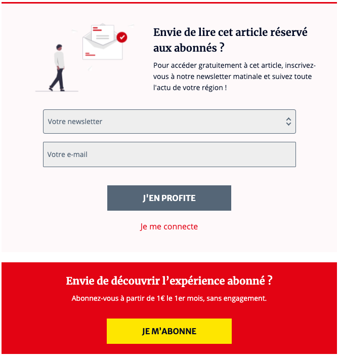
Hybrid newsletter and paywall: This wall encourages users to sign up to the publisher's newsletter whilst simultaneously promoting their subscription offer and providing a CTA button to subscribe.
EBRA group has taken paywalling a step further by cleverly offering users the chance to unlock a premium article by signing up to their newsletter (which will help increase reader engagement through forming a content consumption habit).
For users who are already engaged, the wall promotes the DNA premium offer, with a clear selling point (a reduced cost for the first month) and provides a CTA button to easily convert into a subscriber.
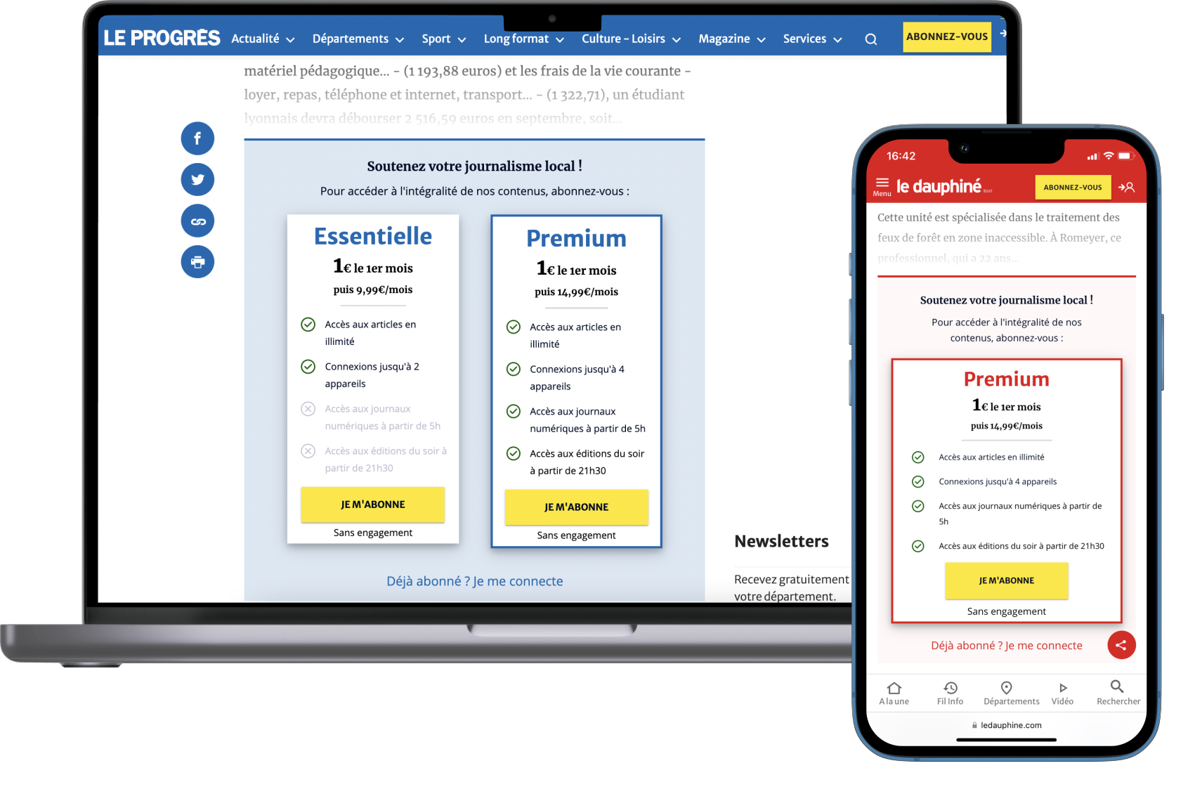
Since then, the team have optimized their paywall across all brands, integrating the subscription offers into the paywall to reduce a step in the conversion funnel. What's more, they've segmented audiences based on device-used, designing a mobile-friendly paywall for mobile users to make for a better user experience.
Analysis of the EBRA group paywall
✅ Achieves multiple goals simultaneously (engagement, content discovery and conversion
✅ Brand colors and bold CTA
✅ Subscription offers integrated into the paywall to reduce a step in the conversion funnel
❌ A bit of work needs to be done on communicating their value proposition - aside form access to this premium article, what do we get in exchange for signing up to the newsletter?
You may also like:

Best Paywalls from VOD Websites
Netflix
Hard paywall: users can't even browse Netflix's content without being blocked by their paywall - in fact the wall is on the landing page itself.
It's often forgotten than paywalls can be employed successfully by producers of other types of content aside from written news articles. VOD (video on demand) sites, such as Netflix, HBO and Disney+, commonly employ hard paywalls to entirely block users from their content unless they pay for a subscription package.
This strategy has worked extremely well for Netflix who now have over 214 million subscribers.
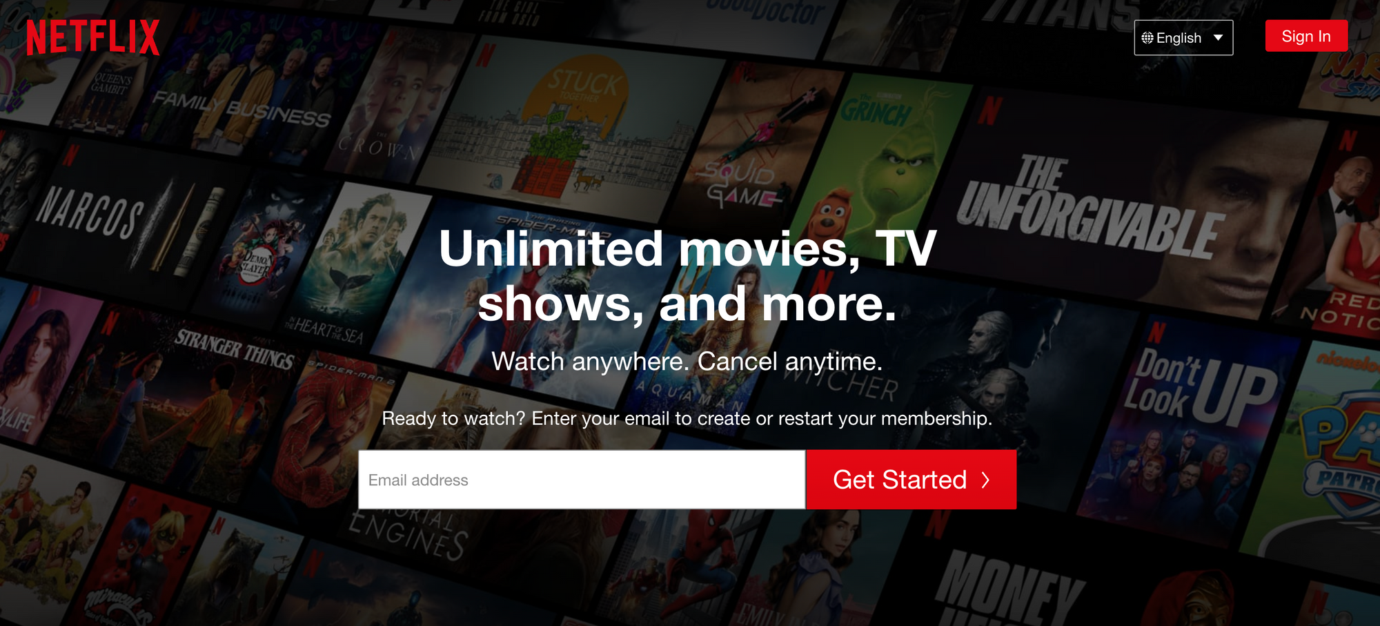
Analysis of Netflix's paywall:
✅ Extremely clear value proposition and reassurance (cancel anytime) as well as images in the background that are updated with the latest releases
✅ Email address collection as the first step to gather this key data point as a priority
❌ No way of discovering content prior to subscribing, however Netflix now dominates the market and you can easily find out what content they offer via other sites
Disney Plus
Hard Paywall: Just like Netflix, the paywall blocks directly on the landing page.
Although employing the same paywall type, Disney differs to Netflix by integrating the subscription offers into their wall instead of email collection. Again, this reduces a step in the conversion funnel and facilitates the subscription process.
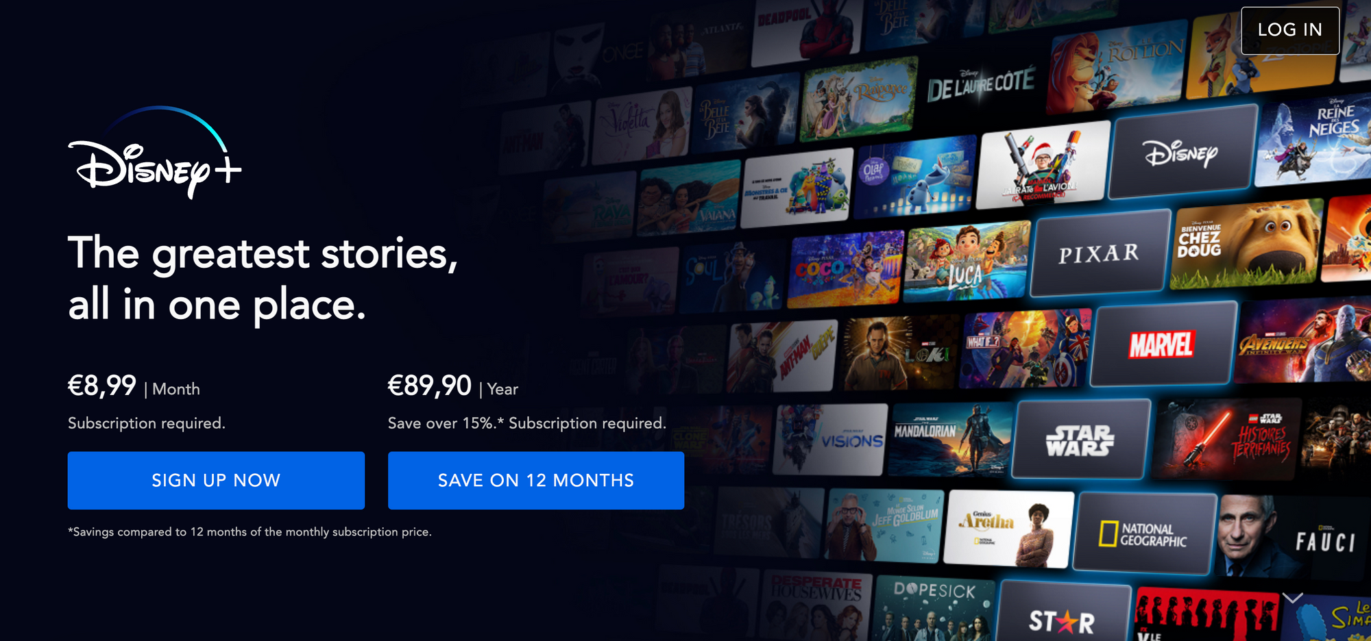
Analysis of the Disney Plus paywall:
✅ Well communicated value proposition, supported by images of logos in the background to demonstrate the range of content available on Disney+
✅ Bold CTA buttons and emphasis on 'Save' which encourages longer commitment to subscription
❌ Again, we can't browse content prior to subscribing, but the images show a lot of value despite this
❌ Unlike Netflix, they don't collect email addresses before showing subscription offers, meaning Disney can't send email promotions/campaigns to users who decided not to subscribe
Canal
Freemium paywall: content is divided between free and premium, with their subscription offer lying under the name of Canal+.
On the French VOD and TV-replay website, Canal, we're able to browse through content freely. Some content, particularly some of the shorter sports clips or TV shows, are unblocked and free to access. However, upon clicking on the premium content, we're invited to discover Canal's subscription offers.
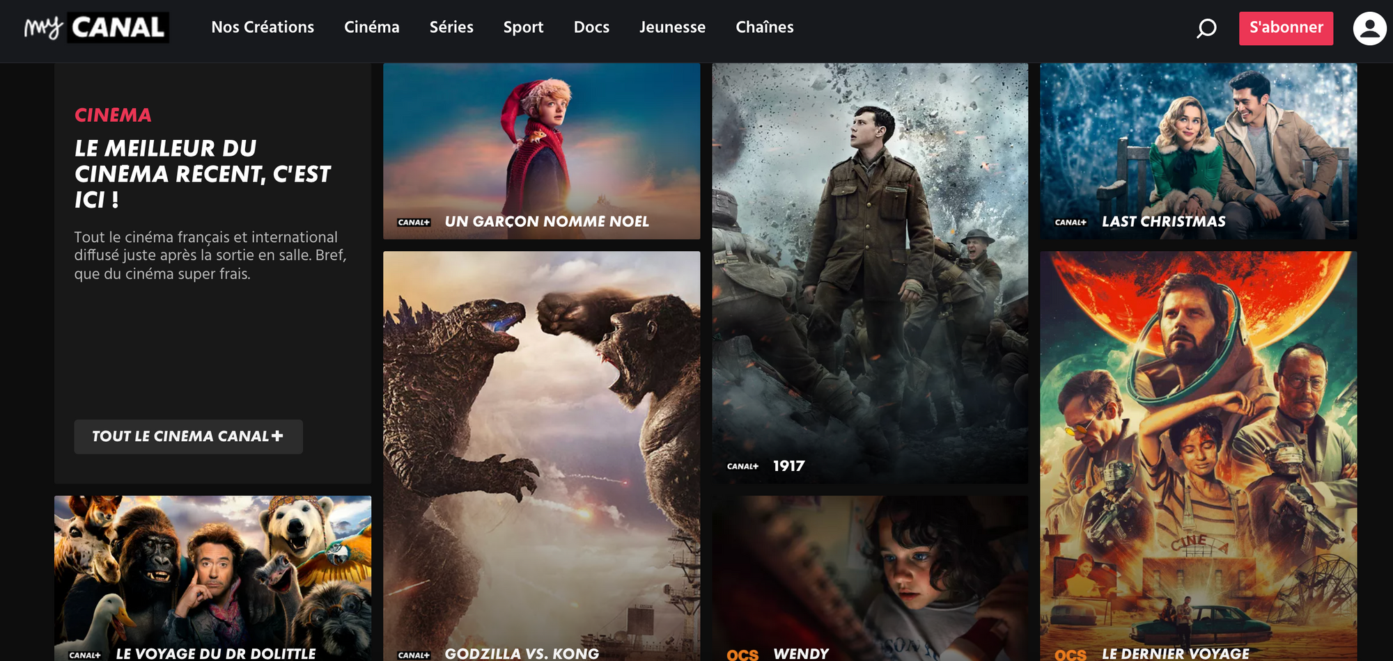
By allowing users to discover content and not presenting the paywall until they've been persuaded to start watching, Canal successful engages their audience prior to showing the paywall meaning they'll be highly more likely to subscribe.

Analysis of Canal's paywall:
✅ Proof of concept and content discovery which increase engagement to boost conversion rates
✅ Personalized wall based on the content that the user wishes to watch (here, 'Interested in watching 1917?)
❌ The CTA button opens another page and requires extra clicks - this could perhaps be improved by integrating part of the conversion funnel into the wall itself
❌ It's not always clear which content is premium until the user clicks on it. This can increase paywall frustration
Apple TV+
Hard paywall: We're able to browse content freely and watch a free episode of certain series, but we're asked to sign into our account at each step and start a free trial of their paid offer.
Taking an alternative approach to that of Netflix and Disney, Apple allows us to browse through their content and discover what we'd be able to access by paying for a subscription (proof of concept). To add to this, they employ an interesting technique of offering not only a free trial but also the chance to watch the first episode of a series for free.
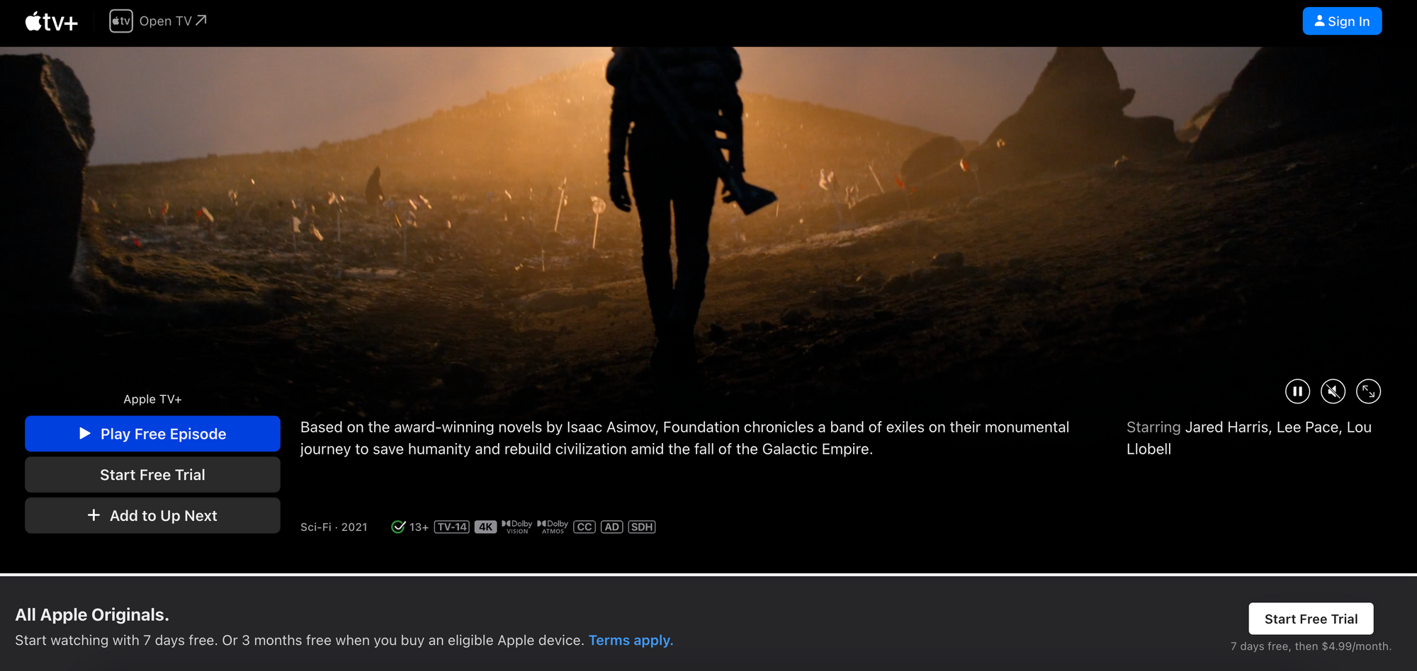
When we click on 'Play Free Episode' or 'Start Free trial', we're immediately required to sign in to our Apple account or create one. This allows for data collection, personalization and targeting of marketing campaigns based on the content consumed.
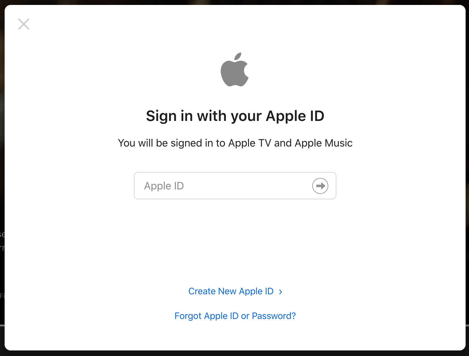
Analysis of the Apple TV+ paywall:
✅ Proof of concept in 3 forms: browsing content, watching an episode for free and the 7-day free trial of Apple's premium offer
✅ Registration is required before consuming any content (even for the content discovery options) which benefits Apple
✅ The 'Free Trial' banner is constantly at the bottom of the screen, making for high visibility and ease of access to starting the free trial
❌ The only point at which we're informed of the cost of their premium offer is in small writing underneath the 'Free Trial' button. This could be clearer and perhaps used to Apple's advantage as this cost is cheaper than many competitors
Discover more about paywalls for VOD and video streaming sites in our other article:

Best Paywalls from Elearning Platforms
Rosetta Stone
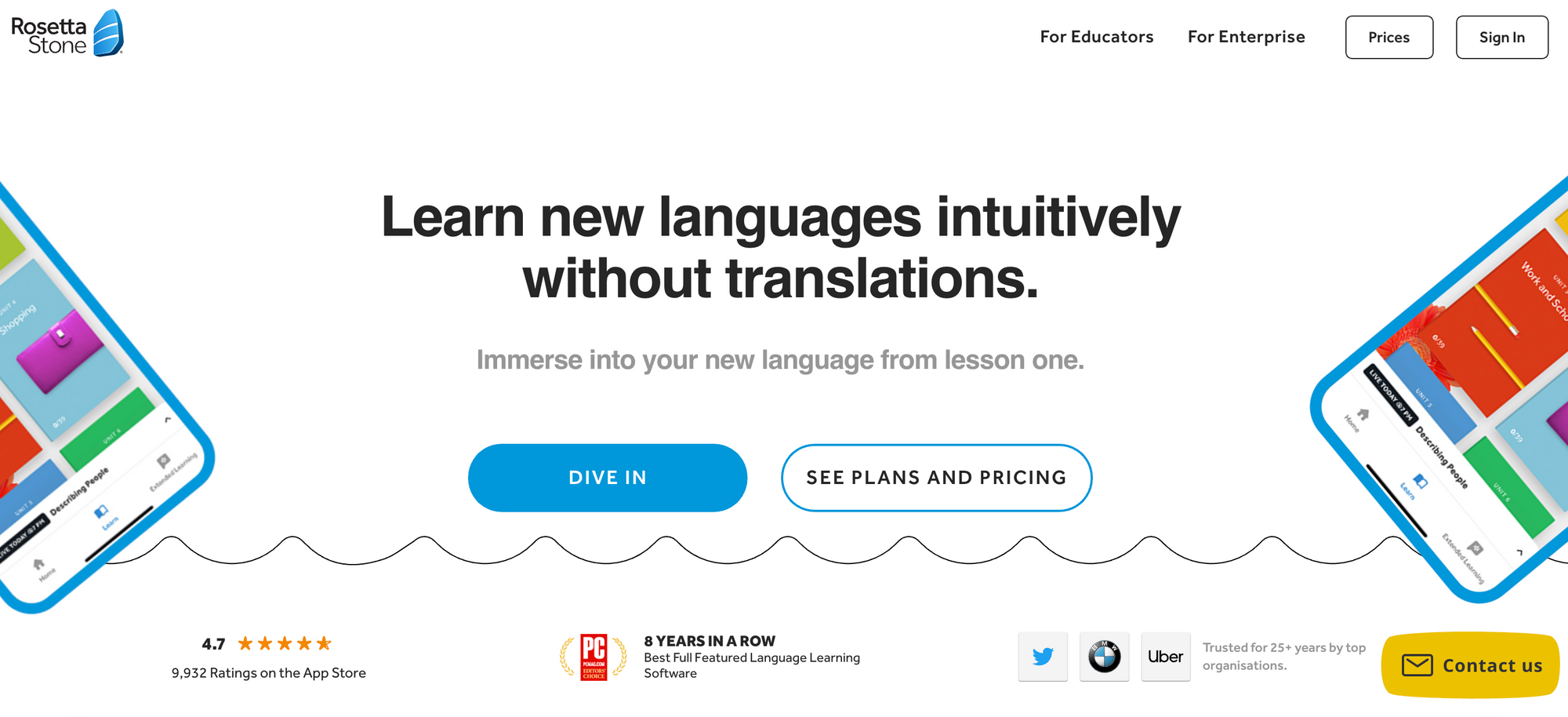
Hard paywall: the paywall is on the landing page itself but is framed rather differently than 'Subscribe now'. By clicking 'Dive in', we're offered a free trial of their offers and encouraged to create an account.
The language learning platform gets straight to the point by placing their paywall on the landing page. However, they cleverly offer a free trial as their proof of concept. This allows users to discover content and be persuaded by the value that Rosetta Stone provides, whilst the company can collect key data points from the user to inform their strategy and provide a personalized experience.
The value proposition is extremely clear and the 'Dive in' button makes us think that access is completely free.
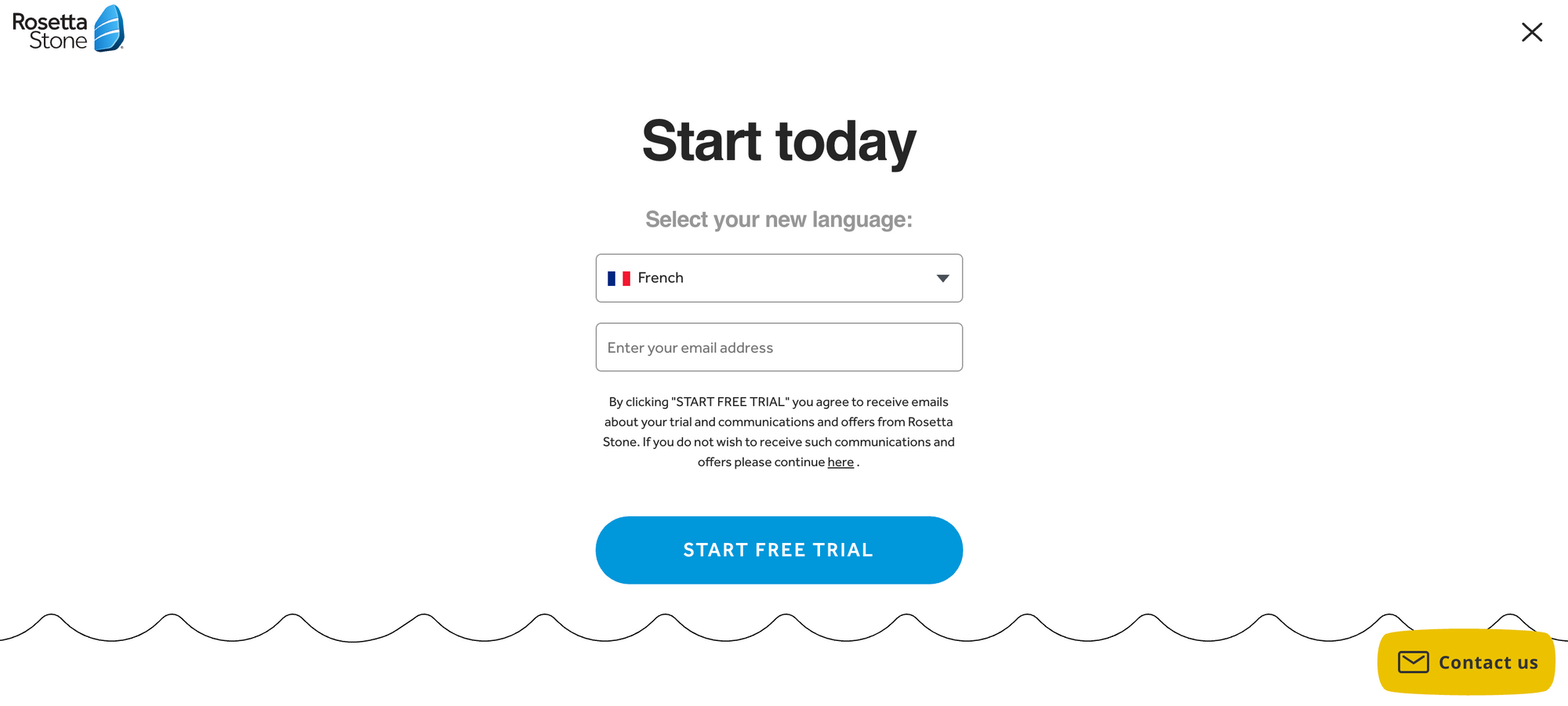
Analysis of Rosetta Stone's paywall:
✅ Rosetta Stone build trust with users by including their 4.7 star reviews, awards and logos of well-recognized companies on this landing page below the paywall
✅ The CTA button that the company want users to click on is highlighted the most, clearly standing out on the page
✅ Key data points can be collected by offering a free trial, even if the user unsubscribes before the trial finishes
❌ Despite the value proposition being clear, there is little proof of what they offer in terms of languages, types of lessons, etc
MasterClass
Hard Paywall: their paywall is on the landing page alongside a great deal of information about what content MasterClass provides.
This e-learning site includes lessons from some of the 'most inspiring artists, leaders and icons in the world'. Their value proposition is clearly communicated on the landing page, with 'trailers' that present the type of content available to subscribers.
MasterClass have cleverly included email collection on the paywall itself, reducing a step in the funnel and gathering this important data point as a priority. We're also able to browse all the famous people who provide content for their site via the 'Categories' menu bar which provides some proof of concept.
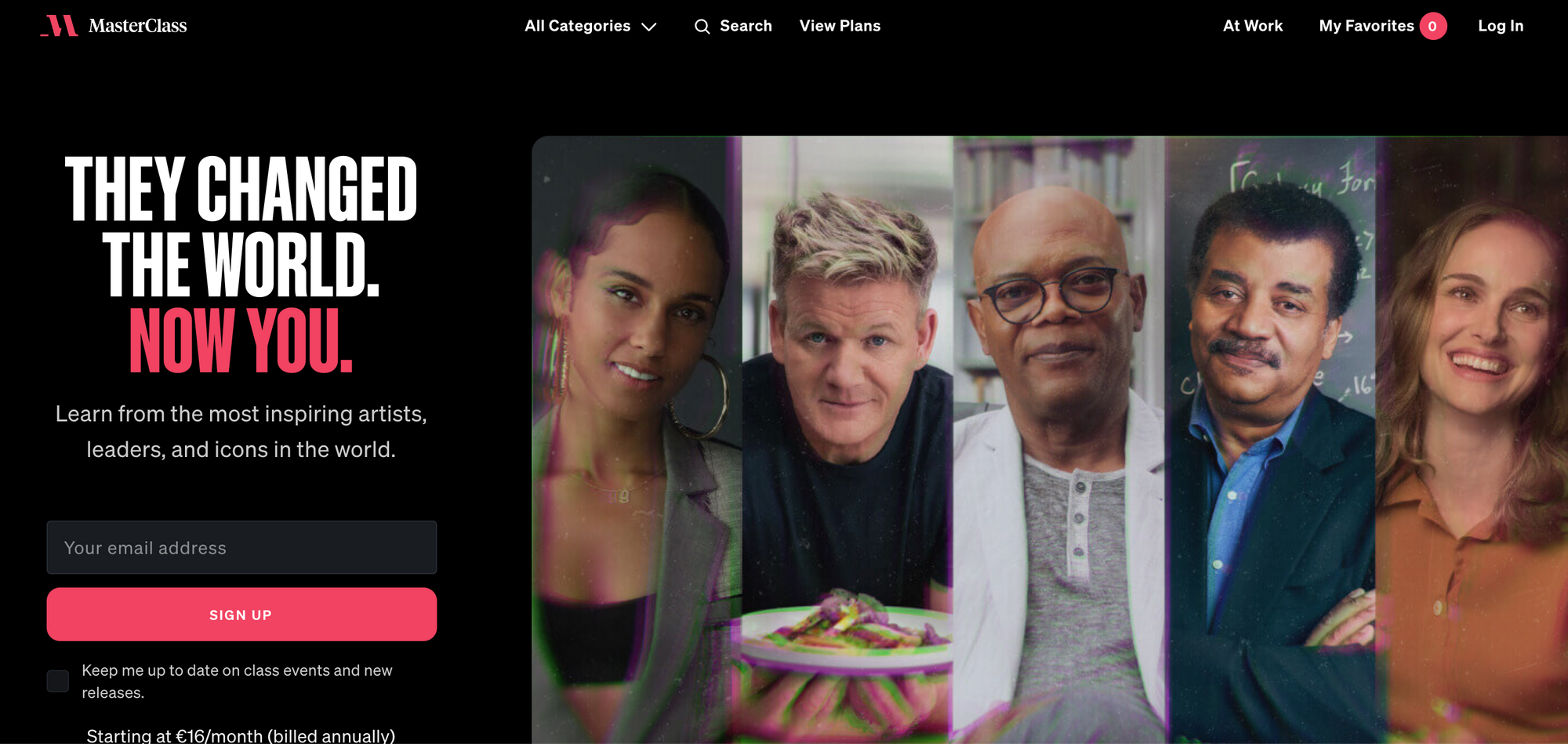
If we scroll down the page, there's plenty of information to persuade us to subscribe as well as a banner pop-up that provides easy access to signing up.

Analysis of MasterClass' paywall:
✅ Well communicated value proposition and proof of concept
✅ Email collection early on in the conversion funnel
❌ They don't offer a free trial to experience content
❌ We also can't provide our data through an existing social account, such as Google or Facebook, which would benefit both MasterClass (more data) and the user (easier to sign up)
Discover more about paywalls for E-learning platforms and online courses in our other blog post:

In need of a simple but effective solution to get your paywall strategy on the road to success? Well, Poool's here for you!
Our Dashboard puts your marketing team back in control to drive your strategy forever, without ever having to call on the tech team for support. Segment your audience, build user journeys for each using our ready-made but fully personalizable wall options, carry out endless A/B tests with ease, analyze results and make changes in minutes.
👉 Tech integration in a matter of days
👉 Launch in less than a month
👉 ROI in under 90 days
Interested in finding out how Poool can help you become data-driven, solve the challenge of the cookieless future and increase your ARPU?
Book a demo
You may also be interested in:


